Managing museums and cultural centres requires a perfect balance between visitor experience, financial sustainability, and operational efficiency. However, when data remains scattered across spreadsheets, reports, and manual logs, decision-making becomes slow and unclear. Therefore, organizations increasingly look for structured and visual solutions to manage performance effectively.
That is exactly where the Museums & Cultural Centres Dashboard in Excel plays a critical role.
In this detailed article, you will learn what a Museums & Cultural Centres Dashboard in Excel is, why it is important, how it works, its page-wise structure, key features, advantages, opportunities for improvement, best practices, and frequently asked questions. Moreover, the language remains simple, active, and easy to understand, making this guide suitable for both technical and non-technical users.
Click to Purchases Museums & Cultural Centres Dashboard in Excel
What Is a Museums & Cultural Centres Dashboard in Excel?
A Museums & Cultural Centres Dashboard in Excel is a ready-to-use analytical tool that helps museums, galleries, and cultural institutions track visitor satisfaction, ticket revenue, staff costs, event expenses, and operating costs in one centralized Excel file.
Instead of reviewing multiple reports or raw data sheets, this dashboard transforms data into interactive charts, KPI cards, and slicers. As a result, management teams can quickly understand performance trends, identify cost drivers, and improve visitor engagement.
Because the dashboard uses Microsoft Excel, organizations do not need any advanced software or coding knowledge. Moreover, Excel ensures easy customization, scalability, and offline access.
Why Do Museums & Cultural Centres Need a Dashboard in Excel?
Museums and cultural centres operate in a complex environment. They manage exhibitions, events, staff, maintenance, and visitor services simultaneously. Therefore, decision-makers need a clear view of performance at all times.
Key Reasons to Use This Dashboard
-
Museums manage multiple event types, ticket categories, and visitor segments
-
Cultural centres track staff, maintenance, and operating costs
-
Management needs monthly, category-wise, and regional insights
-
Visitor satisfaction plays a major role in long-term success
-
Manual analysis consumes time and increases errors
Hence, a structured dashboard ensures clarity, speed, and accuracy in decision-making.
How Does the Museums & Cultural Centres Dashboard in Excel Work?
The dashboard follows a simple and logical workflow, making it easy to use for daily operations.
-
Data Entry
All raw data gets entered into a structured Data Sheet. -
Data Processing
Excel formulas, pivot tables, and calculated fields process the data automatically. -
Interactive Analysis
Slicers allow users to filter data by region, museum type, event type, ticket type, and month. -
Visual Insights
Charts and KPI cards update instantly when slicers change.
As a result, users spend less time preparing reports and more time analyzing insights.
What Are the Key Features of the Museums & Cultural Centres Dashboard in Excel?
This dashboard includes multiple features designed for clarity, usability, and performance tracking.
🔹 Page Navigator
-
Located on the left side
-
Allows quick navigation between dashboard pages
-
Improves user experience and reduces confusion
🔹 Interactive Slicers
-
Positioned on the right side
-
Filter data dynamically across all charts
-
Enable fast comparison across categories
🔹 KPI Cards
-
Display key metrics at a glance
-
Help leadership monitor performance instantly
-
Click to Purchases Museums & Cultural Centres Dashboard in Excel
What Pages Are Included in the Museums & Cultural Centres Dashboard in Excel?
The dashboard consists of five analytical pages, each focusing on a specific performance area.
Overview Page – What Does the Overview Page Show?
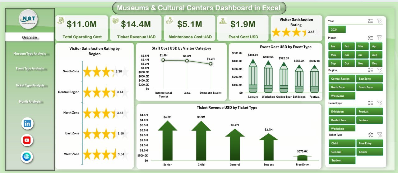
The Overview Page serves as the main landing page of the dashboard. It provides a high-level summary of museum and cultural centre performance.
Key Elements on the Overview Page
KPI Cards
-
Highlight key performance indicators for quick insights
Charts Included
-
📊 Visitor Satisfaction Rating by Region
-
📊 Staff Cost USD by Visitor Category
-
📊 Event Cost USD by Event Type
-
📊 Ticket Revenue USD by Ticket Type
Why This Page Matters
This page allows decision-makers to:
-
Quickly assess visitor satisfaction
-
Identify cost-heavy visitor segments
-
Understand ticket revenue distribution
-
Monitor event expenses efficiently
-
Click to Purchases Museums & Cultural Centres Dashboard in Excel
Museum Type Analysis Page – Why Analyze by Museum Type?
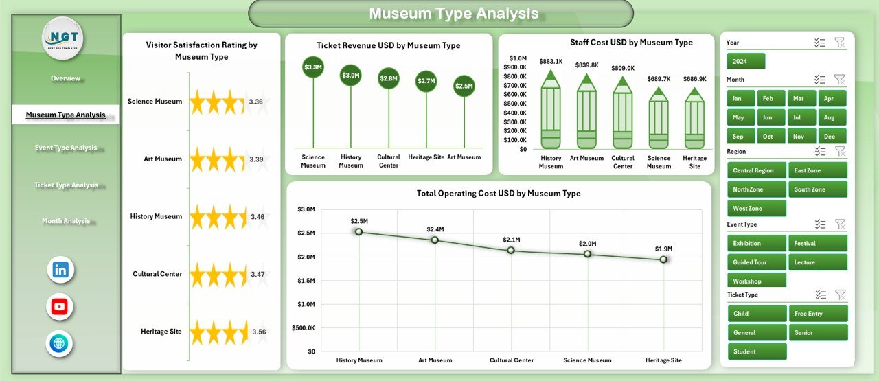
Different museum types operate differently. Therefore, analyzing performance by museum type helps optimize resources and strategy.
Charts on the Museum Type Analysis Page
-
📊 Visitor Satisfaction Rating by Museum Type
-
📊 Staff Cost USD by Museum Type
-
📊 Ticket Revenue USD by Museum Type
-
📊 Total Operating Cost USD by Museum Type
Business Benefits
-
Compare performance across museum categories
-
Identify high-cost museum types
-
Improve budget allocation
-
Enhance visitor experience strategies
Event Type Analysis Page – How Do Events Impact Performance?
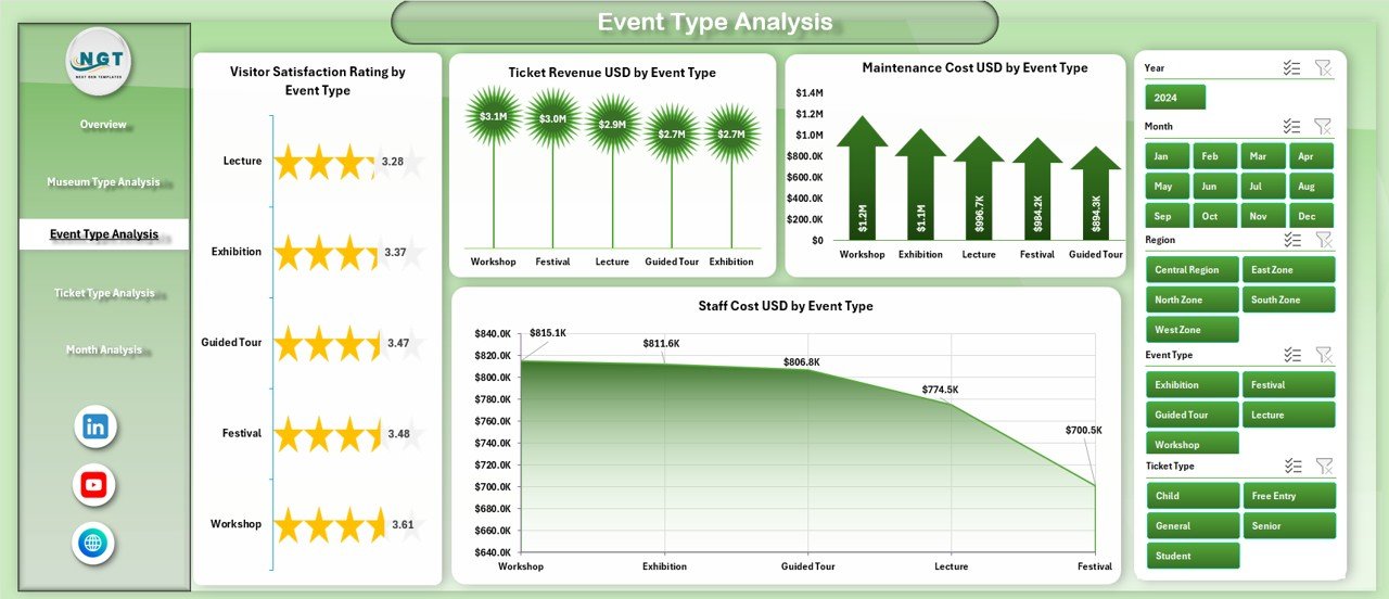
Events attract visitors but also generate costs. Hence, tracking event performance becomes essential.
Charts on the Event Type Analysis Page
-
📊 Visitor Satisfaction Rating by Event Type
-
📊 Staff Cost USD by Event Type
-
📊 Ticket Revenue USD by Event Type
-
📊 Maintenance Cost USD by Event Type
Insights You Gain
Click to Purchases Museums & Cultural Centres Dashboard in Excel
-
Identify profitable event types
-
Monitor maintenance-heavy events
-
Improve event planning decisions
-
Balance satisfaction with cost control
Ticket Type Analysis Page – Why Is Ticket Analysis Important?
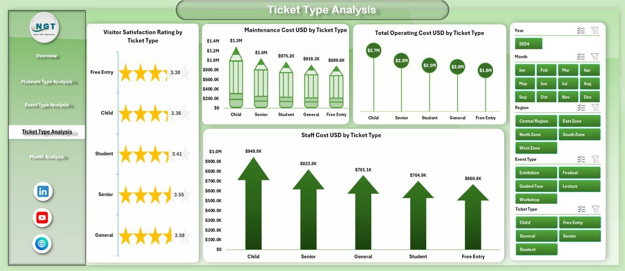
Ticket pricing directly affects revenue and visitor volume. Therefore, analyzing ticket types helps maximize income without hurting satisfaction.
Charts on the Ticket Type Analysis Page
-
📊 Visitor Satisfaction Rating by Ticket Type
-
📊 Staff Cost USD by Ticket Type
-
📊 Ticket Revenue USD by Ticket Type
-
📊 Maintenance Cost USD by Ticket Type
Key Outcomes
-
Evaluate premium vs regular ticket performance
-
Optimize pricing strategies
-
Identify cost drivers by ticket category
-
Improve overall revenue management
Month Analysis Page – How Does Performance Change Over Time?
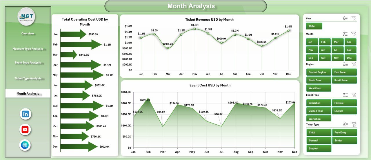
Seasonality impacts visitor traffic, costs, and events. Hence, month-wise analysis becomes essential.
Charts on the Month Analysis Page
-
📊 Total Operating Cost USD by Month
-
📊 Ticket Revenue USD by Month
-
📊 Event Cost USD by Month
Why Monthly Analysis Helps
-
Track seasonal trends
-
Plan budgets effectively
-
Forecast future performance
-
Control monthly expenses
What Is the Role of the Data Sheet and Support Sheet?
📂 Data Sheet
-
Acts as the single source of truth
-
Stores raw transactional data
-
Uses structured formats for pivot tables
📂 Support Sheet
-
Contains helper tables
-
Supports slicers and calculations
-
Improves dashboard stability
Advantages of Museums & Cultural Centres Dashboard in Excel
Using this dashboard delivers several operational and strategic benefits.
✅ Key Advantages
-
📈 Centralized performance tracking
-
⏱ Saves reporting and analysis time
-
🎯 Improves decision-making accuracy
-
💰 Enhances cost control and budgeting
-
😊 Boosts visitor satisfaction insights
-
📊 Easy to customize and scale
-
🧩 No advanced technical skills required
Opportunities for Improvement in Museums & Cultural Centres Dashboards
Although the dashboard offers strong insights, continuous improvement ensures better results.
🔧 Opportunities for Improvement
-
Add predictive trend analysis
-
Include year-over-year comparisons
-
Integrate attendance forecasting
-
Automate data import processes
-
Add regional benchmarking metrics
-
Expand KPI cards for executive summaries
Best Practices for the Museums & Cultural Centres Dashboard in Excel
Click to Purchases Museums & Cultural Centres Dashboard in Excel
Following best practices ensures accuracy, performance, and long-term usability.
⭐ Best Practices
-
📌 Keep the data sheet clean and structured
-
📌 Use consistent naming conventions
-
📌 Refresh data regularly
-
📌 Limit slicer overload for clarity
-
📌 Use clear chart titles and labels
-
📌 Validate data before analysis
-
📌 Protect formulas from accidental edits
Who Should Use a Museums & Cultural Centres Dashboard in Excel?
This dashboard suits a wide range of users.
Ideal Users
-
Museum Directors
-
Cultural Centre Managers
-
Finance & Operations Teams
-
Event Coordinators
-
Government & Public Institutions
-
Non-profit Cultural Organizations
How Does This Dashboard Improve Decision-Making?
Because the dashboard converts raw data into visual insights, leaders can:
-
Identify issues faster
-
Act on trends proactively
-
Justify funding and budgets
-
Improve visitor experience
-
Optimize staffing and event planning
As a result, museums operate more efficiently and sustainably.
Conclusion – Why Choose a Museums & Cultural Centres Dashboard in Excel?
The Museums & Cultural Centres Dashboard in Excel provides a powerful yet simple solution for managing complex cultural operations. By combining interactive visuals, structured data, and intuitive navigation, this dashboard empowers organizations to make informed decisions with confidence.
Moreover, Excel ensures flexibility, affordability, and accessibility, making this dashboard suitable for institutions of all sizes. When museums embrace data-driven management, they improve sustainability, enhance visitor satisfaction, and maximize impact.
Frequently Asked Questions (FAQs)
❓ What is a Museums & Cultural Centres Dashboard in Excel used for?
It helps track visitor satisfaction, ticket revenue, staff costs, event expenses, and operating costs in one centralized Excel dashboard.
❓ Do I need advanced Excel skills to use this dashboard?
No. Basic Excel knowledge is sufficient to operate and customize the dashboard.
❓ Can I add more pages or KPIs?
Yes. The dashboard allows full customization, including adding new KPIs, charts, and analysis pages.
❓ Is this dashboard suitable for small museums?
Yes. Small, medium, and large museums can all use this dashboard effectively.
❓ How often should I update the data?
You should update data monthly or weekly, depending on reporting needs.
❓ Can I use this dashboard for cultural festivals?
Yes. You can easily adapt event and ticket analysis for festivals and special programs.
Visit our YouTube channel to learn step-by-step video tutorials