Museums and cultural centres play an important role in preserving history, promoting creativity, and enriching communities. Because of this heavy responsibility, cultural institutions must track many performance metrics to understand how well they operate, engage visitors, and manage resources. However, many organizations still report KPIs manually, which slows down decision-making, creates errors, and hides important insights.
A Museums & Cultural Centres KPI Dashboard in Power BI solves these challenges. It turns complex datasets into interactive visuals, clear comparisons, and real-time insights. With powerful analytics, museum leaders gain a complete view of performance—from visitor trends and exhibit engagement to revenue, staff efficiency, and cultural program outcomes.
In this guide, you will learn what this dashboard is, how it works, and why every cultural institution should use one. You will also explore its key features, advantages, best practices, and frequently asked questions.
Click to Purchases Museums & Cultural Centres KPI Dashboard in Power BI
What Is a Museums & Cultural Centres KPI Dashboard in Power BI?
A Museums & Cultural Centres KPI Dashboard in Power BI is a ready-to-use analytical tool that tracks monthly and yearly performance across various museum departments and cultural programs. It provides visual insights into operational KPIs, financial KPIs, visitor engagement metrics, and program outcomes.
Unlike traditional Excel-based reports, Power BI offers automation, real-time updates, and interactive visuals. As a result, museum managers gain a quicker and clearer view of how well their institution performs and where improvement is needed.
The dashboard uses an Excel file as its data source. Teams simply enter the actual values, targets, and KPI definitions in three well-organized sheets. Power BI then refreshes the dashboard and displays accurate charts, cards, and KPI comparisons instantly.
Because the design is user-friendly, anyone—from directors to program coordinators—can understand trends without technical knowledge.
Why Do Museums Need KPI Dashboards?
Museums operate in a competitive landscape. Visitors seek engaging experiences, meaningful exhibitions, and high-quality programming. Donors expect impact. Management must ensure operational efficiency. A KPI dashboard brings all these dimensions together in one place.
Museums need a KPI dashboard because it helps them:
-
Track performance on a monthly and yearly basis
-
Compare results with targets and previous years
-
Identify declining trends quickly
-
Measure visitor satisfaction
-
Understand exhibit performance
-
Improve budgeting and resource allocation
-
Strengthen decision-making with real-time data
-
Present insights visually for board meetings and reviews
Because the dashboard uses Power BI, museums gain transparency, accuracy, and confidence in their reporting process.
Click to Purchases Museums & Cultural Centres KPI Dashboard in Power BI
Key Features of the Museums & Cultural Centres KPI Dashboard in Power BI
This dashboard includes three powerful pages, each designed for a specific purpose: Summary, Trend Analysis, and KPI Definition.
Let’s explore each page in detail.
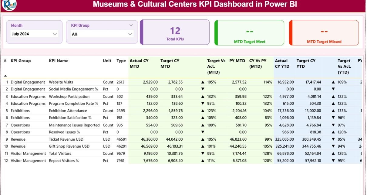
1. Summary Page: Your Main Performance Overview
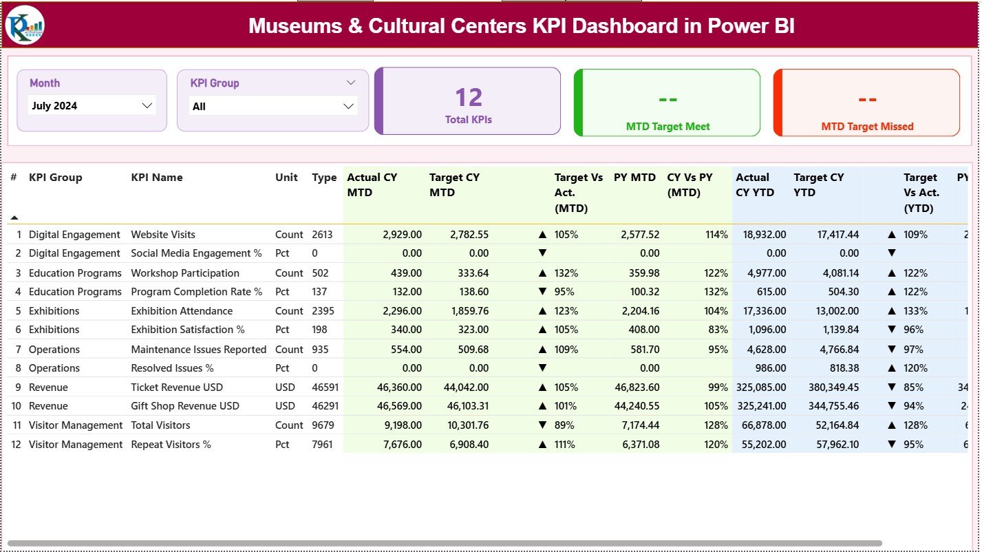
The Summary Page serves as the central hub of the entire dashboard. Users can view the overall performance at a glance and drill into KPIs for deeper understanding.
This page includes:
✔ Month and KPI Group Slicers
Users can select any month or KPI group. The entire dashboard updates instantly to reflect the chosen period and category.
✔ Three KPI Cards for Quick Highlights
These cards provide a snapshot of performance:
-
Total KPIs Count
-
MTD Target Met Count
-
MTD Target Missed Count
These insights help managers understand if the institution is on track or needs immediate action.
✔ Detailed KPI Table With Rich Insights
The summary table presents all important KPI metrics in one structured format. It includes:
-
KPI Number – Sequence of the KPI
-
KPI Group – Category or department
-
KPI Name – KPI title
-
Unit – Measurement unit
-
Type – Lower-the-better (LTB) or Upper-the-better (UTB)
-
Actual CY MTD – Current Year Month-to-Date actuals
-
Target CY MTD – Current Year MTD targets
-
MTD Icon – ▲ or ▼ (green/red) performance indicator
-
Target vs Actual (MTD) – Formula: Actual / Target
-
PY MTD – Previous Year MTD values
-
CY vs PY (MTD) – Formula: CY MTD / PY MTD
-
Actual CY YTD – Current Year Year-to-Date actuals
-
Target CY YTD – Current Year YTD targets
-
YTD Icon – ▲ or ▼ based on YTD performance
-
Target vs Actual (YTD) – Formula: Actual / Target
-
PY YTD – Previous Year YTD values
-
CY vs PY (YTD) – Formula: CY YTD / PY YTD
Because the table uses icons, colors, and percentage metrics, users understand performance instantly.
Click to Purchases Museums & Cultural Centres KPI Dashboard in Power BI
2. KPI Trend Page: Monthly and Yearly Performance Trends
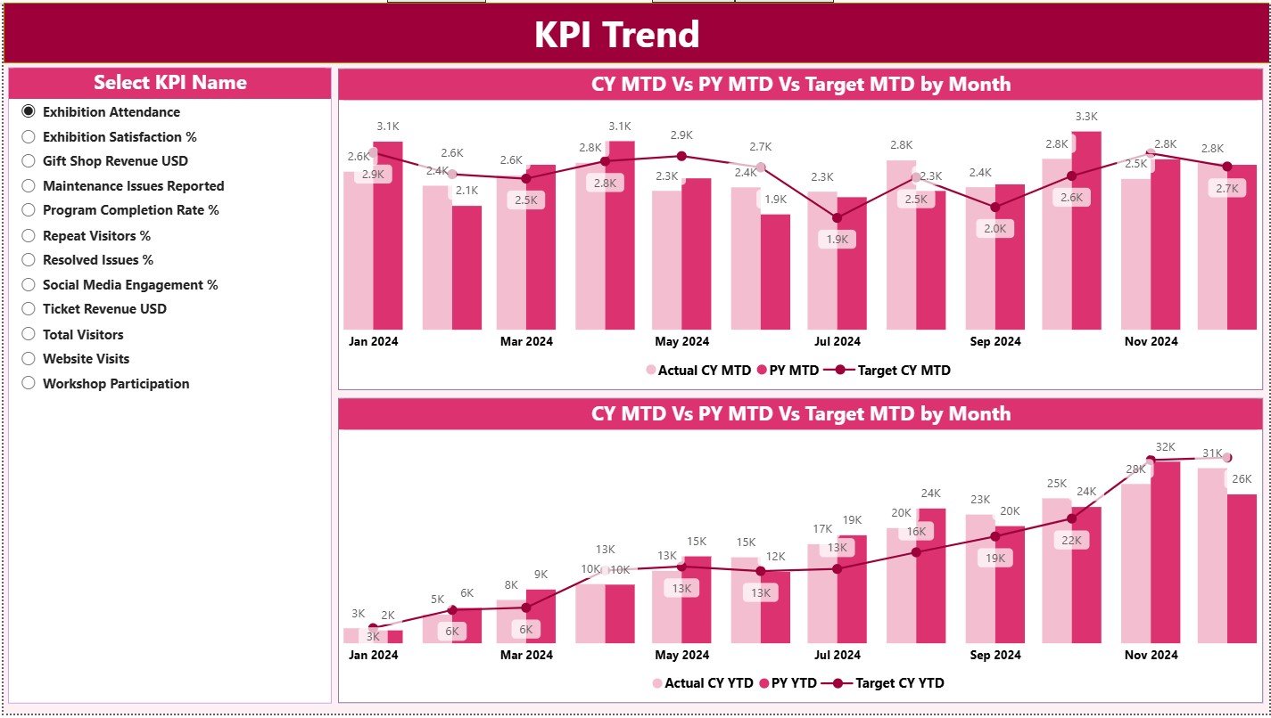
This page focuses on understanding historical behavior and long-term patterns.
✔ Interactive KPI Slicer
Users can select any KPI name from the left side.
✔ Two Combo Charts
The dashboard shows:
-
MTD Trend – Current Year, Previous Year, and Targets
-
YTD Trend – Actuals vs Previous Year vs Targets
These visuals reveal whether performance improves, declines, or stays consistent across months.
Trend analysis helps museums:
-
Adjust strategies for declining engagement
-
Improve programs with low attendance
-
Identify seasonal patterns
-
Assess long-term museum growth
Because trends matter more than just numbers, this page becomes essential for strategic planning.
3. KPI Definition Page: Understanding the KPIs Clearly
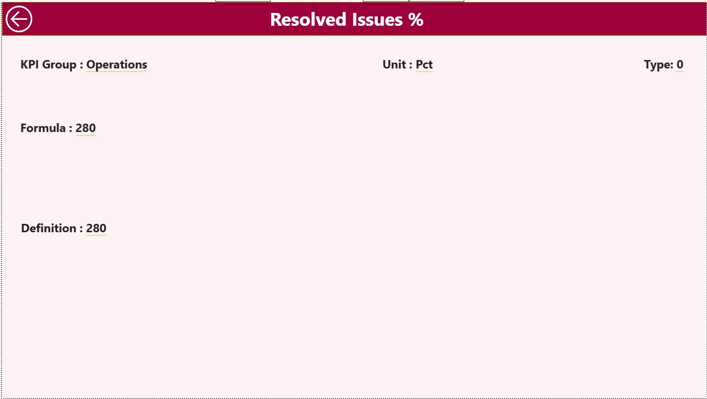
This hidden drill-through page explains the logic behind each KPI.
It includes:
-
KPI Number
-
KPI Group
-
KPI Name
-
Unit
-
Formula
-
Definition
-
Type (LTB or UTB)
Users can right-click any KPI from the Summary page and drill through to view its description. A back button allows quick navigation to the main page.
This page is critical because it ensures:
-
KPI transparency
-
Standard measurement practices
-
Clear communication across teams
-
Reduced confusion in review meetings
Every KPI has a documented meaning and formula, which helps teams interpret data accurately.
How the Excel Data Source Structure Works
The dashboard pulls data from an easy-to-manage Excel file. The file has three worksheets, each serving a unique purpose.
1. Input_Actual Sheet
This sheet contains:
-
KPI Name
-
Month (first date of each month)
-
MTD Actual
-
YTD Actual
Museum teams fill actual performance numbers here each month.
2. Input_Target Sheet
This sheet includes:
-
KPI Name
-
Month
-
MTD Target
-
YTD Target
Targets help the dashboard calculate variance and performance icons.
3. KPI Definition Sheet
This page stores:
-
KPI Number
-
KPI Group
-
KPI Name
-
Unit
-
Formula
-
Definition
-
Type (LTB / UTB)
Because the dashboard reads this sheet automatically, users never update definitions inside Power BI.
Click to Purchases Museums & Cultural Centres KPI Dashboard in Power BI
Advantages of Using the Museums & Cultural Centres KPI Dashboard in Power BI
The dashboard offers many practical benefits. Here are the most important ones.
1. Improves Decision-Making
Leaders understand performance instantly because visuals highlight strengths and weaknesses clearly.
2. Saves Time
The dashboard updates with one click. Teams no longer prepare manual reports.
3. Enhances Transparency
Every KPI shows its definition, formula, and calculation method, which reduces confusion.
4. Supports Strategic Planning
Trend charts help museums revise strategies, allocate resources better, and improve visitor engagement.
5. Strengthens Accountability
Clear metrics ensure that each team understands their responsibilities and performance expectations.
6. Boosts Visitor Satisfaction
Museums track engagement, program success, and service quality more effectively.
7. Improves Donor and Board Reporting
Power BI visuals create professional presentations for stakeholders.
8. Ensures Data Accuracy
Because the dashboard pulls data from structured sheets, errors reduce significantly.
9. Encourages Continuous Improvement
YTD and MTD comparisons highlight where performance improves or declines.
10. Enables Better Cultural Impact Measurement
Museums monitor program reach and cultural value more precisely.
Best Practices for Using the Museums & Cultural Centres KPI Dashboard in Power BI
To get the best results, museums must follow effective practices.
1. Keep KPI Definitions Clear
Ensure every KPI has a simple, measurable definition so teams understand what they track.
2. Update Data Regularly
Refresh monthly to maintain real-time visibility.
3. Use Filters to Explore Insights
Slicers help teams focus on specific KPI groups or time periods.
4. Compare Targets and Trends Together
Do not rely only on actual numbers; analyze variance and long-term behavior.
5. Train Teams Before Using
A small orientation helps staff navigate the dashboard efficiently.
6. Review KPIs Annually
Organizations evolve, so KPI relevance must evolve as well.
7. Focus on Actionable KPIs Only
Avoid crowding the dashboard with too many metrics.
8. Use Icons for Faster Interpretation
Color-coded indicators help users understand performance in seconds.
9. Involve Department Heads
Each team should review their KPI group to ensure accuracy and completeness.
10. Validate Data Before Each Refresh
Cross-check data sheets to avoid wrong insights.
How Museums Can Use the Dashboard for Improving Visitor Experience
Visitors are at the heart of every museum. The dashboard helps improve visitor experience in many ways:
-
Track visitor satisfaction
-
Identify popular exhibits
-
Understand participation in cultural programs
-
Measure waiting times or ticketing efficiency
-
Improve staffing during peak hours
With better insights, museums create more engaging and meaningful experiences.
How the Dashboard Supports Cultural Program Growth
Cultural programs need structured data to grow. The dashboard helps in several ways:
-
Compare attendance across months
-
Identify high-performing programs
-
Track program ratings
-
Measure reach in different age groups
-
Evaluate cost vs impact
Because insights are clear, program teams make confident decisions.
Conclusion
The Museums & Cultural Centres KPI Dashboard in Power BI provides a complete solution for performance management in cultural institutions. It turns raw data into clear insights, helps teams improve operations, and supports strategic growth. With automated updates, user-friendly visuals, trend analysis, and KPI definitions, this dashboard becomes an essential tool for every museum.
Whether you want to understand visitor engagement, track exhibit performance, measure cultural impact, or monitor operational KPIs, this dashboard gives you the clarity you need.
When museums work with accurate data and real-time insights, they move toward better decisions, stronger programs, and a more impactful cultural mission.
Click to Purchases Museums & Cultural Centres KPI Dashboard in Power BI
Frequently Asked Questions (FAQs)
1. What is a Museums & Cultural Centres KPI Dashboard in Power BI?
It is an interactive reporting tool that tracks museum performance using KPIs such as visitor trends, program attendance, engagement scores, and operational metrics.
2. Who should use this dashboard?
Museum directors, cultural program managers, exhibit curators, finance teams, and board members use this dashboard for performance tracking.
3. What data source does the dashboard use?
It uses an Excel file containing actual values, target values, and KPI definitions.
4. Can staff without technical skills use it?
Yes, the dashboard is simple and fully interactive. Anyone can use it after a short orientation.
5. How often should museums update the data?
Monthly updates work best to keep MTD and YTD insights accurate.
6. Can we modify KPI definitions?
Yes, you can edit the KPI Definition sheet in Excel, and the dashboard will reflect those changes.
7. Does the dashboard track previous year comparisons?
Yes, it compares Current Year vs Previous Year for both MTD and YTD metrics.
8. Why are icons important in KPI dashboards?
Icons help users see positive or negative performance instantly without reading numbers.
9. Is this dashboard useful for fundraising?
Absolutely. Donors appreciate data-backed insights showing cultural impact and growth.
10. Can museums add more KPI groups later?
Yes, the dashboard is expandable. Just update the KPI Definition sheet and input pages.
11. Does the dashboard support advanced analytics?
Power BI allows forecasting, segmentation, deeper drill-downs, and custom visuals when needed.
12. How does the Trend page help museum managers?
It shows long-term behavior across months and years, helping identify growth patterns and performance issues.
Click to Purchases Museums & Cultural Centres KPI Dashboard in Power BI
Visit our YouTube channel to learn step-by-step video tutorials