Newsrooms grow fast, stories move quickly, and editorial teams manage hundreds of updates every day. As the media landscape evolves, journalists, editors, publishers, and digital teams need an easy way to track performance, review article progress, and understand audience reach. A News & Journalism Dashboard in Excel solves this problem in a simple and powerful way.
This dashboard gives every media team a clear visual view of article stages, category performance, reporter contribution, and month-wise results. Because the dashboard uses slicers, cards, and interactive charts, users understand trends instantly and make quick decisions. In this detailed guide, you will learn everything about the dashboard, how it works, why teams love it, and how you can get the most out of it.
Click to Purchases News & Journalism Dashboard in Excel
What Is a News & Journalism Dashboard in Excel?
A News & Journalism Dashboard in Excel is a ready-to-use reporting template designed for editors, content managers, news reporters, media analysts, and digital publishing teams. It captures essential article information and presents it in a clean visual format. You can track draft percentages, review progress, share distribution, estimated reach, audience interaction, and category insights.
This dashboard works best for:
-
News websites
-
Digital publishers
-
Magazines
-
Media reporting agencies
-
Journalism schools
-
Editorial teams
-
Freelance reporting networks
The dashboard keeps every article’s journey visible — from draft to review, from review to publish, and from publish to impact.
Why Do Media Teams Need a News & Journalism Dashboard?
The modern newsroom handles content at high speed. Articles come in from different reporters, stories belong to different categories, and each platform performs differently. Without a proper dashboard, teams face many challenges:
-
Difficulty in tracking article progress
-
Slow review cycles
-
Limited visibility into performance
-
No clarity on monthly trends
-
Hard to identify reporter productivity
-
No real-time breakdown by article type
With the dashboard, all this changes. Editors do not guess anymore. They check the dashboard, filter the data, and understand the situation instantly.
Key Features of the News & Journalism Dashboard in Excel
This ready-to-use dashboard includes powerful features that simplify work for every media professional.
✔ Page Navigator
A clean and easy navigator located on the left side helps users move between the five analytical pages. You browse insights smoothly without scrolling or searching.
✔ 5 Analytical Pages
You get five strong report pages that show every layer of journalism analytics:
-
Overview Page
-
Category Analysis
-
Article Analysis
-
Reporter Analysis
-
Month Analysis
Let us explore each page in detail.
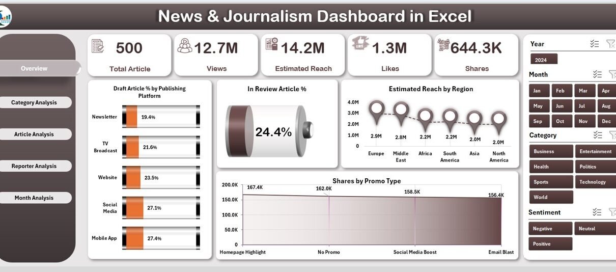
1. Overview Page: What Insights Does It Provide?
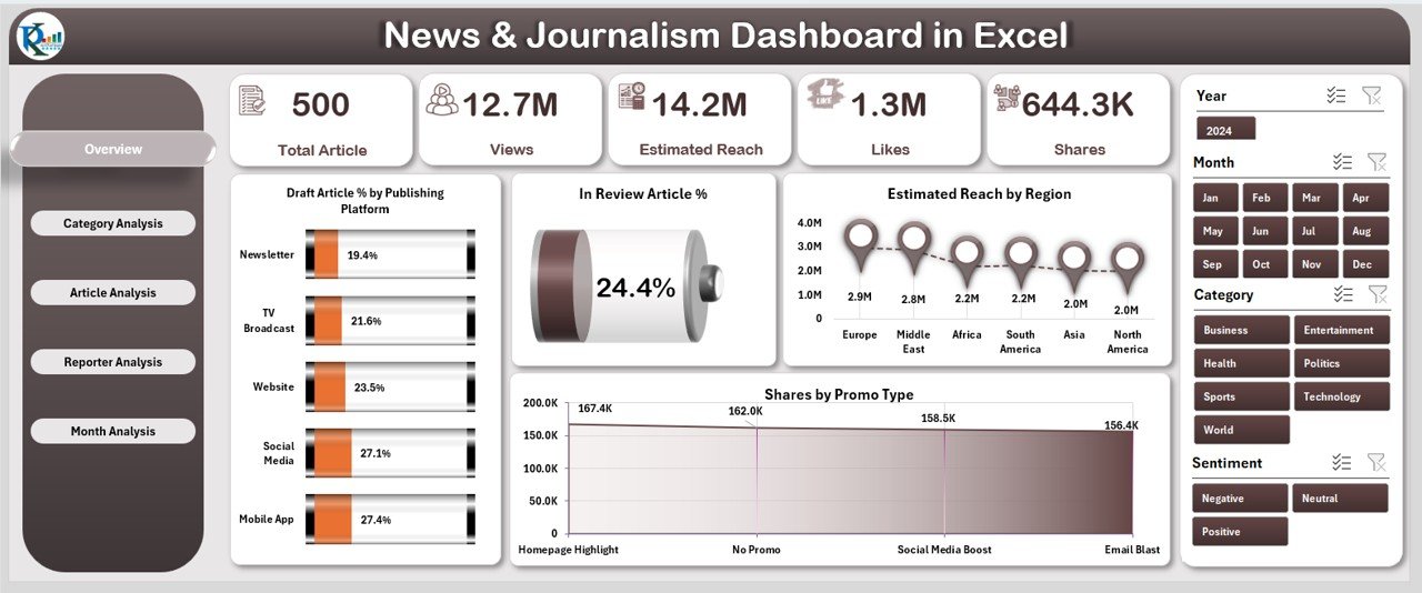
The Overview Page is the core of the dashboard. It provides a complete snapshot of your newsroom’s performance. This page shows:
✔ Interactive Slicers
You can filter the data instantly by selecting platforms, categories, or other attributes.
✔ Five Insightful Cards
The cards give quick highlights such as:
-
Total Articles
-
Draft Article %
-
In Review Article %
-
Estimated Total Reach
-
Share Distribution
This summary helps editors understand the overall situation in seconds.
✔ Powerful Charts
The page includes four visual charts:
-
Draft Article % by Publishing Platform
-
In Review Article %
-
Estimated Reach by Region
-
Share by Promo Type
These charts show how articles perform across platforms, how many articles stay in review, which regions show better reach, and which promotional method works better. Editors use this page daily for a quick health check of the newsroom.
2. Category Analysis: How Does Each Category Perform?
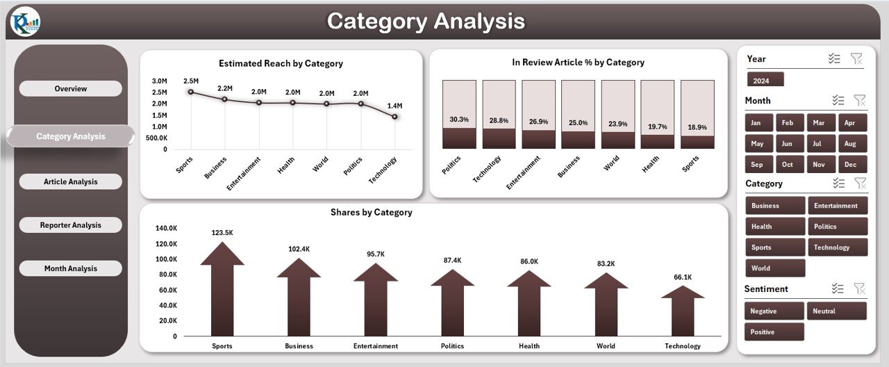
Every news team publishes content across many categories. Some categories attract high engagement, while some categories need better coverage. The Category Analysis Page helps you understand these trends.
You get:
✔ Right-Side Slicer
You use this slicer to filter categories instantly.
✔ Three Key Charts
-
Estimated Reach by Category
-
In Review Article % by Category
-
Share by Category
These charts reveal which categories generate the widest reach, which categories have the highest number of articles stuck in review, and which categories people share the most. This gives clarity on what topics work well and what topics need more attention.
3. Article Analysis: Which Article Types Perform Best?
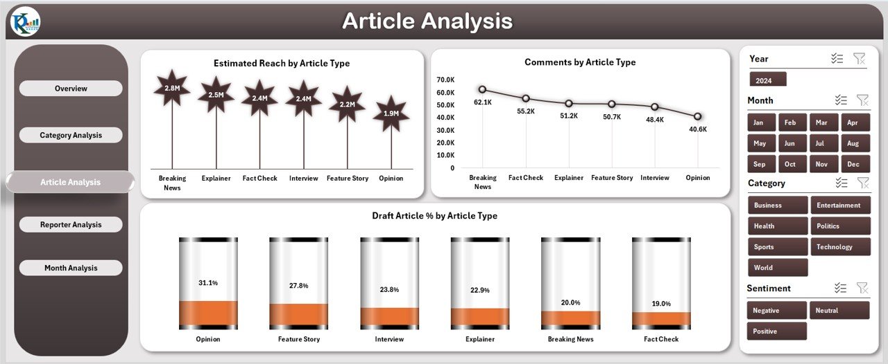
Different article types have different impact levels. Some article formats attract comments, while others bring higher reach. The Article Analysis Page provides deep insight into article formats.
You get three major charts:
✔ Estimated Reach by Article Type
You compare the popularity of each article type such as:
-
Breaking News
-
Opinion
-
Interviews
-
Reports
-
Features
-
Editorials
✔ Comments by Article Type
This shows which article type invites the highest audience interaction.
✔ Draft Article % by Article Type
This reveals which article formats have slow progress or longer writing cycles.
The insights help teams adjust their strategies and focus on the right storytelling methods.
4. Reporter Analysis: How Do Reporters Contribute?
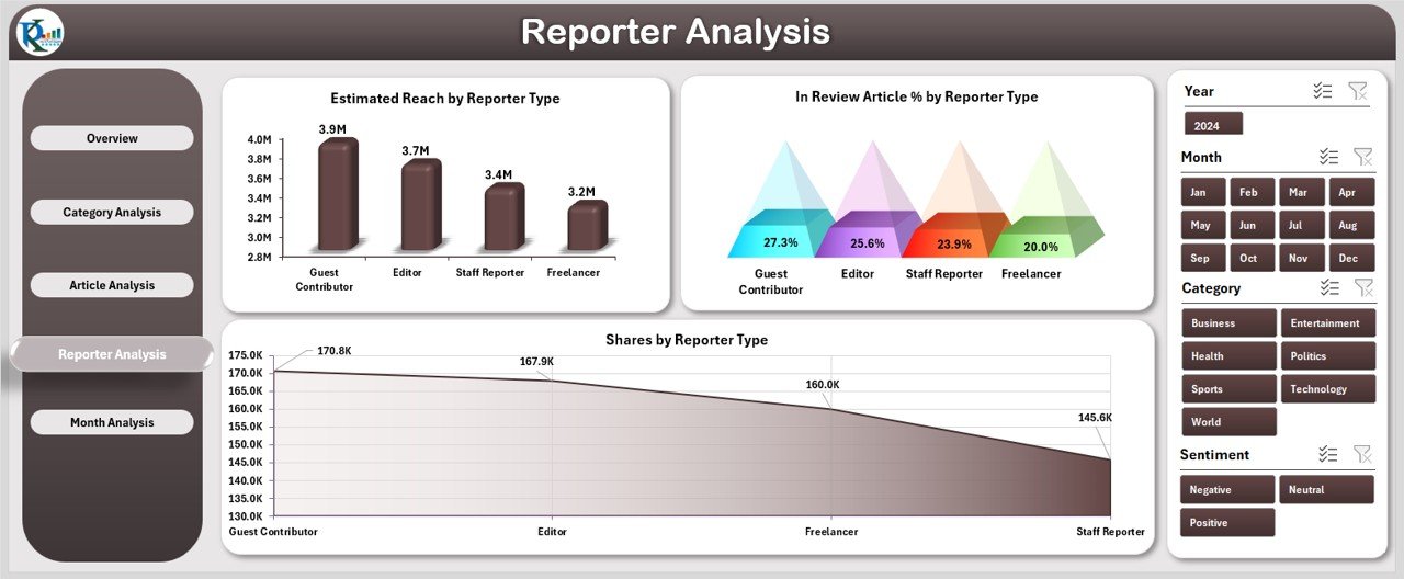
Reporters are the backbone of every newsroom. The Reporter Analysis Page shows how each reporter performs based on reach, review progress, and share patterns.
You get three helpful charts:
Click to Purchases News & Journalism Dashboard in Excel
✔ Estimated Reach by Reporter Type
This helps you measure reporter impact — senior reporters, freelancers, junior reporters, contributors, etc.
✔ In Review Article % by Reporter Type
You check which reporters produce fast, error-free drafts and which reporters need more editing support.
✔ Share by Reporter Type
This shows how often articles are shared based on the reporter’s storytelling style.
Editorial leaders use this page to support reporters, assign articles, and plan training programs.
5. Month Analysis: How Does Performance Change Over Time?
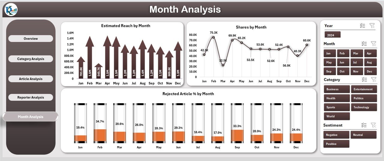
Trends matter in journalism. Some months show more drafts, some months show high shares, and some months show slow review cycles. The Month Analysis Page gives complete visibility.
It includes:
✔ Month-Selector Slicer
You use the slicer to explore performance month by month.
✔ Three Monthly Charts
-
Estimated Reach by Month
-
Share by Month
-
Rejected Article % by Month
These charts show when the newsroom performs best and when rejection rates rise.
This helps editors plan publishing cycles, special editions, or coverage improvements.
Support Sheet and Data Sheet
The dashboard includes a Data Sheet that stores all raw information. Users update the sheet regularly, and the dashboard automatically refreshes with the new results. You do not need formulas or complex settings — everything works in the background.
What Makes This Dashboard Useful for Teams?
This dashboard helps users:
-
Track article progress
-
Compare reporter performance
-
Improve publishing cycles
-
Identify high-performing categories
-
Understand seasonal patterns
-
Strengthen decision-making
-
Reduce delays
-
Increase audience engagement
With simple visuals and clean navigation, the dashboard becomes the newsroom’s daily control panel.
Advantages of the News & Journalism Dashboard in Excel
1. Clear Visibility of All Articles
You see every stage — draft, review, publish, and reject — in one place.
2. Better Team Coordination
Editors assign tasks faster, and reporters follow timelines easily.
3. Higher Audience Engagement
Insights on reach and shares help shape better content.
4. Improved Article Quality
You track which areas need editing or consistency.
5. Strong Category-Level Decisions
You find which categories attract attention and which categories need new strategies.
6. Simple and Easy to Use
Excel makes everything smooth without heavy software.
7. Time-Saving Dashboard
You spend less time searching data and more time creating stories.
8. Works for Any Media Team
Small teams, big media houses, and digital networks use it for decision-making.
Best Practices for Using the News & Journalism Dashboard in Excel
To get the best results, follow these simple best practices:
✔ Update Data Sheet Regularly
Fresh data gives fresh insights.
✔ Use Filters Smartly
Filters help you focus on a category, reporter, or month.
✔ Compare Trends Monthly
This guides publishing strategies and event planning.
✔ Analyze Reporter Output
Reward strong performers and support new writers.
✔ Review Category Reach
Increase focus on categories with high audience potential.
✔ Track Draft and Review Percentages
This helps to reduce delays and keep publishing on schedule.
✔ Use Insights in Editorial Meetings
Discuss monthly reach, shares, and article types in team reviews.
✔ Improve Article Types
Check which formats connect well with readers and create more of them.
How to Use This Dashboard Effectively?
The key to using the dashboard well is consistency. When your team updates the Data Sheet daily, you get clear and meaningful trends. Monthly analysis becomes strong, and planning becomes easier.
Use the dashboard during:
-
Editorial planning meetings
-
Reporter performance reviews
-
Category development discussions
-
Social media strategy planning
-
Monthly publishing reports
-
KPI tracking sessions
The more you use it, the stronger your newsroom becomes.
Click to Purchases News & Journalism Dashboard in Excel
Conclusion
The News & Journalism Dashboard in Excel is a powerful tool for modern media teams. It simplifies tracking, increases visibility, and supports better decisions. You get smart insights into articles, categories, reporters, and monthly trends — all in a simple Excel file. With clean visuals, interactive pages, and accurate metrics, this dashboard becomes your newsroom’s best companion.
Whether you manage a small editorial team or a large digital publication, this dashboard helps you work faster and smarter. Start using it today and take your journalism performance to a new level.
Frequently Asked Questions (FAQs)
Click to Purchases News & Journalism Dashboard in Excel
1. What is a News & Journalism Dashboard in Excel?
It is a ready-made reporting tool that tracks article status, reporter performance, reach, shares, and category insights in Excel.
2. Who should use this dashboard?
Editors, reporters, publishers, content managers, journalism students, and digital media teams.
3. Does this dashboard require advanced Excel skills?
No. Anyone can use it. You only update the data sheet and the visuals refresh automatically.
4. Can this dashboard track monthly performance?
Yes. The Month Analysis page shows performance trends, reach, shares, and rejection rates for each month.
5. Can I customize the dashboard?
Yes. You can add new charts, update categories, or adjust article types based on your needs.
6. How often should I update the data?
Daily or weekly updates give the best results.
7. Is this dashboard suitable for digital-only media?
Yes. It supports websites, blogs, online magazines, and social media teams.
8. Does this dashboard help improve content planning?
Yes. It helps you select better categories, improve article types, and assign tasks more clearly.
9. Can I use this dashboard for team meetings?
Yes. It provides structured insights perfect for editorial and performance reviews.
10. Why should media teams use an Excel-based dashboard?
Excel is simple, flexible, and widely available. It does not require specialized tools, making it ideal for fast-paced newsrooms.
Visit our YouTube channel to learn step-by-step video tutorials