The news and journalism industry moves fast. Editors, reporters, publishers, and digital media teams deal with hundreds of stories, multiple publishing platforms, and fast-changing audience behavior. Because everything changes within minutes, teams need a simple way to track performance, find issues, and improve newsroom decisions. A News & Journalism Dashboard in Power BI brings all KPIs into one clean and interactive place. As a result, media organizations gain full control over their content pipeline, publishing strategy, and audience reach.
In this guide, you will explore everything about this dashboard—its purpose, benefits, structure, features, inner logic, and best practices. You will also learn how each dashboard page helps editors and media leaders review content, track performance, and measure progress. Every section uses easy language and a smooth flow so every reader can understand the complete value of the dashboard.
Click to Purchases News & Journalism Dashboard in Power BI
What Is a News & Journalism Dashboard in Power BI?
A News & Journalism Dashboard in Power BI is a ready-to-use reporting solution for media companies, digital newsrooms, independent publishers, and journalism teams. It helps you track story performance, publishing platforms, reporter output, audience engagement, and reach. It also shows category-wise trends, article types, and monthly patterns so teams take better and faster decisions.
Because the dashboard works inside Power BI, you enjoy clean visuals, slicers, drill-down views, and interactive charts. Your team gets a full understanding of which stories work, which categories bring more reach, which writers perform well, and which platforms need more attention.
This dashboard becomes even more powerful when you connect it to your Excel or database source. As soon as you refresh the data, the entire dashboard updates in real time.
Why Do Newsrooms Need a Power BI Dashboard?
The news industry depends heavily on time and accuracy. Good decisions help you publish trending content and grow your audience. Wrong decisions create delays and loss of reach. Because the team cannot rely on manual reports, a Power BI dashboard solves this gap through fast visuals and structured insights.
A newsroom needs this dashboard because it helps them:
-
Track article performance instantly
-
Compare category-wise trends
-
Review reporter output
-
Find content gaps
-
Improve publishing timelines
-
Study audience behavior
-
Build a future content plan
When everyone works with the same dashboard, teamwork becomes smooth and aligned.
Key Features of the News & Journalism Dashboard in Power BI
The News & Journalism Dashboard in Power BI includes five powerful pages, each designed for deep insights. Below is the complete breakdown.
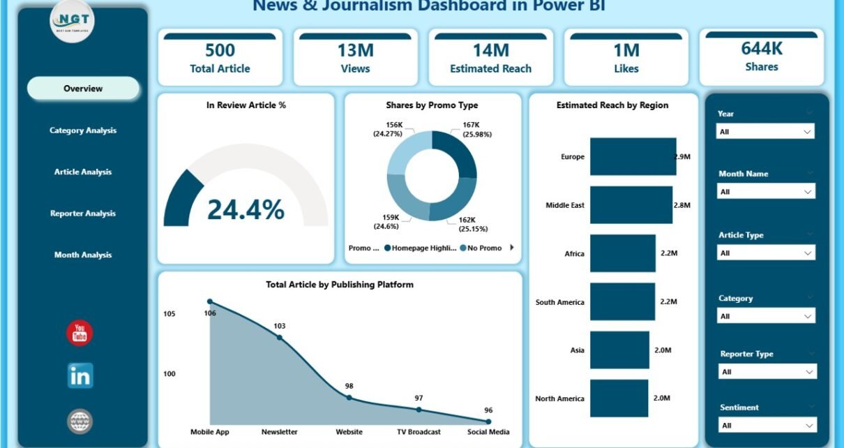
1. Overview Page
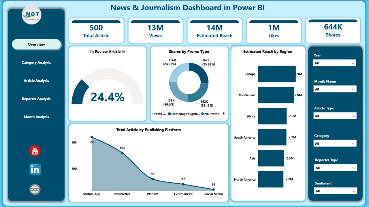
The Overview Page acts as the home screen of the dashboard. Since editors start their review here, this page shows clear visuals and KPI cards.
What You See on the Overview Page
-
Interactive slicers to choose date, region, platform, or category
-
Four KPI cards, such as:
-
Total Articles
-
Review Article %
-
Total Reach
-
Total Comments
-
-
Four charts, including:
-
In Review Article % – to check how many stories are still under review
-
Share by Promo Type – to understand which promotion format brings better visibility
-
Estimated Reach by Region – to track audience strength by location
-
Total Articles by Publishing Platform – to see where the stories perform better
-
This page helps decision-makers check all important KPIs at a glance.
Click to Purchases News & Journalism Dashboard in Power BI
2. Category Analysis Page
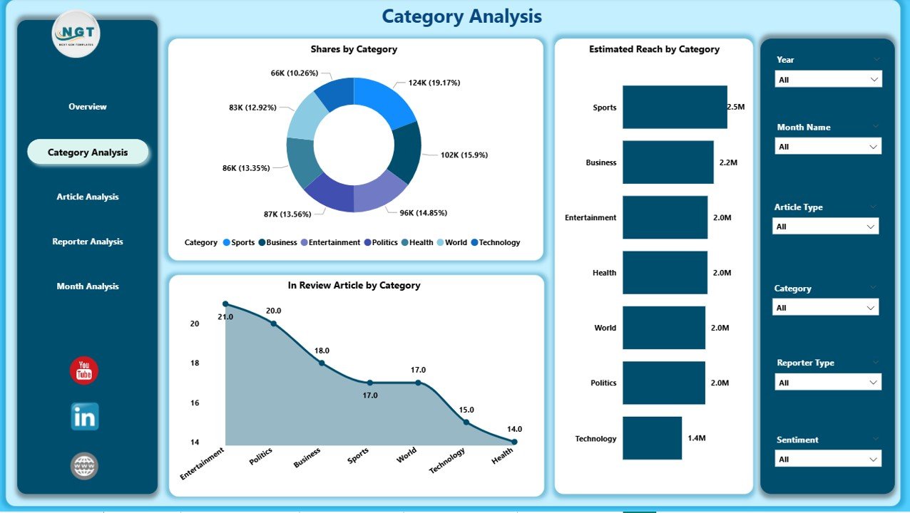
The Category Analysis Page shows performance of every content category. Editors and planning teams use this page to study which topics get more reach and which categories need improvement.
Insights You Get on This Page
-
Slicers to filter the data
-
Three major charts, including:
-
In Review Articles by Category – to find categories with pending articles
-
Share by Category – to see the contribution of each category
-
Estimated Reach by Category – to compare how different topics perform
-
This helps teams design better category-level strategies and improve story planning.
3. Article Analysis Page
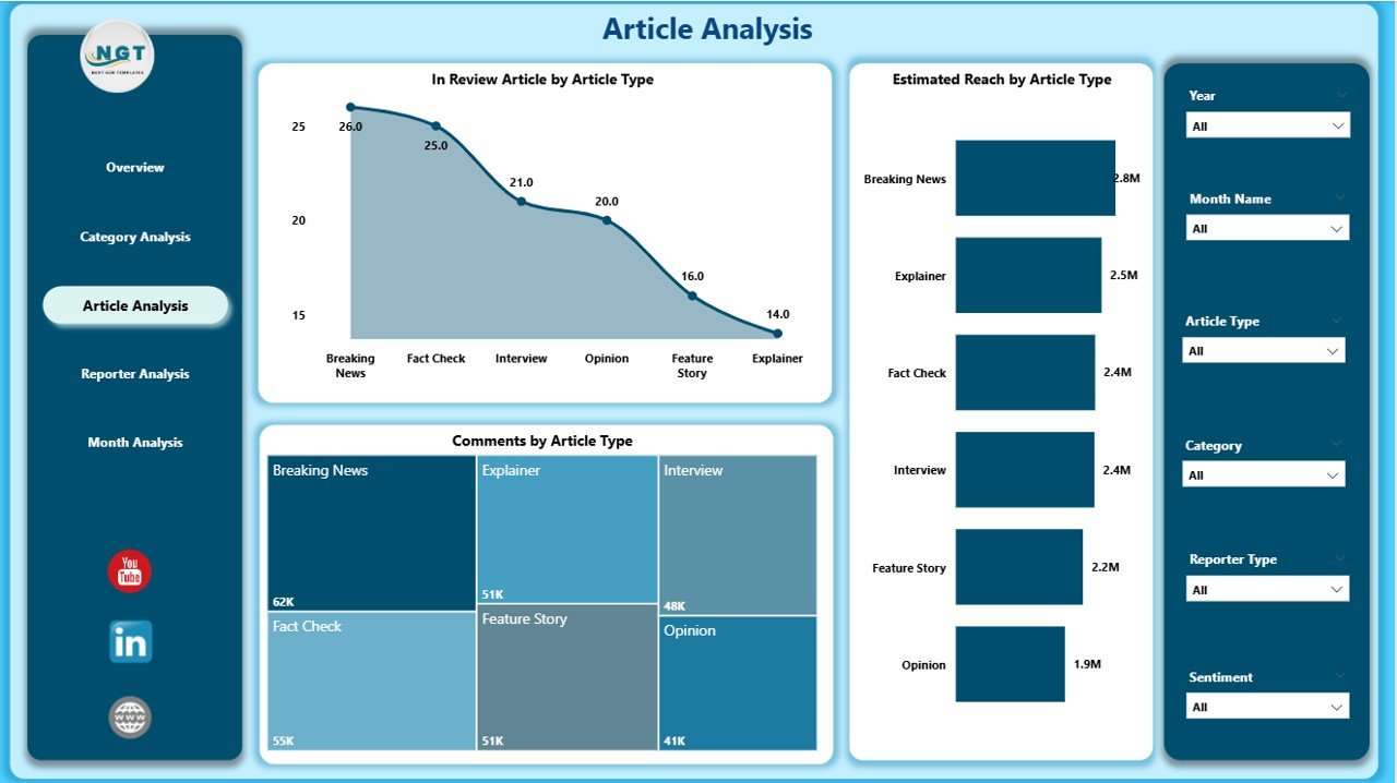
The Article Analysis Page focuses on specific types of articles. It helps you understand which article formats work better and how they engage the audience.
Charts on This Page
-
In Review Articles by Article Type – to track story approval status
-
Comments by Article Type – to find which article types pull more engagement
-
Estimated Reach by Article Type – to measure how format influences performance
Teams use this page to plan content formats that increase reach and engagement.
4. Reporter Analysis Page
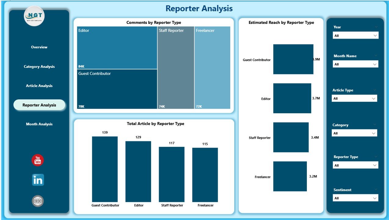
Reporter performance plays a major role in newsroom efficiency. The Reporter Analysis Page helps track the contribution, reach, and engagement generated by different reporters.
What This Page Includes
-
Slicers for easy filtering
-
Three visual charts:
-
Total Articles by Reporter Type – to check productivity
-
Comments by Reporter Type – to measure audience interaction through their content
-
Estimated Reach by Reporter Type – to evaluate the impact of each reporter
-
Because of this page, editors can support low-performing reporters and motivate high-performing ones.
5. Monthly Trends Page
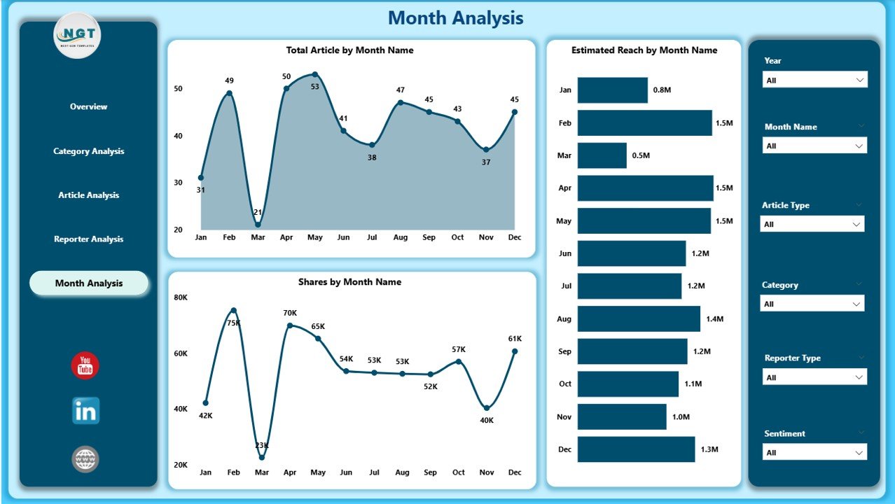
This page helps you track how articles, reach, and share grow month by month. Monthly trend analysis helps planning teams identify seasonal patterns.
Visuals on This Page
-
Total Articles by Month
-
Estimated Reach by Month
-
Share by Month
You understand which months bring more traffic, how reach changes over time, and how article share performs.
How Does a Power BI Dashboard Help Journalists and Media Leaders?
Click to Purchases News & Journalism Dashboard in Power BI
A well-designed Power BI dashboard offers fast insights that help everyone in a newsroom. Because all data appears in one place, reporters, editors, and leadership teams take better decisions.
Here is how it helps:
-
Editors review article stages easily
-
Reporters understand their performance
-
Digital teams study reach and engagement
-
Management aligns strategies
-
Performance meetings become smooth
-
Content planning gets stronger
-
Teams save time and avoid manual reporting
Every team stays connected with real-time facts.
Advantages of a News & Journalism Dashboard in Power BI
A News & Journalism Dashboard brings many benefits. Below are some major advantages explained in detail.
1. Better Decision-Making
Teams make decisions based on real data, not assumptions. Because charts show clear trends, leaders respond faster.
2. Better Planning
Content categories, article types, and publishing patterns become easy to understand. As a result, teams plan their future content more effectively.
3. Smooth Team Collaboration
When everyone reads the same dashboard, communication improves. Editors guide reporters faster, and digital teams act on insights.
4. Improved Audience Engagement
The dashboard shows which topics and article types attract more readers. This helps you create stories that match audience interest.
5. Full Control Over Content Pipeline
You track every article—whether it is published, under review, or pending. This keeps the workflow smooth.
6. Time Savings
Power BI automates calculations. You do not waste time preparing weekly or monthly reports.
7. High Accuracy
Because the dashboard uses structured data, all KPIs stay accurate. You eliminate errors that normally come from manual work.
What KPIs Should You Track in a News & Journalism Dashboard?
A strong dashboard tracks KPIs across categories, article types, platforms, and reporters.
Useful KPIs Include
-
Total Articles
-
In Review Articles
-
Published Articles
-
Reach
-
Comments
-
Engagement Rate
-
Articles by Category
-
Articles by Region
-
Articles by Platform
-
Estimated Reach by Reporter
-
Monthly Article Trends
These KPIs help you understand the whole content cycle.
How to Use the Dashboard Effectively
To get the best results from your News & Journalism Dashboard, follow these steps:
-
Refresh the data daily
-
Review the Overview Page first
-
Look at category performance
-
Check article types
-
Analyze individual reporters
-
Review monthly trends
-
Use insights in your editorial meetings
This keeps your newsroom sharp and well-informed.
Best Practices for the News & Journalism Dashboard in Power BI
Follow these best practices to gain the most value.
1. Keep Data Clean
Use correct formats for date, category, reporter type, and article type. Clean data improves dashboard accuracy.
2. Refresh Data Daily
Daily data refresh ensures your dashboard always shows the latest numbers.
3. Review Key Pages Regularly
Open the Overview Page every morning. It helps you understand the current situation instantly.
4. Use Slicers Wisely
Slicers let you filter information correctly. Always check the selected values before making decisions.
5. Track Reporter and Category Trends
Frequent review helps you identify strong topics and strong writers.
6. Use Insights in Planning Meetings
Bring the dashboard to every editorial meeting. Decisions become more data-driven.
7. Share the Dashboard With Your Team
Power BI allows easy sharing. This helps your team stay aligned.
8. Keep Visuals Simple
Clean visuals are easy to understand. Do not overload the dashboard with unnecessary charts.
Conclusion
The news industry depends on speed, clarity, and accuracy. A News & Journalism Dashboard in Power BI helps every newsroom track performance, analyze trends, and make fast decisions. Because the dashboard covers category-level, article-level, reporter-level, and monthly analysis, it becomes a complete reporting solution for any media organization.
With this dashboard, your team saves time, improves content quality, and gains full control over publishing. As a result, you deliver better stories and keep your audience engaged and informed.
Frequently Asked Questions (FAQs)
1. What is a News & Journalism Dashboard in Power BI?
It is a reporting solution that tracks article performance, category insights, reporter output, and monthly trends using interactive visuals.
2. Who should use this dashboard?
Editors, digital teams, reporters, media managers, and publishing heads benefit from this dashboard.
3. Can I connect this dashboard to Excel?
Yes. The dashboard works smoothly with Excel, SQL, and other data sources.
4. How often should I refresh the dashboard?
Refresh it daily for the best results.
5. What kind of KPIs can I track?
You can track reach, comments, article count, category performance, reporter contribution, and platform share.
6. Does Power BI support real-time updates?
Yes, Power BI supports scheduled refreshes and near real-time data.
7. Can small media companies use this dashboard?
Yes. Even small teams benefit because the dashboard improves their content planning and decision-making.
8. Does the dashboard help with audience engagement?
Yes. It helps you study trends and create stories that match your audience interest.
Visit our YouTube channel to learn step-by-step video tutorials
Click to Purchases News & Journalism Dashboard in Power BI