In today’s fast-paced work environment, managing office travel and related expenses has become more important than ever. With frequent business trips, client meetings, offsite trainings, and on-field activities, keeping track of all associated costs—while ensuring compliance and budget control—can be a daunting task.
Thankfully, Power BI offers a smart solution that transforms messy spreadsheets into dynamic, insightful dashboards. Welcome to the world of the Office Travel and Expense Dashboard in Power BI, where real-time tracking, department-wise analysis, and monthly trend insights come together for better decision-making.
This article will walk you through everything you need to know about this powerful Power BI dashboard—its structure, advantages, best practices, and frequently asked questions.
Click to Purchases Office Travel and Expense Dashboard in Power BI
What Is an Office Travel and Expense Dashboard in Power BI?
An Office Travel and Expense Dashboard in Power BI is a dynamic visual reporting tool that helps companies monitor, analyze, and manage all travel-related expenditures. Built on top of an Excel data source, this dashboard provides real-time insights into total travel costs, trip durations, high-cost expenses, departmental trends, city-wise analysis, and monthly patterns.
From HR and Finance teams to Department Heads and Admins, everyone benefits from this centralized and interactive tool.
Why You Need a Travel and Expense Dashboard in Power BI?
Without a centralized tool, travel expense tracking often leads to:
-
Misplaced receipts
-
Manual errors
-
Budget overshooting
-
Lack of department-wise visibility
-
Delayed reimbursements
That’s where Power BI steps in.
With features like interactive filters, slicers, KPIs, and visualizations, this dashboard not only saves time but also drives smarter decision-making. It makes expense management easier, faster, and more transparent.
Dashboard Structure: The 5 Key Pages Explained
The Office Travel and Expense Dashboard is divided into five powerful pages, each focusing on a different angle of analysis. Let’s break them down.
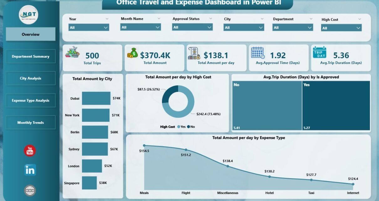
Overview Page: Quick Snapshot of All Travel Data
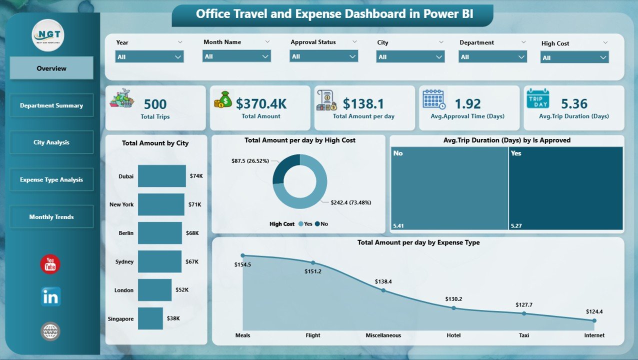
The Overview Page is your one-stop summary that gives you a high-level picture of travel costs and activity.
Components:
-
6 Slicers to filter by city, department, approval status, expense type, etc.
5 Cards showing KPIs like:
- Total Trip Amount
- Average Cost Per Day
- Total Trips
- Average Trip Duration
- Approved Trip Ratio
4 Pivot Charts:
🔹 Total Amount by City
🔹 Total Amount Per Day by High-Cost Trips
🔹 Avg. Trip Duration (Days) by Approval Status
🔹 Total Amount Per Day by Expense Type
Insight Example:
“New York has the highest total travel spend, while trips marked ‘Not Approved’ show longer durations on average.”
Department Summary Page: Know Who Spends What
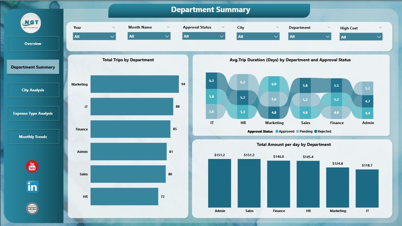
This page helps you track travel expenses and duration by department—crucial for department budgeting and accountability.
Key Charts:
-
📊 Total Trips by Department
-
📊 Avg. Trip Duration (Days) by Department and Approval Status
-
📊 Total Amount Per Day by Department
Insight Example:
“The Sales department has the highest number of trips but shorter durations, while the HR department shows higher costs per day.”
City Analysis Page: Monitor City-Wise Expenses
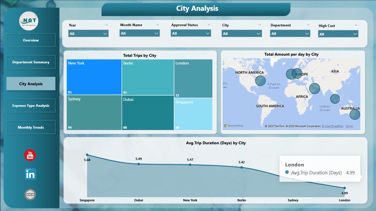
Understand how much each city contributes to your overall travel cost.
Charts:
-
🗺️ Total Trips by City
-
🗺️ Avg. Trip Duration (Days) by City and Approval Status
-
🗺️ Total Amount Per Day by City
Insight Example:
“Although Mumbai has fewer trips, its cost per trip is 25% higher than Bangalore.”
Expense Type Analysis Page: See What’s Driving Costs
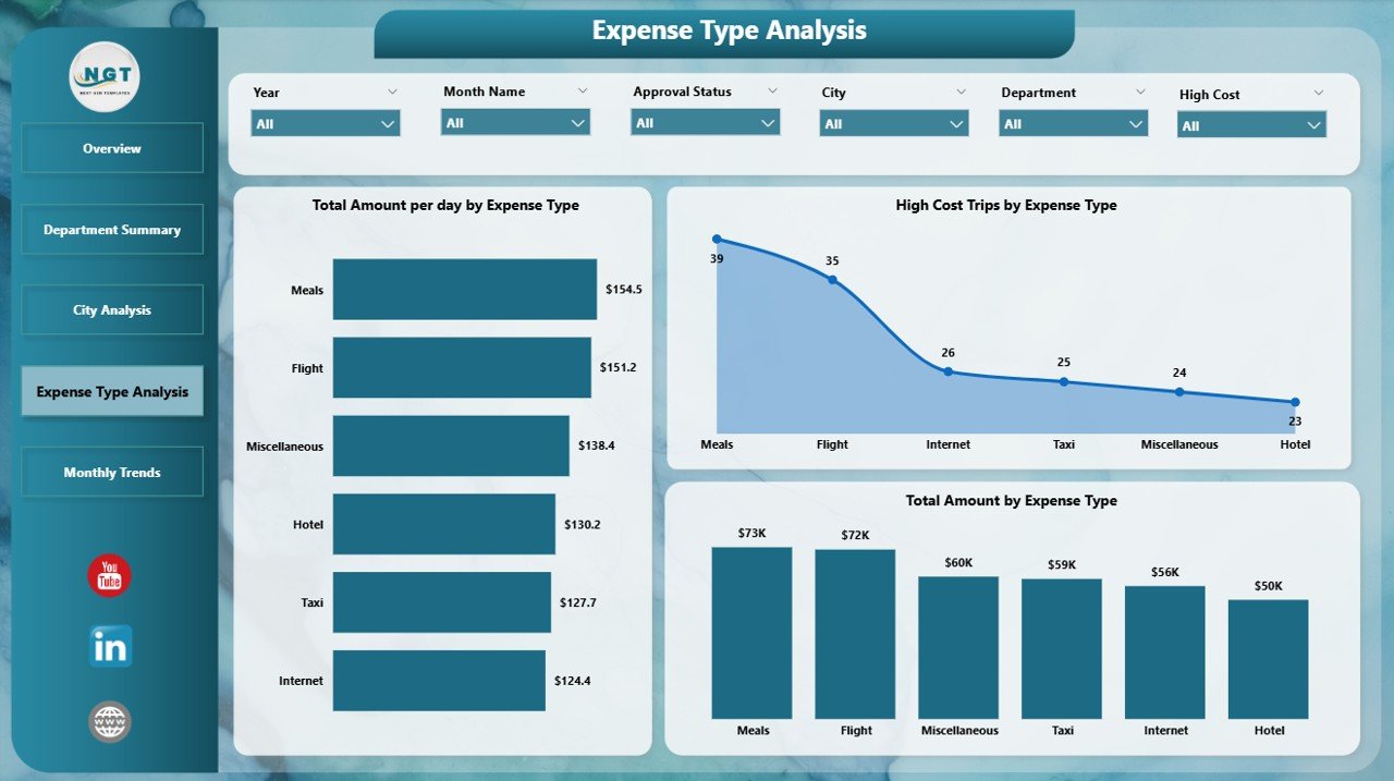
Break down your expenses by type, such as flights, lodging, meals, taxis, and more.
Visuals Include:
-
💰 Total Amount Per Day by Expense Type
-
🔺 High-Cost Trips by Expense Type
-
🧾 Total Amount by Expense Type
Insight Example:
“Hotel bookings account for the largest share of expenses, followed by flights. However, meals have the highest cost per day.”
Monthly Trends Page: Spot Patterns Over Time
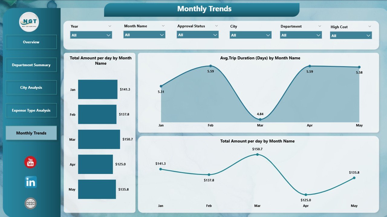
This page shows how travel expenses change over months, which helps with budgeting, forecasting, and trend analysis.
Charts:
-
📈 Total Amount Per Day by Month
-
📈 Total Amount by Month
-
📈 Avg. Trip Duration (Days) by Month Name
Insight Example:
“Q2 sees a sharp rise in travel costs, suggesting seasonal campaigns or annual reviews.”
Advantages of Using Office Travel and Expense Dashboard in Power BI
Click to Purchases Office Travel and Expense Dashboard in Power BI
Here’s why this dashboard is a must-have tool in your business toolkit:
-
✅ Real-Time Analysis: Updates instantly when new data is added.
-
✅ Centralized Tracking: Consolidates travel info from different teams into one place.
-
✅ Error Reduction: Minimizes manual entry mistakes.
-
✅ Interactive Filters: Drill down by city, department, expense type, etc.
-
✅ Customizable: Tailor visuals to your specific needs.
-
✅ Forecasting Support: Monthly views help predict future spend.
-
✅ Improves Compliance: Easy to detect unauthorized or unapproved travel.
Best Practices for the Office Travel and Expense Dashboard in Power BI
To make the most of this tool, follow these simple but effective best practices:
📌 1. Keep Your Data Clean and Consistent
Avoid duplicate entries, blank fields, or inconsistent spellings in city/department names.
📌 2. Update Regularly
Set a schedule (e.g., weekly or monthly) to refresh the Excel data source.
📌 3. Define Expense Policies Clearly
Use slicers for approval status, so policy violations stand out.
📌 4. Categorize Expenses Properly
Ensure every record has the correct expense type (e.g., flight, hotel, meals).
📌 5. Use Conditional Formatting
Apply icons or colors to highlight high-cost trips or rejected approvals.
📌 6. Provide User Training
Help your team understand how to use filters and interpret charts.
Who Can Use This Dashboard?
This tool is designed for any organization that deals with business travel. Key users include:
-
🧑💼 HR Teams – For monitoring travel patterns and policies.
-
🧾 Finance Teams – For budget planning and cost control.
-
🧳 Travel Managers – For vendor negotiation and trip approvals.
-
📊 Executives – For quick overviews and strategic decision-making.
-
👨💻 Admin Staff – For tracking approvals and ensuring data accuracy.
How to Use the Dashboard (Step-by-Step)
-
Open Power BI Desktop
-
Connect the Excel Data File provided with the dashboard.
-
Refresh the Data regularly to capture the latest travel records.
-
Navigate Using Page Tabs or Index Buttons
-
Use Slicers on each page to filter by department, city, month, approval, and expense type.
-
Export Visuals for reports or presentations, if needed.
Example Use Case
Let’s say you work for a consulting firm with teams across cities. You want to:
-
Compare travel costs between Mumbai and Delhi
-
Find which department exceeds its travel budget
-
Track monthly travel cost increases
Using this dashboard, you can filter and visualize all this instantly—no need to scroll through spreadsheets or chase people for updates.
Conclusion: Make Smarter Travel Decisions with Power BI
The Office Travel and Expense Dashboard in Power BI is more than just a reporting tool—it’s a decision-making powerhouse. It provides real-time insights, simplifies data management, and ensures complete visibility into where your travel budget is going.
In a world where every penny counts, especially post-pandemic, having this kind of control and clarity is not a luxury—it’s a necessity.
Frequently Asked Questions (FAQs)
1. Can I use this dashboard without Power BI knowledge?
Yes, it’s beginner-friendly. Most slicers and visuals are click-based. No coding required.
2. Can I connect this dashboard to a live database?
Yes, you can switch the data source from Excel to SQL or other live connections.
3. What if I want to add more visuals?
The dashboard is fully customizable. You can add charts, KPIs, or change slicers based on your need.
4. Is it suitable for large organizations?
Absolutely. It scales well across departments and regions. Just ensure consistent data formats.
5. How often should I update the data?
Weekly or monthly updates are ideal, depending on the frequency of travel in your organization.
6. Can this dashboard be shared with others?
Yes, publish it to Power BI Service or export as PDF for offline use.
7. What types of expenses does it track?
Flights, hotels, meals, transport, per diem, and any custom category you define.
Visit our YouTube channel to learn step-by-step video tutorials