The oil and gas industry operates in one of the most complex and capital-intensive environments in the world. Every day, organizations deal with fluctuating energy prices, high operating costs, production capacity challenges, and strict regulatory requirements. Therefore, data-driven decision-making is no longer optional—it is essential.
That is exactly where an Oil and Gas Dashboard in Excel becomes a powerful and practical solution.
In this detailed and easy-to-understand article, you will learn what an Oil and Gas Dashboard in Excel is, why energy companies need it, how it works, its complete page-wise structure, advantages, best practices, and frequently asked questions. Moreover, this guide uses clear language, simple explanations, and real-world logic so you can apply everything immediately.
Click to Purchases Oil and Gas Dashboard in Excel
What Is an Oil and Gas Dashboard in Excel?
An Oil and Gas Dashboard in Excel is a ready-to-use, interactive reporting and analytics tool designed to monitor operational, financial, and production performance in one centralized file.
Instead of managing multiple spreadsheets for costs, revenue, production, and utilization, this Excel dashboard brings all critical metrics together. As a result, managers and decision-makers gain instant visibility into performance trends, risks, and opportunities.
Most importantly, Excel makes this dashboard flexible, cost-effective, and easy to customize for upstream, midstream, and downstream operations.
Why Do Oil and Gas Companies Need a Dashboard in Excel?
Oil and gas businesses operate with thin margins and high risks. At the same time, leadership teams need quick insights to respond to market changes.
Here is why an Oil and Gas Dashboard in Excel becomes essential:
-
It tracks operating cost, revenue, and profit in one view
-
It monitors capacity utilization and production efficiency
-
It compares performance across countries and regions
-
It analyzes energy type and operational status
-
It reveals monthly performance trends
Without a dashboard, teams rely on static reports. However, with an Excel dashboard, they rely on actionable insights.
What KPIs Are Commonly Tracked in an Oil and Gas Dashboard?
Before exploring the dashboard structure, it helps to understand the common KPIs used in oil and gas analytics.
Financial KPIs
-
Operating Cost
-
Revenue
-
Total Profit
-
Profit Margin %
Operational KPIs
-
Capacity Utilization %
-
Active Status %
-
Operational Status
Production KPIs
-
Actual Production (Barrels/Day)
-
Production Capacity (Barrels/Day)
Analytical Dimensions
-
Country
-
Region
-
Energy Type
-
Month
The Oil and Gas Dashboard in Excel supports all these KPIs in a structured and visual format.
Click to Purchases Oil and Gas Dashboard in Excel
How Does an Oil and Gas Dashboard in Excel Work?
An Oil and Gas Dashboard in Excel works by separating data, support calculations, and visual analysis into organized sheets.
Once you update the data sheet, the dashboard updates automatically. Moreover, slicers allow users to filter insights by country, region, energy type, or month.
As a result, reporting becomes faster, more accurate, and far more insightful.
What Is the Overall Structure of the Oil and Gas Dashboard in Excel?
This ready-to-use Oil and Gas Dashboard in Excel contains 5 interactive analytical pages inside a single Excel desktop file.
Additionally, the file includes:
-
A Data Sheet for raw data
-
A Support Sheet for calculations
Let us explore each dashboard page in detail.
What Is the Page Navigator and Why Is It Important?
The dashboard includes a Page Navigator located on the left side of the file.
Benefits of the Page Navigator
-
Enables one-click navigation between pages
-
Improves usability and user experience
-
Eliminates scrolling or sheet searching
Because of this feature, users move seamlessly between analytical views.
Click to Purchases Oil and Gas Dashboard in Excel
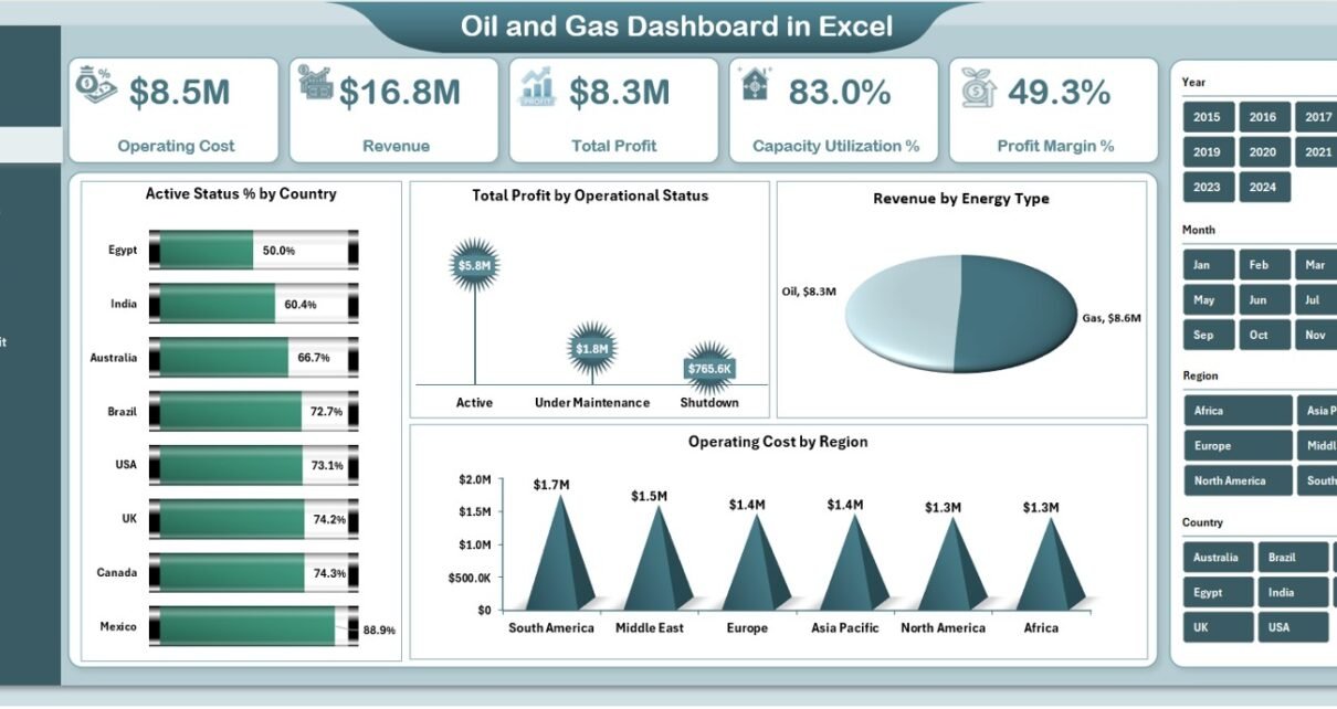
1. What Is the Overview Page in the Oil and Gas Dashboard?
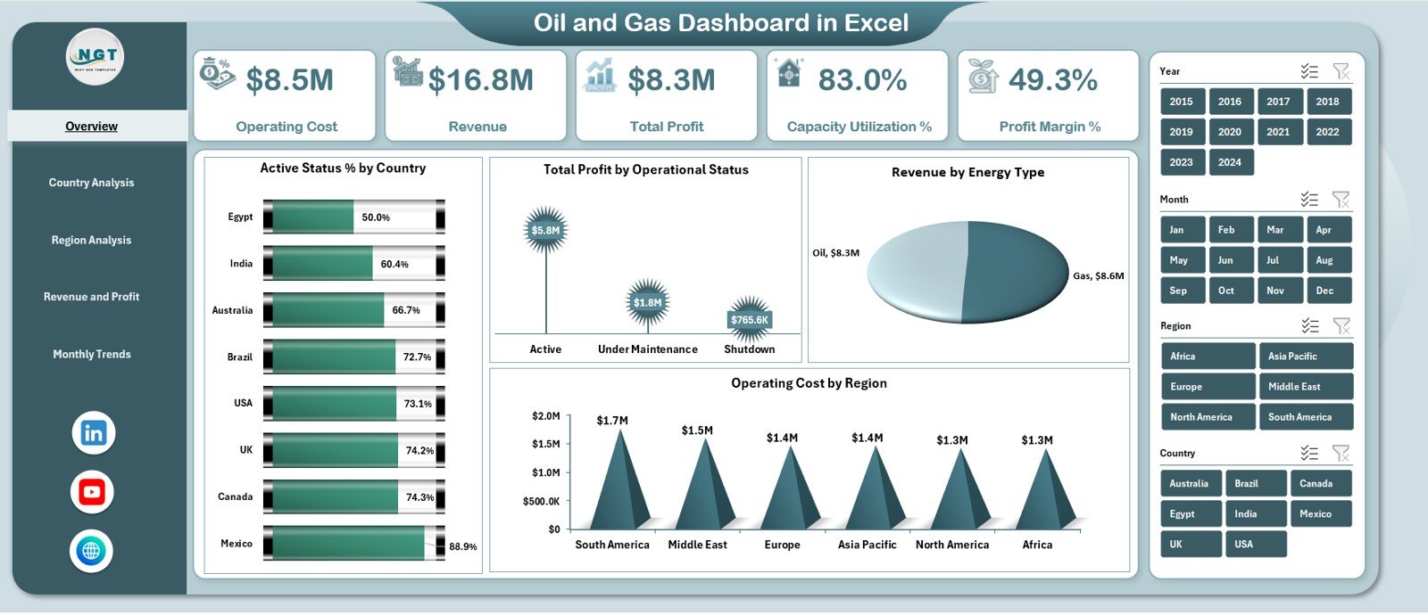
The Overview Page is the main landing page of the dashboard. It provides a high-level summary of overall performance.
KPI Cards on the Overview Page
The dashboard displays five KPI cards:
-
Operating Cost
-
Revenue
-
Total Profit
-
Capacity Utilization %
-
Profit Margin %
These cards provide instant insight into financial and operational health.
What Charts Are Available on the Overview Page?
The Overview Page includes four powerful charts:
-
Active Status % by Country
-
Total Profit by Operational Status
-
Revenue by Energy Type
-
Operating Cost by Region
Because of this layout, leaders quickly identify high-performing and underperforming areas.
Click to Purchases Oil and Gas Dashboard in Excel
2. What Is the Country Analysis Page?
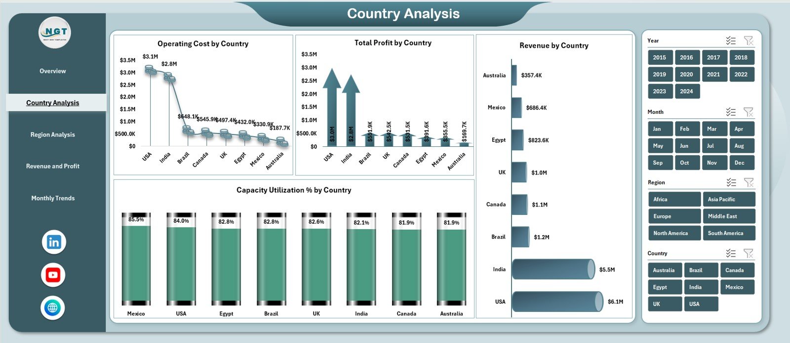
The Country Analysis Page focuses on performance comparison across countries.
Key Features of the Country Analysis Page
-
Right-side slicer for interactive filtering
-
Country-level operational and financial insights
Charts on the Country Analysis Page
-
Operating Cost by Country
-
Total Profit by Country
-
Capacity Utilization % by Country
-
Revenue by Country
As a result, organizations understand which countries drive profitability and which require optimization.
Why Is Country-Wise Analysis Important in Oil and Gas?
Country-wise analysis helps organizations:
-
Identify cost-heavy regions
-
Compare profitability across markets
-
Allocate resources strategically
-
Support expansion or exit decisions
Therefore, this page plays a critical strategic role.
Click to Purchases Oil and Gas Dashboard in Excel
3. What Is the Region Analysis Page?
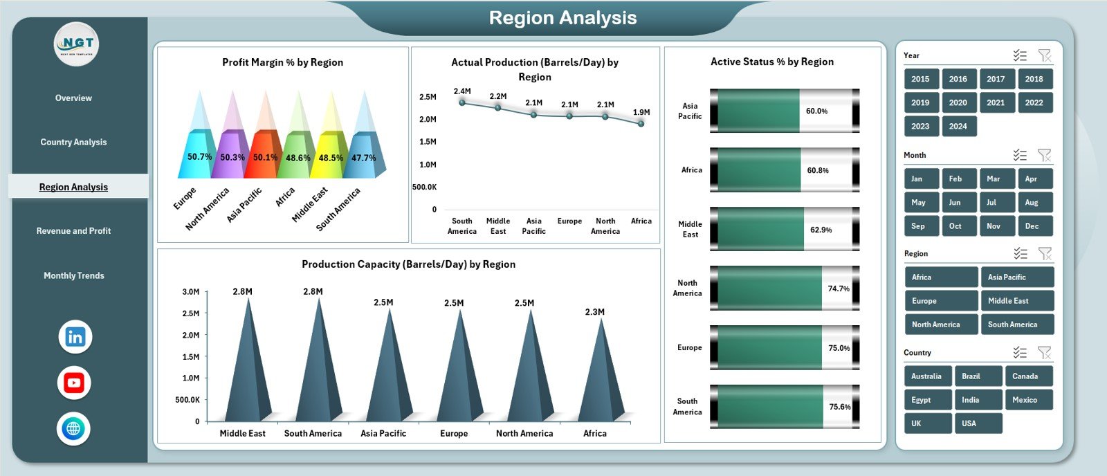
The Region Analysis Page provides deeper insights at a regional level.
Charts on the Region Analysis Page
-
Profit Margin % by Region
-
Actual Production (Barrels/Day) by Region
-
Production Capacity (Barrels/Day) by Region
-
Active Status % by Region
By comparing production and capacity, decision-makers quickly spot inefficiencies.
How Does Region Analysis Improve Operational Planning?
Region analysis allows teams to:
-
Balance production capacity
-
Optimize asset utilization
-
Reduce downtime
-
Improve regional profitability
Therefore, this page supports operational excellence.
4. What Is the Revenue and Profit Analysis Page?
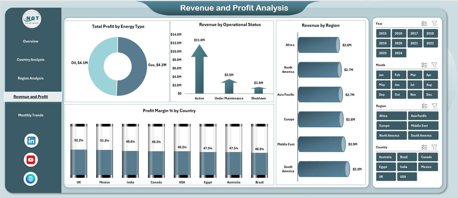
The Revenue and Profit Analysis Page focuses on financial performance drivers.
Charts on the Revenue and Profit Analysis Page
-
Total Profit by Energy Type
-
Revenue by Operational Status
-
Profit Margin % by Country
-
Revenue by Region
Because of this design, finance and leadership teams gain clear visibility into profit drivers.
Why Is Energy Type Analysis Critical?
Energy type analysis helps organizations:
-
Understand revenue mix
-
Compare profitability across energy sources
-
Optimize investment strategies
-
Reduce dependency risks
As a result, strategic planning improves significantly.
5. What Is the Monthly Trends Page?
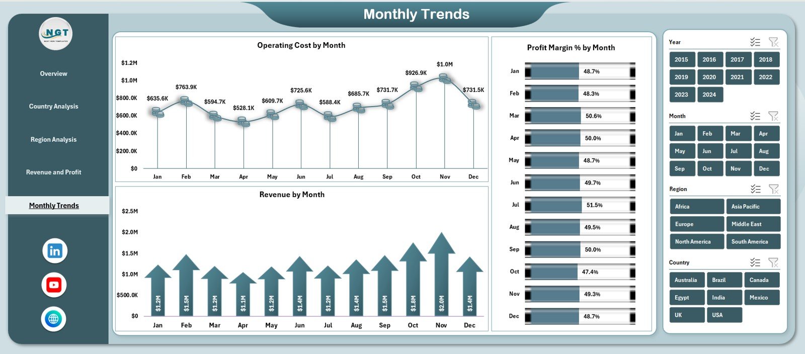
The Monthly Trends Page highlights time-based performance patterns.
Charts on the Monthly Trends Page
-
Operating Cost by Month
-
Revenue by Month
-
Profit Margin % by Month
These trends help identify seasonal patterns and long-term growth or decline.
How Do Monthly Trends Support Forecasting?
Monthly trends help teams:
-
Forecast future performance
-
Identify cost spikes early
-
Track improvement initiatives
-
Plan budgets accurately
Therefore, this page becomes essential for planning and forecasting.
What Is the Role of the Data Sheet?
The Data Sheet stores raw oil and gas data used by the dashboard.
Typical Data Columns
-
Country
-
Region
-
Energy Type
-
Operational Status
-
Operating Cost
-
Revenue
-
Production and Capacity Metrics
-
Month
Users update this sheet regularly to keep the dashboard current.
Click to Purchases Oil and Gas Dashboard in Excel
What Is the Role of the Support Sheet?
The Support Sheet handles calculations and intermediate logic.
Why the Support Sheet Matters
-
Keeps dashboard clean and fast
-
Stores helper calculations
-
Supports complex metrics
As a result, the dashboard remains easy to maintain and scale.
Advantages of Oil and Gas Dashboard in Excel
Using an Oil and Gas Dashboard in Excel offers several business benefits.
1. Centralized Performance Monitoring
All KPIs appear in one place, reducing reporting effort.
2. Real-Time Insights
Data updates instantly reflect across all charts.
3. Easy Comparison Across Dimensions
Country, region, energy type, and time-based analysis becomes simple.
4. Visual Decision Support
Charts and KPI cards simplify complex data.
5. Cost-Effective Analytics
Excel eliminates the need for expensive BI tools.
6. High Customization
Teams can add new KPIs or charts easily.
How Does This Dashboard Support Better Decision-Making?
This dashboard helps leaders:
-
Identify cost inefficiencies
-
Improve capacity utilization
-
Maximize profit margins
-
Track production performance
-
Align operations with strategy
Because of this, organizations move from reactive to proactive management.
Click to Purchases Oil and Gas Dashboard in Excel
Best Practices for the Oil and Gas Dashboard in Excel
To maximize value, follow these best practices.
Keep Data Clean and Consistent
Use standardized formats for countries, regions, and dates.
Update Data Regularly
Monthly updates ensure accurate insights.
Focus on Key KPIs
Avoid overcrowding the dashboard with too many metrics.
Analyze Trends, Not Just Totals
Trends reveal patterns that totals cannot show.
Validate Numbers Before Review
Always cross-check source data for accuracy.
Train Users
Ensure teams understand how to read charts and slicers.
Common Mistakes to Avoid While Using Oil and Gas Dashboards
Avoid these common pitfalls:
-
Mixing different time periods
-
Ignoring capacity vs production comparison
-
Tracking irrelevant KPIs
-
Overloading charts with data
-
Not reviewing dashboards regularly
Avoiding these mistakes ensures long-term dashboard success.
Click to Purchases Oil and Gas Dashboard in Excel
Who Can Use an Oil and Gas Dashboard in Excel?
This dashboard benefits multiple roles:
-
Operations Managers
-
Production Managers
-
Finance and Cost Controllers
-
Regional Heads
-
Strategy Teams
-
Senior Leadership
Each stakeholder gains tailored insights from the same dashboard.
Excel Dashboard vs Manual Reports: Which Is Better?
Compared to manual reporting, Excel dashboards:
-
Save time
-
Reduce errors
-
Improve visualization
-
Enable faster decisions
-
Support interactive analysis
Therefore, Excel dashboards remain a preferred choice in energy analytics.
Click to Purchases Oil and Gas Dashboard in Excel
Conclusion: Why Use an Oil and Gas Dashboard in Excel?
An Oil and Gas Dashboard in Excel transforms raw operational and financial data into actionable insights. It improves visibility, supports smarter decisions, and enhances operational efficiency.
With interactive pages, KPI cards, trend analysis, and multi-dimensional insights, this dashboard becomes an essential tool for modern oil and gas organizations.
If you want clarity, control, and confidence in performance monitoring, this Excel dashboard delivers exactly that.
Frequently Asked Questions (FAQs)
What is an Oil and Gas Dashboard in Excel?
It is an interactive Excel-based tool that tracks oil and gas performance metrics in one centralized file.
Can this dashboard support multi-country operations?
Yes, it supports country-wise and region-wise analysis.
How often should data be updated?
Monthly updates work best for trend and performance analysis.
Can I customize the dashboard?
Yes, Excel allows easy customization of KPIs and charts.
Is Excel suitable for oil and gas analytics?
Yes, Excel works well for small to mid-scale analytics and reporting needs.
Does this dashboard support trend analysis?
Yes, the Monthly Trends page highlights cost, revenue, and margin trends.
Click to Purchases Oil and Gas Dashboard in Excel
Visit our YouTube channel to learn step-by-step video tutorials