The oil and gas industry runs on data, scale, and precision. Every day, companies track production, revenue, operating cost, capacity utilization, and profit margins across regions and countries. However, when this data stays scattered across spreadsheets, reports, and systems, decision-making slows down.
Therefore, an Oil and Gas Dashboard in Power BI becomes a powerful solution. It converts complex operational and financial data into clear, interactive, and actionable insights. Moreover, Power BI helps energy companies monitor performance in real time and respond quickly to market and operational changes.
In this detailed guide, you will learn what an Oil and Gas Dashboard in Power BI is, why it matters, how it works, its structure, key features, advantages, best practices, and frequently asked questions. Additionally, this article explains how a 5-page Power BI dashboard supports strategic and operational decision-making in the oil and gas sector.
Click to Purchases Oil and Gas Dashboard in Power BI
What Is an Oil and Gas Dashboard in Power BI?
An Oil and Gas Dashboard in Power BI is an interactive business intelligence solution designed to analyze and visualize energy industry data. It consolidates metrics related to revenue, operating cost, profit, production, and capacity utilization into one centralized view.
Instead of reviewing multiple static reports, users explore data through dynamic charts, cards, and slicers. As a result, leaders gain instant visibility into performance across countries, regions, energy types, and time periods.
Moreover, Power BI dashboards support drill-down analysis, which helps users move from a high-level overview to detailed insights within seconds.
Why Do Oil and Gas Companies Need a Power BI Dashboard?
Oil and gas operations involve high capital investment and operational risk. Therefore, timely and accurate insights become critical.
Here is why an Oil and Gas Dashboard in Power BI is essential:
-
It centralizes financial and operational data
-
It improves visibility across regions and countries
-
It highlights cost drivers and profit contributors
-
It tracks capacity utilization and production efficiency
-
It supports faster and data-driven decisions
Additionally, Power BI dashboards reduce manual reporting efforts and improve data accuracy.
Click to Purchases Oil and Gas Dashboard in Power BI
What Are the Key Objectives of an Oil and Gas Dashboard in Power BI?
An effective Oil and Gas Dashboard focuses on performance, efficiency, and profitability. Therefore, its main objectives include:
-
Monitoring operating cost and revenue trends
-
Tracking total profit and profit margin percentage
-
Analyzing performance by region and country
-
Evaluating capacity utilization and production output
-
Understanding monthly trends for proactive planning
Because the dashboard updates dynamically, stakeholders always work with current and reliable data.
How Is the Oil and Gas Dashboard in Power BI Structured?
This Oil and Gas Dashboard contains 5 well-structured pages, each designed for a specific analytical purpose. Together, they provide a 360-degree view of business performance.
Let’s explore each page in detail.
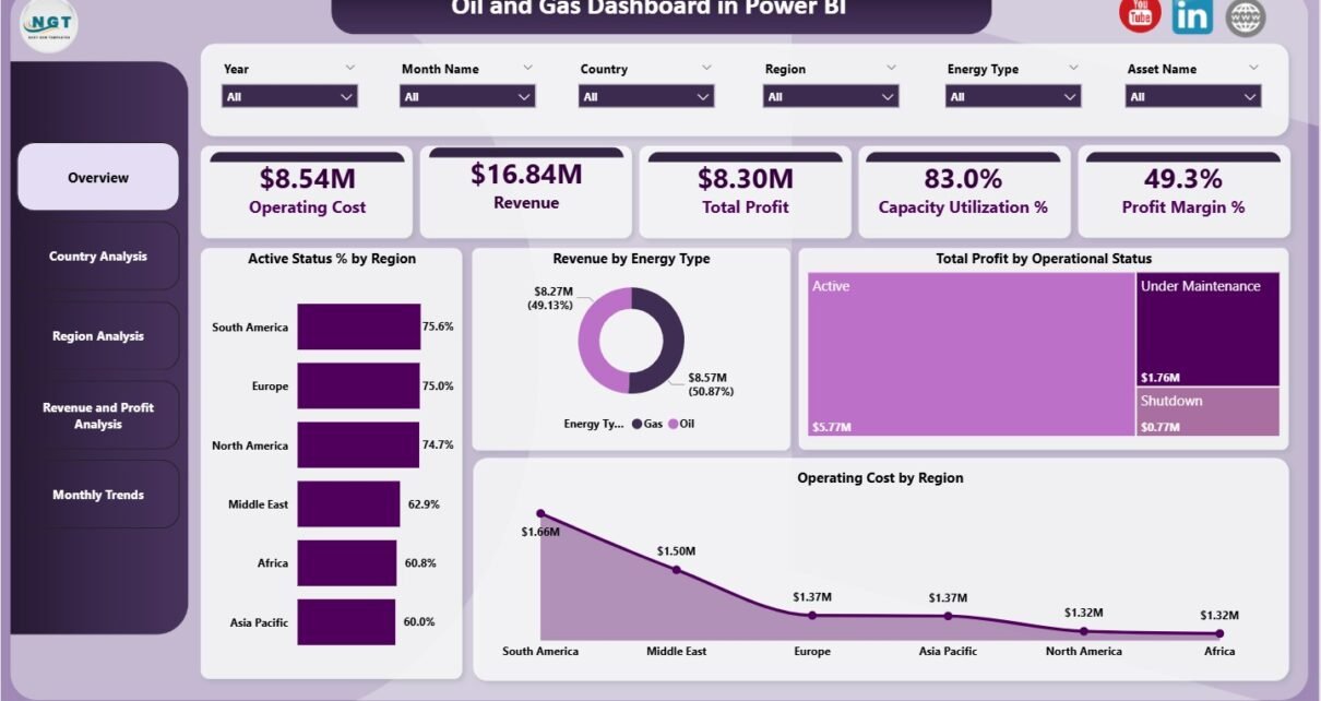
1) What Does the Overview Page Show in the Oil and Gas Dashboard?
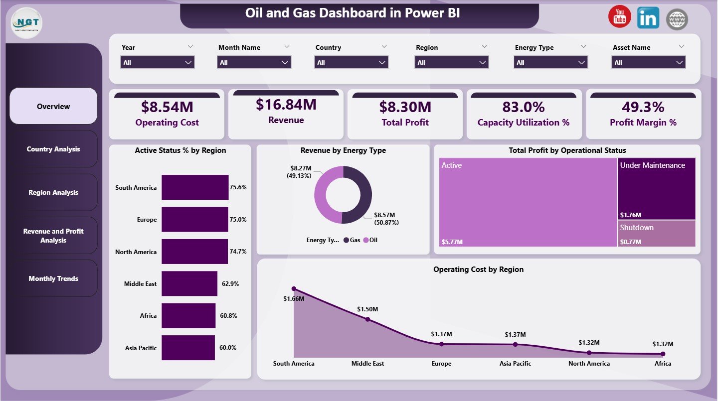
The Overview Page serves as the entry point of the dashboard. It summarizes key performance indicators and highlights overall business health.
Key Cards on the Overview Page
The dashboard displays 5 KPI cards at the top:
-
Operating Cost – Total cost incurred for operations
-
Revenue – Total income generated
-
Total Profit – Revenue minus operating cost
-
Capacity Utilization – Percentage of production capacity used
-
Profit Margin % – Profit as a percentage of revenue
These cards provide instant clarity and help leadership assess performance at a glance.
Charts on the Overview Page
The Overview Page includes 4 interactive charts:
-
Active Status % by Region
Shows the percentage of active operations across regions -
Revenue by Energy Type
Compares revenue contribution from different energy types -
Total Profit by Operational Status
Highlights profit from active, inactive, or maintenance operations -
Operating Cost by Region
Identifies regions with higher operational expenses
Together, these visuals help users quickly spot trends, risks, and opportunities.
Click to Purchases Oil and Gas Dashboard in Power BI
2) How Does the Country Analysis Page Support Decision-Making?
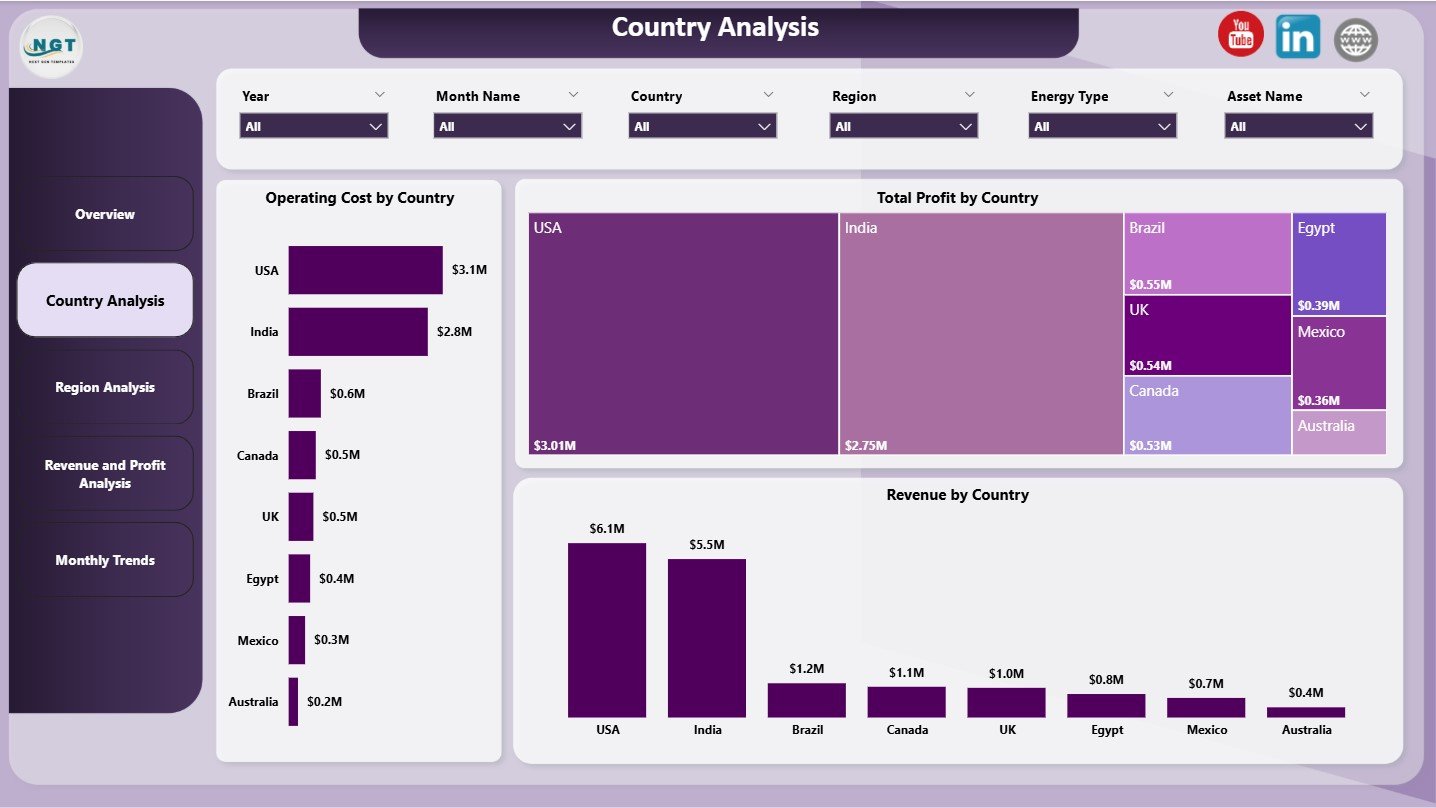
The Country Analysis Page focuses on performance at the country level. This view is essential for multinational oil and gas companies.
Charts on the Country Analysis Page
This page includes 3 powerful charts:
-
Operating Cost by Country
Helps identify countries with high cost structures -
Total Profit by Country
Shows which countries contribute the most to profitability -
Revenue by Country
Highlights revenue concentration across countries
By using slicers, users can filter data by region, energy type, or operational status. As a result, decision-makers compare country-level performance with ease.
3) Why Is the Region Analysis Page Important?
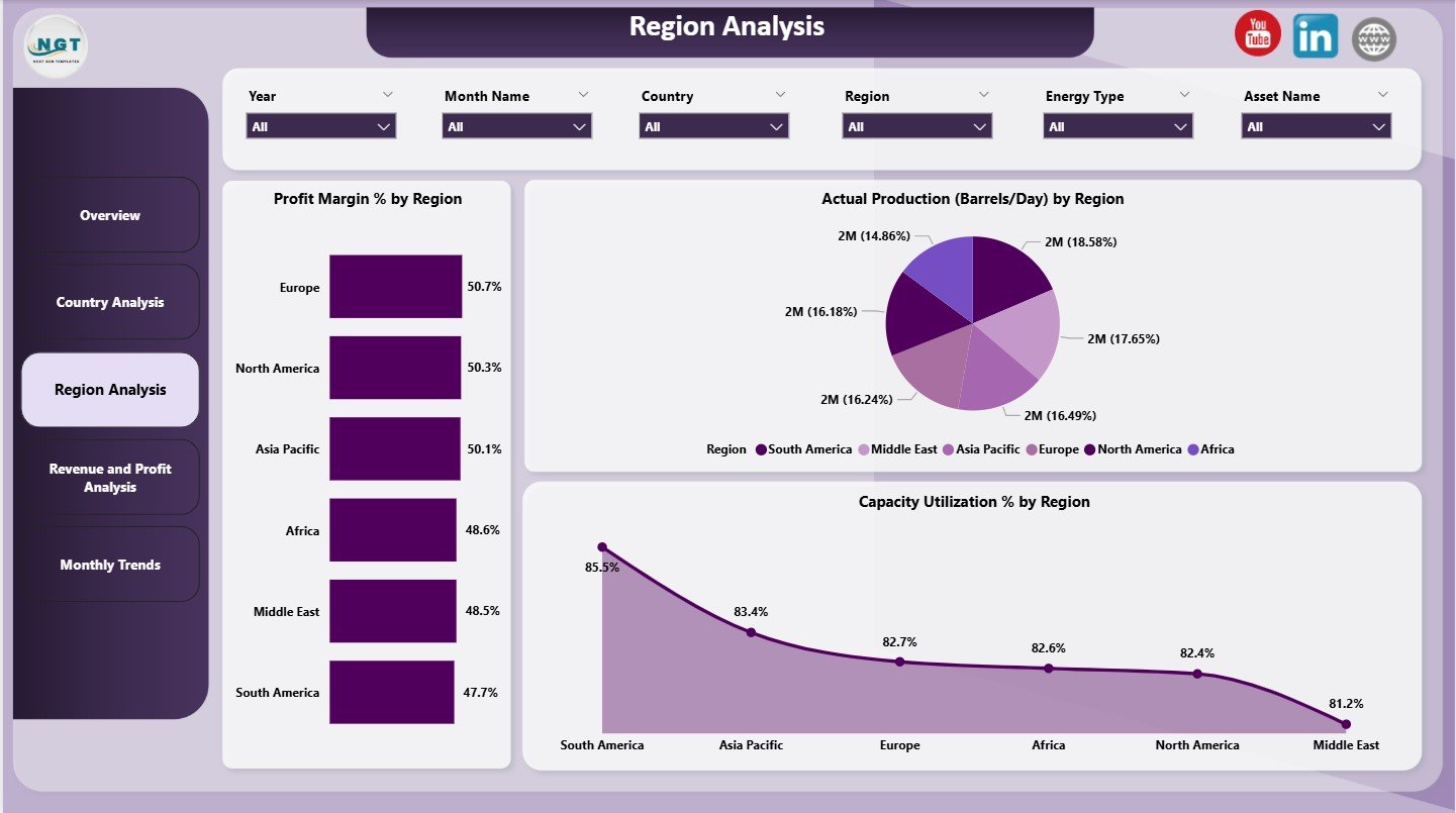
The Region Analysis Page evaluates performance at a broader regional level. It helps leaders allocate resources and plan expansion strategies.
Charts on the Region Analysis Page
This page contains 3 analytical charts:
-
Profit Margin % by Region
Compares profitability efficiency across regions -
Actual Production (Barrels/Day) by Region
Tracks daily production output region-wise -
Capacity Utilization % by Region
Measures how effectively each region uses its production capacity
Because production and utilization directly impact profitability, this page plays a vital role in operational planning.
Click to Purchases Oil and Gas Dashboard in Power BI
4) What Insights Does the Revenue and Profit Analysis Page Provide?

The Revenue and Profit Analysis Page dives deeper into financial performance. It connects revenue streams with profitability drivers.
Charts on the Revenue and Profit Analysis Page
This page includes 3 focused charts:
-
Profit Margin % by Country
Compares country-wise profit efficiency -
Revenue by Operational Status
Shows how active, inactive, or maintenance units generate revenue -
Revenue by Region
Highlights regional revenue distribution
These visuals help finance and strategy teams understand where profits come from and where improvements are needed.
5) How Does the Monthly Trends Page Help Forecasting?
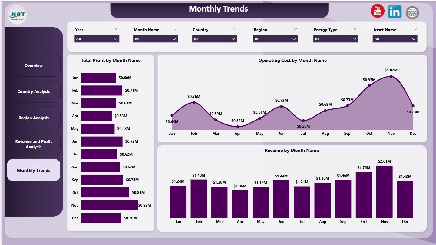
The Monthly Trends Page tracks performance over time. It supports forecasting and seasonality analysis.
Charts on the Monthly Trends Page
This page includes 3 trend charts:
-
Total Profit by Month Name
Shows monthly profit fluctuations -
Operating Cost by Month Name
Tracks cost trends over time -
Revenue by Month Name
Highlights revenue seasonality patterns
By analyzing these trends, organizations can plan budgets, control costs, and predict future performance more accurately.
What KPIs Are Commonly Tracked in an Oil and Gas Dashboard?
An Oil and Gas Dashboard in Power BI typically tracks the following KPIs:
-
Operating Cost
-
Revenue
-
Total Profit
-
Profit Margin %
-
Capacity Utilization %
-
Actual Production (Barrels/Day)
-
Revenue by Energy Type
-
Profit by Operational Status
-
Regional and Country-wise Performance
These KPIs align operational efficiency with financial outcomes.
Advantages of Oil and Gas Dashboard in Power BI
An Oil and Gas Dashboard in Power BI delivers several business advantages.
Key Advantages
-
📊 Centralized Reporting
All key metrics appear in one interactive dashboard -
⚡ Faster Decision-Making
Real-time insights reduce response time -
🌍 Multi-Level Analysis
Analyze data by country, region, and month -
💰 Improved Cost Control
Identify high-cost regions and inefficiencies -
📈 Profit Optimization
Focus on high-margin regions and operations -
🔍 Better Transparency
Clear visuals improve stakeholder understanding
Because of these benefits, Power BI dashboards become a strategic asset in energy organizations.
How Does Power BI Improve Oil and Gas Analytics?
Power BI enhances oil and gas analytics by offering:
-
Interactive slicers for flexible filtering
-
Drill-down and drill-through capabilities
-
Automated data refresh
-
Strong data modeling and calculations
-
Easy sharing across teams
Therefore, teams spend less time preparing reports and more time analyzing insights.
Click to Purchases Oil and Gas Dashboard in Power BI
Best Practices for the Oil and Gas Dashboard in Power BI
To get the maximum value from your dashboard, follow these best practices.
Best Practices You Should Follow
-
✔️ Define clear KPIs aligned with business goals
-
✔️ Keep visuals simple and focused
-
✔️ Use consistent units and formats
-
✔️ Limit the number of charts per page
-
✔️ Enable slicers for flexible analysis
-
✔️ Validate data accuracy before publishing
-
✔️ Optimize performance for large datasets
By following these practices, your dashboard stays accurate, fast, and user-friendly.
Who Can Benefit from an Oil and Gas Dashboard in Power BI?
This dashboard supports multiple stakeholders:
-
Oil and gas executives
-
Operations managers
-
Finance and accounting teams
-
Strategy and planning teams
-
Energy analysts and consultants
Each role gains tailored insights without technical complexity.
How Does an Oil and Gas Dashboard Support Strategic Planning?
Strategic planning requires trend analysis, profitability insights, and capacity evaluation. The Oil and Gas Dashboard delivers all three.
Because leaders track monthly trends, regional margins, and utilization rates, they make informed decisions about:
-
Expansion or shutdown of operations
-
Cost optimization initiatives
-
Capital allocation
-
Energy mix planning
As a result, strategy becomes proactive instead of reactive.
What Makes This 5-Page Oil and Gas Dashboard Effective?
This dashboard works effectively because it:
-
Separates analysis into logical pages
-
Balances overview and detailed insights
-
Uses visuals aligned with business questions
-
Supports both operational and financial analysis
Each page answers a specific question, which improves clarity and usability.
Click to Purchases Oil and Gas Dashboard in Power BI
Conclusion: Why Should You Use an Oil and Gas Dashboard in Power BI?
An Oil and Gas Dashboard in Power BI transforms complex industry data into meaningful insights. It helps organizations monitor costs, maximize profit, improve capacity utilization, and track trends across regions and countries.
Moreover, its 5-page structure ensures that every stakeholder finds the insights they need. As energy markets grow more competitive, such dashboards become essential tools for data-driven success.
Frequently Asked Questions (FAQs)
What is an Oil and Gas Dashboard in Power BI used for?
An Oil and Gas Dashboard in Power BI analyzes operational and financial performance using interactive visuals and KPIs.
How many pages does this Oil and Gas Dashboard include?
This dashboard includes 5 pages: Overview, Country Analysis, Region Analysis, Revenue and Profit Analysis, and Monthly Trends.
Can Power BI handle large oil and gas datasets?
Yes, Power BI efficiently handles large datasets with optimized models and scheduled refresh.
Which KPIs are most important in oil and gas dashboards?
Key KPIs include operating cost, revenue, total profit, profit margin %, capacity utilization, and production volume.
Is this dashboard suitable for multinational oil and gas companies?
Yes, the country and region analysis pages make it ideal for global operations.
Can this dashboard support forecasting?
Yes, the Monthly Trends page helps identify patterns and supports forecasting.
Click to Purchases Oil and Gas Dashboard in Power BI
Visit our YouTube channel to learn step-by-step video tutorials