In today’s digital economy, subscription-based businesses dominate the market. Streaming platforms, SaaS tools, learning apps, fitness memberships, and digital services generate recurring revenue every month. However, many businesses still track subscriptions using scattered spreadsheets. As a result, leaders struggle to monitor revenue trends, churn rate, device usage, and regional performance.
Therefore, companies need a centralized, interactive, and real-time reporting system. The Online Subscription Platforms Dashboard in Power BI solves this challenge completely. It converts raw subscription data into meaningful visual insights. Moreover, it helps decision-makers increase revenue, reduce churn, and improve customer retention.
Click to Purchases Online Subscription Platforms Dashboard in Power BI
In this comprehensive guide, you will learn:
-
What an Online Subscription Platforms Dashboard in Power BI is
-
Why subscription businesses need it
-
Detailed explanation of all 5 dashboard pages
-
Key metrics tracked in the dashboard
-
Advantages of the dashboard
-
Best practices for implementation
-
Frequently Asked Questions with answers
Let’s explore everything step by step.
What Is an Online Subscription Platforms Dashboard in Power BI?
An Online Subscription Platforms Dashboard in Power BI is an interactive reporting system built inside Power BI Desktop. It collects subscription data from Excel files, databases, CRM tools, or SaaS systems and transforms it into dynamic visual reports.
Instead of reviewing multiple sheets manually, managers can instantly analyze:
-
Total subscriptions
-
Active subscription %
-
Revenue by platform
-
Revenue by region
-
Monthly fee trends
-
Device usage performance
Because the dashboard uses slicers and filters, users can explore data quickly. As a result, they make faster and smarter decisions.
Why Do Online Subscription Businesses Need a Dashboard?
Subscription businesses operate in a highly competitive environment. Therefore, leaders must monitor every performance metric closely.
Without a dashboard:
-
Teams waste time on manual reporting
-
Revenue trends remain unclear
-
Regional performance stays hidden
-
Device performance goes unnoticed
-
Monthly fee fluctuations create confusion
However, when companies use an Online Subscription Platforms Dashboard in Power BI, they gain:
-
Real-time performance visibility
-
Improved decision-making
-
Clear revenue insights
-
Better subscription planning
-
Stronger financial control
Therefore, this dashboard becomes a powerful growth tool.
What Are the Key Features of the Online Subscription Platforms Dashboard in Power BI?
This dashboard includes 5 powerful analytical pages. Each page focuses on a specific performance area.
Let’s understand each page in detail.
Click to Purchases Online Subscription Platforms Dashboard in Power BI
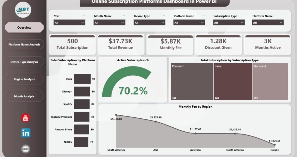
1️⃣ Overview Page – What Does the Main Dashboard Show?
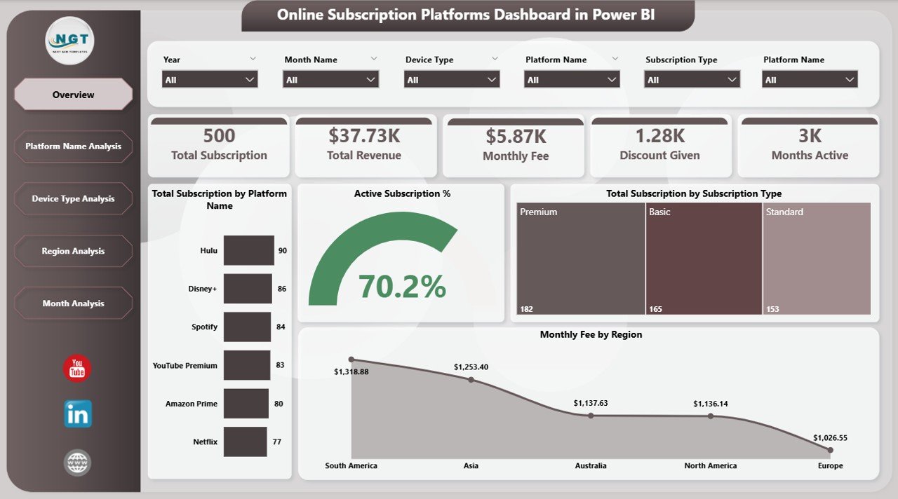
The Overview Page acts as the control center. It provides a complete business snapshot.
KPI Cards on the Overview Page
The dashboard includes 5 KPI cards:
-
Total Subscription by Platform Name
-
Active Subscription %
-
Total Subscription by Subscription Type
-
Monthly Fee by Region
-
Total Revenue
Because these KPIs appear at the top, users immediately understand business health.
Charts on the Overview Page
This page includes clear and interactive visuals such as:
-
Total Subscription by Platform Name
-
Active Subscription % Trend
-
Total Subscription by Subscription Type
-
Monthly Fee by Region
As a result, leaders quickly identify:
-
Which platform performs best
-
Which subscription type generates more customers
-
Which region contributes higher revenue
Therefore, the Overview Page gives instant clarity.
2️⃣ Platform Name Analysis – Which Platform Performs Best?
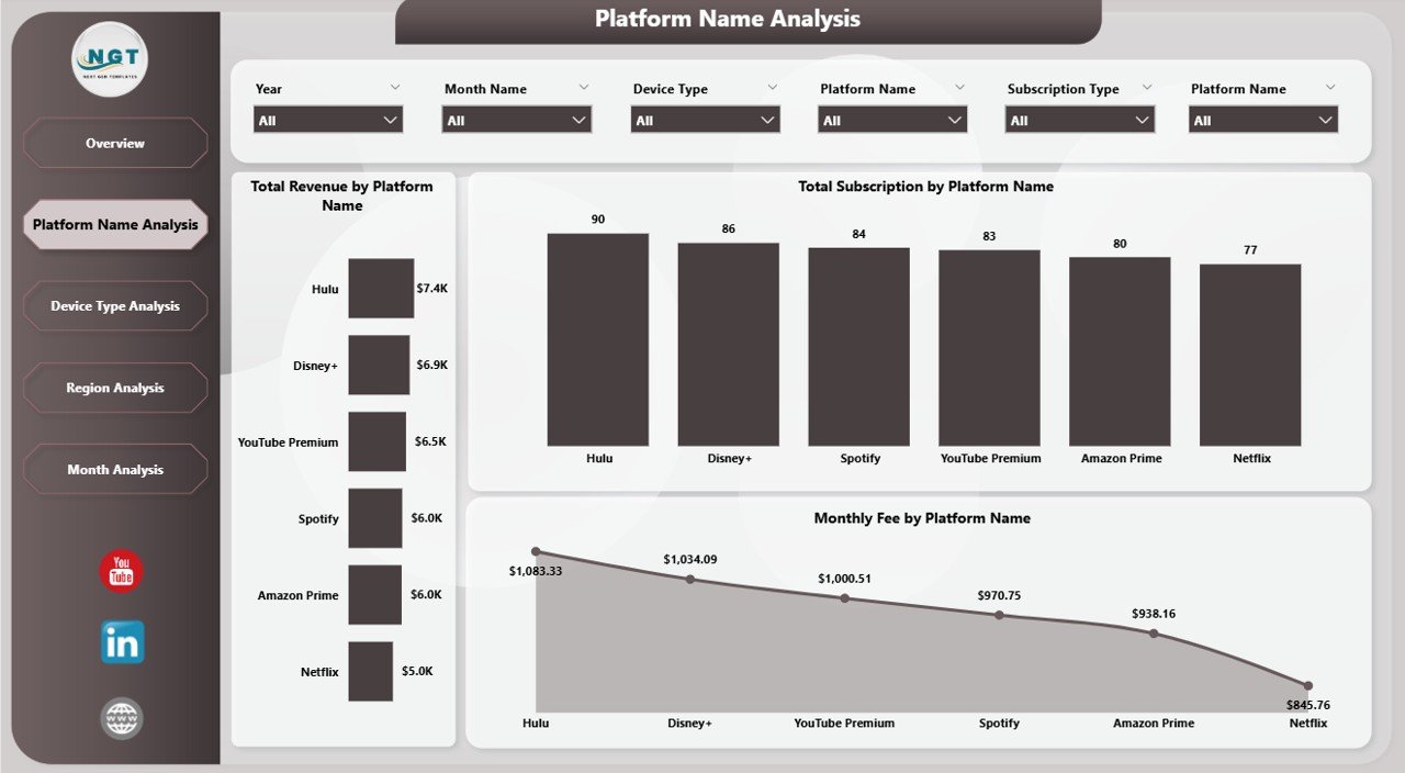
The Platform Name Analysis Page focuses on individual platform performance.
Charts Included:
-
Total Revenue by Platform Name
-
Total Subscription by Platform Name
-
Monthly Fee by Platform Name
With these visuals, managers can:
-
Compare streaming platforms
-
Identify high-performing SaaS tools
-
Detect low-revenue platforms
-
Adjust pricing strategies
For example, if one platform shows high subscriptions but low revenue, managers can revise pricing. Similarly, if a platform generates high revenue but low subscriptions, marketing teams can improve customer acquisition.
Therefore, this page supports strategic planning.
3️⃣ Device Type Analysis – Which Devices Generate More Revenue?
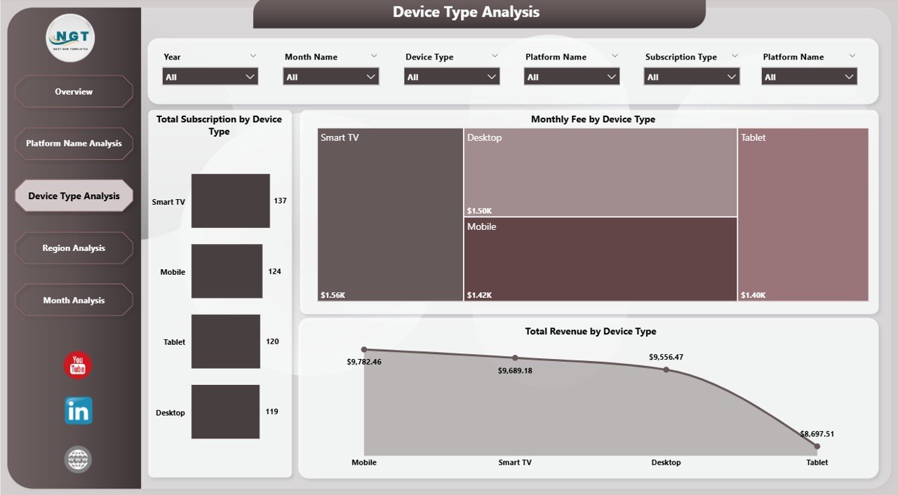
Today, customers use multiple devices such as:
-
Mobile phones
-
Tablets
-
Smart TVs
-
Laptops
-
Desktop computers
The Device Type Analysis Page tracks performance across devices.
Charts Included:
-
Total Revenue by Device Type
-
Monthly Fee by Device Type
-
Total Subscription by Device Type
Because device usage affects engagement, businesses must monitor device trends.
For instance:
-
If mobile generates higher revenue, companies should improve mobile app features.
-
If desktop subscriptions drop, teams should improve the web interface.
Therefore, this page helps optimize user experience.
4️⃣ Region Analysis – Which Region Drives Growth?
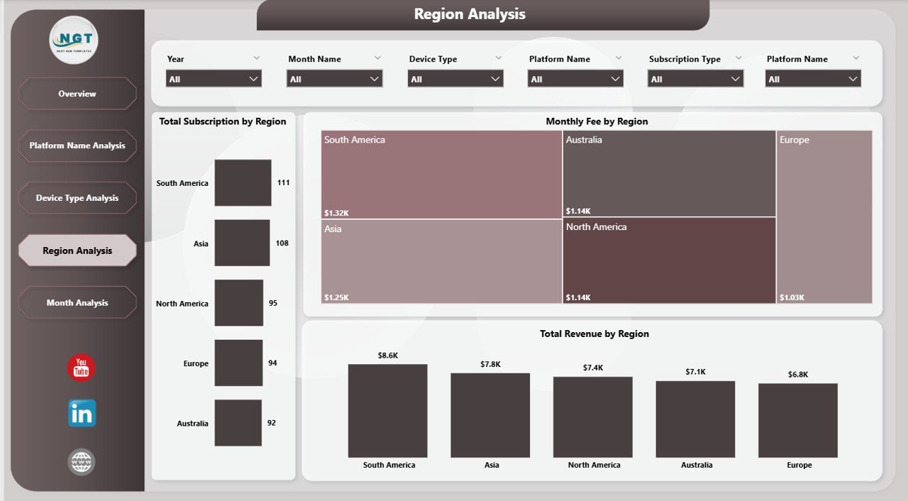
Subscription platforms often operate globally. Therefore, regional insights matter.
The Region Analysis Page focuses on geographical performance.
Charts Included:
-
Total Revenue by Region
-
Monthly Fee by Region
-
Total Subscription by Region
With this page, leaders can:
-
Identify high-growth regions
-
Monitor low-performing areas
-
Adjust regional marketing budgets
-
Optimize pricing based on region
For example, if Asia shows rapid growth, companies can invest more in regional campaigns. Similarly, if Europe shows declining revenue, leaders can investigate churn reasons.
Thus, this page supports expansion strategy.
5️⃣ Month Analysis – How Does Revenue Change Over Time?
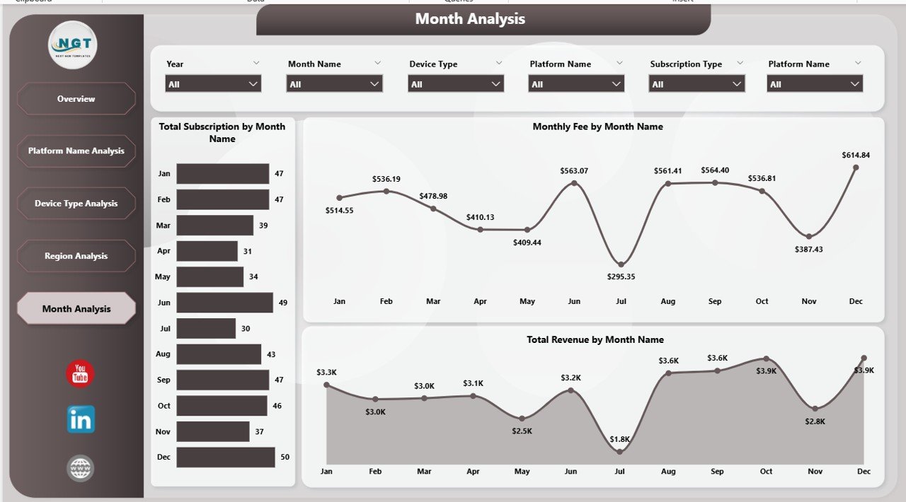
Subscription businesses rely on recurring revenue. Therefore, monthly trend analysis becomes critical.
The Month Analysis Page tracks:
-
Total Revenue by Month
-
Monthly Fee by Month
-
Total Subscription by Month
Because this page shows time-based trends, managers can:
-
Identify seasonal growth
-
Detect sudden revenue drops
-
Analyze campaign performance
-
Forecast future income
For instance, if revenue spikes during holidays, marketing teams can plan special offers. Therefore, this page improves forecasting accuracy.
What Metrics Does the Dashboard Track?
The Online Subscription Platforms Dashboard in Power BI tracks essential KPIs, including:
-
Total Subscriptions
-
Active Subscription %
-
Total Revenue
-
Monthly Fee
-
Revenue by Platform
-
Revenue by Device
-
Revenue by Region
-
Monthly Growth Trends
These metrics help businesses maintain financial stability and growth.
Advantages of Online Subscription Platforms Dashboard in Power BI
Now let’s explore the major benefits.
1️⃣ Centralized Reporting
The dashboard combines all subscription data in one place. Therefore, teams avoid confusion and save time.
2️⃣ Real-Time Insights
Power BI updates data instantly. As a result, decision-makers act quickly.
3️⃣ Improved Revenue Tracking
Managers track revenue by platform, device, region, and month. Therefore, they understand growth patterns clearly.
4️⃣ Better Customer Retention
Because leaders monitor active subscription %, they identify churn risks early.
5️⃣ Enhanced Strategic Planning
The dashboard highlights profitable segments. Consequently, companies focus resources effectively.
6️⃣ Clear Visual Representation
Charts and KPI cards simplify complex data. Therefore, even non-technical users understand insights easily.
Best Practices for the Online Subscription Platforms Dashboard in Power BI
Click to Purchases Online Subscription Platforms Dashboard in Power BI
To maximize results, businesses should follow these best practices:
✔️ Use Clean Data Sources
Always connect reliable and structured data sources. Therefore, reports remain accurate.
✔️ Update Data Regularly
Schedule automatic refresh to maintain real-time reporting.
✔️ Use Meaningful Filters
Apply slicers for platform name, region, device, and subscription type. As a result, users explore data smoothly.
✔️ Monitor Active Subscription %
Track churn indicators frequently. Therefore, you prevent revenue loss.
✔️ Review Monthly Trends
Analyze month-wise performance consistently. Consequently, you improve forecasting.
✔️ Train Your Team
Ensure managers understand dashboard usage. Therefore, they utilize full functionality.
How Does This Dashboard Improve Business Growth?
This dashboard supports growth in multiple ways:
-
It reveals profitable platforms
-
It identifies high-performing regions
-
It highlights device engagement patterns
-
It tracks monthly revenue trends
-
It supports data-driven marketing decisions
Therefore, businesses gain competitive advantage.
Who Should Use This Dashboard?
The Online Subscription Platforms Dashboard in Power BI benefits:
-
SaaS companies
-
Streaming services
-
Online education platforms
-
Membership-based businesses
-
Fitness subscription apps
-
Digital content platforms
Because the dashboard adapts easily, companies customize it for their needs.
How to Implement the Dashboard Successfully?
Follow these steps:
-
Collect subscription data
-
Clean and structure data properly
-
Import data into Power BI
-
Create relationships between tables
-
Build KPI measures
-
Design interactive visuals
-
Publish and share reports
When teams follow this process, they achieve smooth implementation.
Conclusion
Online subscription businesses require strong performance monitoring. Without structured reporting, revenue leaks remain hidden. However, the Online Subscription Platforms Dashboard in Power BI transforms raw data into actionable insights.
It provides:
-
Clear KPI tracking
-
Platform performance comparison
-
Device analysis
-
Regional insights
-
Monthly revenue trends
Therefore, businesses improve profitability, reduce churn, and scale faster.
If you want centralized control, real-time insights, and smarter growth strategies, this dashboard offers the perfect solution.
Frequently Asked Questions (FAQs)
1️⃣ What is an Online Subscription Platforms Dashboard in Power BI?
It is an interactive reporting solution that tracks subscription revenue, active subscriptions, platform performance, device trends, and regional growth using Power BI.
2️⃣ Can I customize this dashboard?
Yes. You can modify visuals, KPIs, filters, and data sources according to your business model.
3️⃣ Does this dashboard help reduce churn?
Yes. Because it tracks Active Subscription %, managers detect early warning signs and take action.
4️⃣ Can small businesses use this dashboard?
Absolutely. Both startups and large enterprises can use it effectively.
5️⃣ How often should I update the data?
You should refresh data daily or weekly depending on business needs.
6️⃣ Does Power BI support automation?
Yes. Power BI allows scheduled data refresh and automatic report updates.
Visit our YouTube channel to learn step-by-step video tutorials