Education systems generate huge amounts of data. Universities track thousands of students, multiple programs, funding sources, academic performance, payments, overdue fees, and satisfaction ratings. When these numbers stay scattered across spreadsheets, institutions struggle to make informed decisions. Therefore, modern education systems need a smart visual tool that presents all university data clearly.
An Open Universities Dashboard in Power BI solves this challenge. It gives education administrators, analysts, and leadership teams a full view of university operations in one place. Because the dashboard uses interactive slicers, cards, charts, and filters, users understand trends instantly and take strategic actions faster.
Click to Purchases Open Universities Dashboard in Power BI
In this detailed and easy-to-understand guide, you will learn:
-
What an Open Universities Dashboard is
-
Why universities must use it
-
Detailed explanation of every page
-
Insights gained from each visual
-
Advantages of using this dashboard
-
Best practices
-
Frequently asked questions
Let’s explore everything step by step.
Click to Purchases Open Universities Dashboard in Power BI
What Is an Open Universities Dashboard in Power BI?
The Open Universities Dashboard in Power BI is a ready-to-use reporting system designed for educational institutions, open universities, distance learning programs, and academic administrators. It captures all student and academic information and presents it in a structured visual format.
The dashboard includes five interactive pages, each focused on a specific aspect:
-
Overview
-
University Analysis
-
Funding Source Analysis
-
Program Analysis
-
Monthly Trends
Because all visuals connect to the same dataset, users get accurate and real-time insights with just a few clicks. This system eliminates manual reporting and brings clarity to decisions.
Why Universities Need a Power BI Dashboard
Universities manage complex operations. Students enroll with different programs, various funding sources, and multiple study patterns. Payments get delayed, satisfaction varies, and academic performance changes every term. Without a dashboard, teams struggle to track:
-
Overdue payments
-
Funding behavior
-
Regional distribution
-
Program credit loads
-
GPA performance
-
Student satisfaction
-
Monthly enrollment trends
A Power BI dashboard removes guesswork and shows clear, visual answers.
Click to Purchases Open Universities Dashboard in Power BI
Key Features of the Open Universities Dashboard in Power BI
This dashboard includes 5 pages, each carefully designed to provide targeted insights.
Let’s understand each page in detail.
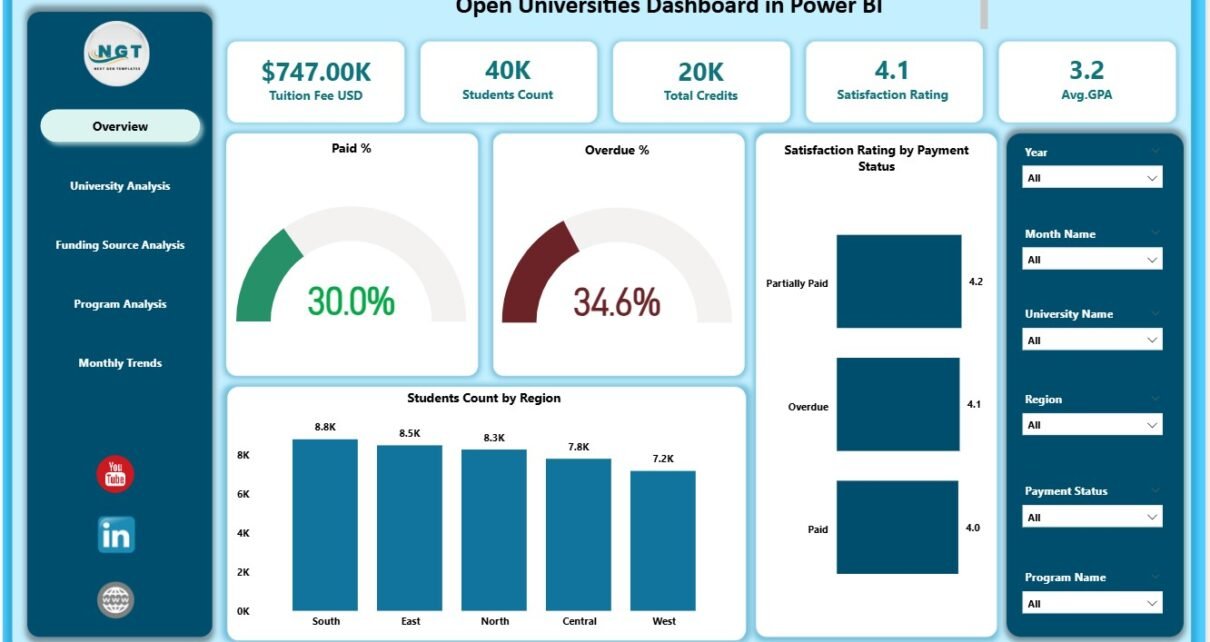
1. Overview Page
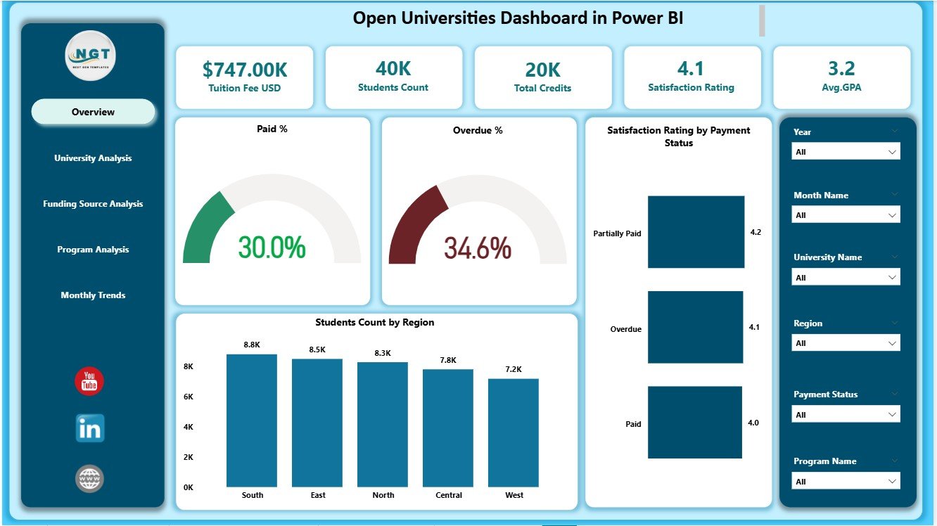
The Overview Page is the most important page in the dashboard. It presents high-level performance indicators that help university leadership understand the overall status of students, payments, and satisfaction.
This page includes:
✔ Five KPI Cards
These cards show the most important numbers such as:
-
Total Students
-
Average GPA
-
Paid %
-
Overdue %
-
Satisfaction Rating
These cards help decision-makers track the health of university operations instantly.
✔ Four Key Charts
The Overview Page includes powerful visual insights:
1. Paid Percentage Chart
Shows how many students completed their tuition payments.
2. Overdue Percentage Chart
Shows the percentage of students pending payments, helping finance teams prioritize follow-ups.
3. Satisfaction Rating by Payment Status
Tracks how student satisfaction changes with payment behavior.
4. Student Count by Region
Highlights geographic distribution and helps plan regional support processes.
✔ Slicers for Filtering
The page includes slicers for selecting:
-
Month
-
Region
-
Program
-
University
Because of these slicers, users can view customized insights instantly.
2. University Analysis Page
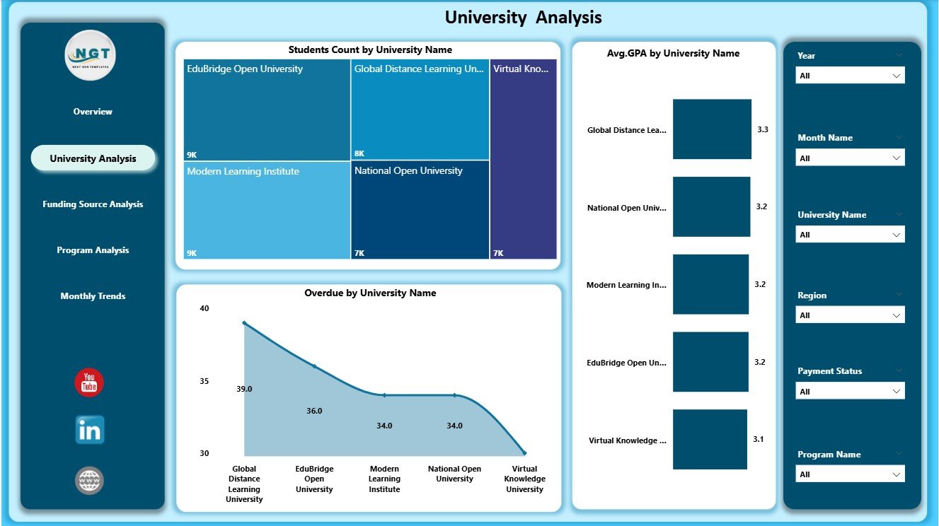
Universities vary in size, performance, program offerings, and payment behavior. The University Analysis Page provides a detailed breakdown.
This page includes 3 charts:
✔ 1. Student Count by University Name
Shows the number of enrolled students in each university. This helps education teams understand which universities attract more learners.
✔ 2. Avg. GPA by University Name
Displays the academic performance of students across universities. Trends reveal learning quality and academic effectiveness.
✔ 3. Overdue Percentage by University Name
Highlights universities with payment delays. Finance teams use this insight to follow up with specific institutions.
✔ Slicers for Filtered Insights
Users can select university names, regions, semesters, or programs.
This page helps leadership detect performance gaps, academic strengths, and financial issues easily.
Click to Purchases Open Universities Dashboard in Power BI
3. Funding Source Analysis Page
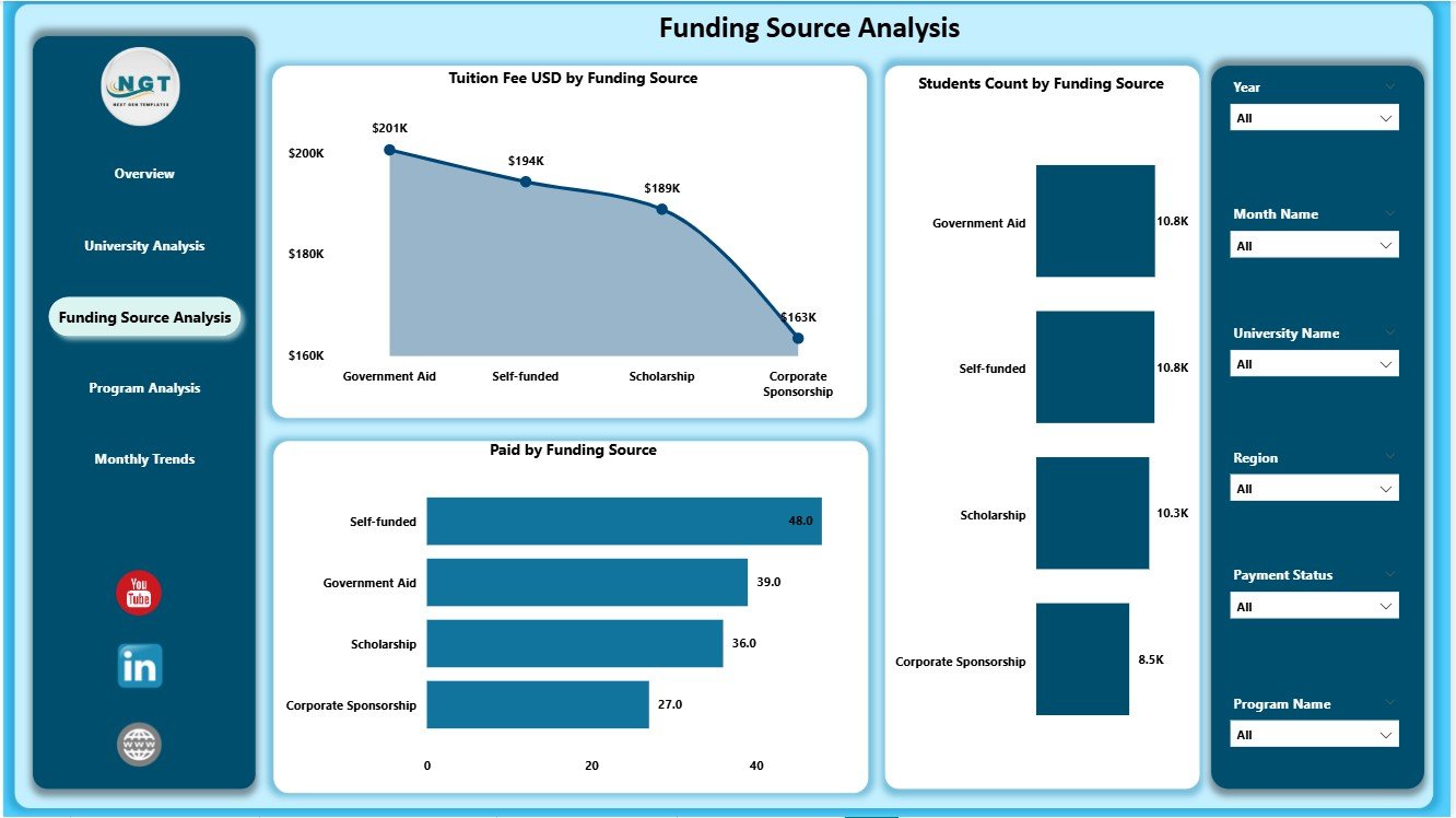
Every student pays fees through different funding sources such as:
-
Scholarships
-
Self-funding
-
Government support
-
Employer sponsorship
-
Private grants
The Funding Source Analysis Page shows how each funding type contributes to university operations.
This page includes 3 charts:
✔ 1. Tuition Fee (USD) by Funding Source
Shows how much revenue each funding source contributes. This helps financial planning and budgeting.
✔ 2. Student Count by Funding Source
Reveals how many students depend on each funding type.
✔ 3. Paid Percentage by Funding Source
Shows payment completion behavior for each funding category.
These insights ensure clear financial reporting and help universities make funding decisions with confidence.
Click to Purchases Open Universities Dashboard in Power BI
4. Program Analysis Page
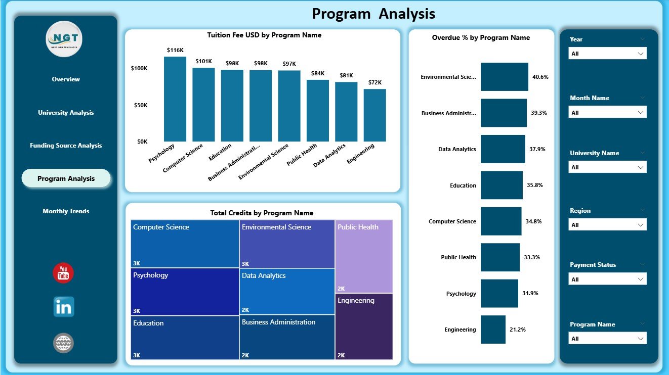
Programs differ in fee structure, credit hours, and completion rate. Therefore, analyzing each program helps improve academic planning.
This page includes 3 powerful charts:
✔ 1. Tuition Fee (USD) by Program Name
Shows how much revenue each program generates.
✔ 2. Overdue Percentage by Program Name
Highlights programs with high fee delays, helping finance teams take early action.
✔ 3. Total Credits by Program Name
Shows academic workload and helps curriculum planners balance program structures.
Because this page connects academic and financial data, institutions make smarter program decisions.
5. Monthly Trends Page
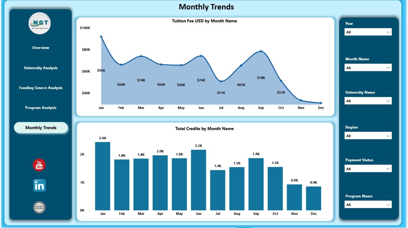
Every university experiences enrollment cycles. Payments, credit registrations, and GPA trends change month by month.
The Monthly Trends Page helps track these patterns clearly.
This page includes 2 charts:
✔ 1. Tuition Fee (USD) by Month
Shows monthly revenue patterns and helps identify seasonal trends.
✔ 2. Total Credits by Month
Shows how student credit load changes every month.
These visuals help predict future growth, plan marketing campaigns, and track academic change.
Click to Purchases Open Universities Dashboard in Power BI
Advantages of Open Universities Dashboard in Power BI
1. Clear Data Visualization
The dashboard uses cards, charts, and slicers for simple navigation and fast insights.
2. Real-Time Performance Tracking
Leaders track financial, academic, and operational KPIs instantly.
3. Better Student Experience
Universities identify issues early and improve support systems.
4. Improved Fee Management
Overdue percentage visualizations help finance teams act quickly.
5. Data-Driven Decision Making
Charts show hidden patterns that spreadsheets usually miss.
6. Clear Academic Insights
GPA trends and credit distribution help improve learning quality.
7. Region-Wise and University-Wise Breakdown
Helps planners allocate resources properly.
Best Practices for Using This Dashboard
1. Update Data Regularly
Keep monthly data updated for accurate reporting.
2. Maintain Consistent Naming
Use the same program names, regions, and funding labels in the dataset.
3. Review Overdue Trends Every Week
This helps maintain healthy cash flow.
4. Analyze GPA Patterns Every Month
Use GPA data to improve academic services.
5. Use Filters for Deep Insights
Compare universities, programs, or months easily.
6. Share Dashboard Reports With Teams
Promote stronger cross-department coordination.
Conclusion
The Open Universities Dashboard in Power BI offers a complete view of university operations, covering payments, academics, programs, funding sources, and regional distribution. With its five structured pages—Overview, University Analysis, Funding Source Analysis, Program Analysis, and Monthly Trends—this dashboard becomes an essential tool for every educational institution.
It replaces manual reporting, reduces errors, improves financial accuracy, and supports strategic planning. When universities use this dashboard consistently, they unlock better decision-making and create a more efficient learning environment.
Click to Purchases Open Universities Dashboard in Power BI
Frequently Asked Questions (FAQs)
1. What is an Open Universities Dashboard in Power BI?
It is a reporting dashboard that tracks student performance, payments, GPA, program credits, and trends for universities.
2. Who can use this dashboard?
University administrators, finance teams, academic planners, regional officers, and education analysts.
3. Does it support trend analysis?
Yes. The Monthly Trends page shows yearly patterns.
4. Can beginners use this dashboard?
Yes. The interface is simple and beginner-friendly.
5. How many pages does the dashboard include?
It includes five pages: Overview, University Analysis, Funding Source, Program Analysis, and Monthly Trends.
6. Can I customize the visuals?
Yes. You can modify charts, colors, themes, and slicers.
7. Does the dashboard track fee overdue?
Yes. Multiple charts show overdue percentage for better financial control.
8. Can I analyze GPA performance?
Yes. The University Analysis page includes GPA insights.
9. How often should data be updated?
Update it monthly for accurate reporting.
10. Does it support region-wise analysis?
Yes. You can track student count by region on the Overview Page.
Click to Purchases Open Universities Dashboard in Power BI
Visit our YouTube channel to learn step-by-step video tutorials