Retail outlet stores operate in a highly competitive environment. Every day, store managers handle sales targets, product performance, regional demand, pricing strategies, and operational costs. However, many businesses still rely on scattered Excel sheets and manual reports. As a result, decision-making becomes slow and performance gaps remain hidden.
Therefore, companies now adopt Power BI dashboards to monitor outlet store performance in real time. One powerful solution is the Outlet Stores Dashboard in Power BI, which brings all retail KPIs into a single interactive analytics platform.
In this comprehensive guide, you will learn everything about the Outlet Stores Dashboard in Power BI — including its features, benefits, analytics capabilities, best practices, and frequently asked questions.
Click to Purchases Outlet Stores Dashboard in Power BI
What Is an Outlet Stores Dashboard in Power BI?
An Outlet Stores Dashboard in Power BI is an interactive business intelligence solution designed to track and analyze retail outlet performance using visual analytics.
Instead of reviewing multiple reports, users can monitor sales, profits, costs, targets, and trends from one centralized dashboard. Moreover, Power BI allows managers to explore data dynamically using slicers, filters, and drill-down visuals.
This dashboard helps organizations:
-
Monitor outlet sales performance
-
Compare Actual vs Target sales
-
Analyze profit margins across regions
-
Evaluate product category performance
-
Track monthly business trends
-
Improve strategic decision-making
Because Power BI updates visuals instantly, decision-makers gain faster insights and take corrective actions quickly.
Why Do Outlet Stores Need a Power BI Dashboard?
Retail businesses generate massive amounts of transactional data. However, raw data alone does not create value. Companies must transform data into insights.
Common Challenges Without a Dashboard
-
Data scattered across multiple systems
-
Lack of centralized reporting
-
Difficult performance comparison between outlets
-
Slow identification of low-performing products
-
Limited visibility into regional trends
-
Manual reporting errors
Therefore, businesses require structured analytics tools that simplify monitoring.
How Power BI Solves These Problems
Power BI converts raw outlet data into meaningful visuals. Consequently, managers understand performance instantly.
With a dashboard:
-
Leaders track KPIs in real time.
-
Store managers monitor targets daily.
-
Analysts identify profit opportunities.
-
Executives make data-driven decisions.
Key Features of the Outlet Stores Dashboard in Power BI
This dashboard contains five powerful analytical pages, each designed to answer specific business questions.
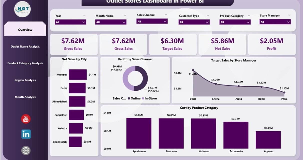
1. Overview Page – The Complete Business Snapshot
The Overview Page acts as the main control center of the dashboard. Here, users quickly understand overall outlet performance.
What You See on This Page
-
Interactive slicers for filtering data
-
Five KPI cards showing major performance metrics
-
High-level business insights
Key Visuals Included
-
Net Sales by City
-
Profit by Sales Channel
-
Target Sales by Store Manager
-
Cost by Product Category
-
Summary KPI cards
Why This Page Matters
First, executives gain instant visibility into performance. Then, they identify which cities or channels drive revenue. As a result, decision-makers focus on profitable areas faster.
2. Outlet Name Analysis – Which Stores Perform Best?
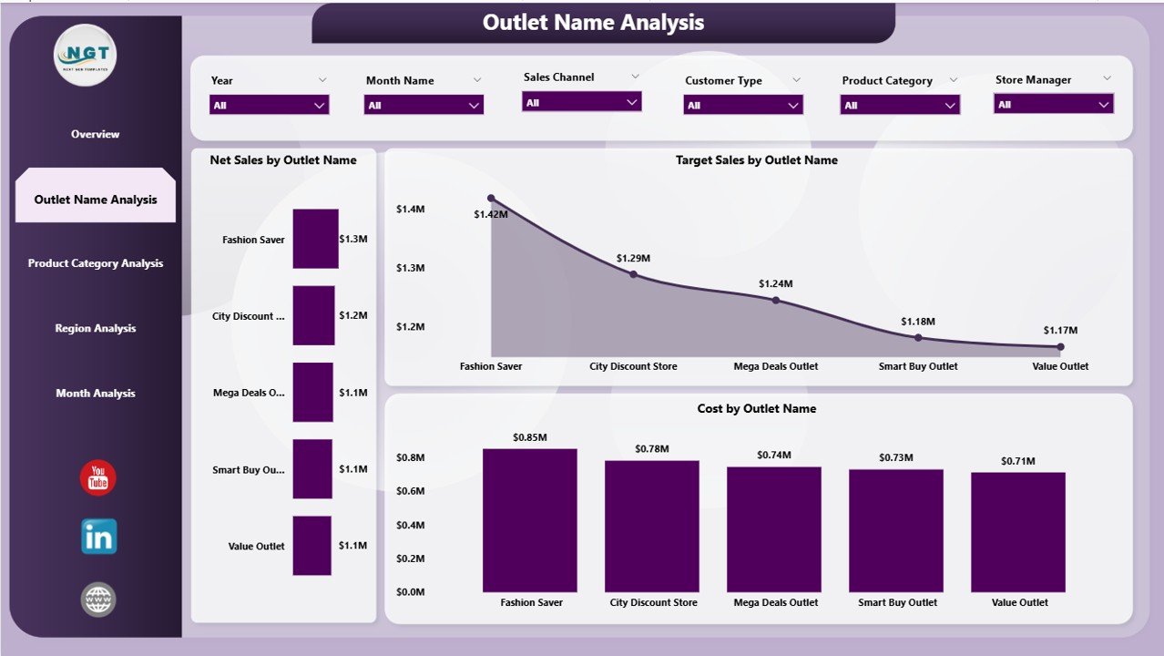
Retail success depends heavily on individual outlet performance. Therefore, the dashboard includes a dedicated Outlet Name Analysis page.
Charts Available
-
Net Sales by Outlet Name
-
Target Sales by Outlet Name
-
Cost by Outlet Name
Insights You Can Discover
-
Top-performing outlets
-
Stores missing sales targets
-
High-cost locations
-
Efficiency comparison between outlets
Because managers can compare stores visually, they quickly identify improvement opportunities.
Click to Purchases Outlet Stores Dashboard in Power BI
3. Product Category Analysis – Understanding Product Performance
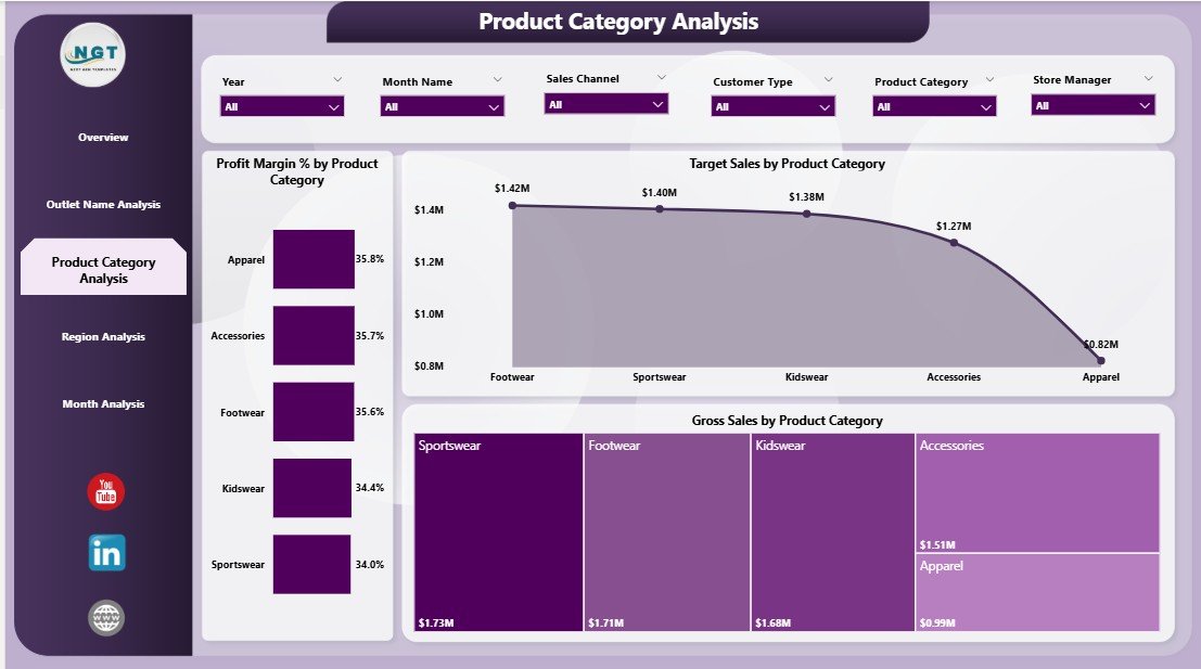
Product performance directly affects profitability. Consequently, this page focuses on category-level analytics.
Charts Included
-
Profit Margin % by Product Category
-
Target Sales by Product Category
-
Gross Sales by Product Category
Business Questions Answered
-
Which categories generate maximum profit?
-
Which products require pricing adjustments?
-
Where do costs reduce margins?
-
Which categories need promotional focus?
Moreover, category insights help retailers optimize inventory planning and marketing strategies.
4. Region Analysis – Measuring Geographic Performance
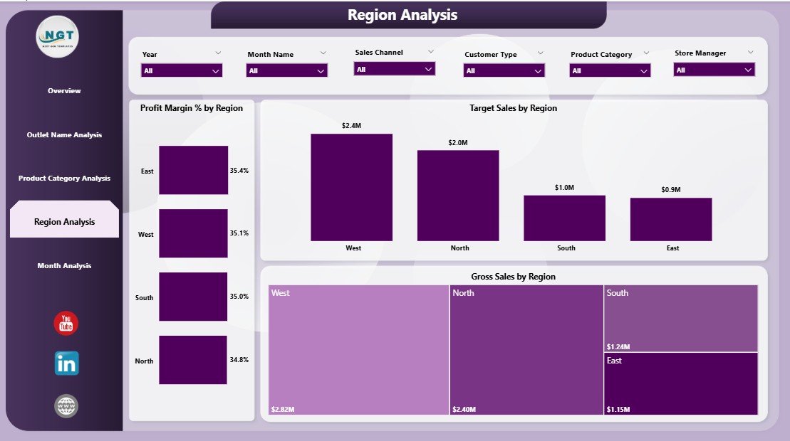
Retail performance varies across regions due to customer behavior, demographics, and competition. Therefore, regional analysis becomes essential.
Visualizations Available
-
Profit Margin % by Region
-
Target Sales by Region
-
Gross Sales by Region
Benefits of Regional Insights
-
Identify high-growth regions
-
Compare regional profitability
-
Allocate resources effectively
-
Plan expansion strategies
As a result, businesses invest in regions that deliver higher returns.
Click to Purchases Outlet Stores Dashboard in Power BI
5. Month Analysis – Tracking Business Trends Over Time
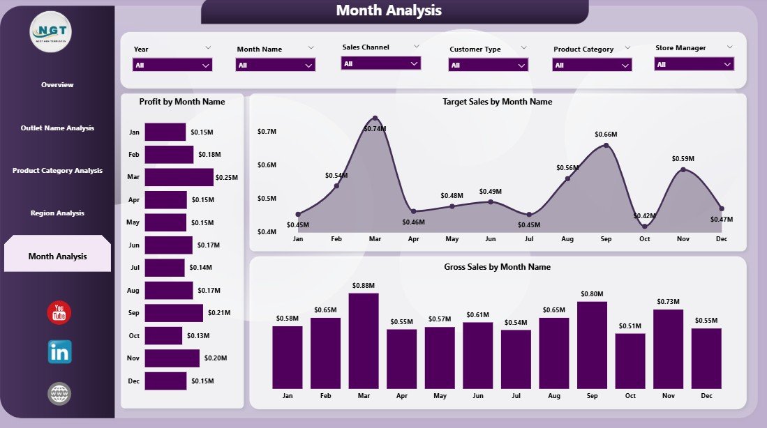
Retail performance changes month by month. Hence, the Month Analysis Page helps track time-based trends.
Charts Included
-
Profit by Month
-
Target Sales by Month
-
Gross Sales by Month
Why Monthly Analysis Is Important
-
Detect seasonal trends
-
Forecast future sales
-
Monitor campaign effectiveness
-
Adjust monthly targets
Because trends become visible instantly, organizations plan proactively instead of reacting late.
What KPIs Can You Track in an Outlet Stores Dashboard?
A well-designed dashboard monitors essential retail KPIs such as:
-
Net Sales
-
Gross Sales
-
Profit Margin %
-
Target Achievement %
-
Cost by Category
-
Sales by Region
-
Store Performance Index
-
Monthly Profit Trend
-
Sales Channel Performance
These KPIs provide a complete picture of business health.
How Does the Dashboard Improve Retail Decision-Making?
Power BI dashboards transform reporting into strategic analytics.
Faster Decisions
Managers view live data instead of waiting for reports. Therefore, they respond quickly to performance changes.
Better Target Tracking
The dashboard compares targets with actual performance. Consequently, teams stay accountable.
Improved Profitability
Businesses identify high-margin products and eliminate underperforming categories.
Enhanced Collaboration
Since dashboards remain centralized, departments work using the same data source.
Advantages of Outlet Stores Dashboard in Power BI
Implementing this dashboard delivers multiple benefits.
✅ Real-Time Insights
Managers analyze performance instantly without manual calculations.
✅ Centralized Reporting
All outlet data appears in one dashboard.
✅ Interactive Analysis
Users filter data by region, outlet, category, or month.
✅ Improved Sales Strategy
Businesses focus on profitable channels and stores.
✅ Easy Performance Monitoring
Click to Purchases Outlet Stores Dashboard in Power BI
Visual charts simplify complex data.
✅ Scalable Solution
The dashboard grows with expanding retail networks.
How Retail Teams Use This Dashboard Daily
Different teams benefit differently from the dashboard.
Store Managers
-
Track outlet targets
-
Monitor daily performance
-
Improve staff productivity
Regional Managers
-
Compare store performance
-
Identify weak regions
-
Allocate resources efficiently
Executives
-
Monitor company-wide KPIs
-
Plan expansion strategies
-
Improve profitability planning
Analysts
-
Discover trends and patterns
-
Prepare data-driven recommendations
Best Practices for the Outlet Stores Dashboard in Power BI
To achieve maximum value, organizations should follow proven practices.
1. Define Clear KPIs
Choose metrics aligned with business goals.
2. Maintain Data Accuracy
Clean and validate data regularly.
3. Use Consistent Data Sources
Avoid combining inconsistent datasets.
4. Update Data Frequently
Schedule automatic refreshes.
5. Keep Visuals Simple
Avoid overcrowded charts.
6. Use Meaningful Filters
Provide slicers for region, outlet, and time.
7. Train Users Properly
Ensure teams understand dashboard usage.
Opportunities for Improvement in Outlet Store Analytics
Even strong dashboards evolve over time.
Businesses can enhance analytics by:
-
Adding customer segmentation analysis
-
Including inventory turnover KPIs
-
Integrating loyalty program data
-
Tracking promotion effectiveness
-
Using predictive forecasting models
As analytics maturity grows, insights become more powerful.
How to Implement an Outlet Stores Dashboard in Power BI
Follow these steps to deploy successfully:
-
Collect outlet sales data in Excel or databases.
-
Define KPIs and business objectives.
-
Import data into Power BI.
-
Create relationships between tables.
-
Build visuals for each analysis page.
-
Add slicers and filters.
-
Publish dashboard to Power BI Service.
-
Share access with stakeholders.
After implementation, organizations immediately experience better visibility.
Why Power BI Is Ideal for Retail Analytics
Power BI offers several advantages compared to traditional reporting tools.
-
Interactive visualizations
-
Fast data processing
-
Easy integration with Excel
-
Cloud sharing capabilities
-
Automated refresh
-
Mobile dashboard access
Therefore, retailers increasingly choose Power BI for performance monitoring.
Future of Outlet Store Analytics
Click to Purchases Outlet Stores Dashboard in Power BI
Retail analytics continues to evolve rapidly.
In the future, dashboards will include:
-
AI-driven sales predictions
-
Automated anomaly detection
-
Customer behavior analytics
-
Real-time inventory tracking
-
Personalized store recommendations
Consequently, businesses that adopt analytics early gain competitive advantage.
Conclusion
The Outlet Stores Dashboard in Power BI provides a powerful and structured way to monitor retail performance. Instead of relying on manual reports, businesses analyze sales, profits, costs, regions, outlets, and trends through interactive visuals.
Because the dashboard delivers real-time insights, managers make faster decisions, improve profitability, and achieve targets consistently. Moreover, its five analytical pages ensure complete visibility across operations.
In today’s data-driven retail environment, organizations that use analytics outperform competitors. Therefore, implementing an Outlet Stores Dashboard in Power BI becomes not just helpful but essential for sustainable growth.
Frequently Asked Questions (FAQs)
1. What is an Outlet Stores Dashboard in Power BI?
It is an interactive analytics dashboard that tracks outlet sales, profit, targets, and performance using Power BI visuals.
2. Who should use this dashboard?
Retail managers, store owners, analysts, and executives can use it to monitor business performance.
3. Can beginners use this dashboard?
Yes. Power BI dashboards use simple visuals and filters, so beginners can analyze data easily.
4. What data source does the dashboard use?
Typically, the dashboard connects with Excel files, databases, or retail management systems.
5. How often should the dashboard update?
Organizations usually refresh data daily or weekly depending on business needs.
6. Can the dashboard handle multiple outlets?
Yes. Power BI easily scales to hundreds or thousands of outlets.
7. Does this dashboard help improve profitability?
Yes. It highlights high-performing products, regions, and outlets, allowing smarter decisions.
8. Can we customize the dashboard?
Absolutely. Businesses can add KPIs, visuals, or filters based on requirements.
9. Is Power BI suitable for retail analytics?
Yes. Power BI provides strong visualization, automation, and data modeling features ideal for retail.
10. What is the biggest benefit of using this dashboard?
The biggest advantage is centralized, real-time performance visibility that enables faster and smarter decision-making.
Visit our YouTube channel to learn step-by-step video tutorials


