The paper and pulp industry operates in a high-cost, energy-intensive, and margin-sensitive environment. Mills handle massive raw material volumes. Production teams manage multiple shifts. Managers track waste levels, energy costs, and regional profitability every single day.
However, many companies still rely on scattered Excel sheets and manual reports. As a result, decision-makers struggle to monitor profit, cost, and efficiency in real time.
So, how can paper manufacturers gain full visibility into production performance, cost structure, and profitability?
The answer is simple.
Click to Purchases Paper and Pulp Dashboard in Power BI
You need a Paper and Pulp Dashboard in Power BI.
This ready-to-use Power BI solution converts raw operational data into powerful interactive visuals. Moreover, it allows you to track waste percentage, raw material cost, regional performance, mill profitability, and shift-level efficiency — all in one centralized system.
In this detailed guide, you will learn:
-
What a Paper and Pulp Dashboard in Power BI is
-
Why manufacturing companies need it
-
A complete explanation of all 5 dashboard pages
-
Key KPIs you can track
-
Advantages of the Paper and Pulp Dashboard in Power BI
-
Best Practices for the Paper and Pulp Dashboard
-
Frequently Asked Questions
Let’s explore everything step by step.
What Is a Paper and Pulp Dashboard in Power BI?
A Paper and Pulp Dashboard in Power BI is an interactive business intelligence solution that helps paper manufacturing companies monitor production, cost, revenue, and profitability in real time.
Instead of reviewing static reports, managers can:
-
Filter data by region, mill, shift, product type, or month
-
Drill down into cost details
-
Compare profit across mills
-
Track waste percentage trends
-
Monitor energy consumption performance
Therefore, leadership teams can make faster and smarter decisions.
Why Does the Paper and Pulp Industry Need a Power BI Dashboard?
The paper industry faces unique operational challenges:
-
High raw material costs (wood pulp, recycled fiber, chemicals)
-
Rising energy expenses
-
Waste management pressure
-
Regional demand fluctuations
-
Multi-shift production complexity
Without a centralized dashboard, companies often face:
-
Delayed reporting
-
Cost overruns
-
Unnoticed waste spikes
-
Low-profit product lines
-
Poor shift performance tracking
However, when companies use a Power BI dashboard, they gain instant visibility into operational performance. As a result, they reduce cost leakages and improve margins.
Complete Explanation of All 5 Dashboard Pages
Now let’s understand the complete structure of the Paper and Pulp Dashboard in Power BI.
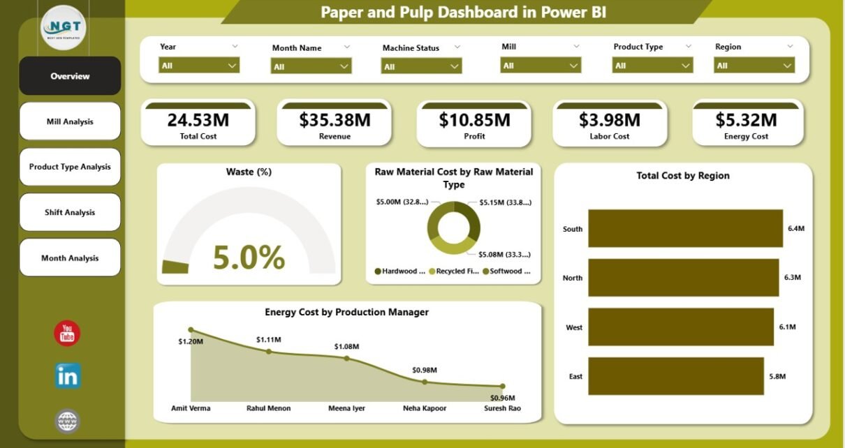
1️⃣ Overview Page – How Does It Provide a Complete Snapshot?
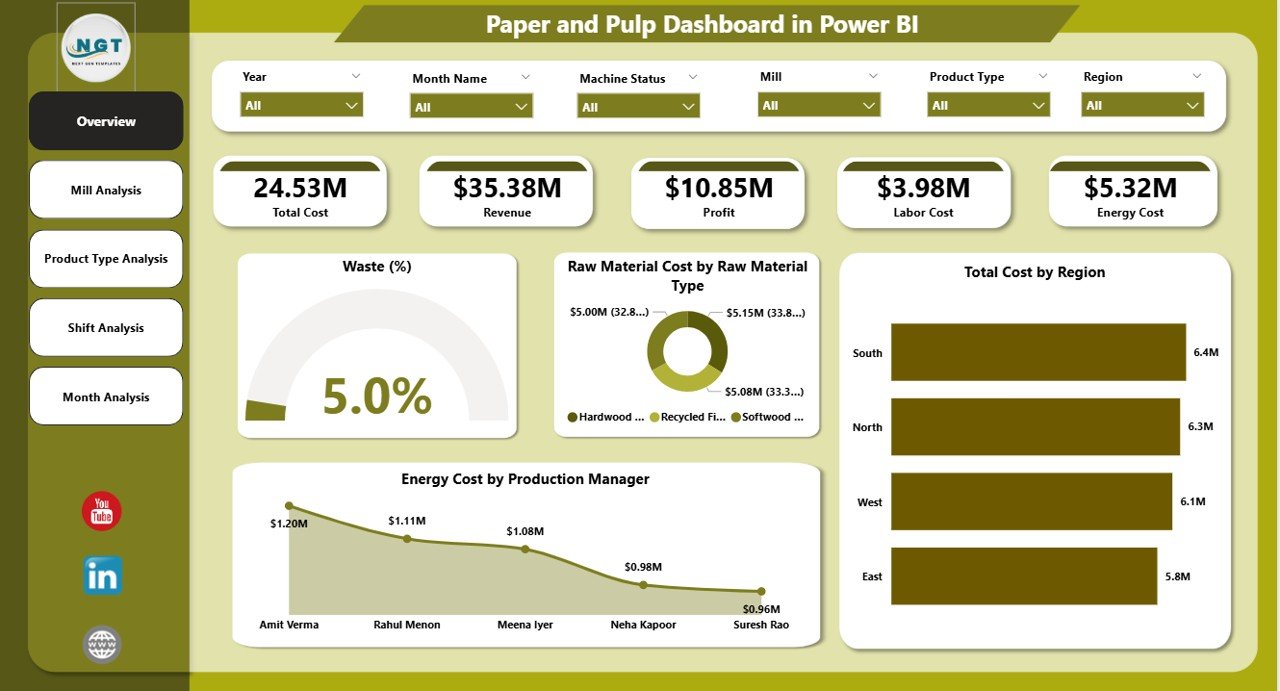
The Overview Page serves as the command center of the dashboard.
Here, users can apply slicers (filters) to analyze data dynamically. These slicers may include:
-
Region
-
Mill
-
Production Manager
-
Product Type
-
Shift
-
Month
Key KPI Cards on the Overview Page
-
Waste %
-
Raw Material Cost by Raw Material Type
-
Total Cost by Region
-
Energy Cost by Production Manager
-
Overall Profit or Revenue Summary
What Insights Can You Get?
-
Instantly detect high waste levels
-
Identify costly raw materials
-
Compare regional cost performance
-
Evaluate energy efficiency by manager
Therefore, executives can immediately understand the financial health of operations.
2️⃣ Mill Analysis – Which Mill Performs Best?
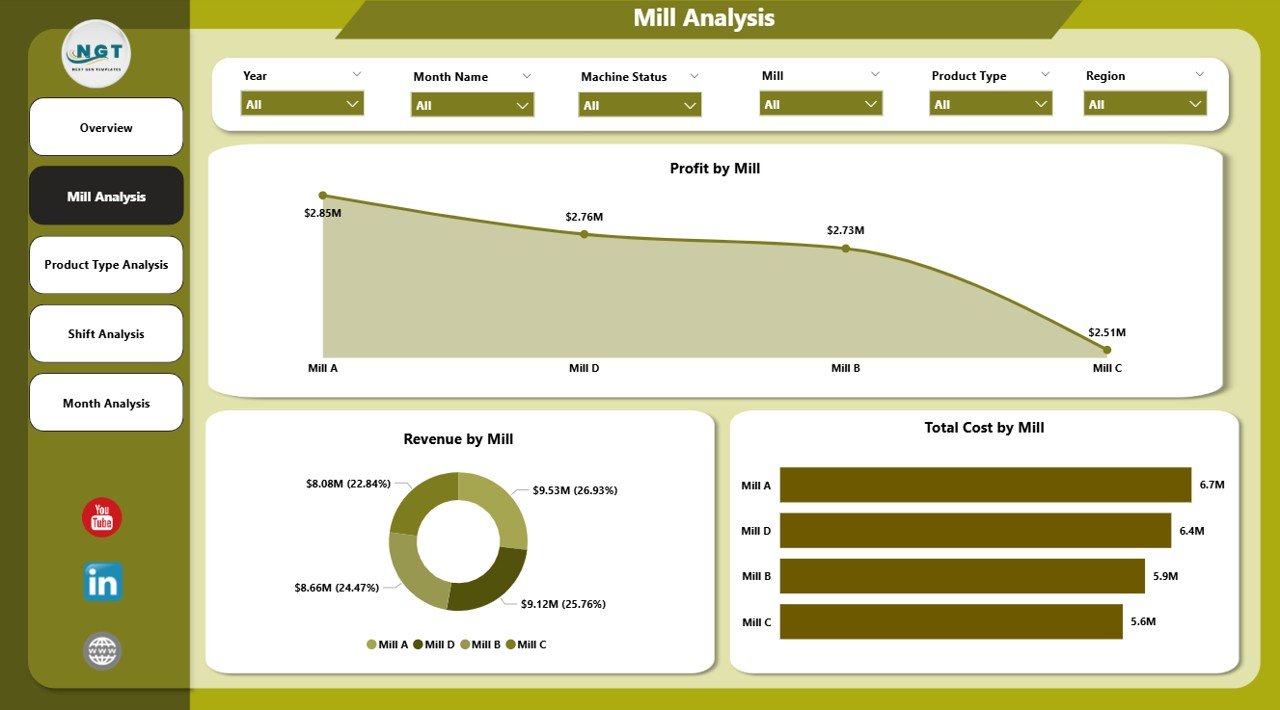
The Mill Analysis Page focuses on location-level performance.
Charts Included:
-
Profit by Mill
-
Revenue by Mill
-
Total Cost by Mill
Why Is This Important?
Paper companies often operate multiple mills. However, not all mills perform equally.
With this page, you can:
-
Compare profitability across mills
-
Identify high-cost facilities
-
Detect underperforming mills
-
Analyze revenue concentration
As a result, management can optimize operations and allocate resources more efficiently.
Click to Purchases Paper and Pulp Dashboard in Power BI
3️⃣ Product Type Analysis – Which Products Generate the Highest Profit?
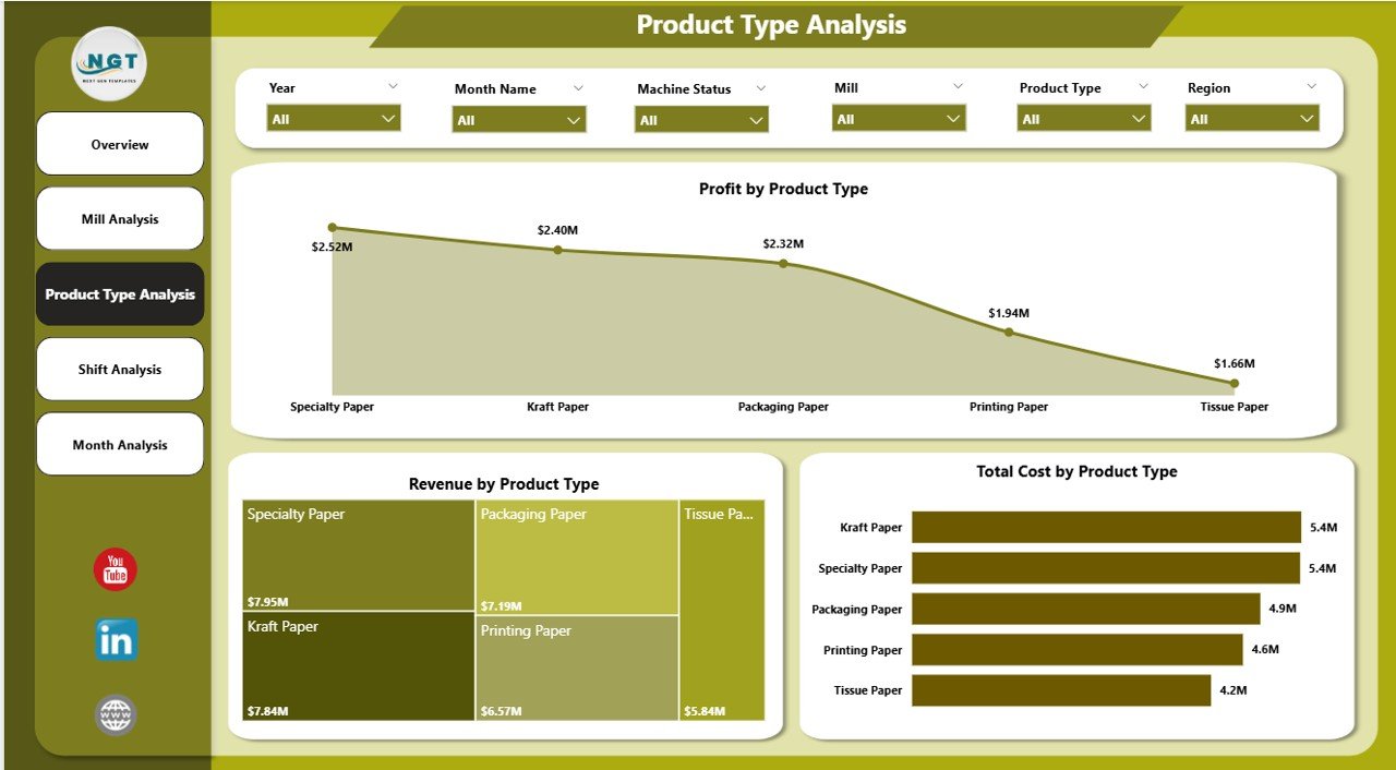
The Product Type Analysis page evaluates performance based on product categories.
Charts Included:
-
Profit by Product Type
-
Revenue by Product Type
-
Total Cost by Product Type
What Can You Analyze?
-
Identify high-margin products
-
Detect low-profit product lines
-
Compare revenue contribution by category
-
Optimize product portfolio
For example, if packaging paper generates high profit but printing paper shows low margins, leadership can adjust production planning accordingly.
4️⃣ Shift Analysis – Does Shift Performance Affect Profit?
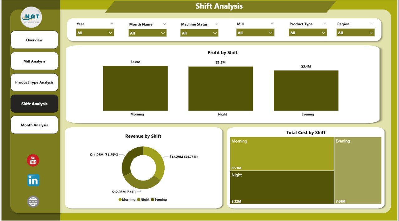
The Shift Analysis page evaluates operational efficiency by shift.
Charts Included:
-
Profit by Shift
-
Revenue by Shift
-
Total Cost by Shift
Manufacturing units often operate in:
-
Morning Shift
-
Evening Shift
-
Night Shift
Key Insights You Can Discover:
-
Which shift produces the highest revenue
-
Which shift incurs higher costs
-
Whether waste percentage increases during night shifts
-
Energy consumption differences across shifts
Therefore, plant managers can improve supervision and workforce allocation.
5️⃣ Month Analysis – How Does Performance Change Over Time?
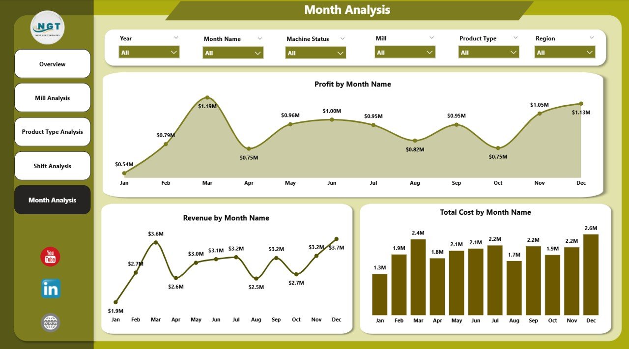
The Month Analysis page tracks performance trends.
Charts Included:
-
Profit by Month
-
Revenue by Month
-
Total Cost by Month
This page helps companies:
-
Identify seasonal demand trends
-
Monitor cost increases
-
Track profit growth
-
Compare month-over-month performance
Moreover, trend analysis helps forecast future performance.
Key KPIs Tracked in the Paper and Pulp Dashboard
A strong dashboard tracks measurable KPIs. Some important KPIs include:
-
Waste Percentage
-
Raw Material Cost
-
Energy Cost
-
Production Volume
-
Revenue
-
Profit Margin
-
Cost per Ton
-
Regional Revenue Contribution
-
Shift Efficiency Rate
-
Mill-Level Profitability
When companies monitor these KPIs consistently, they maintain operational discipline.
Click to Purchases Paper and Pulp Dashboard in Power BI
Advantages of Paper and Pulp Dashboard in Power BI
Now let’s explore the key benefits.
1️⃣ Real-Time Visibility
You can see updated performance instantly. Therefore, managers respond faster.
2️⃣ Improved Cost Control
You identify cost spikes quickly. As a result, you reduce waste and unnecessary expenses.
3️⃣ Better Production Planning
You understand product-level profitability. Consequently, you plan production strategically.
4️⃣ Shift Performance Optimization
You track shift-level efficiency. Hence, you improve workforce management.
5️⃣ Regional Performance Comparison
You compare regional results easily. Therefore, you focus on high-growth areas.
6️⃣ Interactive Filtering and Drill-Down
Users can explore data dynamically. Instead of reading static reports, they interact with insights.
7️⃣ Stronger Decision-Making
Leaders make data-driven decisions. As a result, profitability improves.
How to Implement the Paper and Pulp Dashboard Successfully?
Implementation requires structured planning.
Step 1: Collect Clean Data
Gather data from:
-
ERP systems
-
Production logs
-
Financial systems
-
Energy monitoring tools
Ensure accuracy and consistency.
Step 2: Define KPIs Clearly
Define formulas for:
-
Waste %
-
Profit
-
Cost per ton
-
Energy cost per unit
Clear definitions ensure consistent reporting.
Step 3: Build Data Model in Power BI
Create relationships between:
-
Mill Table
-
Product Table
-
Shift Table
-
Region Table
-
Date Table
A clean data model ensures accurate insights.
Step 4: Design User-Friendly Visuals
Keep visuals simple. Use:
-
Bar charts
-
Column charts
-
KPI cards
-
Trend lines
Avoid clutter.
Step 5: Train Users
Teach managers how to use slicers and filters. Therefore, they extract maximum value.
Best Practices for the Paper and Pulp Dashboard
To get the best results, follow these best practices.
1️⃣ Keep KPIs Focused
Do not overload the dashboard. Instead, focus on strategic KPIs.
2️⃣ Update Data Regularly
Ensure daily or weekly refresh. Outdated data leads to poor decisions.
3️⃣ Use Clear Visual Labels
Use simple titles and units. Avoid confusing abbreviations.
4️⃣ Monitor Waste Continuously
Waste directly impacts profit. Therefore, track it daily.
5️⃣ Compare Cost vs Revenue Together
Always analyze cost alongside revenue. Otherwise, profit insights remain incomplete.
6️⃣ Enable Drill-Through Pages
Allow users to explore details. This improves transparency.
7️⃣ Review Monthly Trends
Track patterns over time. Trends reveal long-term issues.
How Does This Dashboard Improve Profitability?
Click to Purchases Paper and Pulp Dashboard in Power BI
The dashboard increases profitability because it:
-
Reduces waste
-
Controls energy cost
-
Identifies profitable products
-
Highlights underperforming mills
-
Optimizes shift productivity
-
Improves regional strategy
Therefore, companies gain both operational efficiency and financial strength.
Who Should Use the Paper and Pulp Dashboard?
This dashboard benefits:
-
Plant Managers
-
Production Heads
-
Finance Managers
-
Regional Directors
-
Operations Analysts
-
Business Owners
Each stakeholder can view relevant insights instantly.
Future Scope of Paper and Pulp Analytics
The industry continues to evolve. Therefore, companies can enhance dashboards further by adding:
-
Predictive cost forecasting
-
AI-based waste analysis
-
Carbon footprint tracking
-
Inventory optimization metrics
-
Supplier performance tracking
With advanced analytics, organizations stay competitive.
Conclusion
The paper and pulp industry demands precision, efficiency, and cost control. However, traditional reporting systems slow down decision-making.
The Paper and Pulp Dashboard in Power BI transforms operational data into actionable insights. It centralizes performance tracking across mills, product types, shifts, regions, and months.
Moreover, it improves visibility, enhances cost control, and increases profitability.
If your organization wants to reduce waste, optimize production, and boost margins, this dashboard offers the perfect solution.
Frequently Asked Questions with Answers
1️⃣ What data do I need to build a Paper and Pulp Dashboard?
You need production data, cost data, revenue data, shift information, regional details, and raw material cost records.
2️⃣ Can small paper mills use this dashboard?
Yes. Small and large mills can customize the dashboard according to their scale.
3️⃣ How often should I update the dashboard?
You should update it daily or weekly to maintain accurate insights.
4️⃣ Does Power BI support large manufacturing data?
Yes. Power BI handles large datasets efficiently when you build a proper data model.
5️⃣ Can I track waste percentage trends?
Yes. The Month Analysis page allows trend tracking for waste and profit.
6️⃣ How does this dashboard improve decision-making?
It provides real-time visibility, interactive filtering, and clear KPI monitoring. Therefore, managers take faster and better actions.
Visit our YouTube channel to learn step-by-step video tutorials