In every organization, managing payroll efficiently is one of the most crucial and time-sensitive processes. From calculating employee salaries and benefits to tracking deductions and compliance, payroll management involves numerous moving parts. To make this process smarter, faster, and more transparent, businesses are turning toward data visualization — and the Payroll Management KPI Dashboard in Power BI delivers exactly that.
This ready-to-use interactive dashboard transforms raw payroll data into meaningful visual insights, enabling HR and finance professionals to monitor payroll performance, compliance accuracy, and efficiency in real time.
Click to Purchases Payroll Management KPI Dashboard in Power BI
🧭 What Is a Payroll Management KPI Dashboard in Power BI?
A Payroll Management KPI Dashboard in Power BI is a data-driven analytical solution that consolidates payroll data into a single, dynamic view. It helps HR and payroll departments measure, track, and analyze payroll-related KPIs such as salary disbursement accuracy, processing time, cost efficiency, and compliance metrics.
Unlike traditional Excel sheets or manual tracking, this Power BI dashboard provides automated updates, interactive visuals, and powerful drill-through features. You can instantly spot bottlenecks, compare performance across months or years, and ensure payroll accuracy at every level.
With this dashboard, you can:
-
Monitor Month-to-Date (MTD) and Year-to-Date (YTD) payroll performance.
-
Compare Actual vs Target vs Previous Year (PY) results.
-
Visualize KPIs with color indicators to instantly identify trends.
-
Drill through to view KPI formulas, definitions, and detailed insights.
-
Make real-time, data-based decisions that improve payroll efficiency.
📊 Structure of the Payroll Management KPI Dashboard
The Payroll Management KPI Dashboard in Power BI consists of three main pages and connects directly to an Excel data source. Let’s explore each page and its purpose.
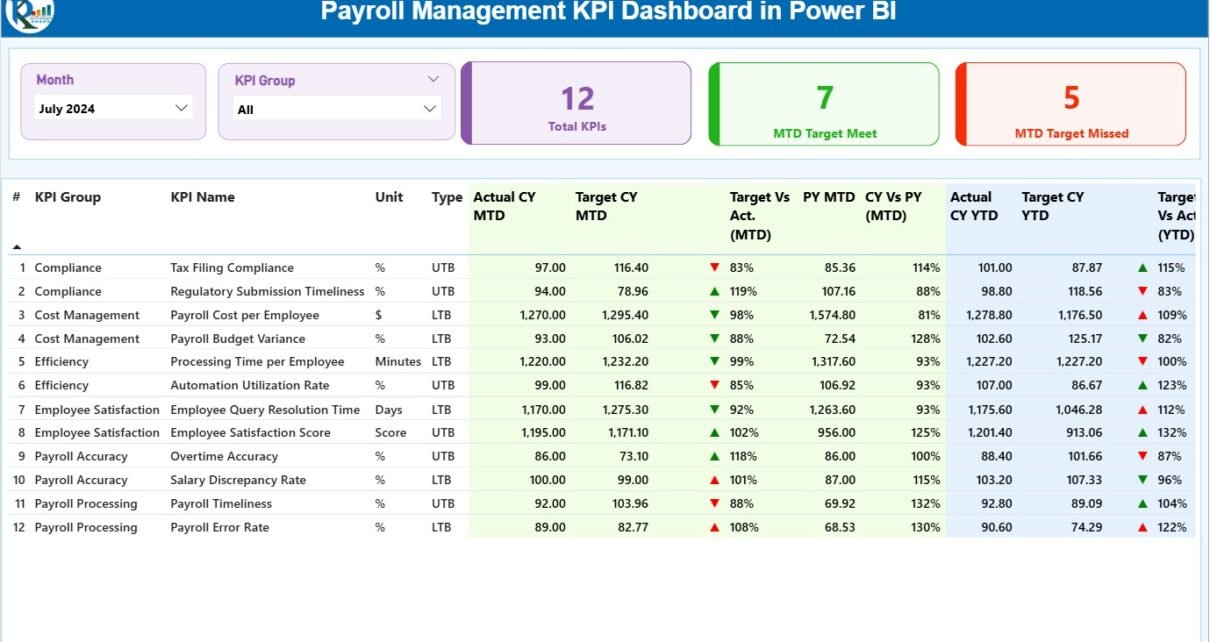
1️⃣ Summary Page (Main Dashboard)
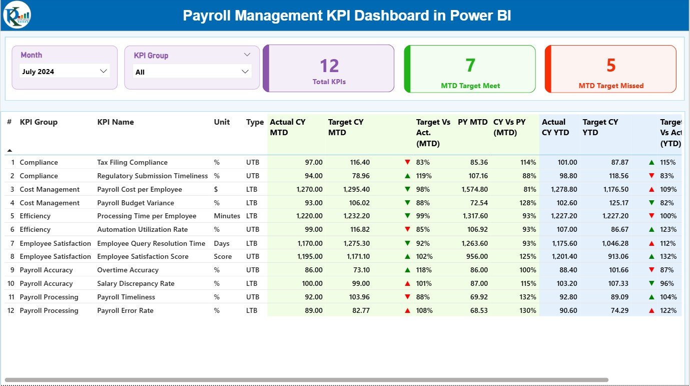
The Summary Page serves as the command center of your payroll analytics. It displays all major payroll KPIs along with visual indicators and performance comparisons.
🔍 Key Components:
-
Month and KPI Group Slicer: Quickly filter KPIs based on month or category.
-
Summary Cards:
-
Total KPIs Count
-
MTD Target Met Count
-
MTD Target Missed Count
-
2️⃣ KPI Trend Page
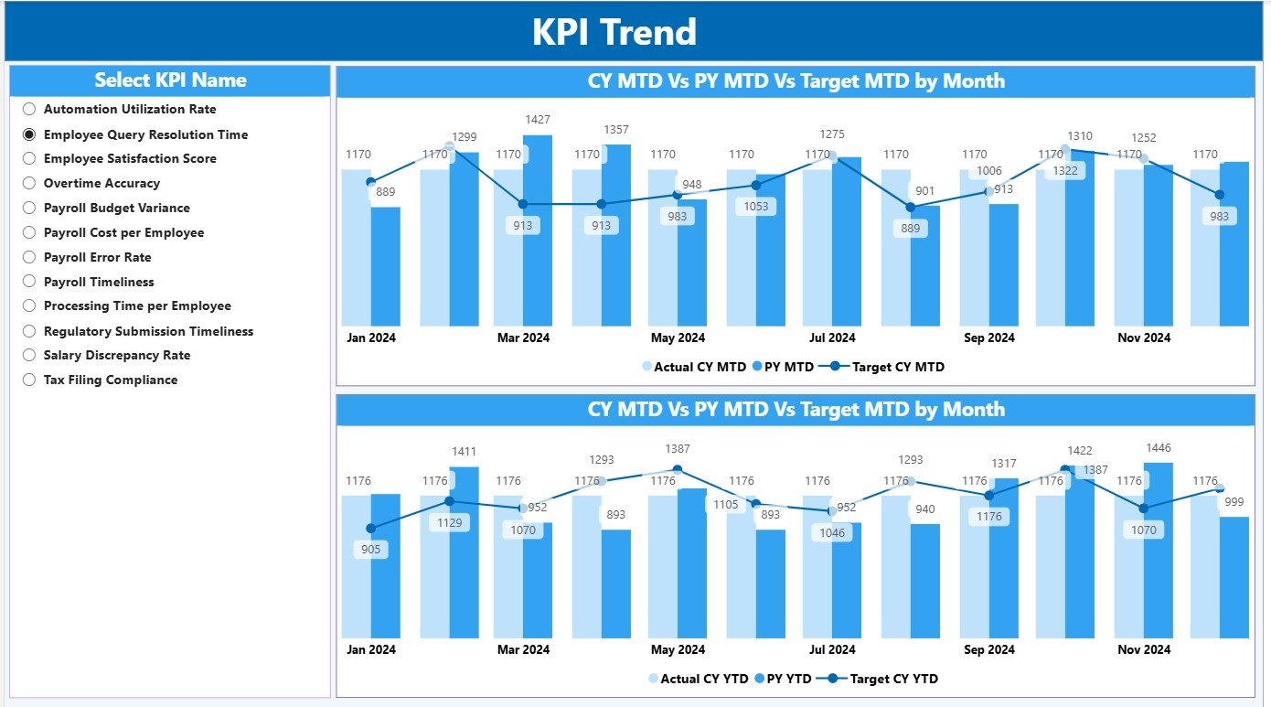
The KPI Trend Page focuses on performance visualization over time. You can select any KPI using the slicer and instantly view trend patterns for both MTD and YTD metrics.
📈 Visual Features:
-
Combo Charts: Display Current Year Actuals, Previous Year Actuals, and Targets together for easy comparison.
-
Interactive Slicer: Select a specific KPI to dynamically update both charts.
-
Performance Patterns: Identify rising or falling trends in payroll accuracy, disbursement speed, or cost control.
-
Insightful Color Themes: Power BI automatically highlights key variances for visual clarity.
This page is perfect for monthly reviews and management presentations.
Click to Purchases Payroll Management KPI Dashboard in Power BI
3️⃣ KPI Definition Page (Drill-Through)
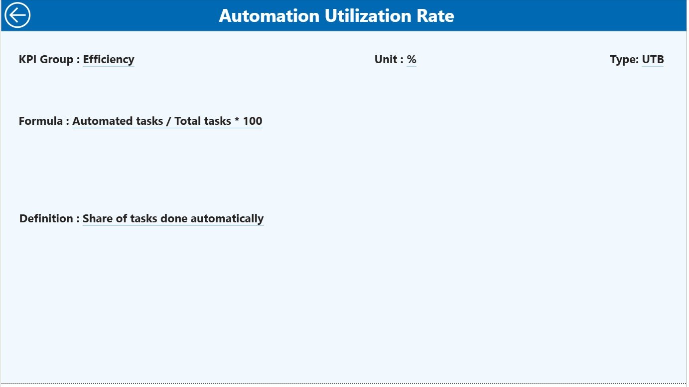
This page provides a detailed understanding of each KPI — how it’s calculated and why it matters.
📘 Page Highlights:
-
Formula and Definition: Explains exactly how each KPI is derived.
-
Drill-Through Capability: Access this page directly from the Summary Page by right-clicking on a KPI.
-
Navigation: Click the Back button (top-left corner) to return to the main dashboard.
This hidden yet essential page ensures transparency and consistency in performance tracking.
📂 Excel Data Source Integration
The Payroll Management KPI Dashboard in Power BI relies on Excel as its backend data source. The Excel file includes three worksheets, each serving a specific function.
1️⃣ Input_Actual Sheet
-
Record actual KPI values for each month.
-
Include KPI Name, Month (first day of the month), MTD, and YTD numbers.
-
Acts as the live data feed for Power BI visuals.
2️⃣ Input_Target Sheet
-
Capture monthly and yearly target values for each KPI.
-
Similar structure as the Actual sheet for seamless comparison.
3️⃣ KPI Definition Sheet
-
Define every KPI used in the dashboard.
-
Columns include KPI Number, Group, Name, Unit, Formula, Definition, and Type (LTB or UTB).
-
Ensures clarity for all stakeholders using the dashboard.
⚙️ How the Dashboard Works
The dashboard operates through seamless integration of Excel and Power BI. Here’s how it functions:
-
Data Entry in Excel: Input monthly Actual and Target data.
-
Automatic Refresh: Power BI imports data and updates all visuals automatically.
-
Visual Analysis: The Summary Page displays performance cards, tables, and icons.
-
Trend Monitoring: Use the KPI Trend Page to observe historical changes.
-
Deep Dive: Drill through to the KPI Definition Page for detailed insights.
Everything updates in real time with one click of the “Refresh” button — ensuring that HR and finance teams always work with the latest payroll data.
Click to Purchases Payroll Management KPI Dashboard in Power BI
🌟 Advantages of the Payroll Management KPI Dashboard in Power BI
1️⃣ Centralized Payroll Monitoring
Track all payroll performance indicators in one unified dashboard — no need for multiple reports.
2️⃣ Real-Time Performance Analysis
With Power BI’s live connections, you can instantly see how your payroll team is performing this month or year.
3️⃣ Visual Clarity
Color-coded icons, charts, and cards make performance evaluation simple and engaging.
4️⃣ Accuracy and Transparency
The dashboard eliminates manual errors and offers data consistency across months.
5️⃣ Data-Driven Decisions
Empower leadership with accurate insights on cost control, processing time, and payroll efficiency.
6️⃣ Improved Compliance
Track compliance KPIs and identify potential risks before they affect operations.
7️⃣ Easy Integration
Since it’s based on Excel and Power BI, it’s highly adaptable and requires no complex setup.
🚀 Opportunities for Improvement
To make the Payroll Management Dashboard even more powerful, consider the following enhancements:
-
Automate Data Refresh: Use Power BI Gateway for real-time sync from HRMS systems.
-
Integrate Power Automate: Send alerts or emails when KPIs fall below thresholds.
-
Add Predictive Analysis: Forecast payroll cost trends using Power BI AI visuals.
-
Include Departmental Filters: Analyze payroll performance per department or location.
-
Expand KPI Library: Add KPIs for employee benefits, taxation accuracy, or overtime management.
These improvements can elevate your payroll analytics to the next level.
💡 Best Practices for Using the Payroll Management Dashboard
Follow these tips to ensure accurate and effective payroll performance tracking:
-
Update Data Monthly: Keep actuals and targets fresh to maintain relevance.
-
Validate Data Consistency: Always double-check input values in Excel.
-
Use Clear KPI Definitions: Ensure all team members understand what each KPI means.
-
Monitor Trend Charts: Analyze both MTD and YTD performance regularly.
-
Customize Visuals: Tailor visuals to suit your company’s reporting style.
-
Back Up Your Files: Keep a backup of the Excel source monthly.
-
Review Results in Team Meetings: Use the dashboard in HR and finance review sessions.
-
Train Users: Educate payroll staff on dashboard navigation and KPI meaning.
🧮 Example Use Case: Payroll Efficiency Tracking
Let’s say your HR department processes payroll for 500 employees every month. Using the Payroll Management KPI Dashboard in Power BI, you can:
-
Measure payroll accuracy and detect calculation errors.
-
Track the time taken to process salaries each month.
-
Compare costs across months or departments.
-
Identify trends in employee payroll queries.
-
Ensure salaries are paid on time, every time.
In just a few clicks, the management team can review all key metrics and make data-backed improvements.
🏢 Who Can Use This Dashboard?
This Power BI dashboard benefits various professionals across HR and finance functions, including:
-
HR Managers
-
Payroll Specialists
-
Finance Controllers
-
Business Analysts
-
Operations Heads
-
Auditors and Compliance Officers
Regardless of company size, this dashboard ensures your payroll operations remain transparent, accurate, and efficient.
🏁 Conclusion
The Payroll Management KPI Dashboard in Power BI is more than just a visual report — it’s a strategic decision-making tool. By consolidating all payroll data in one place, it gives HR and finance teams complete visibility into payroll performance, accuracy, and compliance.
With this dashboard, you can reduce manual effort, minimize payroll errors, and improve employee satisfaction through timely and accurate salary disbursement. It’s an essential digital tool for any organization seeking to modernize its payroll process and ensure continuous operational improvement.
❓ Frequently Asked Questions (FAQs)
1️⃣ What is the main purpose of the Payroll Management Dashboard?
It helps HR and finance teams monitor payroll KPIs like accuracy, cost, and timeliness in one interactive Power BI interface.
2️⃣ How does this dashboard handle Actual vs Target data?
It compares Actual and Target values for both MTD and YTD periods and visually highlights performance gaps using color icons.
3️⃣ Can I use this dashboard with my existing Excel data?
Yes. Simply link your Excel sheets following the provided structure to refresh the Power BI visuals automatically.
4️⃣ What are LTB and UTB KPIs?
LTB means “Lower the Better” (e.g., Error Rate), while UTB means “Upper the Better” (e.g., Accuracy Rate).
5️⃣ Can I add new KPIs to this dashboard?
Absolutely. You can extend the KPI Definition Sheet and refresh Power BI to include additional KPIs.
6️⃣ Does this work with Power BI Service?
Yes, you can publish the dashboard to Power BI Service for cloud access and team sharing.
7️⃣ How often should I refresh the data?
Refreshing once a month is ideal, but with automation, you can schedule daily or weekly refreshes.
8️⃣ Is it suitable for small and medium-sized businesses?
Definitely. It’s scalable and cost-effective, perfect for companies of all sizes.
Click to Purchases Payroll Management KPI Dashboard in Power BI
Visit our YouTube channel to learn step-by-step video tutorials