Managing pension funds demands accuracy, transparency, and timely decision-making. However, traditional reports, scattered Excel files, and delayed insights often make pension fund monitoring difficult. Therefore, pension fund managers increasingly rely on analytical dashboards that turn complex financial data into actionable insights.
That is exactly where a Pension Fund KPI Dashboard in Power BI becomes a powerful solution.
In this comprehensive guide, you will clearly understand what a Pension Fund KPI Dashboard in Power BI is, how it works, why it is essential, and how each dashboard page supports confident decision-making. Moreover, you will also learn about advantages, best practices, Excel data structure, real-world use cases, and frequently asked questions—all explained in simple language.
Click to Purchases Pension Fund KPI Dashboard in Power BI
What Is a Pension Fund KPI Dashboard in Power BI?
A Pension Fund KPI Dashboard in Power BI is an interactive, visual performance-tracking solution designed to monitor and analyze key performance indicators related to pension fund operations.
Instead of working with static spreadsheets and manual calculations, this dashboard transforms raw pension data into meaningful visuals, indicators, and trends. As a result, pension fund managers can track performance, evaluate targets, measure year-over-year growth, and identify risks early.
Most importantly, Power BI allows users to filter data by month, KPI group, and KPI name, which improves clarity and speeds up analysis.
Why Do Pension Funds Need a KPI Dashboard?
Pension funds manage long-term financial commitments. Therefore, even small deviations in performance can create large impacts over time. Because of this, pension fund managers need real-time visibility into key metrics.
A Pension Fund KPI Dashboard in Power BI helps organizations:
-
Track fund performance consistently
-
Compare actual results with targets
-
Measure month-to-date (MTD) and year-to-date (YTD) trends
-
Evaluate current year versus previous year performance
-
Improve compliance and reporting accuracy
Moreover, interactive dashboards reduce dependency on manual reports and enhance strategic planning.
How Does a Pension Fund KPI Dashboard in Power BI Work?
This dashboard uses Excel as the data source and Power BI as the visualization layer.
First, users enter actual, target, and KPI definition data in Excel.
Next, Power BI connects to the Excel file and automatically calculates KPIs.
Finally, Power BI displays the results in a structured and interactive dashboard.
As a result, users save time, minimize errors, and gain instant insights.
What Pages Are Available in the Pension Fund KPI Dashboard in Power BI?
This ready-to-use dashboard includes three structured pages, each designed for a specific purpose.
Click to Purchases Pension Fund KPI Dashboard in Power BI
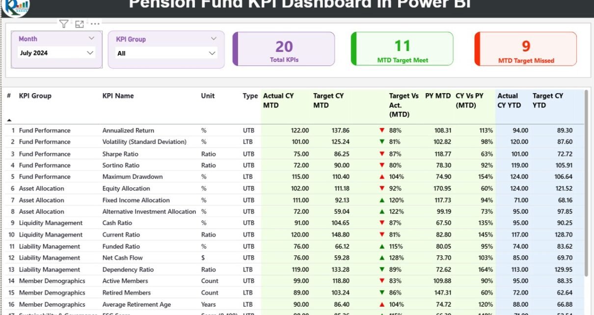
1. What Is Covered in the Summary Page?
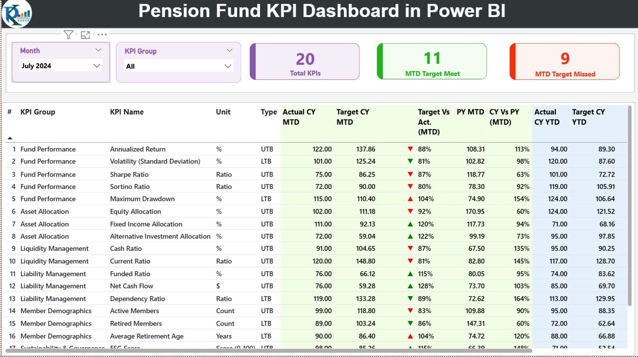
The Summary Page acts as the main control panel of the dashboard. It provides a complete overview of all pension KPIs at a glance.
Key Elements of the Summary Page
At the top of the page, users can find:
-
Month slicer for selecting the reporting month
-
KPI Group slicer for filtering KPIs by category
Below the slicers, three KPI cards display high-level performance:
-
Total KPI Count
-
MTD Target Met Count
-
MTD Target Missed Count
These cards instantly show how many KPIs meet or miss expectations.
What Details Appear in the KPI Table?
The detailed KPI table provides granular insights into each KPI.
The table includes the following columns:
-
KPI Number – Sequence number of the KPI
-
KPI Group – Category of the KPI
-
KPI Name – Name of the KPI
-
Unit – Unit of measurement
-
Type (LTB / UTB) – Indicates whether lower or higher values perform better
How Does MTD Performance Analysis Work?
The dashboard clearly tracks Month-to-Date (MTD) performance:
-
Actual CY MTD – Actual value for the current year
-
Target CY MTD – Target value for the current year
-
MTD Icon – Green ▲ or red ▼ to indicate performance status
-
Target vs Actual (MTD) – Actual divided by target
-
PY MTD – Previous year MTD value
-
CY vs PY (MTD) – Current year MTD compared with previous year
Therefore, managers can quickly identify underperforming KPIs.
How Does YTD Performance Analysis Help?
Similarly, the dashboard tracks Year-to-Date (YTD) performance:
-
Actual CY YTD
-
Target CY YTD
-
YTD Icon
-
Target vs Actual (YTD)
-
PY YTD
-
CY vs PY (YTD)
Consequently, users can evaluate long-term performance trends with confidence.
2. How Does the KPI Trend Page Help in Analysis?
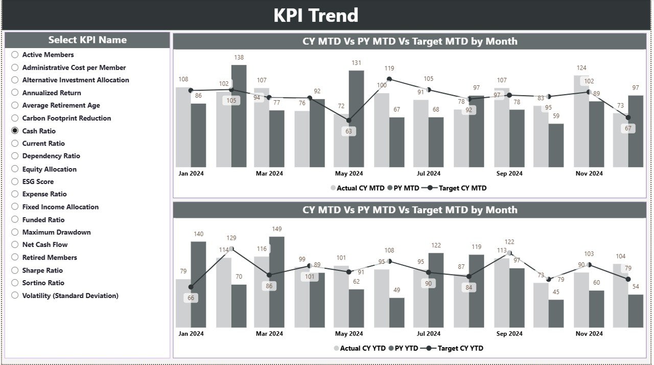
The KPI Trend Page focuses on historical and comparative analysis.
Key Features of the KPI Trend Page
-
Two combo charts display:
-
Current Year Actual
-
Previous Year Actual
-
Target Values
-
-
Separate charts for MTD and YTD performance
-
KPI Name slicer for selecting a specific KPI
Because of this structure, users can visually track growth patterns and identify deviations.
3. What Is the Purpose of the KPI Definition Page?
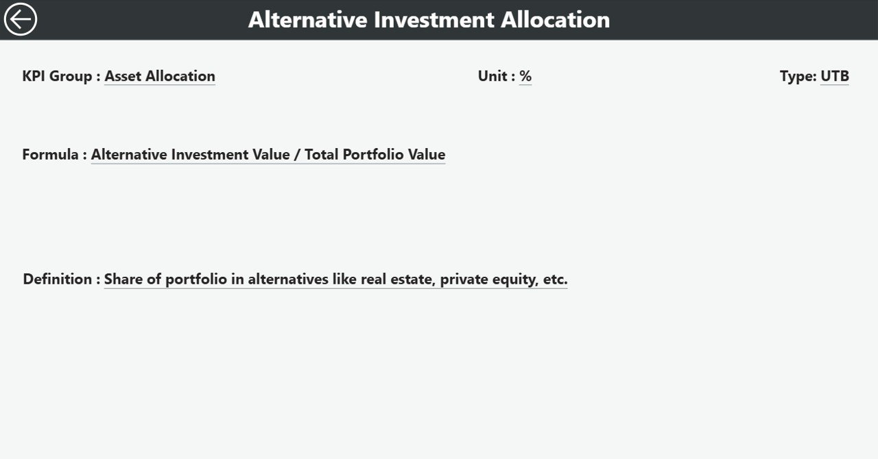
The KPI Definition Page provides contextual information about each KPI.
Key Highlights
-
Hidden drill-through page
-
Accessible directly from the Summary Page
-
Displays:
-
KPI Formula
-
KPI Definition
-
Unit and KPI type
-
Additionally, a back button allows users to return to the main page easily.
This page ensures transparency and consistency across stakeholders.
What Excel Data Is Required for the Pension Fund KPI Dashboard?
The dashboard uses an Excel file with three structured worksheets.
1. Input_Actual Sheet
This sheet captures actual KPI performance.
Required fields include:
-
KPI Name
-
Month (first date of the month)
-
MTD Actual Value
-
YTD Actual Value
Users must update this sheet monthly to refresh dashboard data.
Click to Purchases Pension Fund KPI Dashboard in Power BI
2. Input_Target Sheet
This sheet stores target values.
Fields include:
-
KPI Name
-
Month (first date of the month)
-
MTD Target
-
YTD Target
Separation of actual and target data ensures clean modeling.
3. KPI Definition Sheet
This sheet defines each KPI clearly.
Fields include:
-
KPI Number
-
KPI Group
-
KPI Name
-
Unit
-
Formula
-
Definition
-
Type (LTB or UTB)
As a result, all KPIs remain well-documented and standardized.
Advantages of Pension Fund KPI Dashboard in Power BI
Using a Pension Fund KPI Dashboard in Power BI offers several advantages.
1. Centralized Performance Monitoring
Managers can track all pension KPIs from one screen without switching files.
2. Faster Decision-Making
Because visuals update instantly, leaders can act quickly on risks and opportunities.
3. Improved Accuracy
Automated calculations reduce manual errors and inconsistencies.
4. Clear Target Tracking
MTD and YTD icons instantly highlight underperforming KPIs.
5. Better Transparency
Clear KPI definitions ensure everyone understands performance metrics.
Who Can Use a Pension Fund KPI Dashboard?
This dashboard benefits multiple stakeholders:
-
Pension fund managers
-
Investment analysts
-
Finance teams
-
Risk management teams
-
Compliance officers
-
Trustees and board members
Because Power BI supports secure sharing, teams can collaborate efficiently.
Best Practices for the Pension Fund KPI Dashboard in Power BI
Follow these best practices to maximize dashboard value.
1. Maintain Clean Excel Data
Use consistent KPI names and standardized units across sheets.
2. Update Data Regularly
Always update actual and target data at month-end.
3. Limit Manual Overrides
Avoid manual editing in Power BI visuals to maintain data accuracy.
4. Review KPIs Periodically
Evaluate KPIs annually to ensure relevance.
5. Use Drill-Through Smartly
Encourage users to explore KPI definitions for better understanding.
Common Challenges and How to Overcome Them
Data Inconsistency
Solution: Apply data validation rules in Excel.
KPI Confusion
Solution: Maintain clear KPI definitions.
Delayed Updates
Solution: Assign ownership for monthly data updates.
How Does This Dashboard Improve Pension Fund Governance?
Because the dashboard improves transparency, accuracy, and accountability, it strengthens governance practices.
Boards gain clearer insights, auditors access structured data, and regulators receive consistent reports.
As a result, pension funds operate with greater confidence and compliance.
Conclusion: Why Choose a Pension Fund KPI Dashboard in Power BI?
A Pension Fund KPI Dashboard in Power BI transforms pension fund management from reactive reporting to proactive performance monitoring.
By combining structured Excel data with interactive Power BI visuals, this dashboard delivers clarity, accuracy, and strategic insight. Moreover, its ready-to-use design reduces implementation time while supporting long-term financial planning.
For pension fund managers who value precision, compliance, and data-driven decisions, this dashboard serves as an essential analytical tool.
Frequently Asked Questions (FAQs)
1. What is a Pension Fund KPI Dashboard in Power BI used for?
It helps track pension fund KPIs, compare actuals against targets, and monitor MTD and YTD performance.
2. Does this dashboard require advanced Power BI knowledge?
No. Basic Power BI filtering knowledge is sufficient.
3. Can I customize KPIs in the dashboard?
Yes. You can add or modify KPIs by updating the Excel data source.
4. Is Excel mandatory for data input?
Yes. The dashboard uses Excel as its primary data source.
5. How often should data be updated?
You should update data monthly for accurate insights.
6. Can this dashboard support multiple pension schemes?
Yes. You can extend KPI groups to include multiple schemes.
Visit our YouTube channel to learn step-by-step video tutorials