ReligiousPilgrimage Tourism KPI Dashboard to grow across the world. Every year, millions of devotees visit sacred places for faith, culture, and spiritual connection. However, managing pilgrimage tourism requires strong planning, real-time monitoring, and smart decision-making. Without proper tracking, authorities struggle with overcrowding, revenue leakage, poor service quality, and operational delays.
That is exactly where a Pilgrimage Tourism KPI Dashboard in Power BI becomes essential.
Instead of depending on scattered Excel files and manual reports, tourism boards and temple authorities can monitor performance through one interactive dashboard. As a result, decision-makers gain instant clarity on visitor trends, revenue performance, service quality, and operational efficiency.
In this complete guide, you will learn:
Click to Purchases Pilgrimage Tourism KPI Dashboard in Power BI
-
What a Pilgrimage Tourism KPI Dashboard in Power BI is
-
How it works
-
Dashboard pages and features
-
Key KPIs you should track
-
Advantages of using this dashboard
-
Best practices for implementation
-
Frequently asked questions
Let’s begin.
What Is a Pilgrimage Tourism KPI Dashboard in Power BI?
A Pilgrimage Tourism KPI Dashboard in Power BI is an interactive analytics solution designed to monitor and analyze tourism performance related to religious destinations.
Instead of reviewing long spreadsheets, users can:
-
Track total KPIs and performance status
-
Monitor Month-to-Date (MTD) and Year-to-Date (YTD) numbers
-
Compare current year performance with previous year
-
Identify target achievement gaps
-
Analyze trends over time
Because the dashboard connects to structured Excel data, it allows easy updates. Therefore, authorities can simply update the Excel sheets, and the Power BI dashboard refreshes automatically.
Why Does Pilgrimage Tourism Need a KPI Dashboard?
Pilgrimage destinations face unique challenges. For example:
-
Seasonal crowd surges
-
Security concerns
-
Infrastructure stress
-
Donation and revenue tracking
-
Accommodation management
-
Volunteer coordination
Although many organizations track numbers manually, manual tracking often leads to errors and delays. On the other hand, a KPI dashboard provides instant clarity.
Consequently, decision-makers can:
-
Predict crowd patterns
-
Improve service quality
-
Optimize staff allocation
-
Increase revenue transparency
-
Enhance visitor satisfaction
Key Features of Pilgrimage Tourism KPI Dashboard in Power BI
This ready-to-use dashboard contains 3 powerful pages inside the Power BI Desktop file.
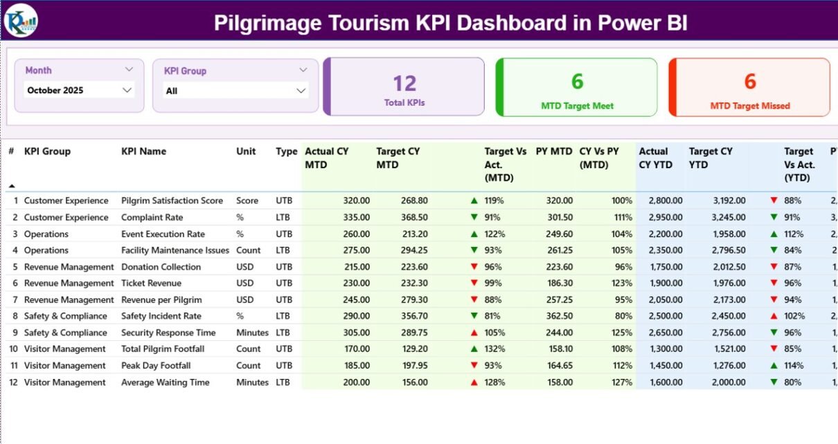
1️⃣ Summary Page – How Does It Provide Complete Performance Visibility?

The Summary Page acts as the central control room.
🔹 Top Slicers
-
Month slicer
-
KPI Group slicer
These slicers allow users to filter data instantly.
🔹 KPI Cards
At the top, three powerful cards show:
-
Total KPIs Count
-
MTD Target Meet Count
-
MTD Target Missed Count
Therefore, users quickly understand overall performance status.
🔹 Detailed KPI Performance Table
The table includes the following fields:
-
KPI Number – Unique sequence number
-
KPI Group – Category of KPI
-
KPI Name – Name of performance indicator
-
Unit – Measurement unit
-
Type – LTB (Lower the Better) or UTB (Upper the Better)
🔹 MTD Analysis Section
-
Actual CY MTD – Current Year Month-to-Date value
-
Target CY MTD – Target for the month
-
MTD Icon – ▲ Green or ▼ Red indicator
-
Target Vs Act. (MTD) – Actual / Target %
-
PY MTD – Previous Year MTD
-
CY Vs PY (MTD) – CY MTD / PY MTD %
Because visual indicators show performance instantly, managers do not waste time analyzing raw numbers.
🔹 YTD Analysis Section
-
Actual CY YTD
-
Target CY YTD
-
YTD Icon
-
Target Vs Act. (YTD)
-
PY YTD
-
CY Vs PY (YTD)
Thus, leaders can compare long-term progress and adjust strategy quickly.
2️⃣ KPI Trend Page – How Can You Analyze Performance Over Time?
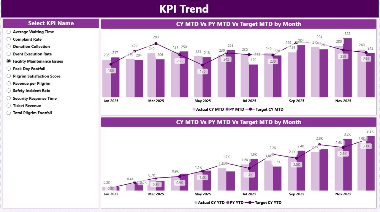
This page focuses on trends.
🔹 Features:
-
Two Combo Charts
-
Current Year vs Previous Year comparison
-
Target tracking
-
Separate MTD and YTD visuals
-
KPI Name slicer
When users select a KPI, the dashboard updates instantly. Therefore, trend analysis becomes simple and effective.
As a result, planners can identify:
-
Seasonal visitor growth
-
Donation fluctuations
-
Infrastructure demand changes
-
Festival-related spikes
-
Click to Purchases Pilgrimage Tourism KPI Dashboard in Power BI
3️⃣ KPI Definition Page – Why Is Documentation Important?

This hidden drill-through page stores KPI logic.
From the Summary page, users can drill through to see:
-
KPI Formula
-
KPI Definition
-
KPI Group
-
KPI Type
Because transparency improves accountability, teams clearly understand how each KPI is calculated.
To return to the main page, users simply click the back button at the top left corner.
Excel Data Structure – How Does the Backend Work?
The dashboard uses an Excel file as the data source. You need to fill three worksheets.
1️⃣ Input_Actual Sheet
Fill the following columns:
-
KPI Name
-
Month (First date of month)
-
MTD Number
-
YTD Number
2️⃣ Input_Target Sheet
Fill:
-
KPI Name
-
Month
-
MTD Target
-
YTD Target
3️⃣ KPI Definition Sheet
Fill:
-
KPI Number
-
KPI Group
-
KPI Name
-
Unit
-
Formula
-
Definition
-
Type (LTB or UTB)
Because this structure remains simple, even non-technical users can manage it easily.
What KPIs Should You Track in Pilgrimage Tourism?
Click to Purchases Pilgrimage Tourism KPI Dashboard in Power BI
To maximize value, consider tracking:
Visitor Management KPIs
-
Total Visitors
-
Peak Day Footfall
-
Average Stay Duration
-
Online Booking Rate
Revenue KPIs
-
Donation Revenue
-
Ticket Revenue
-
Accommodation Revenue
-
Revenue Growth %
Service Quality KPIs
-
Cleanliness Score
-
Complaint Resolution Time
-
Volunteer Response Time
Operational KPIs
-
Security Incidents
-
Queue Waiting Time
-
Transportation Efficiency
Tracking these KPIs ensures balanced growth.
Advantages of Pilgrimage Tourism KPI Dashboard in Power BI
Using this dashboard provides significant benefits.
1️⃣ Real-Time Visibility
Because the dashboard updates instantly, leaders make faster decisions.
2️⃣ Target Monitoring
Icons and percentage calculations clearly show performance gaps.
3️⃣ Year-over-Year Comparison
CY vs PY metrics highlight growth patterns.
4️⃣ Improved Transparency
Clear formulas and definitions increase trust.
5️⃣ Better Resource Planning
Trend analysis supports manpower and infrastructure allocation.
6️⃣ Reduced Manual Errors
Automated calculations eliminate spreadsheet mistakes.
7️⃣ Faster Reporting
Instead of building reports manually, teams generate insights in seconds.
Best Practices for the Pilgrimage Tourism KPI Dashboard
To get maximum value, follow these best practices.
✔️ Define KPIs Clearly
First, align KPIs with strategic goals. Avoid tracking unnecessary metrics.
✔️ Keep Data Updated Monthly
Update Excel sheets consistently. Otherwise, reports may become outdated.
✔️ Use LTB and UTB Correctly
For example:
-
Lower queue time = LTB
-
Higher visitor satisfaction = UTB
Clear classification ensures correct icon logic.
✔️ Review Trends Regularly
Monthly review meetings help improve strategy.
✔️ Train Staff Properly
Although Power BI remains user-friendly, training improves adoption.
✔️ Secure Data Access
Because pilgrimage data can include financial details, apply proper access control.
How Does This Dashboard Improve Decision-Making?
Click to Purchases Pilgrimage Tourism KPI Dashboard in Power BI
When authorities rely on intuition, mistakes happen. However, when they use data:
-
They predict peak seasons
-
They optimize transport
-
They improve accommodation management
-
They reduce waiting times
-
They increase donation transparency
Therefore, data-driven governance becomes practical and efficient.
Who Can Use This Dashboard?
This solution works perfectly for:
-
Temple Trust Boards
-
Religious Tourism Departments
-
Pilgrimage Event Organizers
-
Government Tourism Authorities
-
Shrine Management Committees
Because the structure remains flexible, organizations can customize it easily.
How to Implement the Pilgrimage Tourism KPI Dashboard?
Follow these steps:
-
Define KPIs
-
Prepare Excel data
-
Fill Input_Actual and Input_Target sheets
-
Update KPI Definition sheet
-
Connect Excel to Power BI
-
Refresh the dashboard
-
Share reports with stakeholders
Within a short time, your organization will shift from reactive management to proactive planning.
Conclusion
Pilgrimage tourism continues to grow rapidly. Therefore, organizations must manage operations smartly. Manual tracking no longer supports large-scale visitor management.
The Pilgrimage Tourism KPI Dashboard in Power BI transforms raw data into actionable insights. It helps leaders monitor performance, compare trends, evaluate targets, and improve services.
Because the dashboard connects to a simple Excel backend, implementation remains easy. Moreover, visual indicators, slicers, and trend charts make analysis intuitive.
If you want to improve governance, enhance visitor experience, and increase operational efficiency, this dashboard offers the perfect solution.
Frequently Asked Questions (FAQs)
1️⃣ What is the main purpose of this dashboard?
It helps pilgrimage tourism authorities monitor KPIs, track targets, and analyze trends in real time.
2️⃣ Do I need advanced Power BI knowledge to use it?
No. You only need to update the Excel sheets. The dashboard calculates everything automatically.
3️⃣ What does LTB and UTB mean?
LTB means Lower the Better. UTB means Upper the Better.
4️⃣ Can I add more KPIs?
Yes. You can add new KPIs in the KPI Definition sheet and update Excel data accordingly.
5️⃣ How often should I update the data?
You should update it monthly for accurate MTD and YTD tracking.
6️⃣ Can this dashboard support multiple pilgrimage sites?
Yes. You can add location-level KPIs and filter using slicers.
Visit our YouTube channel to learn step-by-step video tutorials