Pop-up stores have become a powerful retail strategy for brands that want flexibility, fast market entry, and high customer engagement. However, because pop-up stores operate for a limited time, performance tracking becomes even more critical. Pop-up Stores Dashboard in Power BI Without real-time insights, brands risk overspending, missing revenue opportunities, and losing valuable learnings.
Pop-up Stores Dashboard in Power BIThat is exactly why a Pop-up Stores Dashboard in Power BI becomes an essential analytics solution.
Pop-up Stores Dashboard in Power BI In this detailed article, you will learn what a Pop-up Stores Dashboard in Power BI is, why it matters, how it works, page-wise dashboard structure, key metrics, advantages, best practices, and frequently asked questions. Moreover, the language stays simple and practical so marketing teams, retail managers, and analysts can apply it easily.
Click to Purchases Pop-up Stores Dashboard in Power BI
What Is a Pop-up Stores Dashboard in Power BI?
A Pop-up Stores Dashboard in Power BI is an interactive analytics dashboard designed to monitor the financial, operational, and performance metrics of temporary retail stores. Instead of relying on manual spreadsheets or static reports, this dashboard provides real-time visual insights in one centralized view.
This dashboard uses Power BI Desktop for visualization and analytics. As a result, businesses can track cost, sales, profit, conversion rate, staff usage, and store duration efficiently.
Most importantly, this dashboard helps brands evaluate whether pop-up stores deliver the expected return on investment.
Why Do Businesses Need a Pop-up Stores Dashboard?
Pop-up stores operate under tight timelines and budgets. Therefore, delayed or inaccurate reporting can quickly lead to losses.
A Pop-up Stores Dashboard in Power BI helps because it:
-
Tracks cost, sales, and profit in real time
-
Measures conversion and staff efficiency
-
Compares performance across cities, categories, and promotion types
-
Identifies successful pop-up strategies quickly
-
Supports data-driven retail decisions
As a result, brands gain clarity, control, and confidence.
How Does the Pop-up Stores Dashboard in Power BI Work?
This dashboard follows a simple and structured analytics flow:
-
Data flows into Power BI from connected sources
-
Power BI models and visualizes the data
-
Users interact using slicers and charts
Because of this structure, decision-makers can analyze performance instantly without technical complexity.
Click to Purchases Pop-up Stores Dashboard in Power BI
What Are the Pages in the Pop-up Stores Dashboard in Power BI?
This dashboard contains five well-designed pages, each focusing on a different analysis angle.
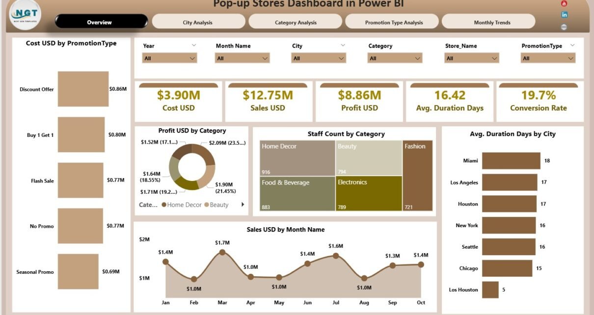
What Does the Overview Page Show?
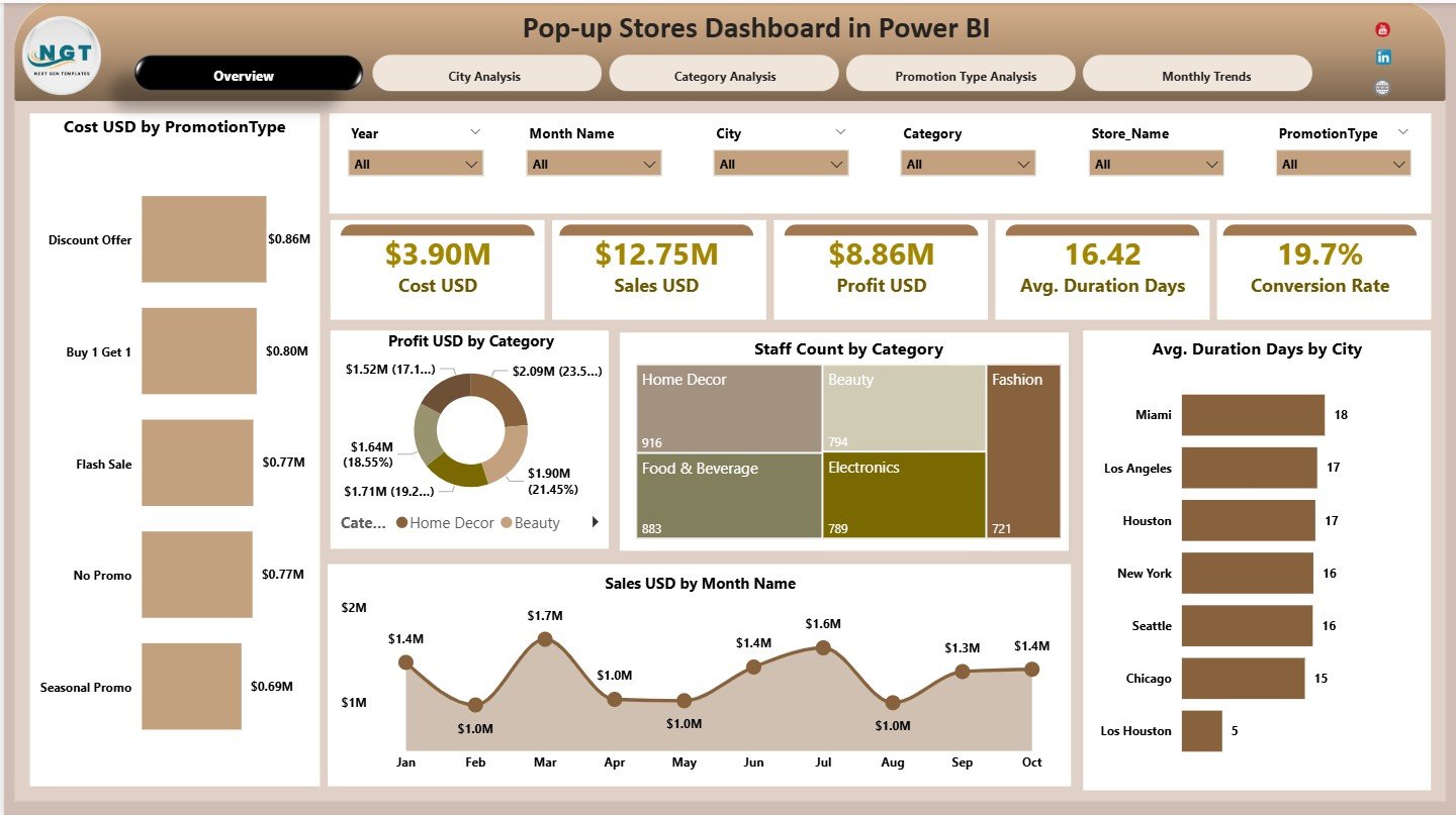
The Overview Page acts as the main control center of the dashboard.
What KPI Cards Are Displayed on the Overview Page?
At the top of the page, the dashboard displays five KPI cards:
-
Cost USD – Total cost of running pop-up stores
-
Sales USD – Total revenue generated
-
Profit USD – Net profit after costs
-
Average Duration (Days) – Average store duration
-
Conversion Rate – Percentage of visitors converted to customers
These cards provide a quick performance snapshot. Therefore, stakeholders can instantly understand overall results.
What Charts Are Included on the Overview Page?
The Overview Page includes five visual charts:
-
Cost USD by Promotion Type
-
Profit USD by Category
-
Staff Count by Category
-
Average Duration (Days) by City
-
Sales USD by Month
Together, these charts highlight cost efficiency, profitability, staffing needs, and seasonal trends.
What Is the City Analysis Page Used For?
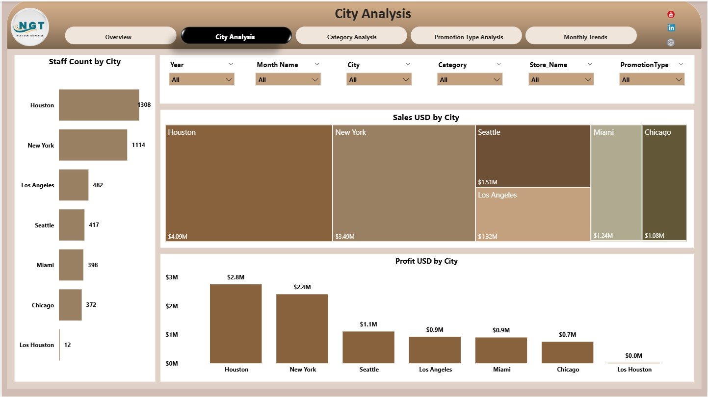
The City Analysis Page focuses on location-based performance.
What Charts Are Available on the City Analysis Page?
This page includes three charts:
-
Staff Count by City
-
Sales USD by City
-
Profit USD by City
Because of this view, users can quickly identify high-performing and underperforming cities.
Why Is City-Wise Analysis Important for Pop-up Stores?
City-wise analysis helps businesses:
-
Identify profitable locations
-
Optimize staffing by city
-
Allocate budgets more effectively
-
Select future pop-up locations
As a result, expansion decisions become data-driven.
Click to Purchases Pop-up Stores Dashboard in Power BI
What Insights Does the Category Analysis Page Provide?
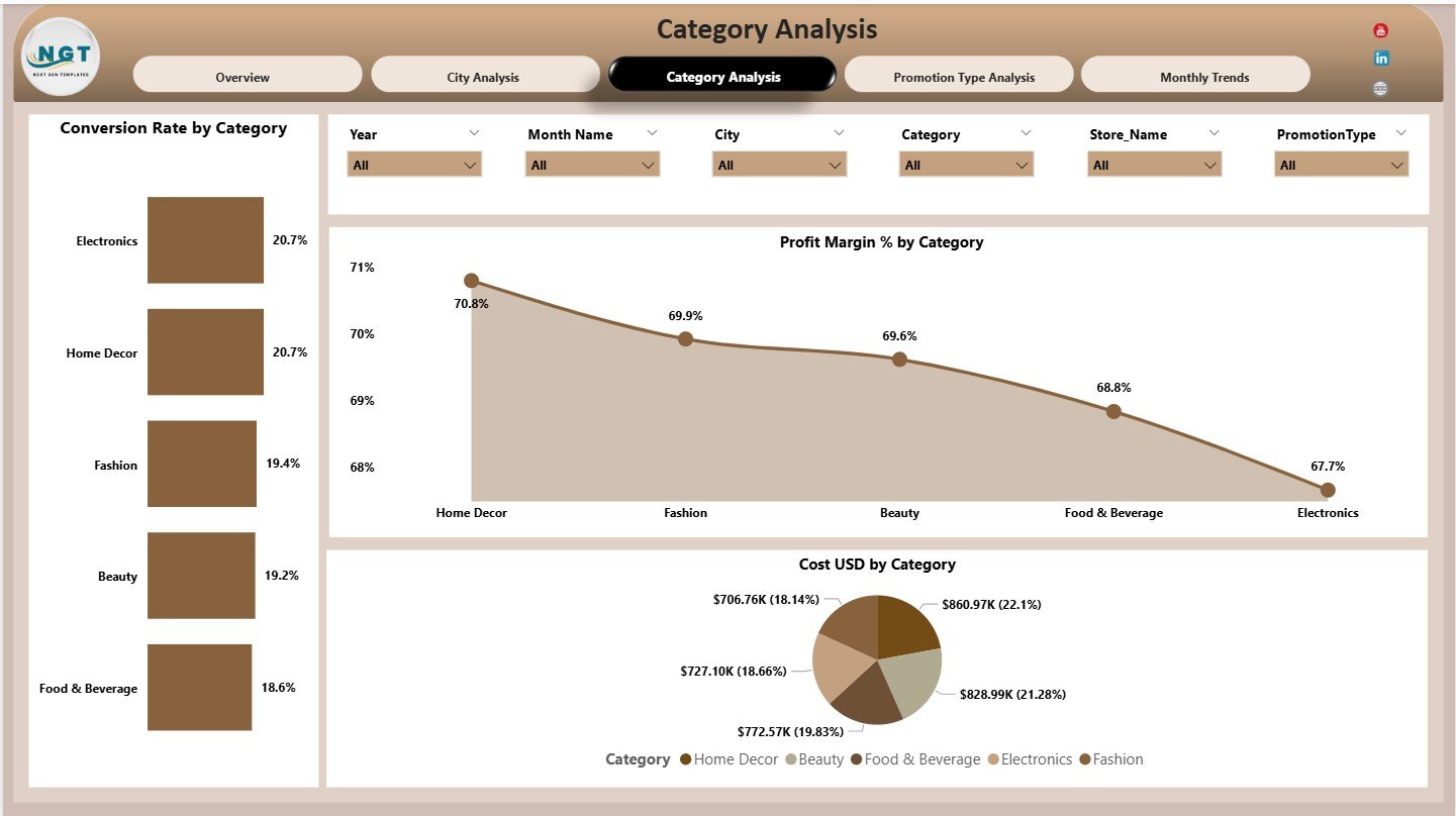
The Category Analysis Page focuses on product or business categories.
What Charts Are Included on the Category Analysis Page?
This page displays three charts:
-
Conversion Rate by Category
-
Profit Margin % by Category
-
Cost USD by Category
These visuals help brands understand which categories perform best during pop-up events.
How Does Category Analysis Improve Decision-Making?
Category analysis allows teams to:
-
Focus on high-margin categories
-
Reduce spending on low-performing categories
-
Improve product mix strategy
Therefore, pop-up stores become more profitable.
What Is the Promotion Type Analysis Page?
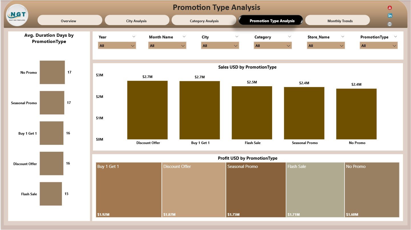
The Promotion Type Analysis Page evaluates the effectiveness of different promotional strategies.
What Charts Are Shown on the Promotion Type Analysis Page?
This page includes three charts:
-
Average Duration (Days) by Promotion Type
-
Sales USD by Promotion Type
-
Profit USD by Promotion Type
These insights help teams measure which promotions deliver better engagement and revenue.
Why Is Promotion Type Analysis Valuable?
Promotion analysis helps businesses:
-
Select the most effective promotions
-
Optimize campaign duration
-
Improve return on promotional spend
As a result, marketing strategies become more efficient.
Click to Purchases Pop-up Stores Dashboard in Power BI
What Does the Monthly Trends Page Show?
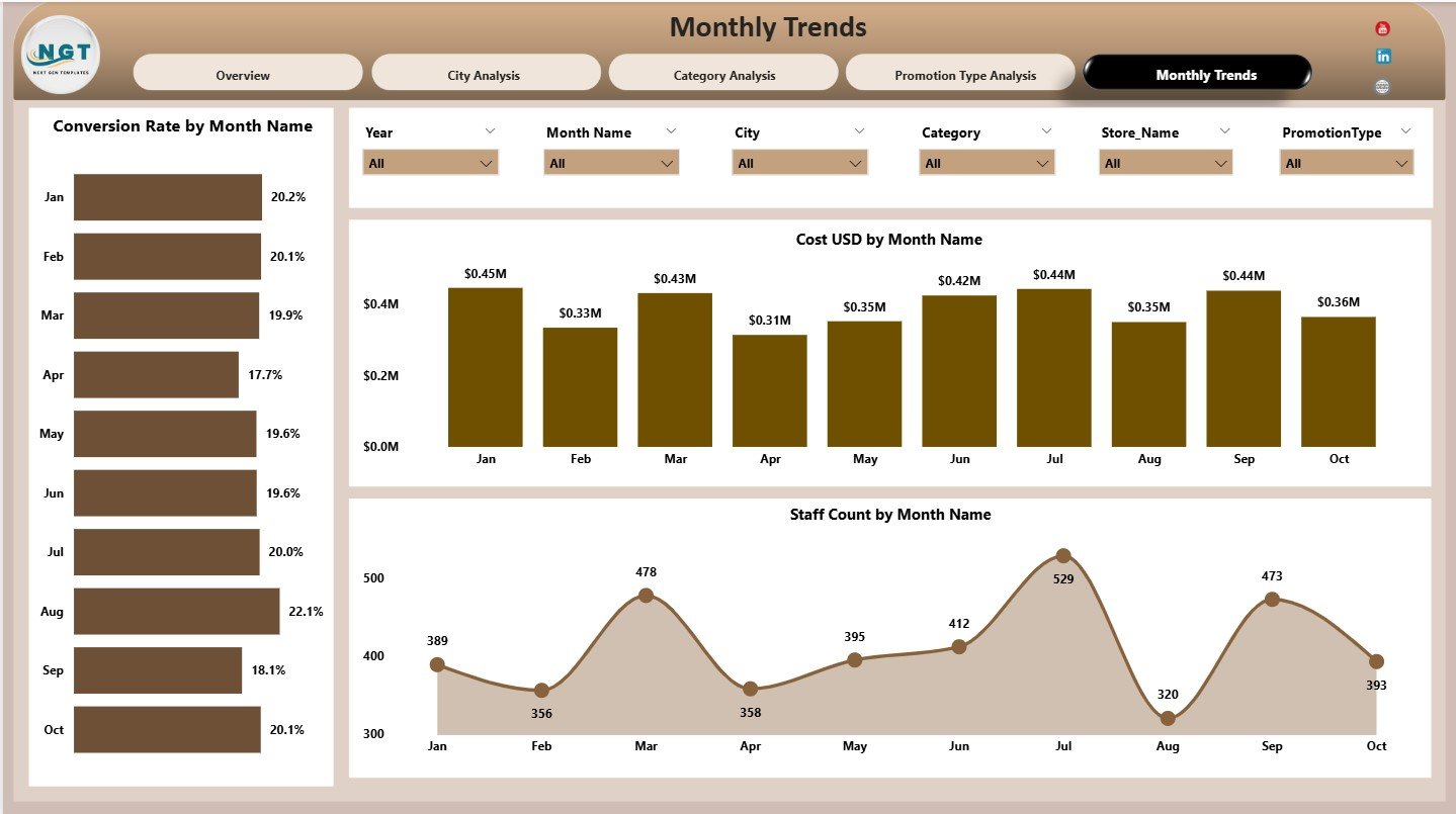
The Monthly Trends Page highlights time-based performance patterns.
What Charts Are Available on the Monthly Trends Page?
This page includes three charts:
-
Conversion Rate by Month
-
Cost USD by Month
-
Staff Count by Month
These charts reveal seasonality, staffing trends, and cost patterns across months.
How Do Monthly Trends Help Retail Planning?
Monthly trends help teams:
-
Prepare for peak months
-
Optimize staffing schedules
-
Control costs during low seasons
Therefore, operational planning becomes more accurate.
Click to Purchases Pop-up Stores Dashboard in Power BI
Advantages of Pop-up Stores Dashboard in Power BI
Using a Pop-up Stores Dashboard in Power BI offers several business advantages.
Centralized Performance Visibility
All key metrics remain available in one dashboard.
Faster Retail Decisions
Interactive visuals eliminate reporting delays.
Improved Cost Control
Cost analysis by category, city, and promotion type improves budgeting.
Better Profitability Insights
Profit and margin analysis highlights successful strategies.
Scalable and Flexible Design
Users can easily extend the dashboard for new stores or metrics.
Best Practices for the Pop-up Stores Dashboard in Power BI
Follow these best practices to maximize dashboard value.
Define Metrics Clearly
Always standardize definitions for cost, sales, and conversion rate.
Review Performance Frequently
Daily or weekly reviews help detect issues early.
Use Slicers Effectively
Filter data by city, category, and promotion type for focused analysis.
Compare Across Dimensions
Always analyze performance across time, city, and promotion type.
Train Stakeholders
Ensure teams understand how to interpret dashboard insights.
Click to Purchases Pop-up Stores Dashboard in Power BI
Who Should Use a Pop-up Stores Dashboard in Power BI?
This dashboard benefits:
-
Retail Managers
-
Marketing Teams
-
Brand Managers
-
Operations Teams
-
Business Analysts
-
Senior Leadership
Both small brands and large retail chains can use it effectively.
How Does This Dashboard Improve Pop-up Store Success?
This dashboard converts raw data into actionable insights. As a result:
-
Brands identify profitable strategies faster
-
Teams control costs more effectively
-
Customer conversion improves
-
Expansion decisions become smarter
Over time, these insights lead to higher ROI from pop-up stores.
Conclusion: Why Choose a Pop-up Stores Dashboard in Power BI?
A Pop-up Stores Dashboard in Power BI provides a powerful, visual, and data-driven way to evaluate temporary retail performance. It combines financial, operational, and behavioral metrics into one easy-to-use dashboard.
For brands that rely on agility and fast insights, this dashboard becomes an essential decision-support tool.
Frequently Asked Questions (FAQs)
What is a Pop-up Stores Dashboard in Power BI?
It is a Power BI dashboard that tracks performance metrics of pop-up retail stores.
Can this dashboard track multiple cities?
Yes. The dashboard supports detailed city-wise analysis.
Does it measure conversion rate?
Yes. Conversion rate appears as a KPI card and trend chart.
Can marketing teams use this dashboard?
Yes. Marketing teams can analyze promotion and category performance easily.
Is this dashboard suitable for short-term retail campaigns?
Yes. It is designed specifically for temporary and pop-up store analysis.
Can this dashboard scale for multiple brands?
Yes. The structure supports easy scalability.
Click to Purchases Pop-up Stores Dashboard in Power BI
Visit our YouTube channel to learn step-by-step video tutorials