Ports and harbors operate in a highly demanding environment where efficiency, safety, compliance, and operational excellence matter every single day. Cargo movements, vessel scheduling, dock operations, turnaround time, and resource allocation change frequently. Because of this constant activity, port authorities and harbor management teams need a simple, clear, and effective way to monitor daily, monthly, and yearly performance.
A Ports and Harbors KPI Dashboard in Excel offers a complete solution. It helps teams track performance, improve decision-making, and monitor key indicators without switching between tools. Excel makes the dashboard easy to update, simple to customize, and reliable for daily operations.
This article explains everything about the Ports and Harbors KPI Dashboard in Excel. You will learn how it works, how each sheet provides insights, and how this dashboard strengthens port performance. You will also understand its advantages, best practices, and common questions so you get maximum value from this KPI tool.
Click to Purchases Ports and Harbors KPI Dashboard in Excel
What Is a Ports and Harbors KPI Dashboard in Excel?
A Ports and Harbors KPI Dashboard in Excel is a ready-to-use performance tracking tool designed for maritime authorities, shipping terminals, port operators, logistics managers, and harbor administrations. It captures essential KPIs related to vessel operations, cargo handling, berth utilization, safety, inspection activities, workforce efficiency, and financial performance.
Since this dashboard runs in Excel, teams track MTD, YTD, and PY numbers with visual clarity. The dashboard includes interactive controls, conditional formatting, trend charts, drop-down selectors, and a structured data input system. Because of these features, it becomes extremely easy to maintain performance visibility across multiple departments.
The dashboard includes seven well-organized worksheets:
-
Home Sheet
-
Dashboard Sheet
-
KPI Trend Sheet
-
Actual Numbers Input Sheet
-
Target Sheet
-
Previous Year Sheet
-
KPI Definition Sheet
Each page supports a unique function, but together they create a full analytical system.
Click to Purchases Ports and Harbors KPI Dashboard in Excel
Why Do Ports and Harbors Need a KPI Dashboard?
Ports and harbors handle huge workloads. Teams deal with unpredictable tides, vessel delays, customs checks, hazardous materials, and weather-related challenges. Because of these constant changes, port management must track key metrics in real time.
A KPI dashboard solves this problem by:
-
Bringing all relevant KPIs into one place
-
Showing clear comparisons
-
Highlighting operational gaps
-
Supporting planning, budgeting, and forecasting
-
Improving coordination between departments
When leaders use this dashboard, they make faster decisions, reduce operational downtime, and increase overall efficiency.
Key Features of the Ports and Harbors KPI Dashboard in Excel
Your provided content explains the structure of this dashboard clearly. Here is an enhanced and SEO-optimized explanation for each worksheet.
1. Home Sheet of the Ports and Harbors KPI Dashboard

The Home Sheet acts as the index page of the dashboard. It includes six buttons, and each button takes the user to the correct worksheet.
Since this is the first sheet that users see, it works as a navigation hub. Users avoid scrolling and move across dashboards quickly. This design improves workflow efficiency and helps even new users understand how to use the file.
Click to Purchases Ports and Harbors KPI Dashboard in Excel
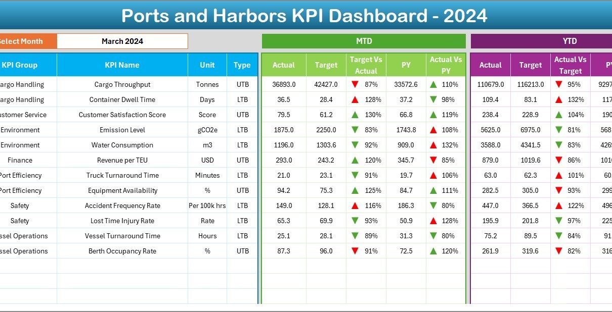
2. Dashboard Sheet of the Ports and Harbors KPI Dashboard

The Dashboard Sheet is the main analysis page. It displays all KPIs in a clear layout. At the top, in cell D3, the user selects the Month from a drop-down list. As soon as the user chooses a month, the entire dashboard updates instantly.
This sheet shows:
-
MTD Actual
-
MTD Target
-
MTD Previous Year
-
MTD Target vs Actual %
-
MTD PY vs Actual %
-
YTD Actual
-
YTD Target
-
YTD Previous Year
-
YTD Target vs Actual %
-
YTD PY vs Actual %
Each metric uses conditional formatting with up/down arrows. Green arrows show improvement; red arrows indicate areas that need attention. Because of this visual feedback, port authorities identify delays, inefficiencies, and performance gaps immediately.
This sheet becomes essential during:
-
Performance review meetings
-
Monthly operational analysis
-
Cargo traffic planning
-
Vessel turnaround time evaluation
-
Workforce productivity reviews
Since the dashboard displays values with color-coded indicators, users interpret the results quickly without reading long reports.
Click to Purchases Ports and Harbors KPI Dashboard in Excel
3. KPI Trend Sheet

The KPI Trend Sheet takes the analysis one step further. Users select a KPI using the drop-down in cell C3, and the sheet displays:
-
KPI Group
-
KPI Unit
-
KPI Type (LTB or UTB)
-
KPI Formula
-
KPI Definition
This information helps users understand what the KPI means and why it matters.
Below this section, the sheet displays two trend charts:
-
MTD Trend Chart
-
YTD Trend Chart
Both charts show Actual, Target, and Previous Year numbers. This gives a complete picture of performance movement over time. Because the charts show short-term and long-term trends, teams identify improvement areas, risks, and operational patterns quickly.
4. Actual Numbers Input Sheet

The Actual Numbers Input Sheet is the heart of the dashboard because it stores the actual performance values. Users enter:
-
MTD Actual
-
YTD Actual
-
Month
-
KPI Name
In cell E1, users enter the first month of the financial year. This helps Excel calculate MTD and YTD segments correctly. Since the sheet uses a clean table format, Power Query or Excel formulas pull data into the dashboard smoothly.
Users update this sheet every month. This ensures that the dashboard always displays accurate performance metrics.
Click to Purchases Ports and Harbors KPI Dashboard in Excel
5. Target Sheet

In the Target Sheet, users enter:
-
MTD Targets
-
YTD Targets
-
KPI Names
-
Months
Targets help teams measure progress and maintain accountability. Because targets change based on port activity, seasonal demands, and cargo volume, this sheet keeps everyone aligned with the current goals.
The dashboard compares these target numbers with the actual values, making it easy to see which KPIs succeed and which KPIs need improvement.
6. Previous Year Numbers Sheet

This sheet holds the historical data. Users enter the previous year’s MTD and YTD values. These numbers help users compare:
-
CY vs PY (MTD)
-
CY vs PY (YTD)
This year-over-year comparison helps port managers track long-term performance. Since ports operate in cycles influenced by weather, trade patterns, and seasonal shipping trends, PY comparison becomes important for planning.
7. KPI Definition Sheet

The KPI Definition Sheet brings clarity to the entire dashboard. It includes:
-
KPI Name
-
KPI Group
-
Unit
-
Formula
-
KPI Definition
-
KPI Type (Lower the Better or Upper the Better)
Since different ports use different KPI definitions, this sheet ensures consistency across all users.
It avoids confusion and helps the team use the same standard definitions during:
-
Internal meetings
-
Audit reviews
-
Compliance checks
-
Performance evaluations
Because the sheet stores formulas and definitions, new staff members understand each KPI without needing long training sessions.
Click to Purchases Ports and Harbors KPI Dashboard in Excel
Advantages of the Ports and Harbors KPI Dashboard in Excel
This dashboard brings powerful benefits to port authorities and harbor operations.
Clear Performance Tracking
The dashboard shows MTD, YTD, and PY numbers with easy navigation, so teams understand performance quickly.
Faster Operational Decisions
Because the dashboard updates instantly when the month changes, leaders identify issues early and respond fast.
Accurate Trend Analysis
Trend charts help teams track vessel delays, cargo volumes, and operational bottlenecks.
Reduced Manual Effort
The Excel-based structure removes the need for complex systems. Users enter data easily and see automatic updates.
Better Coordination Across Departments
Everyone follows the same KPIs, so decision-making becomes unified and consistent.
Target-Based Monitoring
Managers check Target vs Actual performance in seconds and take timely action.
Easy Customization
Users edit KPIs, units, and formulas according to their port’s workflow.
Data Transparency
Color-coded arrows help users interpret results without technical knowledge.
Since ports operate in dynamic conditions, these advantages improve planning, execution, and long-term strategy.
Click to Purchases Ports and Harbors KPI Dashboard in Excel
Best Practices for the Ports and Harbors KPI Dashboard in Excel
To maximize the impact of this KPI dashboard, follow these best practices.
Maintain Clean Data
Always use consistent KPI names and avoid blank rows in the input sheets.
Update Monthly Without Delays
Regular updates ensure accurate MTD and YTD tracking.
Use Realistic Targets
Base targets on historical data and operational capacity, not guesswork.
Review KPI Trends Frequently
Study charts before taking decisions related to cargo allocation or vessel scheduling.
Monitor Conditional Formatting Indicators
Green arrows show healthy performance. Red arrows reveal urgent issues. Act quickly when you see downward trends.
Train Teams on KPI Definitions
Use the KPI Definition sheet to align everyone with correct formulas and units.
Maintain a Backup File
Create a copy of the dashboard monthly to track historical changes.
Keep Drop-Down Lists Updated
When you add new KPIs, update all validation lists to avoid errors.
These best practices ensure accuracy, reduce operational risks, and improve overall efficiency.
How This Dashboard Supports Port and Harbor Operations
This KPI dashboard strengthens port operations in several ways:
-
Tracks vessel turnaround time
-
Monitors cargo movement volumes
-
Supports berth planning
-
Improves workforce productivity
-
Helps reduce congestion
-
Supports safety and compliance checks
-
Enhances maintenance scheduling
-
Improves reporting for stakeholders
When port leaders use this dashboard consistently, they improve service levels, reduce delays, and enhance operational transparency.
Conclusion
The Ports and Harbors KPI Dashboard in Excel is a powerful performance tracking tool that helps maritime authorities and port operators stay organized, efficient, and data-driven. It centralizes KPIs, updates automatically based on month selection, and provides easy-to-read visuals. Teams use it to track MTD, YTD, and PY performance, analyze trends, and make smart decisions.
Since the dashboard works entirely in Excel, it becomes simple to maintain and easy to customize. Whether you manage cargo terminals, vessel operations, berth scheduling, or safety processes, this dashboard improves visibility and drives operational excellence.
Frequently Asked Questions (FAQs)
1. What is a Ports and Harbors KPI Dashboard in Excel?
It is a performance tracking tool that monitors key operational, financial, and safety KPIs for ports and harbor activities.
2. Who uses this dashboard?
Port authorities, harbor managers, logistics teams, terminal operators, and maritime administrators use it daily.
3. Do I need advanced Excel skills to use it?
No. You only update actual, target, and previous-year numbers in simple tables.
4. Can I add more KPIs to the dashboard?
Yes. Add them to the KPI Definition sheet and update the input sheets accordingly.
5. Does it support trend analysis?
Yes. The KPI Trend sheet shows both MTD and YTD charts for actual, target, and previous year numbers.
6. Do I need Power BI?
No. This dashboard runs fully in Excel.
7. Can I customize formulas or units?
Yes. You can modify KPI definitions, formulas, and units based on your port operations.
Click to Purchases Ports and Harbors KPI Dashboard in Excel
Visit our YouTube channel to learn step-by-step video tutorials