In today’s fast-changing energy and utility environment, power distribution companies must track performance continuously. However, when data sits across multiple spreadsheets, reports, and systems, decision-making becomes slow and inefficient. Therefore, organizations need a structured and automated way to monitor key performance indicators.
That is exactly why a Power Distribution KPI Dashboard in Excel plays a critical role.
In this article, we explain what a Power Distribution KPI Dashboard in Excel is, why it is essential, how it works, its advantages, best practices, and frequently asked questions. Moreover, this guide uses simple language, clear structure, and practical explanations so that anyone can understand and implement it easily.
Click to buy Power Distribution KPI Dashboard in Excel
What Is a Power Distribution KPI Dashboard in Excel?
A Power Distribution KPI Dashboard in Excel is a centralized and interactive Excel-based reporting tool designed to track, analyze, and visualize key performance indicators related to power distribution operations.
Instead of manually reviewing raw data every month, this dashboard consolidates all critical KPIs into one structured Excel file. As a result, managers, engineers, and decision-makers can quickly monitor operational performance, identify issues, and take corrective actions.
Most importantly, since the dashboard works entirely in Microsoft Excel, users do not need any advanced software or technical expertise. Therefore, it becomes a cost-effective and practical solution for power utilities, electrical distribution companies, and energy service providers.
Why Do Power Distribution Companies Need a KPI Dashboard in Excel?
Power distribution operations involve multiple variables such as outages, losses, reliability, efficiency, and service quality. Without a proper monitoring system, performance gaps often remain unnoticed.
Here is why a KPI dashboard becomes essential:
- First, it provides real-time visibility into operational performance.
- Second, it highlights deviations from targets instantly.
- Third, it enables data-driven decision-making.
- Moreover, it improves accountability and transparency across teams.
- Finally, it supports regulatory reporting and audits.
Therefore, a Power Distribution KPI Dashboard in Excel transforms raw operational data into actionable insights.
How Does a Power Distribution KPI Dashboard in Excel Work?
The dashboard works by connecting structured input sheets with automated calculations and visual reports. Once users enter monthly data, the dashboard automatically updates all KPI values, trends, and indicators.
Additionally, built-in drop-downs, formulas, and conditional formatting ensure consistency and accuracy across all reports.
As a result, users spend less time preparing reports and more time analyzing performance.
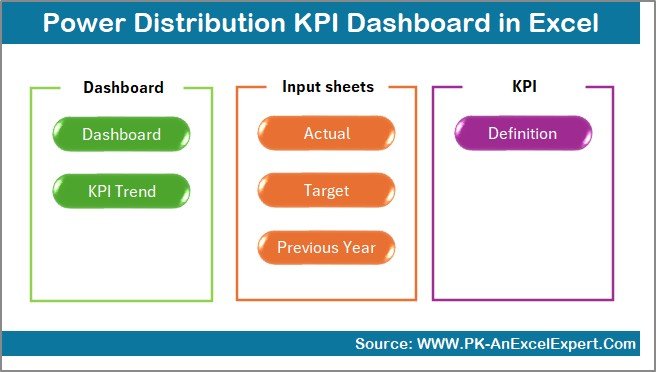
What Are the Key Features of the Power Distribution KPI Dashboard in Excel?
This Power Distribution KPI Dashboard in Excel is designed with 7 structured worksheets, each serving a specific purpose. Below is a detailed explanation of each worksheet.
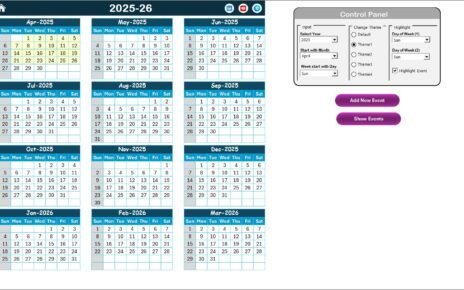
Summary Page – How Does the Navigation Work?
The Summary Page acts as an index or home screen for the dashboard.
Key Highlights:
- Provides 6 navigation buttons.
- Allows quick access to all major sheets.
- Improves user experience and usability.
- Reduces time spent searching for reports.
As a result, users can jump to any section with just one click.
Click to buy Power Distribution KPI Dashboard in Excel
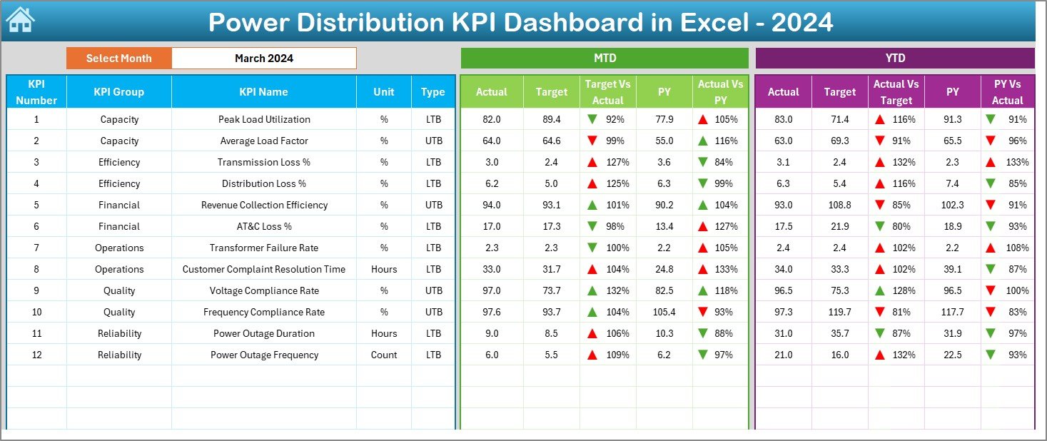
Dashboard Sheet – What Information Does It Show?
The Dashboard sheet is the core reporting page where all KPIs come together.
Key Features:
- Month selection drop-down available in cell D3.
- Entire dashboard updates automatically based on the selected month.
- Displays MTD (Month-to-Date) and YTD (Year-to-Date) values.
- Shows Actual, Target, and Previous Year (PY) comparisons.
Visual Indicators:
- Target vs Actual comparison.
- PY vs Actual comparison.
- Conditional formatting with up and down arrows.
Therefore, users can instantly identify performance gaps and improvement areas.
Click to buy Power Distribution KPI Dashboard in Excel
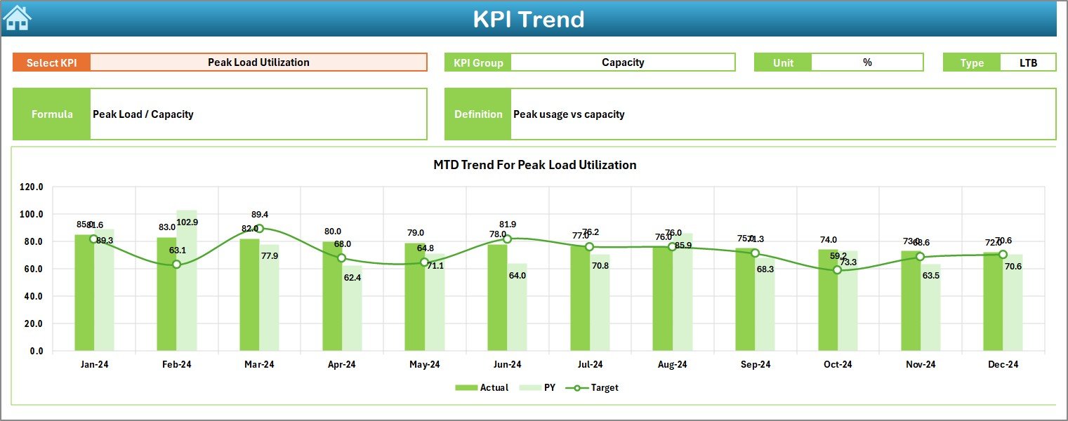
Trend Sheet – How Can You Analyze KPI Trends?
The Trend sheet focuses on detailed KPI-level analysis.
What Can You Select?
- KPI Name selection from the drop-down in cell C3.
What Information Is Displayed?
- KPI Group.
- KPI Unit.
- KPI Type (Lower the Better or Upper the Better).
- KPI Formula.
- KPI Definition.
Charts Included:
- MTD trend chart for Actual, Target, and PY.
- YTD trend chart for Actual, Target, and PY.
As a result, users can analyze performance trends over time instead of relying on static numbers.
Click to buy Power Distribution KPI Dashboard in Excel
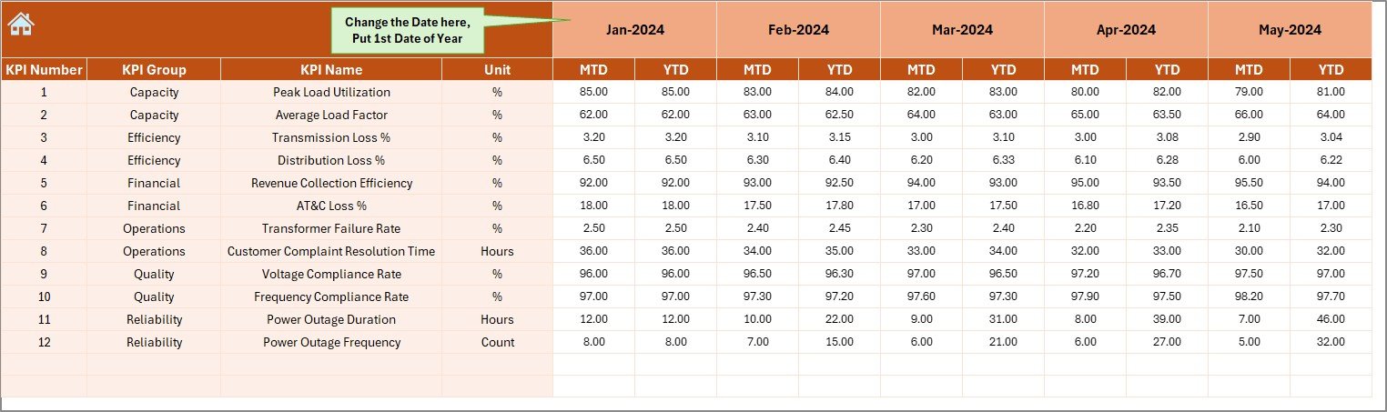
Actual Numbers Input Sheet – Where Do You Enter Actual Data?
The Actual Numbers Input sheet captures real operational data.
Key Inputs:
- Enter MTD and YTD actual values.
- Change the reporting month from cell E1.
- Set the first month of the financial year in cell E1.
Because of this structure, data entry remains simple and error-free.
Click to buy Power Distribution KPI Dashboard in Excel
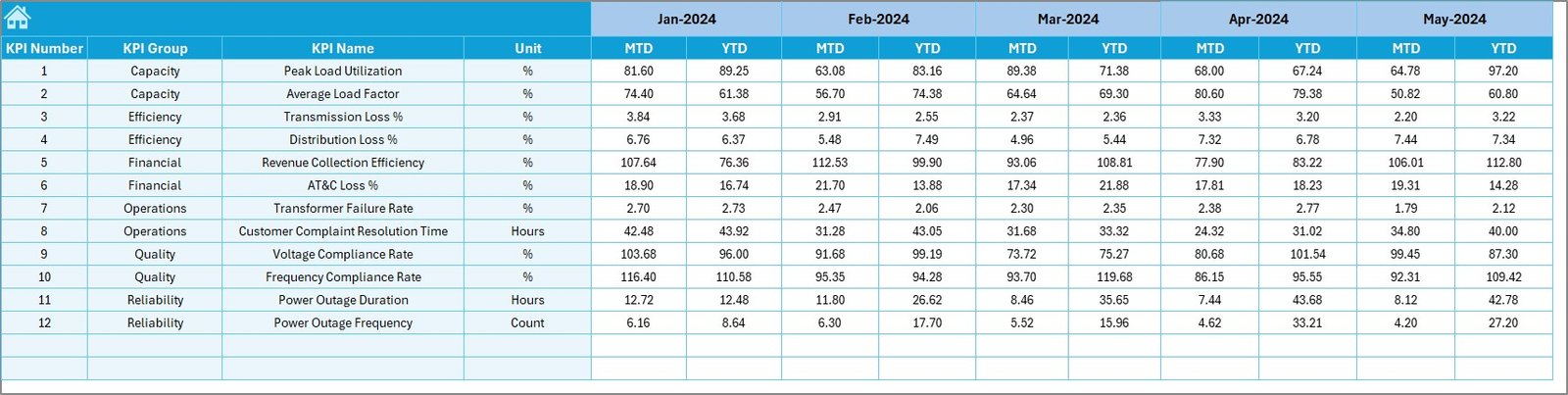
Target Sheet – How Are Targets Managed?
The Target Sheet stores KPI targets for performance comparison.
Key Features:
- Monthly MTD targets.
- Cumulative YTD targets.
- Separate targets for each KPI.
This separation ensures clarity and avoids data mixing.
Click to buy Power Distribution KPI Dashboard in Excel
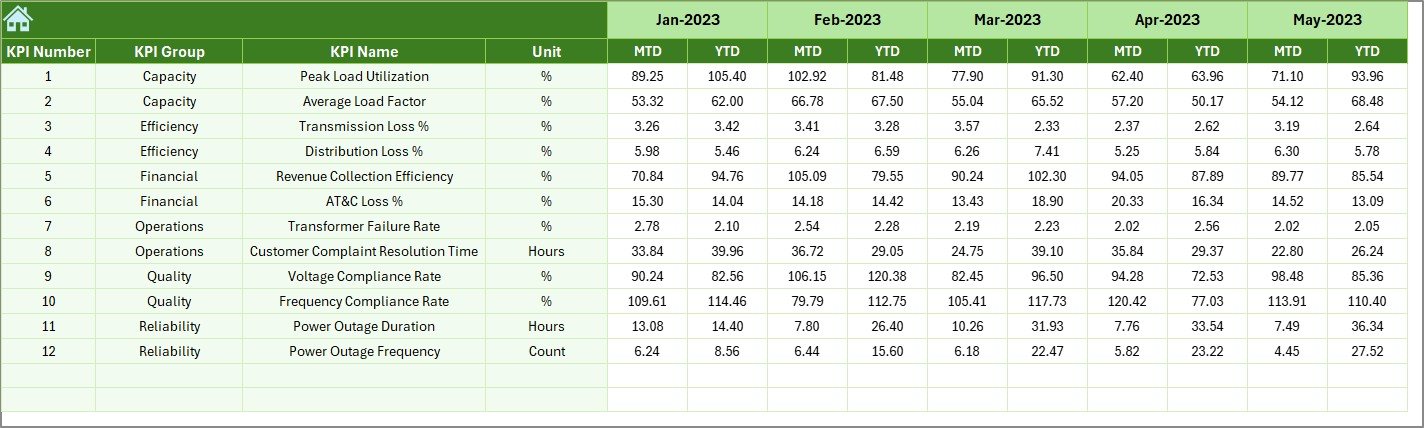
Previous Year Numbers Sheet – Why Is Historical Comparison Important?
The Previous Year Number sheet allows year-on-year comparison.
Benefits:
- Helps measure performance improvement.
- Highlights long-term operational trends.
- Supports strategic planning.
Therefore, management can evaluate whether performance improves or declines over time.
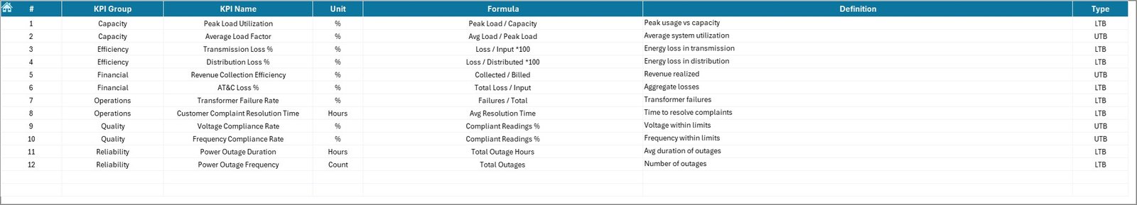
KPI Definition Sheet – Why Is KPI Standardization Necessary?
The KPI Definition sheet acts as a reference document.
Stored Information:
- KPI Name.
- KPI Group.
- KPI Unit.
- KPI Formula.
- KPI Definition.
As a result, everyone interprets KPIs consistently across the organization.
Click to buy Power Distribution KPI Dashboard in Excel
What KPIs Can Be Tracked in a Power Distribution KPI Dashboard?
A Power Distribution KPI Dashboard in Excel can track multiple operational KPIs, such as:
- System Average Interruption Duration Index (SAIDI)
- System Average Interruption Frequency Index (SAIFI)
- Distribution Loss Percentage
- Transformer Failure Rate
- Load Utilization Factor
- Energy Supplied vs Energy Billed
- Customer Complaint Resolution Time
- Power Availability Rate
- Preventive Maintenance Compliance
- Outage Restoration Time
Therefore, the dashboard supports both technical and service-level KPIs.
Advantages of Power Distribution KPI Dashboard in Excel
Using a Power Distribution KPI Dashboard in Excel offers multiple benefits.
Key Advantages:
- Centralized KPI monitoring
- Automated calculations and updates
- Easy-to-use interface
- No additional software required
- Customizable KPIs and targets
- Visual performance indicators
- Time-saving reporting process
- Better decision-making
Because of these advantages, Excel dashboards remain a preferred choice for many power distribution organizations.
How Does This Dashboard Improve Decision-Making?
The dashboard improves decision-making by:
- Highlighting underperforming KPIs.
- Showing trends instead of isolated numbers.
- Enabling proactive corrective actions.
- Supporting data-driven discussions.
- Reducing manual reporting errors.
As a result, leadership gains confidence in operational decisions.
Who Can Use a Power Distribution KPI Dashboard in Excel?
This dashboard proves useful for:
- Power distribution companies
- Utility service providers
- Electrical maintenance teams
- Energy operations managers
- Compliance and audit teams
- Government electricity boards
- Private power distribution firms
Since it works in Excel, teams across all levels can use it easily.
Best Practices for the Power Distribution KPI Dashboard in Excel
To get maximum value, follow these best practices.
- Define KPIs Clearly
Always define KPIs with units, formulas, and ownership.
- Update Data Regularly
Enter actual, target, and PY data consistently every month.
- Validate Input Data
Check data accuracy before finalizing reports.
- Use Consistent Targets
Align targets with operational goals and regulatory standards.
- Review Trends Monthly
Focus on trends instead of one-month performance.
- Train Users
Ensure users understand how to read and interpret the dashboard.
Following these practices ensures reliable and actionable insights.
Conclusion
A Power Distribution KPI Dashboard in Excel is not just a reporting tool. Instead, it acts as a performance management system for power distribution operations.
By combining structured input sheets, automated calculations, trend analysis, and visual indicators, this dashboard empowers organizations to monitor efficiency, improve reliability, and enhance service quality.
Most importantly, since it works entirely in Excel, it remains accessible, flexible, and cost-effective. Therefore, any power distribution organization aiming for operational excellence should adopt this dashboard.
Frequently Asked Questions (FAQs)
- What is a Power Distribution KPI Dashboard in Excel?
It is an Excel-based tool that tracks, analyzes, and visualizes power distribution KPIs in a structured and automated way.
- Can I customize KPIs in this dashboard?
Yes, you can add, remove, or modify KPIs easily using the KPI Definition sheet.
- Does this dashboard support MTD and YTD analysis?
Yes, it supports both MTD and YTD Actual, Target, and Previous Year comparisons.
- Do I need advanced Excel skills to use it?
No, basic Excel knowledge is enough to operate this dashboard.
- Can this dashboard support regulatory reporting?
Yes, it helps maintain historical data and performance records required for audits and compliance.
- Is this dashboard suitable for small utilities?
Yes, both small and large power distribution organizations can use it.
Visit our YouTube channel to learn step-by-step video tutorials
Watch the step-by-step video tutorial:
Click to buy Power Distribution KPI Dashboard in Excel