Power distribution companies operate in a high-pressure environment. Every day, they must balance reliability, efficiency, safety, and regulatory compliance. Therefore, decision-makers need accurate, timely, and easy-to-understand insights. That is exactly where a Power Distribution KPI Dashboard in Power BI becomes essential.
In this detailed guide, you will learn what a Power Distribution KPI Dashboard in Power BI is, why it matters, how it works, and how each dashboard page supports better decisions. Moreover, you will explore its advantages, best practices, and frequently asked questions. By the end of this article, you will clearly understand how this dashboard helps utilities improve reliability, reduce losses, and achieve operational excellence—without complexity.
Click to buy Power Distribution KPI Dashboard in Power BI
What Is a Power Distribution KPI Dashboard in Power BI?
A Power Distribution KPI Dashboard in Power BI is a ready-to-use, interactive reporting solution designed to track and monitor key performance indicators (KPIs) across power distribution operations.
Instead of working with scattered Excel files, manual reports, and static charts, this dashboard consolidates all critical KPIs into one structured Power BI report. As a result, managers gain instant visibility into performance at both Month-to-Date (MTD) and Year-to-Date (YTD) levels.
Moreover, the dashboard uses Microsoft Excel as its data source and Power BI for visualization. Therefore, teams can enter data easily in Excel while enjoying powerful analytics in Power BI.
Why Do Power Distribution Companies Need a KPI Dashboard?
Power distribution involves complex processes such as energy delivery, loss management, outage control, asset performance, and compliance tracking. However, without a structured dashboard, teams often struggle to answer simple questions.
For example:
- Are we meeting our reliability targets this month?
- Which KPIs missed targets, and why?
- How does current performance compare with last year?
- Which areas need immediate corrective action?
A Power Distribution KPI Dashboard in Power BI answers these questions clearly and quickly. Moreover, it helps leaders move from reactive reporting to proactive decision-making.
How Does a Power Distribution KPI Dashboard in Power BI Work?
This dashboard follows a simple yet powerful structure. You enter data in Excel, refresh the Power BI file, and instantly view updated KPIs and visuals. Therefore, you save time while maintaining accuracy.
The dashboard includes three structured pages, each designed for a specific analytical purpose.
What Is Included in the Summary Page of the Dashboard?
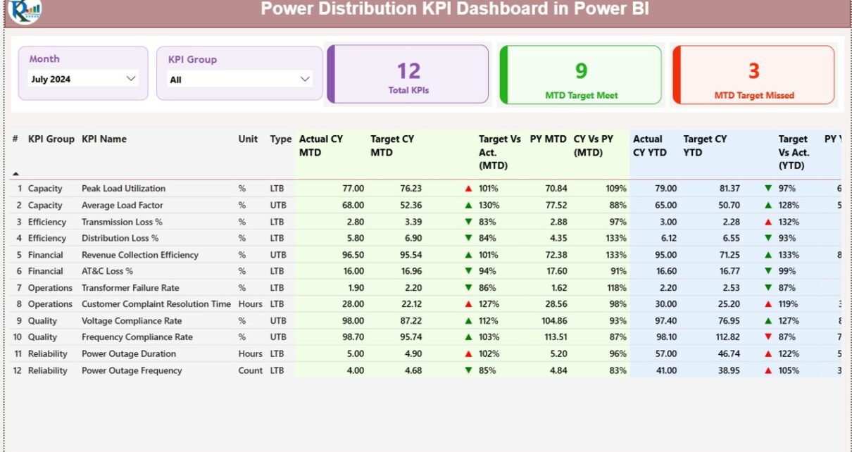
The Summary Page acts as the control center of the Power Distribution KPI Dashboard in Power BI. It provides a consolidated view of all KPIs with clear status indicators.
Key Elements of the Summary Page
Month and KPI Group Slicers
- Select the required month
- Filter KPIs by group or category
As a result, the entire dashboard updates dynamically.
KPI Status Cards
At the top, the dashboard displays three high-impact cards:
- Total KPIs Count
- MTD Target Met Count
- MTD Target Missed Count
These cards instantly show overall performance health.

Click to buy Power Distribution KPI Dashboard in Power BI
KPI Table
Below the cards, a detailed KPI table provides granular insights. Each row represents one KPI, while each column tells a performance story.
Key columns include:
- KPI Number – Unique sequence number
- KPI Group – Category of the KPI
- KPI Name – Name of the metric
- Unit – Unit of measurement
- Type – LTB (Lower the Better) or UTB (Upper the Better)
How Are MTD KPIs Tracked?
For Month-to-Date analysis, the dashboard shows:
- Actual CY MTD – Current year actual value
- Target CY MTD – Current year target
- MTD Icon –
▲ Green arrow for target met
▼ Red arrow for target missed
Target vs Actual (MTD) – Actual ÷ Target
PY MTD – Previous year MTD value
CY vs PY (MTD) – Current MTD ÷ Previous MTD
Therefore, users can quickly assess performance trends and deviations.

Click to buy Power Distribution KPI Dashboard in Power BI
How Are YTD KPIs Tracked?
For long-term performance tracking, the dashboard also includes:
- Actual CY YTD
- Target CY YTD
- YTD Icon
- Target vs Actual (YTD)
- PY YTD
- CY vs PY (YTD)
Because of this structure, managers can monitor both short-term execution and long-term progress simultaneously.
KPI Trend Page
The KPI Trend Page focuses on performance trends rather than snapshots. It helps users understand how KPIs evolve over time.
Key Features of the KPI Trend Page
Two combo charts:
MTD trend: Actual CY, PY, and Target
YTD trend: Actual CY, PY, and Target
A KPI Name slicer on the left
By selecting a KPI, users can instantly analyze trends, seasonality, and performance gaps. Therefore, root-cause analysis becomes much easier.

Click to buy Power Distribution KPI Dashboard in Power BI
the KPI Definition
The KPI Definition Page serves as a documentation and governance layer.
Why Is This Page Important?
- It ensures everyone understands each KPI
- It eliminates ambiguity in calculations
- It supports audit and compliance requirements
This page remains hidden by default. However, users can drill through from the Summary Page to view:
- KPI Formula
- KPI Definition
- KPI Type (LTB or UTB)
A back button on the top-left corner allows smooth navigation back to the main page.

Click to buy Power Distribution KPI Dashboard in Power BI
How Is Data Managed in the Excel File?
The dashboard uses a simple Excel-based data model. Therefore, even non-technical users can maintain it easily.
What Worksheets Are Used?
Input_Actual Sheet
Enter:
- KPI Name
- Month (first date of the month)
- MTD Actual Value
- YTD Actual Value
Input_Target Sheet
Enter:
- KPI Name
- Month (first date of the month)
- MTD Target Value
- YTD Target Value
KPI Definition Sheet
Enter:
- KPI Number
- KPI Group
- KPI Name
- Unit
- Formula
- Definition
- Type (LTB or UTB)
Once data entry is complete, a simple refresh updates the Power BI dashboard.
Advantages of a Power Distribution KPI Dashboard in Power BI
A Power Distribution KPI Dashboard in Power BI offers several strategic and operational benefits.
- Centralized Performance Visibility
All KPIs appear in one dashboard. Therefore, leaders avoid fragmented reporting.
- Faster Decision-Making
Clear visuals and indicators allow quick interpretation. As a result, teams act faster.
- Improved Target Tracking
MTD and YTD comparisons highlight gaps early. Consequently, corrective actions become timely.
- Historical Performance Comparison
CY vs PY analysis helps identify trends and improvements.
- Reduced Manual Effort
Excel-based input eliminates complex data pipelines. Therefore, maintenance remains simple.
- Better Accountability
Clear KPI ownership and definitions promote responsibility across teams.
Who Can Benefit from This Dashboard?
A Power Distribution KPI Dashboard in Power BI supports multiple stakeholders.
- Power distribution managers
- Operations and maintenance teams
- Reliability and asset management teams
- Finance and planning departments
- Regulatory and compliance officers
- Senior leadership and executives
Because of its flexibility, the dashboard adapts to utilities of all sizes.
Best Practices for the Power Distribution KPI Dashboard in Power BI
To get maximum value, organizations should follow proven best practices.
- Define KPIs Clearly
Always document formulas and definitions. Therefore, everyone interprets KPIs consistently.
- Update Data Regularly
Maintain a monthly update cycle. As a result, insights stay relevant.
- Use Meaningful KPI Groups
Group KPIs by reliability, losses, financials, or operations. This approach improves clarity.
- Focus on Actionable KPIs
Track metrics that drive decisions, not vanity numbers.
- Review Trends, Not Just Status
Trend charts reveal patterns that tables cannot show.
- Train Users
Ensure users understand slicers, drill-throughs, and interpretations.
How Does This Dashboard Improve Power Distribution Performance?
A Power Distribution KPI Dashboard in Power BI transforms raw data into actionable intelligence. Instead of reacting to issues after they escalate, teams identify risks early. Moreover, leadership gains confidence in data-driven planning.
Because the dashboard combines simplicity with analytical depth, it bridges the gap between operations and strategy.
Conclusion: Is a Power Distribution KPI Dashboard in Power BI Worth It?
Absolutely. A Power Distribution KPI Dashboard in Power BI provides clarity, control, and confidence. It simplifies complex performance data while enabling faster and smarter decisions.
By using Excel for data entry and Power BI for visualization, this dashboard delivers a cost-effective and scalable solution. Therefore, utilities can improve reliability, reduce losses, and strengthen governance—without heavy IT dependency.
Frequently Asked Questions (FAQs)
- What is a Power Distribution KPI Dashboard in Power BI?
It is an interactive Power BI dashboard that tracks key power distribution KPIs using Excel as the data source.
- Can non-technical users maintain this dashboard?
Yes. Users only need to enter data in Excel and refresh Power BI.
- What KPIs can I track?
You can track reliability, operational, financial, loss-related, and compliance KPIs.
- Does the dashboard support MTD and YTD analysis?
Yes. It includes both MTD and YTD metrics with targets and historical comparisons.
- Can I customize KPI groups and definitions?
Yes. The KPI Definition sheet allows full customization.
- Is this dashboard suitable for regulatory reporting?
Yes. Clear definitions and historical tracking support audits and compliance.
- How often should data be updated?
Ideally, update data monthly for accurate MTD and YTD analysis.
- Does the dashboard show trend analysis?
Yes. The KPI Trend page displays MTD and YTD trends using combo charts.
- Can I add new KPIs later?
Yes. You can easily add new KPIs through the Excel sheets.
- Why should utilities choose Power BI for KPI dashboards?
Power BI offers interactive visuals, scalability, and strong integration with Excel, making it ideal for power distribution analytics.
Visit our YouTube channel to learn step-by-step video tutorials
Watch the step-by-step video tutorial:
Click to buy Power Distribution KPI Dashboard in Power BI