In today’s competitive and fast-changing business environment, professional training and coaching have become essential for success. Organizations that invest in employee development not only boost productivity but also increase retention and morale. However, managing training programs, tracking satisfaction levels, and measuring outcomes manually can be time-consuming and inconsistent.
That’s where the Professional Training & Coaching Dashboard in Power BI steps in.
This ready-to-use, interactive Power BI dashboard helps training managers, HR leaders, and business coaches visualize all key metrics in one place. With dynamic charts, intuitive filters, and automated data integration from Excel, it enables better decision-making, accurate tracking, and continuous improvement across all training initiatives.
Click to Purchases Professional Training & Coaching Dashboard in Power BI
In this detailed guide, we’ll explore everything you need to know about this dashboard — from its structure and features to its advantages, best practices, and frequently asked questions.
What Is a Professional Training & Coaching Dashboard in Power BI?
A Professional Training & Coaching Dashboard in Power BI is an analytical tool designed to monitor, measure, and evaluate the performance of training and coaching programs. It consolidates multiple data points — such as training completion rates, satisfaction scores, cost metrics, and trainer performance — into one visually rich, interactive dashboard.
Because it’s built in Power BI, it connects seamlessly with Excel or other data sources. You can refresh data with a single click, explore performance by region, trainer, client, or training type, and uncover insights instantly through charts and KPIs.
Unlike static Excel reports, this dashboard updates dynamically, offering a real-time view of your training ecosystem. Whether you are an L&D manager, corporate coach, or HR executive, this tool provides you with a 360° understanding of how your programs are performing.
Structure of the Dashboard
The Professional Training & Coaching Dashboard in Power BI consists of five main pages, each designed to analyze a specific aspect of your training data. Let’s explore them in detail:
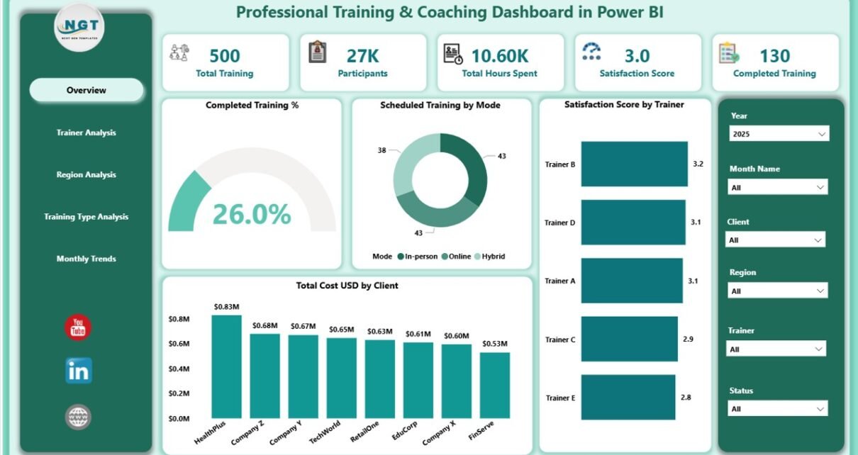
1. Overview Page
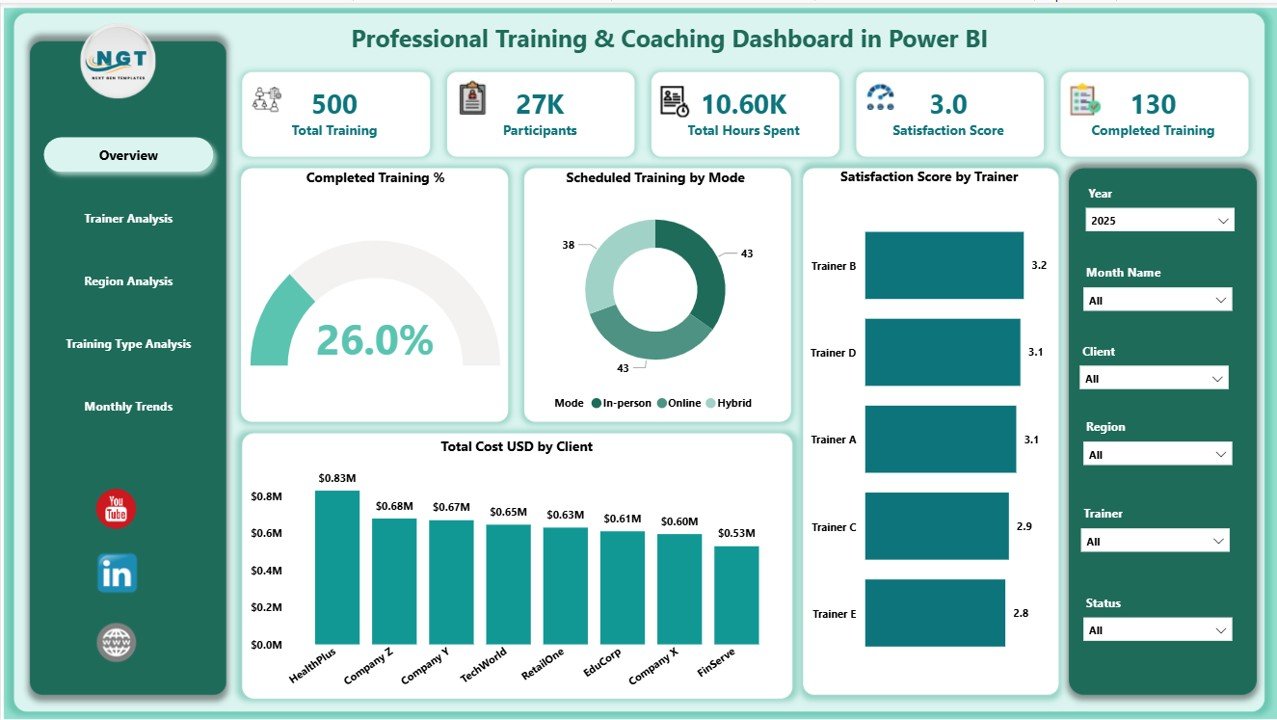
The Overview Page serves as the central hub of your dashboard. It displays key metrics and summaries of the entire training program.
Key Visual Elements
Five KPI Cards show essential figures such as:
- Total Trainings Conducted
- Completed Training Percentage
- Satisfaction Score
- Total Cost (USD)
- Number of Participants
Interactive Charts include:
✅ Completed Training (%)
✅ Scheduled Training by Mode (Online vs. Offline)
✅ Satisfaction Score by Trainer
✅ Total Cost (USD) by Client
This page helps users quickly identify overall performance, spot areas that need attention, and make strategic decisions instantly.
2. Trainer Analysis Page
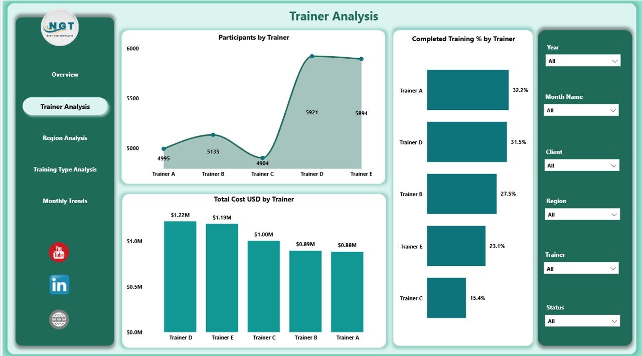
The Trainer Analysis Page focuses on evaluating each trainer’s contribution and effectiveness.
Key Charts and KPIs
-
📊Participants by Trainer
-
📈 Completed Training (%) by Trainer
-
💰 Total Cost (USD) by Trainer
This section helps organizations identify high-performing trainers, track cost efficiency, and pinpoint areas for coaching improvement.
Training departments can use these insights to reward top trainers, plan future sessions more effectively, and ensure training quality across all trainers.
3. Region Analysis Page
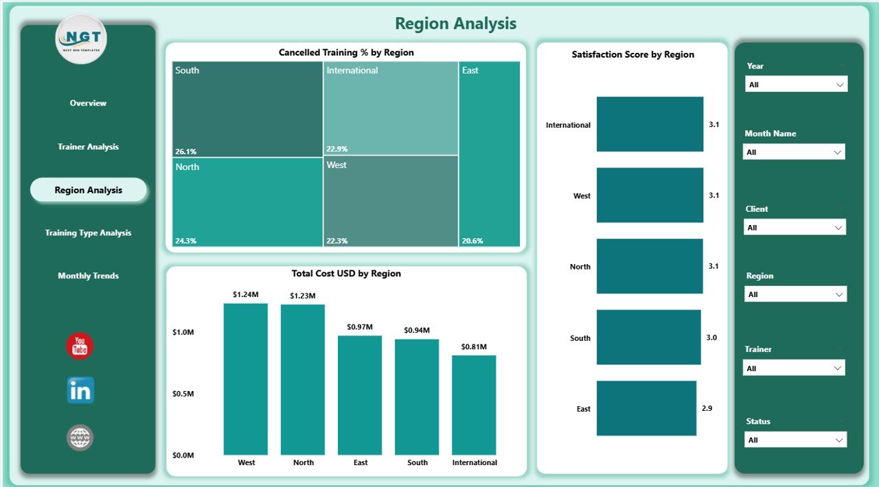
The Region Analysis Page gives a detailed view of how training and coaching programs perform across various geographical locations.
Key Charts
-
🌍 Cancelled Training (%) by Region
-
📊 Satisfaction Score by Region
-
💸 Total Cost (USD) by Region
By analyzing these metrics, decision-makers can determine which regions face operational challenges or yield higher satisfaction. This regional insight allows for more tailored strategies, such as increasing digital training in underperforming areas or allocating resources to regions with higher demand.
Click to Purchases Professional Training & Coaching Dashboard in Power BI
4. Training Type Analysis Page
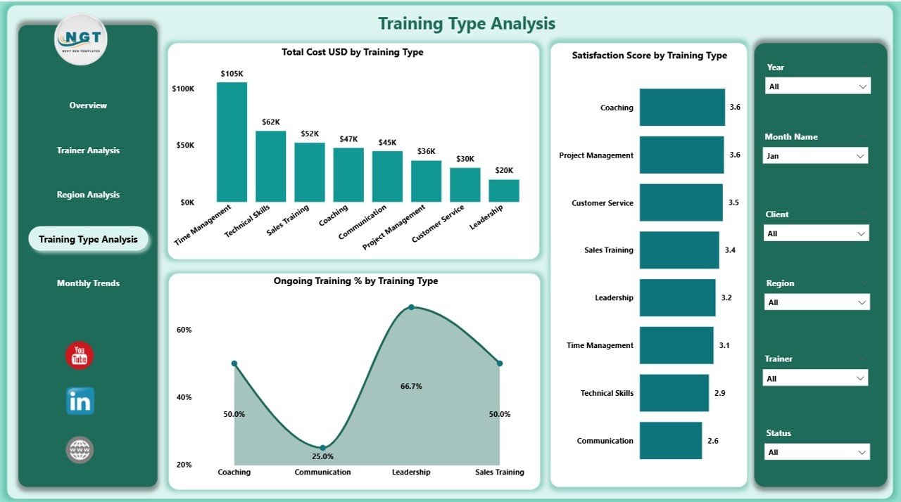
Not all training programs deliver the same value. The Training Type Analysis Page helps you measure success based on the type of training conducted.
Key Charts
-
🔄 Ongoing Training (%) by Training Type
-
⭐ Satisfaction Score by Training Type
-
💰 Total Cost (USD) by Training Type
This page is particularly valuable for comparing in-person workshops, webinars, certification courses, or leadership sessions. By understanding which types produce the best results, companies can invest wisely and optimize their curriculum offerings.
5. Monthly Trends Page
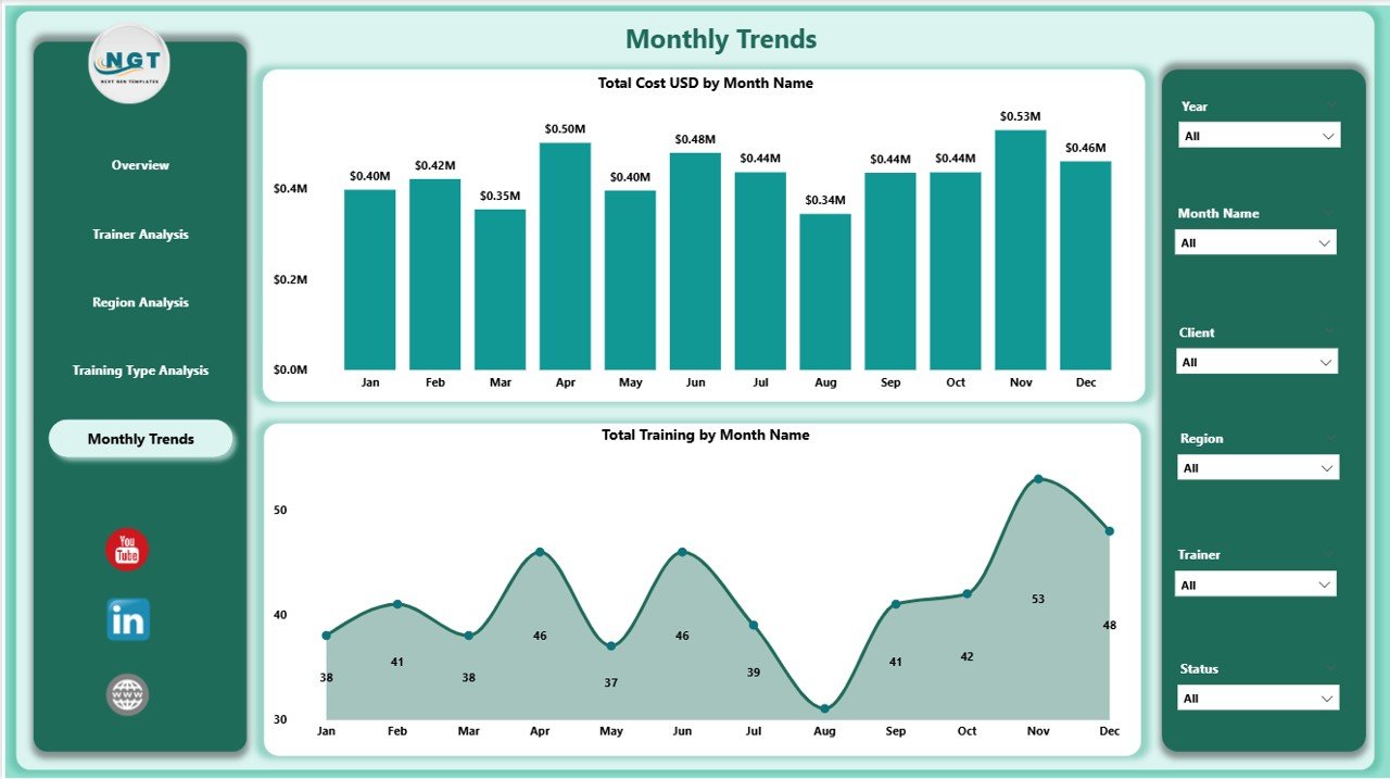
The Monthly Trends Page visualizes how training performance evolves over time.
Key Charts
-
📆 Total Cost (USD) by Month
-
📊 Total Trainings by Month
This trend analysis allows managers to identify seasonal patterns, track cost fluctuations, and evaluate the long-term impact of training initiatives. It’s an excellent way to forecast upcoming budgets or resource needs based on historical trends.
Why Power BI Is the Perfect Tool for Training Dashboards
Power BI is not just a data visualization platform — it’s a complete business intelligence solution. Here’s why it fits perfectly for professional training and coaching analytics:
-
Ease of Use: Even non-technical users can navigate, filter, and analyze data intuitively.
-
Excel Integration: Data from Excel files can be easily imported, cleaned, and refreshed automatically.
-
Interactive Dashboards: Clickable visuals and slicers make exploration quick and meaningful.
-
Real-Time Updates: With live connections, metrics stay up to date.
-
Scalability: Suitable for small coaching centers or large corporate academies alike.
By combining Power BI’s flexibility with training data, organizations gain actionable insights that traditional spreadsheets can’t offer.
Advantages of Professional Training & Coaching Dashboard in Power BI
A professional dashboard offers many benefits beyond simple reporting. Here are some of the major advantages:
1. Centralized Data Visualization
All performance indicators — from trainer efficiency to training costs — appear in one view. This saves time and ensures every stakeholder sees the same version of truth.
2. Improved Decision-Making
Instant access to live data helps managers make quicker and smarter decisions. Instead of relying on guesswork, they can analyze trends and allocate resources effectively.
3. Enhanced Trainer Accountability
Trainer performance can be tracked transparently, encouraging responsibility and improvement.
4. Optimized Budget Control
By comparing costs across clients, training types, or regions, organizations can identify where spending yields the most value and where optimization is needed.
5. Increased Participant Satisfaction
Feedback scores and satisfaction trends help identify strong programs and trainers while highlighting areas for improvement.
6. Simplified Reporting
Automated Power BI visuals replace manual reporting, saving hours of effort and reducing errors.
7. Real-Time Insights
Live connections with Excel or cloud sources keep dashboards always up to date, ensuring that leaders make decisions based on current data.
How to Use the Dashboard Effectively
To make the most out of the Professional Training & Coaching Dashboard in Power BI, follow these practical tips:
-
Import Clean Data: Ensure your Excel data (training details, trainers, clients, regions, satisfaction scores) is structured properly before connecting to Power BI.
-
Set Slicers for Key Filters: Add slicers for Trainer, Region, Month, and Training Type to explore data dynamically.
-
Refresh Data Regularly: Keep your reports updated by scheduling automatic refreshes.
-
Use Drill-Through Features: Right-click on visuals to see detailed performance for any trainer, region, or training type.
-
Share Reports Securely: Publish your Power BI reports to the Power BI Service and share them securely with your team.
Opportunities for Improvement
Even though this dashboard provides a comprehensive overview, there are always ways to enhance it further. Consider implementing the following upgrades:
-
Add ROI Analysis: Include calculations to measure the return on investment of each training.
-
Incorporate Feedback Comments: Use Power BI’s text analysis to summarize feedback sentiment.
-
Include Attendance Trends: Track attendance rates over time to spot engagement issues.
-
Automate Data Input: Integrate the dashboard with a live training management system instead of manual Excel updates.
-
Mobile Optimization: Ensure all visuals are mobile-friendly for on-the-go access.
These improvements can take the dashboard from insightful to transformative.
Best Practices for the Professional Training & Coaching Dashboard in Power BI
To ensure long-term success, follow these best practices when building or using this dashboard:
1. Keep Visuals Simple
Avoid clutter. Use clear charts and limit the number of visuals per page to ensure readability.
2. Maintain Consistent Color Themes
Use consistent color codes for metrics such as cost, satisfaction, and completion percentage to enhance user experience.
3. Focus on Key KPIs
Prioritize KPIs that matter — like satisfaction score, completion rate, and cost per training — rather than overloading the report.
4. Schedule Automatic Refresh
Set daily or weekly refresh schedules so data always stays accurate and relevant.
5. Monitor Data Quality
Always validate Excel data before loading it into Power BI to prevent inconsistencies.
6. Encourage Feedback
Ask trainers, clients, and management for input to continuously improve the dashboard’s design and usability.
How This Dashboard Supports Business Growth
The Professional Training & Coaching Dashboard in Power BI does more than track numbers — it fuels strategic growth.
-
It empowers HR leaders to plan effective learning initiatives.
-
It helps trainers monitor their performance and satisfaction scores.
-
It enables executives to justify training budgets with clear, data-driven ROI evidence.
Over time, this tool builds a culture of continuous learning and accountability — essential for any organization aiming to remain competitive in today’s knowledge economy.
Conclusion
The Professional Training & Coaching Dashboard in Power BI is not just a reporting tool — it’s a performance enhancer. It transforms static Excel data into actionable insights, helping organizations measure success, control costs, and improve satisfaction levels across all training initiatives.
With its five structured pages — Overview, Trainer Analysis, Region Analysis, Training Type Analysis, and Monthly Trends — this dashboard gives users a complete view of the learning ecosystem. By implementing the best practices shared here, you can ensure that your training programs stay effective, data-driven, and aligned with business goals.
Investing in such a dashboard means investing in the growth of your people — and your organization.
Frequently Asked Questions (FAQs)
1. What data sources can be connected to the Professional Training & Coaching Dashboard in Power BI?
You can connect Excel files, SQL databases, SharePoint lists, or cloud sources like OneDrive and Google Sheets. Power BI supports both manual and automated data refresh.
2. Can I customize the dashboard visuals?
Yes. You can easily modify visuals, change chart types, add filters, and apply your own branding or color themes within Power BI Desktop.
3. Is it possible to track satisfaction scores in real time?
Yes, if your feedback form or training management system automatically updates an Excel or database source, Power BI can pull and display real-time satisfaction metrics.
4. How often should I refresh the data?
For most organizations, a daily refresh is ideal. However, if training events occur frequently, consider setting hourly refreshes.
5. Can this dashboard handle large datasets?
Absolutely. Power BI can handle millions of rows efficiently. You can use features like data modeling and aggregations to improve performance.
6. Do I need advanced Power BI skills to use this dashboard?
No. This dashboard is designed for both technical and non-technical users. The interface is intuitive, and most actions involve simple clicks and filters.
7. How can I share this dashboard with others?
Once published to Power BI Service, you can share it with your team or management using secure access permissions or embed it in Microsoft Teams.
8. Can I export visuals to Excel or PDF?
Yes. Power BI allows exporting visuals, tables, and summaries directly to Excel or PDF for presentation and reporting purposes.
9. Does this dashboard work on mobile devices?
Yes, Power BI provides a mobile view mode that automatically adjusts visuals for smartphones and tablets.
10. How does this dashboard help improve training ROI?
It enables you to analyze costs, satisfaction, and completion rates across multiple parameters, helping you identify the most effective training strategies and allocate budgets wisely.
Visit our YouTube channel to learn step-by-step video tutorials