Public Relations (PR) is no longer about sending out press releases or waiting for journalists to pick up a story. In today’s fast-paced world, PR teams must track campaigns, measure media coverage, evaluate sentiment, and analyze cost efficiency. Without the right tools, measuring PR success can be overwhelming.
This is where a Public Relations Dashboard in Excel becomes a game-changer. It provides an organized, interactive, and visual tool to track campaigns, coverage, reach, sentiment, and budget performance—all in one place. With Excel’s flexibility, businesses can monitor results monthly, quarterly, or annually, ensuring PR activities stay aligned with organizational goals.
In this guide, we’ll explore the structure, features, benefits, best practices, opportunities for improvement, and real-world applications of a PR dashboard in Excel.
Click to Purchases Public Relations Dashboard in Excel
What Is a Public Relations Dashboard in Excel?
A Public Relations Dashboard in Excel is a ready-to-use analytical tool designed to consolidate all PR activities and KPIs into a single view. It helps PR managers, communication specialists, and executives track campaigns across channels, evaluate audience reach, monitor media mentions, and calculate the cost efficiency of efforts.
Instead of dealing with scattered reports and emails, the dashboard provides a single source of truth. Every campaign metric becomes visible with the click of a button. Whether it’s positive campaign percentage, cost by channel, or media mentions by region, the dashboard ensures you don’t miss critical insights.
Key Features of the Public Relations Dashboard in Excel
This PR Dashboard is structured with five interactive pages and one support sheet. Each page focuses on different aspects of PR performance.
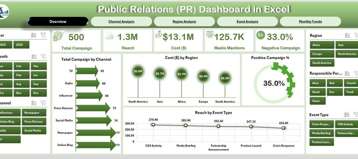
Overview Page
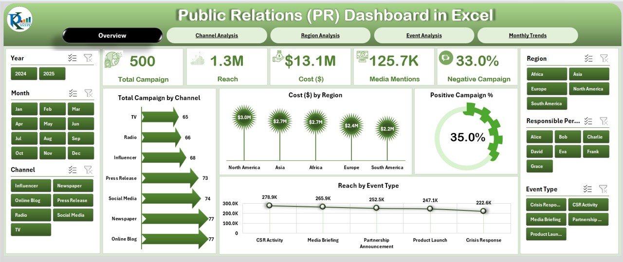
The Overview Page is the central hub of the dashboard.
-
Located on the left, a page navigator makes it easy to jump across different sections.
-
On the right, slicers allow quick filtering by time, region, channel, or campaign type.
-
It displays five key cards that summarize metrics like campaign count, total cost, positive campaign %, and reach.
The charts include:
- Total Campaign by Channel
- Cost ($) by Region
- Positive Campaign %
- Reach by Event Type
This page provides executives with a snapshot of performance at a glance.
Channel Analysis
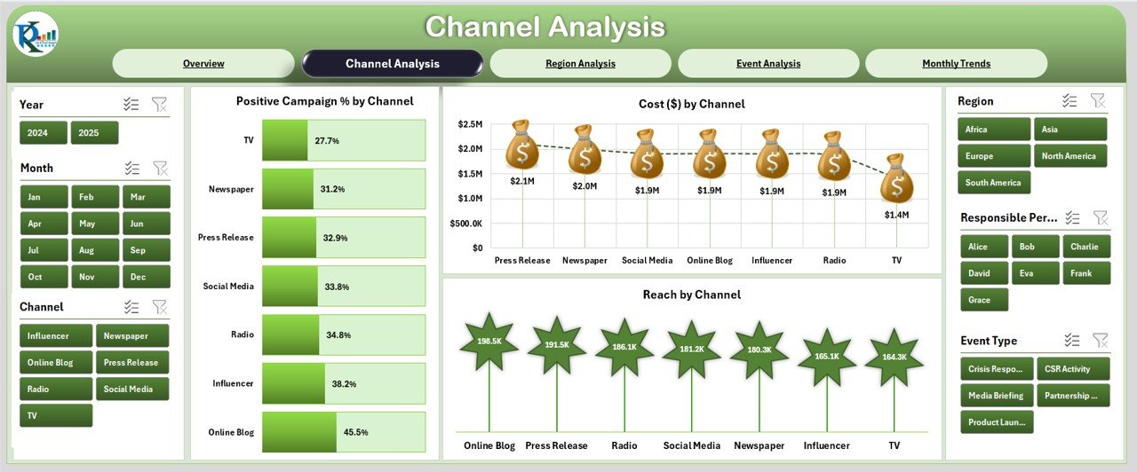
This page focuses on performance by communication channels (social media, TV, print, digital ads, events, etc.).
-
Right-side slicers for dynamic filtering.
Three detailed charts:
- Positive Campaign % by Channel
- Cost ($) by Channel
- Reach by Channel
This breakdown helps identify which channels generate maximum impact relative to cost.
Region Analysis
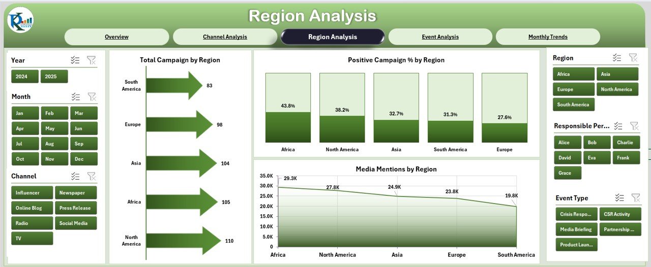
PR is often geographically diverse, making regional tracking essential.
Click to Purchases Public Relations Dashboard in Excel
-
Right-side slicers for region selection.
Three charts available:
- Total Campaign by Region
- Positive Campaign % by Region
- Media Mentions by Region
By comparing performance across locations, companies can reallocate resources effectively.
Event Analysis
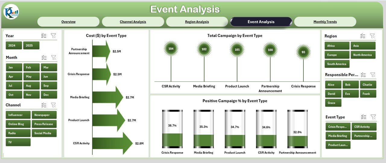
Events remain a core part of PR campaigns.
-
Right-side slicers for event type.
Charts included:
- Cost ($) by Event Type
- Total Campaign by Event Type
- Positive Campaign % by Event Type
This view helps evaluate ROI from events such as conferences, product launches, or community engagements.
Monthly Trends
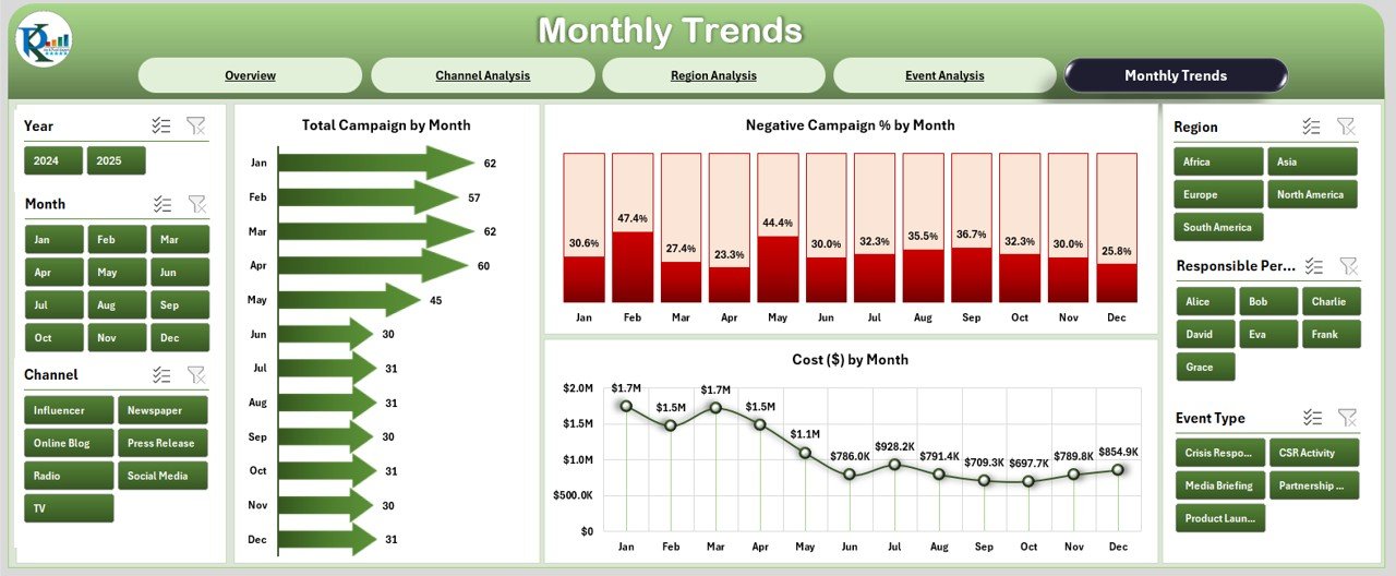
PR effectiveness is best tracked over time.
-
Right-side slicers allow period selection.
Charts included:
- Total Campaign by Month
- Negative Campaign % by Month
- Cost ($) by Month
This view highlights seasonality, long-term trends, and performance patterns.
Support Sheet
The Support Sheet works behind the scenes, storing reference lists, dropdown data, and lookup values. It ensures that slicers, charts, and formulas run seamlessly without manual intervention.
Advantages of Using a PR Dashboard in Excel
✔ Centralized Tracking – All PR activities, costs, and KPIs are available in one interactive file.
✔ Cost-Effective Tool – No expensive software subscriptions needed; Excel provides all functionalities.
✔ Customizable – Businesses can add or remove KPIs, adjust charts, and modify designs as per requirements.
✔ Data-Driven Decisions – Helps managers identify which regions, channels, or events perform best.
✔ Real-Time Analysis – With updated data, stakeholders can view monthly or yearly performance instantly.
✔ User-Friendly – Requires no advanced technical expertise; even non-analysts can use it.
Opportunities for Improvement
While Excel dashboards are powerful, there are always opportunities to enhance them:
📊 Integration with Live Data – Connecting Excel with online data sources (social media APIs, Google Analytics) for real-time updates.
⚡ Automation – Using VBA macros or Power Query to reduce manual updates.
📈 Advanced Visuals – Adding Power BI or Tableau integration for more interactive graphics.
🔄 Collaboration Features – Storing the file in cloud platforms (SharePoint, Google Drive) for multi-user access.
🧩 Sentiment Analysis – Incorporating formulas or add-ins to analyze text sentiment from media mentions.
Best Practices for Public Relations Dashboards
✅ Define Clear KPIs – Track only the metrics that align with organizational PR goals (e.g., positive mentions %, reach, ROI).
✅ Use Consistent Data Sources – Ensure accuracy by maintaining structured campaign and cost data.
✅ Keep the Dashboard Simple – Avoid clutter; focus on high-value insights.
✅ Regularly Update Data – Refresh monthly or quarterly to maintain relevance.
✅ Leverage Conditional Formatting – Use arrows, colors, or progress bars to highlight performance gaps.
✅ Document Definitions – Add a KPI definition sheet so all stakeholders interpret metrics correctly.
Real-World Applications of a PR Dashboard in Excel
-
Corporate PR Teams – Track campaigns across digital, print, and broadcast media.
-
Nonprofits & NGOs – Measure outreach effectiveness for fundraising and awareness campaigns.
-
Government Agencies – Monitor public perception of policies and initiatives.
-
Event Management Firms – Evaluate event reach, cost, and sentiment.
-
Startups & SMEs – Optimize PR spending by identifying the most effective channels.
Step-by-Step: Building a Basic PR Dashboard in Excel
-
List Campaign Data – Include fields like Campaign Name, Channel, Region, Event Type, Cost, Reach, and Sentiment.
-
Create Pivot Tables – Summarize metrics by Channel, Region, and Event Type.
-
Add Slicers – Provide filters for month, channel, and region.
-
Insert Charts – Use column, pie, and line charts for visualization.
-
Design Cards – Add KPIs such as Campaign Count, Cost, Positive %, and Negative %.
-
Format for Usability – Apply colors, conditional formatting, and navigation buttons.
This do-it-yourself process ensures businesses can adapt the dashboard to their unique PR needs.
Conclusion
A Public Relations Dashboard in Excel empowers organizations to track, evaluate, and optimize their PR activities with ease. It offers a cost-effective, user-friendly, and customizable way to consolidate data into actionable insights. From tracking campaign costs to analyzing positive mentions by region, the dashboard enables smarter decisions and better storytelling.
By applying best practices, automation, and continuous improvements, PR teams can turn data into a competitive advantage.
Frequently Asked Questions (FAQs)
1. What is the main purpose of a PR dashboard in Excel?
The main purpose is to centralize PR metrics such as campaign count, cost, media mentions, sentiment, and reach, making it easier for teams to analyze effectiveness.
2. How often should I update my PR dashboard?
Ideally, update it monthly or quarterly. However, during active campaigns, weekly updates can provide better visibility.
3. Can I connect my PR dashboard to social media platforms?
Yes. By using Power Query or third-party connectors, you can link Excel to APIs like Facebook Insights, Twitter Analytics, or Google Analytics.
4. What KPIs should I include in a PR dashboard?
Common KPIs include:
-
Positive vs. Negative Campaign %
-
Media Mentions by Region
-
Campaign Cost by Channel
-
Audience Reach by Event Type
-
ROI on PR Spend
5. Is Excel enough for managing PR analytics?
For small to medium organizations, Excel is sufficient. However, large enterprises may benefit from integrating Excel with Power BI or advanced analytics tools.
6. Can multiple users work on the same PR dashboard?
Yes, if stored on cloud platforms like OneDrive, SharePoint, or Google Drive, multiple users can access and update the dashboard simultaneously.
7. How do I make my PR dashboard more interactive?
You can add slicers, timelines, dropdown filters, and conditional formatting. For advanced interactivity, consider linking it with Power BI.
Visit our YouTube channel to learn step-by-step video tutorials