Public transit systems play a vital role in connecting cities, reducing traffic, improving mobility, and supporting economic growth. Every day, transit authorities manage hundreds of vehicles, multiple transport modes, ticket types, routes, and thousands of passengers. Therefore, they need quick insights to take smart decisions. However, manual reporting slows teams down and creates confusion.
A Public Transit Dashboard in Excel solves this problem. It brings all critical performance indicators into one clear and interactive dashboard, so transit managers and analysts can track everything in real time. In this complete guide, you will learn what this dashboard is, how it works, what each page contains, and how it helps you improve efficiency across your transit system.
Click to Purchases Public Transit Dashboard in Excel
What Is a Public Transit Dashboard in Excel?
A Public Transit Dashboard in Excel is a ready-to-use performance monitoring tool that helps public transport authorities, city planners, and operational teams track KPIs with accuracy. It captures data related to transport modes, vehicles, tickets, delays, profit, operating costs, revenue, and monthly trends.
Because the dashboard uses slicers, cards, tables, and charts, users get a complete view without switching between multiple spreadsheets. In addition, the dashboard refreshes automatically when you update the data sheet. As a result, you save time, avoid human error, and get reliable insights.
This dashboard includes five analytical pages—Overview, Transport Analysis, Vehicle Analysis, Ticket Analysis, and Month Analysis—along with a support sheet and main data sheet. Each page answers a specific business question so teams can act faster and improve service quality.
Why Do Public Transit Agencies Need a Dashboard?
Public transit operations grow more complex every year. Multiple transport modes run at different intervals, passengers prefer many ticket types, and citywide travel demand changes often. When teams track everything manually, they struggle to find patterns or spot inefficiencies.
A dashboard brings clarity.
It helps teams:
-
Compare transport modes
-
Understand vehicle-level performance
-
Identify profitable and unprofitable categories
-
Study passenger behavior
-
Control operational costs
-
Improve on-time performance
-
Track progress month by month
Because Excel is easy to use, teams can adopt this dashboard without training or heavy investment.
Key Features of the Public Transit Dashboard in Excel
This dashboard is simple, interactive, and easy to navigate. Let’s explore its structure and features.
Page Navigator for Smooth Navigation
On the left side of the dashboard, you will find a Page Navigator.
It works like a menu with clickable buttons that take you to each page instantly.
This saves time and allows users to explore insights without scrolling or searching.
Overview Page: What Insights Does It Show?
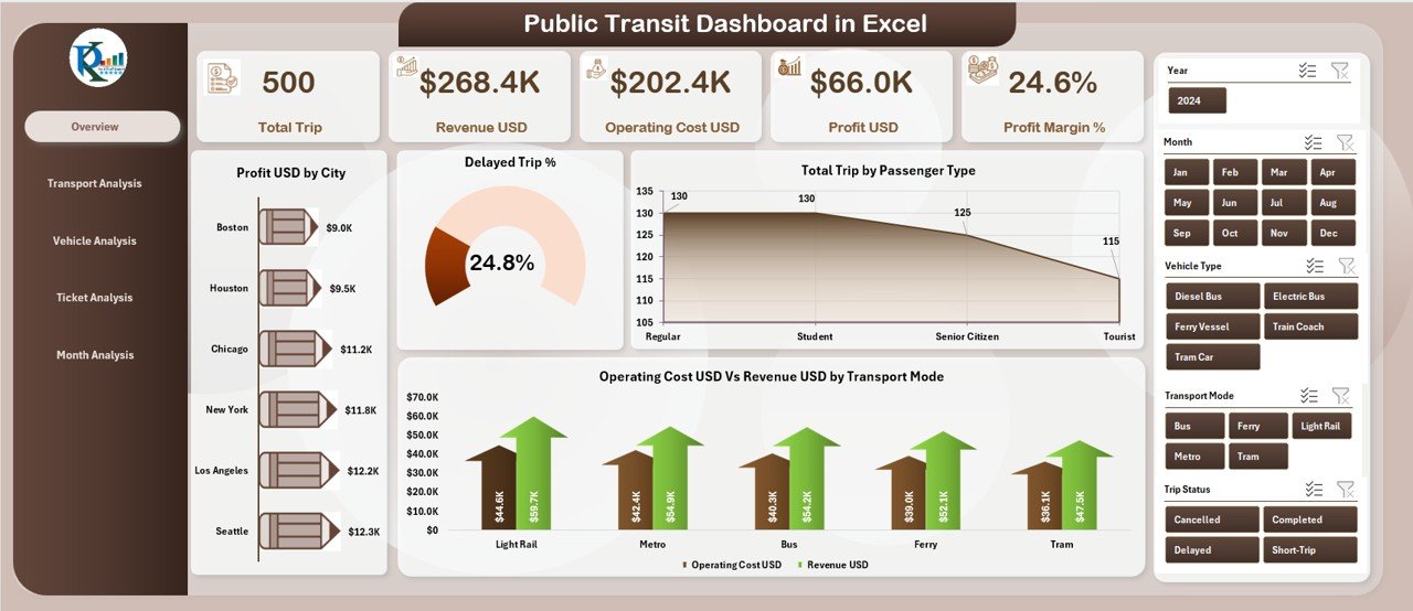
The Overview Page is the main analytical page. It gives a quick snapshot of performance so managers can make fast decisions.
Dashboard Highlights
On the right side, a slicer allows filtering the entire dashboard based on chosen values.
This helps you compare performance across cities, transport modes, months, or ticket types.
Cards on the Overview Page
You get five important cards that show key numbers:
-
Total Profit (USD)
-
Delayed Trip Percentage
-
Total Trip Count
-
Revenue (USD)
-
Operating Cost (USD)
These cards display the most important KPIs at a glance.
Charts on the Overview Page
-
Profit (USD) by City
This chart shows which cities contribute the highest profit.
It helps you plan resource allocation. -
Delayed Trip Percentage
This chart identifies cities with frequent delays.
You can improve scheduling and reduce passenger complaints. -
Total Trips by Passenger Type
You get a clear idea of whether passengers prefer regular, senior, student, or premium categories. -
Operating Cost vs. Revenue by Transport Mode
This comparison helps you understand which transport modes generate more income and which require cost control.
Click to Purchases Public Transit Dashboard in Excel
Transport Analysis Page: What Does It Show?
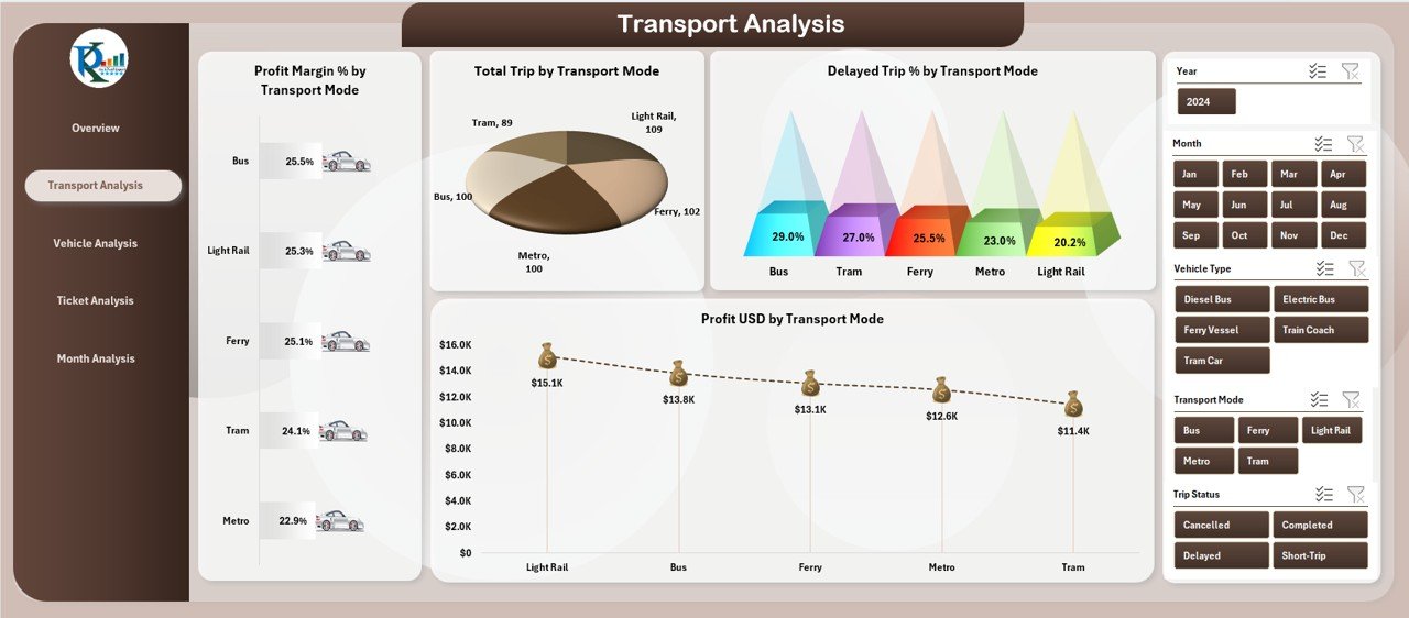
The Transport Analysis Page focuses on performance by transport mode, such as buses, trams, metros, ferries, or shuttles.
Charts on the Transport Analysis Page
-
Profit (USD) by Transport Mode
This reveals which transport mode earns the highest profit. -
Delayed Trip Percentage by Transport Mode
It identifies unreliable modes so teams can address issues. -
Total Trips by Transport Mode
You can see which mode carries the most passengers. -
Cost vs. Revenue by Transport Mode
This helps analyze financial health for each mode.
Why It Matters
Managers get a clear breakdown of performance per transport mode.
As a result, they can plan improvements for underperforming modes.
Vehicle Analysis Page: How Does It Help?
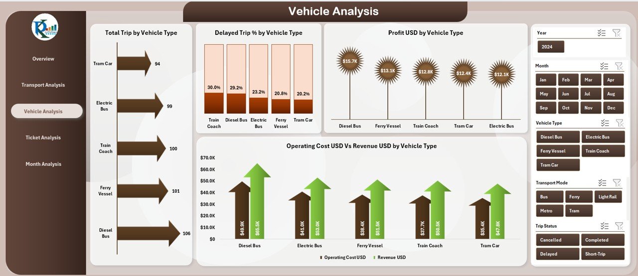
The Vehicle Analysis Page helps teams track performance by vehicle type—such as minibuses, coaches, trams, metro cars, or ferries.
Charts on the Vehicle Analysis Page
-
Profit (USD) by Vehicle Type
-
Delayed Trip Percentage by Vehicle Type
-
Cost vs. Revenue by Vehicle Type
-
Total Profit by Vehicle Type
These insights help fleet managers identify which vehicles run efficiently and which need maintenance, replacement, or better scheduling.
Why It Matters
When teams track performance at a vehicle level, they control costs better and improve reliability.
Ticket Analysis Page: What Insights Does It Provide?
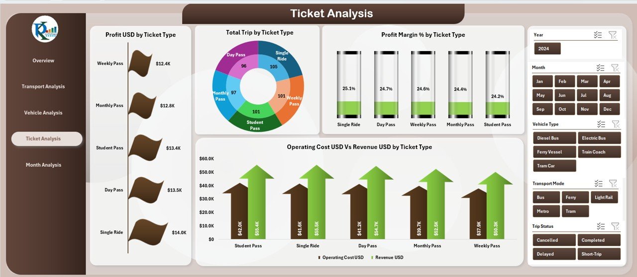
The Ticket Analysis Page focuses on ticket categories, such as:
-
Single Trip
-
Day Pass
-
Weekly Pass
-
Monthly Pass
-
Senior Ticket
-
Student Ticket
Charts on the Ticket Analysis Page
-
Profit (USD) by Ticket Type
-
Profit Margin (%) by Ticket Type
-
Total Trips by Ticket Type
-
Cost vs. Revenue by Ticket Type
Why It Matters
This page answers important questions:
-
Which ticket type gives the highest profit?
-
Do passengers prefer regular tickets or passes?
-
Which ticket category needs a pricing revision?
This page helps transit agencies make smart pricing decisions.
Month Analysis Page: What Performance Trends Can You Track?
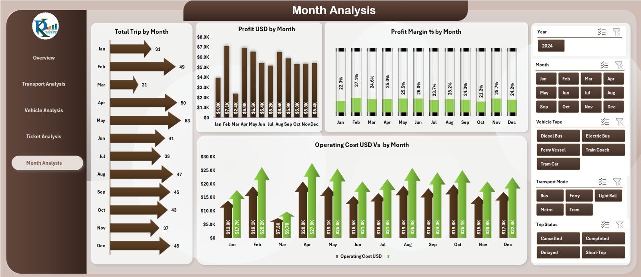
The Month Analysis Page highlights monthly performance trends.
Charts on the Month Analysis Page
-
Profit (USD) by Month
-
Profit Margin (%) by Month
-
Total Trips by Month
-
Cost vs. Revenue by Month
Why It Matters
Month-by-month trends help:
-
Forecast demand
-
Plan seasonal schedules
-
Manage maintenance cycles
-
Improve resource planning
Teams understand how performance changes throughout the year.
Support Sheets and Data Sheets Explained
Click to Purchases Public Transit Dashboard in Excel
Aside from the analytical pages, the dashboard includes:
Support Sheet
This sheet contains metadata, lists for drop-downs, and reference tables.
It keeps formulas clean and ensures the dashboard works smoothly.
Data Sheet
The Data Sheet stores all raw data such as:
-
City
-
Transport Mode
-
Vehicle Type
-
Ticket Type
-
Profit
-
Revenue
-
Operating Cost
-
Total Trips
-
Delay Percentage
-
Month
-
Passenger Type
Once you update this sheet, the entire dashboard updates automatically.
Advantages of Using a Public Transit Dashboard in Excel
A well-designed dashboard helps public transit teams take better decisions.
Here are some key advantages:
1. Instant Performance Insights
Users understand KPIs instantly without reviewing many sheets.
2. Better Resource Allocation
Teams identify profitable cities, vehicles, and modes.
3. Reduced Costs
Cost vs. revenue charts highlight areas that need improvement.
4. Improved Passenger Satisfaction
Delay analysis helps reduce waiting times and disruptions.
5. Accurate Forecasting
Monthly trends support better operational planning.
6. Zero Learning Curve
Excel dashboards are easy to use, even for beginners.
7. Faster Decision Making
Because insights are clear and visual, leaders act quickly.
Best Practices for Using the Public Transit Dashboard
Follow these best practices to get the best results:
1. Update the Data Sheet Regularly
Ensure you enter data consistently every week or month.
2. Use Clear Naming Conventions
Organize data with simple labels for cities, vehicles, and modes.
3. Maintain Data Quality
Double-check values for errors before uploading.
4. Use Filters Wisely
Apply slicers to focus on specific segments.
5. Review Monthly Trends
Use monthly charts to spot sudden changes.
6. Compare KPIs Across Categories
Study multiple charts together to uncover deeper insights.
7. Share the Dashboard with Teams
Encourage all stakeholders to use the dashboard for better collaboration.
Conclusion
A Public Transit Dashboard in Excel brings clarity, speed, and accuracy to transit performance analysis. It presents all important KPIs in one place so users understand profit, costs, delays, and passenger activity without effort. Because the dashboard includes five powerful analysis pages—Overview, Transport, Vehicle, Ticket, and Month Analysis—teams get both high-level insights and deep analytical detail.
With clear visuals, easy navigation, and automatic updates, this dashboard becomes an essential tool for public transit systems that want to improve performance and enhance passenger satisfaction.
Frequently Asked Questions (FAQs)
1. What is a Public Transit Dashboard in Excel?
It is a ready-to-use Excel dashboard that tracks public transit KPIs like revenue, profit, vehicle performance, ticket trends, and monthly activity.
2. Who can use this dashboard?
Transit managers, analysts, city planners, and operations teams can use this dashboard for decision-making.
3. Do I need advanced Excel skills to use it?
No. Anyone can use the dashboard because it updates automatically when you refresh the data.
4. What data do I need to maintain?
You need city data, transport mode data, vehicle details, ticket types, monthly performance, costs, and revenue.
5. Can I customize the dashboard?
Yes, you can add new KPIs, modify chart types, or expand data tables based on your requirements.
6. How often should I update the data sheet?
You should update the data sheet weekly or monthly for accurate analysis.
7. Does the dashboard support multiple cities?
Yes. You can track performance across all cities and compare them using charts.
8. Does it show profit and cost analysis?
Yes. Each analysis page includes profit, margin, cost, and revenue-related charts.
Visit our YouTube channel to learn step-by-step video tutorials
Click to Purchases Public Transit Dashboard in Excel