Public transportation systems play a big role in supporting modern cities. As more people depend on buses, trains, metros, ferries, and other transport modes, city authorities and transit operators need a clear way to monitor performance. However, manual reports create delays, mistakes, and confusion. Because of this, a Public Transit Dashboard in Power BI becomes an essential decision-making tool.
This dashboard gives you a full view of daily operations, revenue, ridership, cost, delays, efficiency, and monthly trends. You can explore every metric in just a few clicks and make better decisions for smoother public transport service.
In this detailed guide, you will learn everything about the Public Transit Dashboard in Power BI, including its pages, working structure, benefits, and practical use cases. You will also find the advantages, best practices, and frequently asked questions at the end.
Let’s start with the basics.
Click to Purchases Public Transit Dashboard in Power BI
What Is a Public Transit Dashboard in Power BI?
A Public Transit Dashboard in Power BI is an interactive reporting system designed for public transportation departments, transit authorities, and city planners. It helps you track daily and monthly performance through visual KPIs, charts, slicers, and easy-to-read reports.
The dashboard shows key insights such as:
-
Total trips
-
Delayed trip percentage
-
Revenue and operating cost
-
Passenger type analysis
-
Vehicle type performance
-
City-wise profits
-
Transport mode comparison
-
Monthly performance trends
Because Power BI supports slicers, filters, and drill-down options, users can explore data in a smooth and dynamic way. This makes the dashboard perfect for monitoring daily transport operations.
Why Do You Need a Public Transit Dashboard?
Public transit teams handle many activities every day. They track ridership, costs, tickets, delays, routes, vehicles, and revenue. When this data stays scattered, teams struggle with slow decision-making. A dashboard solves these challenges in minutes.
With a Public Transit Dashboard, you can:
-
Improve service levels
-
Reduce delays
-
Identify profitable and non-profitable routes
-
Track peak hours
-
Monitor monthly performance
-
Compare costs across transport modes
-
Understand passenger behavior
As a result, transit authorities can plan better schedules, reduce wastage, and improve overall reliability.
Key Features of the Public Transit Dashboard in Power BI
Your dashboard contains 5 pages, each designed with important KPIs, charts, comparison visuals, and slicers. Below is a complete explanation of every page.
1. Overview Page – A Complete Summary of Public Transit Performance
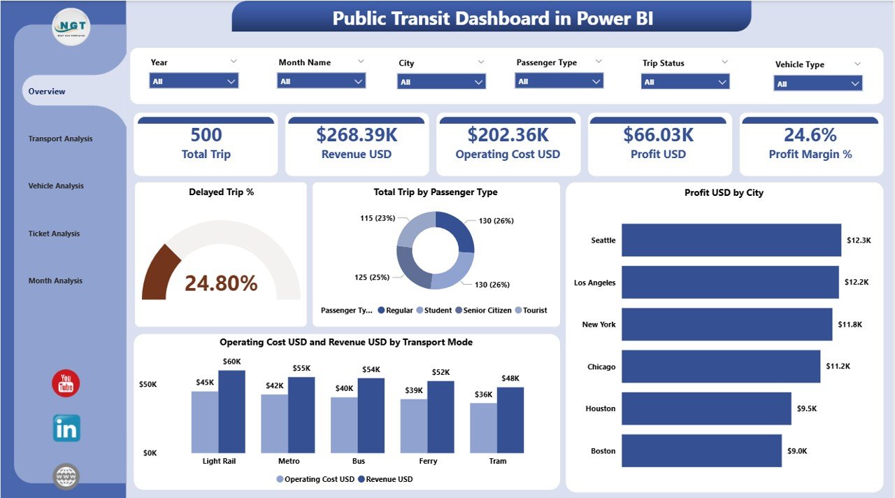
The Overview Page works as the main control screen for the dashboard. It shows a summary of all key metrics in a simple visual format.
Key Elements on the Overview Page
✔️ Slicers on Top
You can select:
-
Month
-
City
-
Transport Mode
-
Passenger Type
This helps you explore the dashboard based on real-time selections.
✔️ Four KPI Cards
The top section highlights important KPIs:
-
Delayed Trip %
-
Total Trips by Passenger Type
-
Profit (USD) by City
-
Operating Cost (USD) & Revenue (USD) by Transport Mode
These KPIs help leaders understand service performance at a glance.
✔️ Important Charts on the Overview Page
-
Delayed Trip %
This chart shows the percentage of trips that faced delays. It helps identify operational challenges. -
Total Trips by Passenger Type
This visual displays total trips for passenger categories such as students, senior citizens, daily commuters, tourists, etc. -
Profit USD by City
This gives a clear view of which cities generate more profit and which cities need attention. -
Operating Cost USD and Revenue USD by Transport Mode
This chart shows how each transport mode performs financially.
The Overview Page gives a simple and complete summary of the entire public transit system.
Click to Purchases Public Transit Dashboard in Power BI
2. Transport Analysis Page – Compare Transport Modes Easily
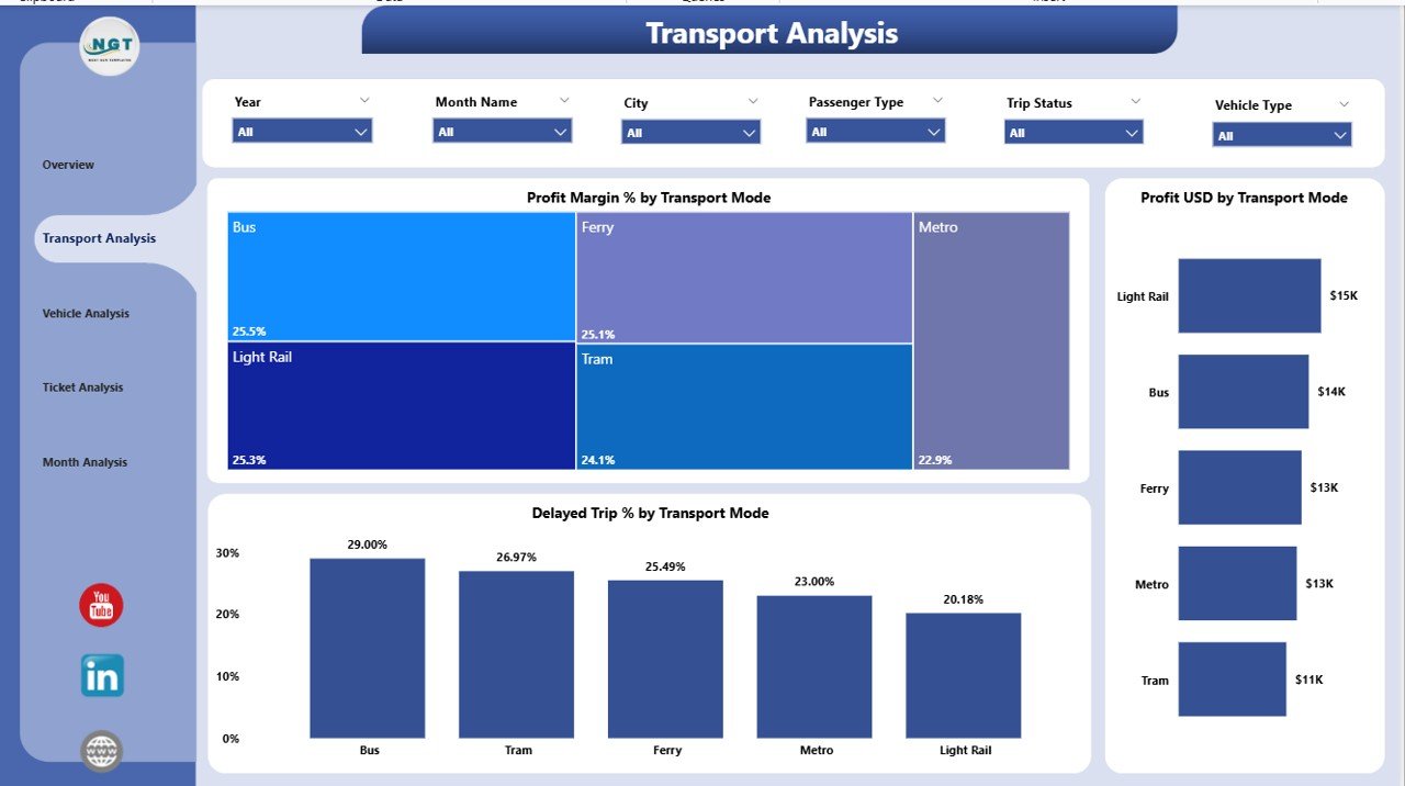
The Transport Analysis Page helps you compare different transport modes such as:
-
Bus
-
Metro
-
Train
-
Ferry
-
Tram
-
Shuttle
It gives you a deep analysis of how each mode performs in terms of cost, revenue, delay, and profitability.
Key Elements on the Transport Analysis Page
✔️ Slicers
You can filter the dashboard by month, city, passenger type, or transport mode.
✔️ Three Main Charts
-
Profit Margin % by Transport Mode
This chart displays which transport mode has the highest profitability. -
Profit USD by Transport Mode
It shows how much profit each transport mode generates. -
Delayed Trip % by Transport Mode
This visual helps you understand which transport mode faces more delays.
The Transport Analysis Page gives you the power to compare performance across all transport modes quickly.
3. Vehicle Analysis Page – Monitor Vehicle-Level Insights
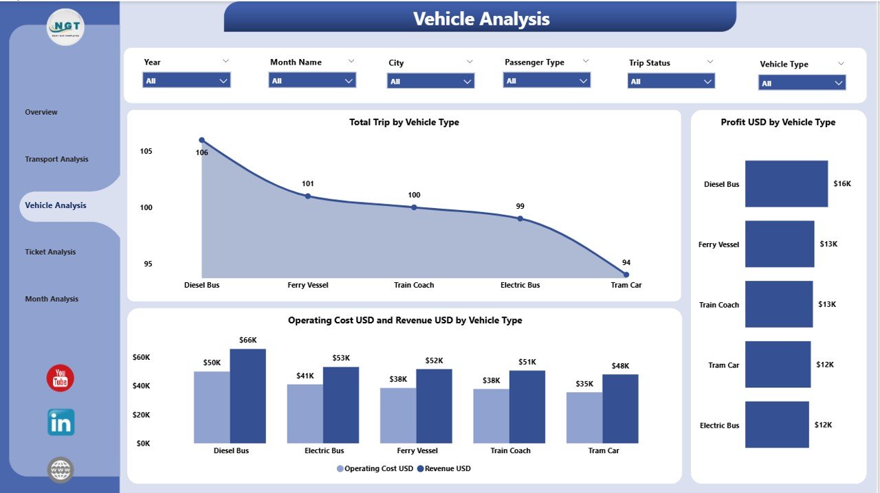
Every public transit network uses different types of vehicles. This page helps you analyze their performance in real time.
Examples of Vehicle Types
-
Bus
-
Mini Bus
-
Electric Bus
-
Tram
-
Metro Coach
-
Ferry Boat
-
Shuttle Van
Key Elements on the Vehicle Analysis Page
✔️ Slicers
You can choose the vehicle type, month, or city.
✔️ Three Major Charts
-
Total Trips by Vehicle Type
It shows how different vehicle types contribute to the total trips. -
Profit USD by Vehicle Type
This chart compares profitability between vehicle types. -
Operating Cost USD and Revenue USD by Vehicle Type
It helps you measure the cost vs. revenue for each vehicle type.
This page gives detailed insights that help authorities plan maintenance, optimize vehicle usage, and reduce operating costs.
4. Ticket Analysis Page – Understand Passenger Behavior
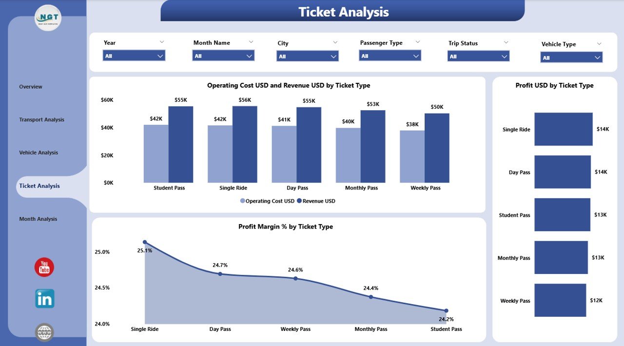
Ticket sales help public transit authorities understand revenue patterns and passenger choices. The Ticket Analysis Page gives clear ticket-wise insights.
Examples of Ticket Types
-
Single Journey Ticket
-
Monthly Pass
-
Student Pass
-
Senior Citizen Pass
-
Tourist Day Pass
Key Elements on the Ticket Analysis Page
✔️ Slicers
Users can filter data by month, city, transport mode, or ticket type.
✔️ Three Important Charts
-
Profit Margin % by Ticket Type
It shows which ticket types give the highest profit. -
Profit USD by Ticket Type
This chart displays revenue contribution from each ticket type. -
Operating Cost USD & Revenue USD by Ticket Type
This visual helps you balance affordability and profitability.
This page helps you understand which ticket types perform well and which need redesigning.
5. Monthly Trends Page – Track Performance Month by Month
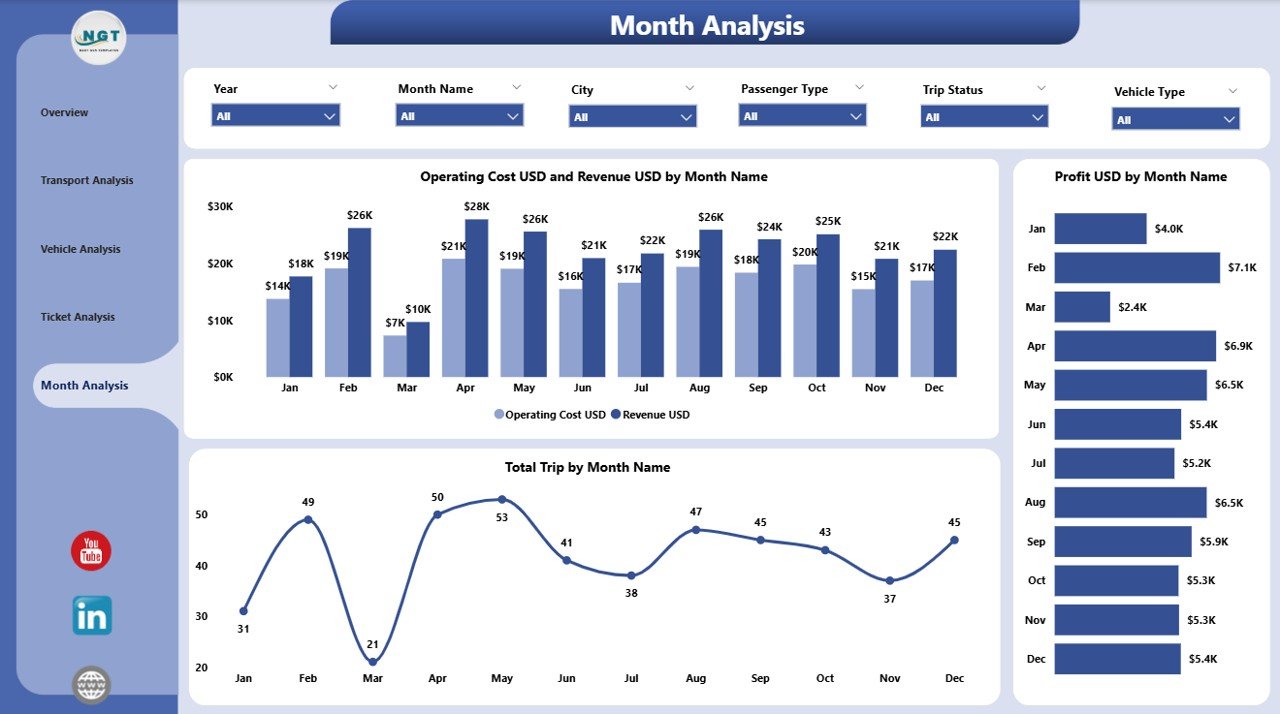
Monthly analysis helps transit authorities plan ahead. The Monthly Trends Page gives you a complete month-by-month breakdown.
Key Elements of Monthly Trends Page
✔️ Three Detailed Charts
-
Total Trips by Month
This visual helps identify seasonal demand and peak months. -
Profit USD by Month
It shows monthly profit trends so you can spot growth or decline. -
Operating Cost USD and Revenue USD by Month
This chart helps you monitor long-term financial stability.
The Monthly Trends Page makes planning easier and supports data-driven decisions.
Advantages of a Public Transit Dashboard in Power BI
Click to Purchases Public Transit Dashboard in Power BI
A Public Transit Dashboard offers many benefits. Below are the most important advantages:
✔️ 1. Real-Time Insights for Fast Decisions
The dashboard updates automatically when you refresh the data. This helps managers make quick decisions.
✔️ 2. Improved Efficiency Across the Transport Network
You can detect delays, vehicle issues, and slow routes. This improves day-to-day operations.
✔️ 3. Clear Financial Analysis
Operators can compare revenue, cost, and profit for every category. This helps reduce waste and increase profit.
✔️ 4. Better Passenger Experience
You can understand passenger trends and improve services based on real demand.
✔️ 5. Support for Long-Term Planning
Monthly trends help you forecast future demands and budget requirements.
✔️ 6. Easy-to-Use and Fully Interactive
Power BI gives smooth navigation, slicers, filters, and drill-down options.
✔️ 7. Accurate Performance Comparison
Compare:
-
Transport Modes
-
Vehicle Types
-
Cities
-
Ticket Types
-
Months
This helps leaders identify strong and weak areas.
Best Practices for Using the Public Transit Dashboard
To get the best results, follow these simple practices:
1. Keep Data Clean and Organized
Accurate data helps you get reliable insights. Remove duplicates and errors regularly.
2. Refresh the Data Frequently
Daily or weekly refresh keeps the dashboard updated.
3. Use Slicers Effectively
Use slicers to filter data by city, month, vehicle, or ticket type.
4. Compare Cost and Revenue Together
Cost and revenue charts help identify loss-making routes.
5. Track Delays Regularly
Delayed trips affect passenger satisfaction. Monitor delay metrics daily.
6. Use Monthly Trends for Planning
Check monthly performance for budgeting and future planning.
7. Share Dashboard with Teams
Give access to operations teams, finance teams, and management for better coordination.
Conclusion
A Public Transit Dashboard in Power BI helps transport authorities monitor performance in a simple and visual way. It gives you insights about trips, delays, revenue, profit, operating cost, vehicles, ticket types, and monthly trends. With its interactive features, easy slicers, and clean visuals, the dashboard becomes an essential tool for making decisions.
This dashboard supports daily operations, monthly reviews, and long-term planning. As a result, public transit systems can improve service quality, reduce delays, and offer a smooth experience for passengers.
Frequently Asked Questions (FAQ)
1. What is a Public Transit Dashboard in Power BI?
It is an interactive reporting system that shows insights about trips, revenue, delays, vehicles, ticket types, and monthly trends.
2. Who can use this dashboard?
Public transport departments, transit authorities, city planners, analysts, and management teams use this dashboard.
3. Can I compare different transport modes?
Yes, the dashboard has a full Transport Analysis Page that compares profit, cost, and delays across transport modes.
4. Does the dashboard show monthly trends?
Yes, the Monthly Trends Page shows trips, profit, cost, and revenue month by month.
5. Can I filter data in this dashboard?
Yes, you can filter the dashboard using slicers such as city, month, vehicle type, transport mode, and ticket type.
Visit our YouTube channel to learn step-by-step video tutorials