Radiology and imaging departments operate at the heart of modern healthcare. Every scan, report, and diagnosis directly affects patient outcomes, clinical decisions, and hospital efficiency. However, without structured performance tracking, even the most advanced imaging centers struggle with delays, rising costs, and missed improvement opportunities. That is exactly why a Radiology & Imaging KPI Dashboard in Power BI becomes a powerful and essential solution.
This in-depth guide explains what a Radiology & Imaging KPI Dashboard in Power BI is, why it matters, how it works, and how each dashboard page supports smarter decision-making. Moreover, this article covers advantages, opportunities for improvement, best practices, and frequently asked questions so you can confidently implement and use this dashboard.
Click to buy Radiology & Imaging KPI Dashboard in Power BI
What Is a Radiology & Imaging KPI Dashboard in Power BI?
A Radiology & Imaging KPI Dashboard in Power BI is a structured, ready-to-use analytical solution that tracks, measures, and visualizes key performance indicators (KPIs) for radiology and diagnostic imaging operations.
Instead of working with scattered Excel files and static reports, this dashboard converts raw data into meaningful visuals, comparisons, and trends. As a result, radiology managers, hospital administrators, and healthcare leaders gain real-time visibility into performance.
Because the dashboard uses Power BI as the visualization layer and Excel as the data source, it remains flexible, scalable, and easy to maintain.
Why Do Radiology & Imaging Departments Need KPI Dashboards?
Radiology departments face constant pressure. On one hand, patient volumes increase. On the other hand, turnaround time expectations keep shrinking. Therefore, departments must monitor performance consistently.
Without a KPI dashboard:
- Leaders struggle to identify bottlenecks
- Target misses go unnoticed
- Year-over-year comparisons remain unclear
- Decision-making becomes reactive instead of proactive
However, when teams use a Radiology & Imaging KPI Dashboard in Power BI, they gain clarity, speed, and control.
How Does a Radiology & Imaging KPI Dashboard in Power BI Work?
This dashboard follows a simple yet powerful structure.
- Excel acts as the data source, where users enter actual values, targets, and KPI definitions.
- Power BI connects to Excel, processes calculations, and displays KPIs visually.
- Slicers allow interaction, such as filtering by month or KPI group.
- Visual indicators highlight performance, making insights easy to understand.
Because of this design, users update data without touching Power BI formulas or visuals.
What Are the Key Features of the Radiology & Imaging KPI Dashboard in Power BI?
This dashboard includes three structured pages, each designed for a specific analytical purpose.
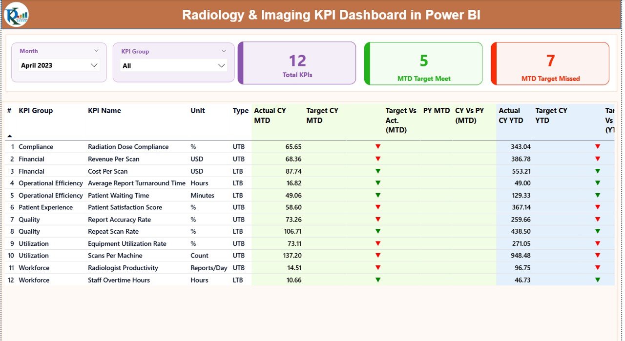
Summary Page Show
The Summary Page serves as the main control center of the dashboard. From the moment users open the report, they see a complete overview of radiology performance.
Key Elements of the Summary Page
- Month Slicer
Allows users to select a specific month. All KPIs update instantly.
KPI Group Slicer
Filters KPIs by category, such as operational, financial, or quality metrics.
KPI Cards
Total KPIs Count
MTD Target Met Count
MTD Target Missed Count
These cards instantly highlight overall performance status.
What KPIs Appear in the Detailed Summary Table
The detailed table provides granular insights for every KPI.
- KPI Number
Displays the sequence number of the KPI. - KPI Group
Shows the category of the KPI. - KPI Name
Clearly identifies the metric. - Unit
Defines the measurement unit. - Type (LTB or UTB)
Indicates whether lower or higher values represent better performance. - Actual CY MTD
Displays the current year’s Month-to-Date actual value. - Target CY MTD
Shows the Month-to-Date target. - MTD Status Icon
Uses green ▲ or red ▼ icons to show target achievement. - Target vs Actual (MTD)
Calculates performance using:
Actual MTD ÷ Target MTD - Previous Year MTD
Shows last year’s performance for the same period. - CY vs PY (MTD)
Compares current and previous year MTD values. - Actual CY YTD
Displays Year-to-Date actual performance. - Target CY YTD
Shows Year-to-Date target values. - YTD Status Icon
Highlights YTD performance visually. - Target vs Actual (YTD)
Calculates:
Actual YTD ÷ Target YTD - Previous Year YTD
- CY vs PY (YTD)
Compares current and previous year YTD performance.
As a result, decision-makers identify trends and gaps without manual calculations.
Click to buy Radiology & Imaging KPI Dashboard in Power BI
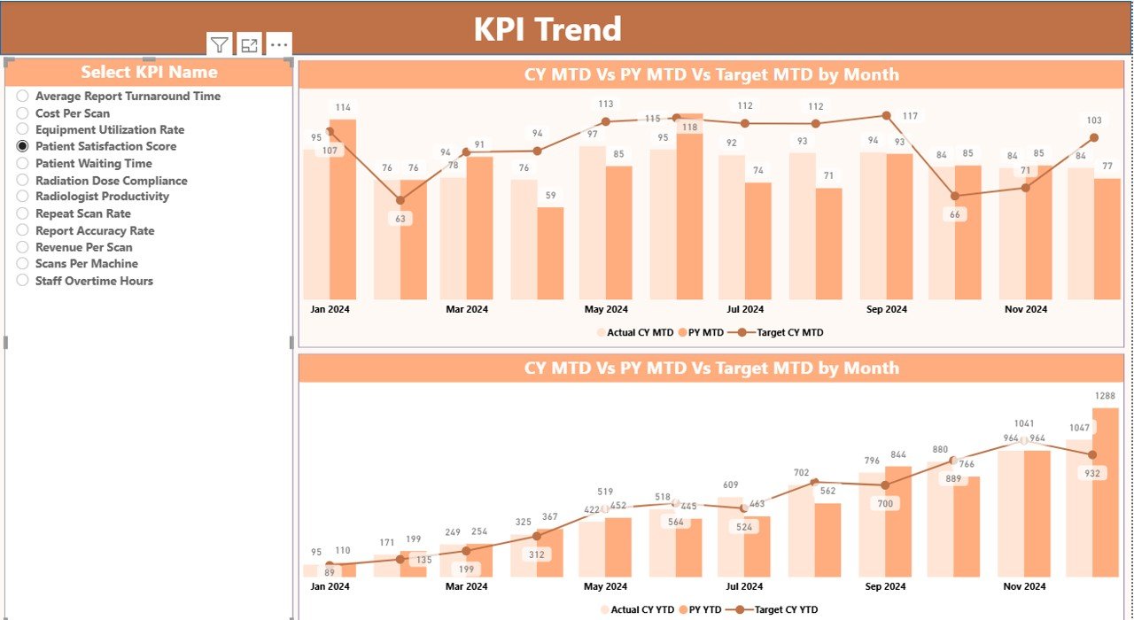
KPI Trend Page
The KPI Trend Page focuses on performance movement over time.
Key Highlights of the KPI Trend Page
- KPI Name Slicer
Allows users to select one KPI for detailed trend analysis. - MTD Combo Chart
Current Year Actual
Previous Year Actual
Target Values
YTD Combo Chart
Current Year Actual
Previous Year Actual
Target Values
Because of this design, users easily compare actuals against targets and historical performance.
Click to buy Radiology & Imaging KPI Dashboard in Power BI
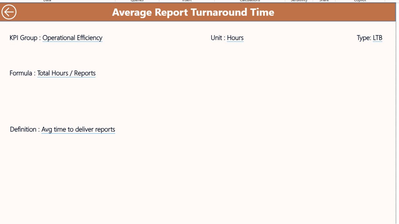
KPI Definition Page
The KPI Definition Page ensures transparency and clarity.
Key Features of the KPI Definition Page
- Hidden by default to keep the dashboard clean
- Accessible via drill-through from the Summary Page
- Displays:
KPI Formula
KPI Definition
Unit and Type
Additionally, a Back Button helps users return to the Summary Page instantly.
Click to buy Radiology & Imaging KPI Dashboard in Power BI
How Does the Excel Data Source Work?
The dashboard uses a structured Excel file with three worksheets.
Input_Actual Sheet
This sheet stores actual performance values.
Users enter:
- KPI Name
- Month (use the first date of the month)
- MTD Actual Number
- YTD Actual Number
Input_Target Sheet
This sheet stores target values.
Users enter:
- KPI Name
- Month (first date of the month)
- MTD Target Number
- YTD Target Number
KPI Definition Sheet
This sheet defines every KPI clearly.
Users enter:
- KPI Number
- KPI Group
- KPI Name
- Unit
- Formula
- Definition
- Type (LTB or UTB)
Because of this structure, the dashboard remains consistent and scalable.
Advantages of Radiology & Imaging KPI Dashboard in Power BI
Using a Radiology & Imaging KPI Dashboard in Power BI delivers significant benefits.
Centralized Performance Monitoring
All KPIs appear in one structured dashboard.
Faster Decision-Making
Visual indicators reduce analysis time.
Improved Target Tracking
MTD and YTD comparisons reveal performance gaps quickly.
Historical Performance Visibility
CY vs PY analysis highlights growth and decline.
Easy Data Maintenance
Excel-based inputs simplify updates.
Executive-Ready Reporting
Clean visuals support leadership discussions.
Opportunities for Improvement in Radiology & Imaging KPI Dashboards
Even powerful dashboards offer room for growth.
- Add equipment utilization KPIs for machines like MRI and CT scanners
- Include radiologist productivity metrics
- Integrate patient wait time analysis
- Add automated alerts for critical KPI misses
- Connect to live hospital systems for real-time data
These enhancements further strengthen performance insights.
Best Practices for Radiology & Imaging KPI Dashboard in Power BI
Following best practices ensures long-term success.
Define Clear KPI Ownership
Assign responsibility for every KPI.
Keep KPI Definitions Simple
Avoid ambiguous formulas or metrics.
Update Data Consistently
Schedule regular Excel data updates.
Focus on Actionable Metrics
Track KPIs that drive improvement, not vanity metrics.
Review Trends Regularly
Analyze MTD and YTD trends monthly.
Train Users Properly
Ensure teams understand slicers and visuals.
Conclusion: Why Radiology & Imaging KPI Dashboards Matter
A Radiology & Imaging KPI Dashboard in Power BI transforms raw data into actionable intelligence. It improves visibility, supports strategic planning, and strengthens operational control. Moreover, by combining Excel data entry with Power BI visualization, this dashboard remains flexible, powerful, and easy to maintain.
When radiology leaders adopt KPI dashboards, they shift from reactive problem-solving to proactive performance management. As a result, patient care improves, efficiency rises, and accountability strengthens.
Frequently Asked Questions (FAQs)
What is a Radiology & Imaging KPI Dashboard in Power BI?
It is a Power BI-based analytics tool that tracks radiology KPIs using Excel data.
Can non-technical users update this dashboard?
Yes. Users update Excel sheets without touching Power BI formulas.
Does the dashboard support MTD and YTD analysis?
Yes. It tracks both Month-to-Date and Year-to-Date performance.
Can this dashboard work for multiple imaging centers?
Yes. Users can scale it by adding more KPIs and data rows.
Does the dashboard support historical comparisons?
Yes. It includes Current Year vs Previous Year comparisons.
Is this dashboard customizable?
Yes. Users can add KPIs, modify targets, and adjust visuals.
Visit our YouTube channel to learn step-by-step video tutorials
Watch the step-by-step video tutorial:
Click to buy Radiology & Imaging KPI Dashboard in Power BI