Railway networks manage thousands of trips, stations, zones, and train categories every day. Because operations run at such scale, decision-makers need clear visibility into performance, cost, and revenue. However, traditional reports fail to deliver fast insights. As a result, managers struggle to track delays, cost overruns, and revenue gaps.
That is exactly why a Railways Dashboard in Power BI becomes a powerful and practical analytics solution.
This detailed guide explains what a Railways Dashboard in Power BI is, how it works, its complete page-wise structure, advantages, opportunities for improvement, best practices, and frequently asked questions. Moreover, this article uses simple language, active voice, and real-world examples so you can apply every concept immediately.
Click to Purchases Railways Dashboard in Power BI
What Is a Railways Dashboard in Power BI?
A Railways Dashboard in Power BI is a centralized, interactive reporting solution that visualizes key railway performance metrics such as scheduled trips, completed trips, operating costs, and revenue.
Instead of reviewing static spreadsheets or manual reports, stakeholders see real-time visuals that highlight trends, bottlenecks, and opportunities. Because the dashboard uses Microsoft Power BI, it offers interactivity, slicers, drill-downs, and dynamic filtering across multiple dimensions like train type, category, station, and zone.
As a result, railway planners, operations teams, and leadership gain faster insights and better control.
Why Do Railways Need a Power BI Dashboard?
Railway operations involve complex coordination. Therefore, visibility and speed matter.
Here is why rail organizations rely on dashboards:
-
🚆 High trip volumes require continuous monitoring
-
💰 Operating costs vary by train type and region
-
📍 Performance differs by station, zone, and category
-
⏱ Delays impact customer satisfaction and revenue
Because a Power BI dashboard consolidates all this data, teams make faster, data-driven decisions.
How Does a Railways Dashboard in Power BI Work?
The Railways Dashboard in Power BI works through a structured data flow.
Step-by-step process:
-
Data Collection
Railway data flows from operational systems or Excel files. -
Data Modeling
Data models connect trips, costs, stations, zones, and revenue tables. -
Visualization Layer
Charts, cards, and slicers transform raw data into insights. -
User Interaction
Users filter by train type, category, station, or zone instantly.
Because of this workflow, users explore performance from multiple angles without technical complexity.
What Are the Key Features of the Railways Dashboard in Power BI?
This ready-to-use dashboard includes five structured analytical pages. Each page focuses on a specific operational dimension.
Let us explore them one by one.
Overview Page: How Do You Get a High-Level Railway Performance View?
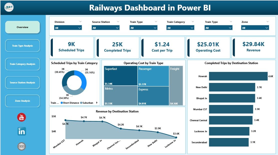
The Overview Page acts as the command center of the dashboard.
What does this page show?
-
Interactive slicers for quick filtering
-
High-level KPI cards for instant understanding
-
Visual comparison across categories and stations
Key Cards on the Overview Page
-
Scheduled Trips by Train Category
-
Operating Cost by Train Type
-
Completed Trips by Destination Station
-
Revenue by Destination Station
Key Insights You Can Extract
-
Which train categories run the most trips
-
Which train types drive higher costs
-
Which destinations generate maximum revenue
Because this page summarizes performance, executives use it for quick reviews and strategic decisions.
Train Type Analysis: How Do Different Train Types Perform?
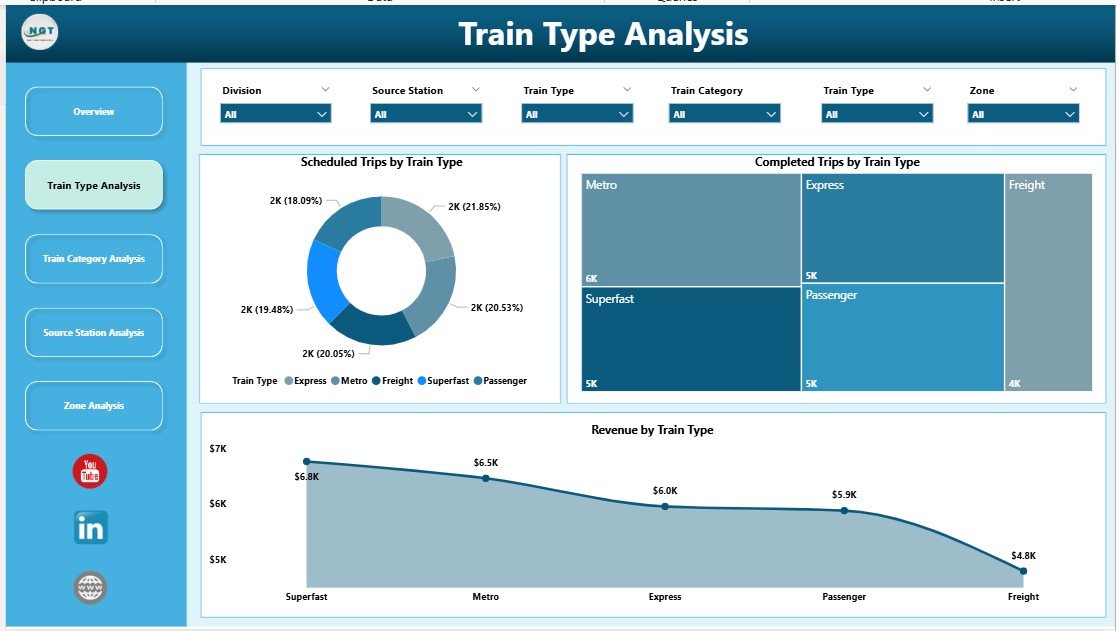
The Train Type Analysis Page focuses on performance differences between train types.
Charts on This Page
-
Scheduled Trips by Train Type
-
Completed Trips by Train Type
-
Revenue by Train Type
Why This Page Matters
Train types differ in speed, capacity, and cost. Therefore, understanding their performance helps optimize deployment.
Key Questions Answered
-
Which train types complete the highest number of trips?
-
Which train types generate the most revenue?
-
Where do gaps exist between scheduled and completed trips?
As a result, planners adjust schedules and resources more effectively.
Train Category Analysis: How Do Train Categories Impact Performance?

The Train Category Analysis Page highlights performance by category, such as passenger, freight, or express services.
Charts on This Page
-
Scheduled Trips by Train Category
-
Operating Cost by Train Category
-
Revenue by Train Category
Business Value of This Page
Different categories serve different goals. Passenger services focus on volume, while freight focuses on revenue per trip.
This page helps leaders:
-
Compare cost efficiency across categories
-
Identify high-revenue categories
-
Balance service mix strategically
Because insights remain visual and interactive, teams identify trends instantly.
Source Station Analysis: Which Stations Drive Operations and Revenue?

The Source Station Analysis Page evaluates performance at the origin level.
Charts on This Page
-
Scheduled Trips by Source Station
-
Operating Cost by Source Station
-
Revenue by Source Station
Why Source Station Analysis Is Critical
Some stations act as major hubs. Others operate at lower capacity.
This page helps answer:
-
Which stations schedule the most trips?
-
Which stations incur higher operating costs?
-
Which stations generate the highest revenue?
As a result, operations teams improve station-level planning and investment decisions.
Click to Purchases Railways Dashboard in Power BI
Zone Analysis: How Do Zones Perform Across the Network?

The Zone Analysis Page provides a regional view of railway performance.
Charts on This Page
-
Scheduled Trips by Zone
-
Operating Cost by Zone
-
Revenue by Zone
Strategic Importance of Zone Analysis
Zones reflect geographic and administrative divisions. Performance often varies due to infrastructure, demand, and population.
With this page, leaders can:
-
Compare zone-wise efficiency
-
Allocate budgets more effectively
-
Identify underperforming regions
Because the data remains filterable, users drill down quickly.
Who Should Use a Railways Dashboard in Power BI?
This dashboard serves a wide range of stakeholders.
Ideal Users Include:
-
Railway Operations Managers
-
Planning & Scheduling Teams
-
Finance & Cost Control Departments
-
Regional & Zone Heads
-
Executive Leadership
-
Data & Business Analysts
Because the dashboard uses intuitive visuals, even non-technical users benefit.
Advantages of Railways Dashboard in Power BI
A Railways Dashboard in Power BI delivers several operational and strategic advantages.
Key Advantages
-
🚀 Real-time performance visibility across the network
-
📊 Interactive filtering for fast analysis
-
💡 Data-driven decisions without manual reports
-
🧭 Clear accountability by station, zone, and category
-
⏳ Time savings through automated reporting
Because teams access one source of truth, coordination improves significantly.
Opportunities for Improvement in a Railways Dashboard
Even powerful dashboards can evolve further.
Possible Enhancements
-
Add on-time performance metrics
-
Include delay reason analysis
-
Track maintenance and asset utilization
-
Integrate passenger satisfaction scores
-
Enable predictive analytics for demand forecasting
By adding these elements, rail organizations gain deeper insights.
Best Practices for the Railways Dashboard in Power BI
To maximize value, follow these proven best practices.
Best Practices Checklist
-
✔ Keep visuals simple and focused
-
✔ Use consistent naming for train types and stations
-
✔ Validate data regularly for accuracy
-
✔ Limit slicers to meaningful dimensions
-
✔ Design pages with a clear analytical purpose
-
✔ Train users on how to interact with visuals
Because best practices improve adoption, dashboards deliver stronger ROI.
How Does a Railways Dashboard Improve Decision-Making?
A dashboard changes how teams think and act.
Instead of reacting to problems late, teams:
-
Identify issues early
-
Compare performance objectively
-
Prioritize high-impact actions
As a result, decisions become proactive, not reactive.
How Can This Dashboard Support Cost Optimization?
Cost control remains a top priority for railways.
With this dashboard, finance teams:
-
Monitor operating cost by train type
-
Compare cost efficiency across zones
-
Identify high-cost stations
Therefore, organizations reduce waste and improve margins.
How Does the Dashboard Support Revenue Growth?
Revenue visibility drives growth.
The dashboard helps by:
-
Highlighting top revenue stations
-
Comparing revenue by train category
-
Identifying underperforming routes
Because insights remain visual, marketing and planning teams act faster.
Conclusion: Why Is a Railways Dashboard in Power BI a Must-Have Tool?
A Railways Dashboard in Power BI transforms complex railway data into clear, actionable insights. Instead of relying on static reports, decision-makers gain real-time visibility into trips, costs, and revenue.
Because the dashboard includes structured pages like Overview, Train Type Analysis, Train Category Analysis, Source Station Analysis, and Zone Analysis, users analyze performance from every critical angle.
In today’s data-driven world, railways that use interactive dashboards stay efficient, competitive, and future-ready.
Frequently Asked Questions (FAQs)
What is a Railways Dashboard in Power BI used for?
A Railways Dashboard in Power BI tracks railway performance metrics such as trips, costs, and revenue through interactive visuals.
Can non-technical users use this dashboard?
Yes, the dashboard uses simple visuals and slicers, which makes it easy for non-technical users.
Does the dashboard support real-time data?
Yes, Power BI supports scheduled and real-time data refresh depending on the data source.
Can we customize the dashboard pages?
Yes, you can customize visuals, KPIs, and pages based on business needs.
Is Power BI suitable for large railway datasets?
Yes, Power BI handles large datasets efficiently with proper data modeling.
Can this dashboard integrate with Excel data?
Click to Purchases Railways Dashboard in Power BI
Yes, Excel works as a common data source for Power BI dashboards.
Does this dashboard help in cost control?
Yes, it highlights operating costs by train type, station, and zone.
Can we add predictive analytics later?
Yes, you can enhance the dashboard with forecasting and AI-driven insights.
Visit our YouTube channel to learn step-by-step video tutorials