Renewable energy projects demand precision, capital control, and strong performance monitoring. However, many organizations still manage solar, wind, hydro, and biomass projects using scattered Excel sheets and manual reports. As a result, decision-makers struggle to track ROI, investment flow, subsidies, operating costs, and regional performance clearly.
So, how can you monitor renewable infrastructure projects in one structured system?
The answer is simple.
You need a Renewable Infrastructure Projects Dashboard in Excel.
Click to Purchases Renewable Infrastructure Projects Dashboard in Excel
This ready-to-use dashboard transforms raw project data into powerful insights. Moreover, it helps you monitor ROI %, Investment, Operating Cost, Revenue, Government Subsidy, and Risk Level across multiple dimensions. Therefore, you can make faster and smarter investment decisions.
In this detailed guide, you will learn:
-
What a Renewable Infrastructure Projects Dashboard in Excel is
-
Why renewable companies need it
-
Detailed explanation of all 5 dashboard pages
-
Advantages of Renewable Infrastructure Projects Dashboard in Excel
-
Best Practices for the Renewable Infrastructure Projects Dashboard
-
Frequently Asked Questions with Answers
Let us explore everything step by step.
What Is a Renewable Infrastructure Projects Dashboard in Excel?
A Renewable Infrastructure Projects Dashboard in Excel is a structured performance tracking system designed to monitor renewable energy infrastructure projects using interactive charts and KPIs.
Instead of reviewing multiple reports, you can:
-
Track ROI % instantly
-
Monitor high-risk project percentage
-
Analyze revenue by project type
-
Compare operating cost by energy source
-
Review government subsidy distribution
-
Evaluate contractor performance
Because the dashboard runs in Excel, you can customize it easily. Moreover, you can use Pivot Tables and Pivot Charts to update the visuals automatically. As a result, you save time and improve reporting accuracy.
Why Do Renewable Infrastructure Companies Need This Dashboard?
Renewable projects involve large capital investments. Therefore, you must monitor performance continuously.
Without a structured dashboard:
-
Investment leakage increases
-
High-risk projects remain unnoticed
-
Contractors underperform without detection
-
Subsidy tracking becomes unclear
-
Regional comparison becomes difficult
However, when you use a centralized dashboard:
-
You gain instant project visibility
-
You compare ROI across regions and energy sources
-
You track cost overruns early
-
You improve investor reporting
Therefore, this dashboard works as your renewable project control center.
Click to Purchases Renewable Infrastructure Projects Dashboard in Excel
Key Features of Renewable Infrastructure Projects Dashboard in Excel
Let us understand the structure of this powerful dashboard.
Page Navigator (Left Side)
The dashboard includes a Page Navigator located on the left side. This feature allows easy navigation across all analytical pages.
Because of this structure:
-
Users switch between pages quickly
-
Reports look professional
-
Stakeholders focus on insights instead of searching sheets
Detailed Explanation of All 5 Dashboard Pages
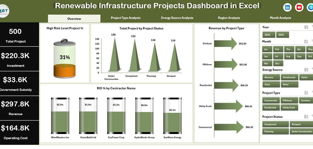
1️⃣ Overview Page – The Strategic Snapshot
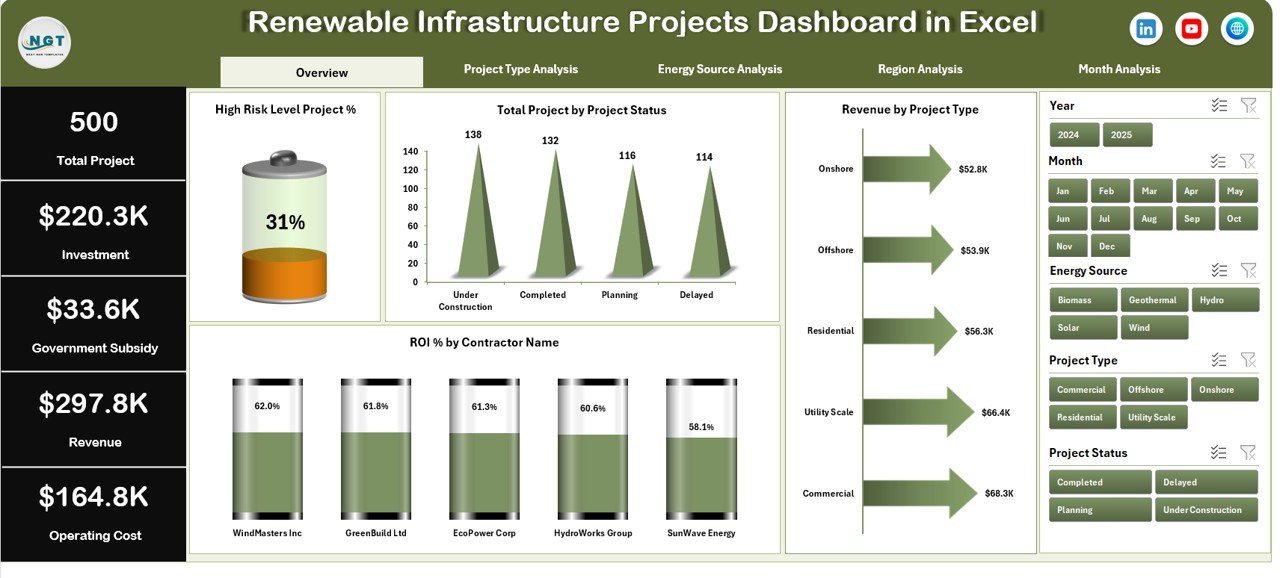
The Overview Page acts as the main control panel.
What does this page include?
-
Right-side slicers for filtering
-
4 KPI cards
-
4 interactive charts
KPI Cards
-
High Risk Level Project %
-
Total Projects
-
Total Revenue
-
Average ROI %
These cards provide instant insights. As a result, management can quickly assess overall performance.
Charts on Overview Page
-
High Risk Level Project %
-
Total Projects by Project Status
-
Revenue by Project Type
-
ROI % by Contractor Name
Therefore, this page helps executives understand risk exposure, profitability, and contractor performance in one glance.
2️⃣ Project Type Analysis – Which Project Type Performs Better?
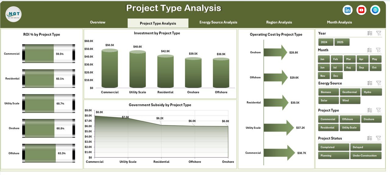
Renewable infrastructure includes:
-
Solar Projects
-
Wind Farms
-
Hydro Projects
-
Biomass Plants
-
Geothermal Projects
This page includes:
-
ROI % by Project Type
-
Investment by Project Type
-
Operating Cost by Project Type
-
Government Subsidy by Project Type
Because of this breakdown, you can:
-
Identify the most profitable project type
-
Analyze capital allocation
-
Compare subsidy impact
-
Detect cost-heavy project categories
As a result, you optimize portfolio allocation.
3️⃣ Energy Source Analysis – Which Energy Source Generates Maximum Return?
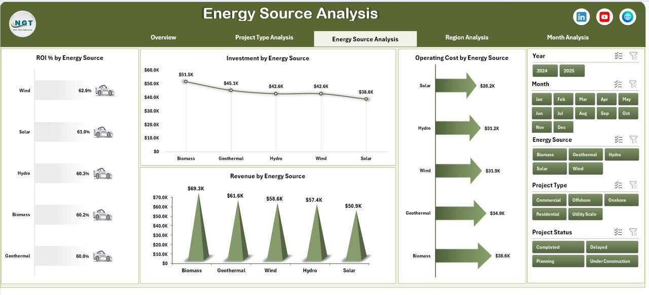
Energy source performance determines long-term sustainability.
This page shows:
-
ROI % by Energy Source
-
Investment by Energy Source
-
Operating Cost by Energy Source
-
Revenue by Energy Source
Therefore, you can:
-
Compare solar vs wind ROI
-
Analyze hydro operating costs
-
Review revenue contribution by energy type
-
Adjust future energy investments
Moreover, this analysis supports strategic expansion planning.
Click to Purchases Renewable Infrastructure Projects Dashboard in Excel
4️⃣ Region Analysis – Which Region Performs Best?
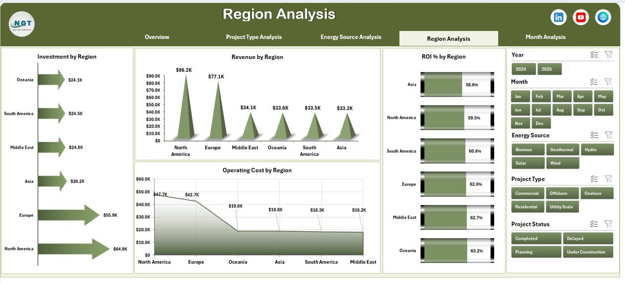
Renewable projects operate across multiple regions. However, performance varies due to policies, climate, and subsidies.
This page includes:
-
ROI % by Region
-
Investment by Region
-
Operating Cost by Region
-
Revenue by Region
Because of this analysis:
-
You compare region-wise profitability
-
You evaluate subsidy-driven growth
-
You detect underperforming regions
-
You plan future expansion strategically
Therefore, regional planning becomes data-driven.
5️⃣ Month Analysis – How Does Performance Change Over Time?
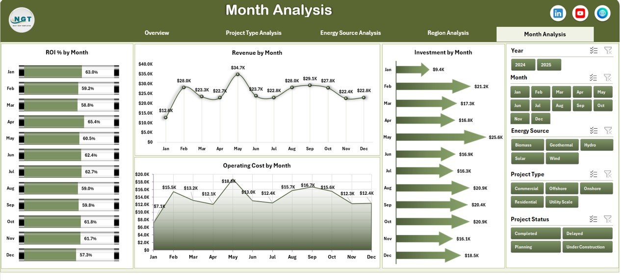
Time-based analysis reveals trends.
This page shows:
-
ROI % by Month
-
Investment by Month
-
Operating Cost by Month
-
Revenue by Month
As a result:
-
You identify seasonal patterns
-
You track revenue growth
-
You detect cost spikes
-
You measure monthly ROI fluctuations
Therefore, trend analysis supports forecasting and budget planning.
Support Sheet – Why Is It Important?
The Support Sheet stores:
-
Helper calculations
-
KPI formulas
-
Intermediate pivot tables
Because this sheet manages backend calculations, the dashboard updates smoothly.
Data Sheet – The Foundation of the Dashboard
The Data Sheet stores structured project data such as:
-
Project ID
-
Project Name
-
Project Type
-
Energy Source
-
Region
-
Contractor Name
-
Investment Amount
-
Operating Cost
-
Revenue
-
Government Subsidy
-
Risk Level
-
Project Status
-
Start Date
-
Completion Date
-
Month
Because the data remains structured, you can build Pivot Tables easily.
How Does This Dashboard Improve Decision-Making?
This dashboard supports multiple stakeholders:
For Project Managers
-
Monitor project status
-
Control cost overruns
-
Track ROI
For Finance Teams
-
Analyze investment efficiency
-
Compare subsidy impact
-
Review revenue trends
For Investors
-
Assess risk exposure
-
Evaluate ROI
-
Monitor portfolio performance
Therefore, everyone works with aligned data.
Advantages of Renewable Infrastructure Projects Dashboard in Excel
Let us explore the key advantages.
1️⃣ Centralized Performance Monitoring
You track all projects in one file. Therefore, you avoid scattered reports.
2️⃣ Better ROI Tracking
You compare ROI across contractors, regions, and energy sources. As a result, you invest wisely.
3️⃣ Risk Management
You monitor high-risk projects instantly. Consequently, you reduce financial exposure.
4️⃣ Cost Control
You analyze operating cost patterns. Therefore, you detect inefficiencies early.
5️⃣ Government Subsidy Tracking
You review subsidy distribution clearly. As a result, you optimize policy benefits.
6️⃣ Interactive Filtering
Slicers allow instant filtering. Therefore, reporting becomes dynamic.
7️⃣ Time Saving
You automate analysis using Pivot Charts. Hence, you reduce manual effort.
Best Practices for the Renewable Infrastructure Projects Dashboard
If you want maximum value, follow these best practices:
✅ Maintain Clean Data
Always keep the Data Sheet structured. Avoid blank rows and inconsistent formats.
✅ Update Data Monthly
Regular updates improve trend analysis.
✅ Use Standard KPI Definitions
Define ROI formula clearly:
ROI % = (Revenue – Operating Cost – Investment + Subsidy) / Investment
✅ Monitor High-Risk Projects Weekly
Frequent monitoring reduces surprises.
✅ Review Region Performance Quarterly
Quarterly reviews support expansion planning.
✅ Validate Subsidy Entries
Incorrect subsidy data distorts ROI.
✅ Protect Support Sheet
Lock formulas to prevent accidental deletion.
How to Build Renewable Infrastructure Projects Dashboard in Excel?
You can follow these steps:
-
Create Data Sheet with structured columns
-
Insert Pivot Tables
-
Build Pivot Charts
-
Add slicers for filtering
-
Design KPI cards
-
Create Page Navigator using shapes
-
Format charts professionally
Because you use Pivot Charts, the dashboard updates automatically.
Who Should Use This Dashboard?
Click to Purchases Renewable Infrastructure Projects Dashboard in Excel
This dashboard suits:
-
Renewable Energy Companies
-
Infrastructure Investors
-
Government Agencies
-
Project Management Teams
-
Sustainability Consultants
-
Financial Analysts
Therefore, it supports both operational and strategic users.
How Does This Dashboard Support Sustainable Growth?
Renewable infrastructure drives long-term sustainability. However, growth requires capital discipline.
This dashboard:
-
Improves transparency
-
Supports data-driven investment
-
Reduces financial risk
-
Enhances reporting clarity
Therefore, it strengthens sustainable growth.
Conclusion
Renewable infrastructure projects demand structured monitoring. However, manual tracking creates confusion and delays.
The Renewable Infrastructure Projects Dashboard in Excel solves this problem effectively. It centralizes project data, visualizes ROI performance, tracks operating costs, monitors risk levels, and supports regional and monthly analysis.
Moreover, it enables faster decisions and better capital allocation. Therefore, renewable companies can grow confidently while maintaining financial discipline.
If you want clarity, control, and performance tracking in one Excel file, this dashboard delivers everything you need.
Frequently Asked Questions with Answers
1. What is a Renewable Infrastructure Projects Dashboard in Excel?
It is an interactive Excel-based reporting tool that tracks renewable energy project performance using KPIs and charts.
2. Can I customize the dashboard?
Yes. You can modify project types, energy sources, regions, and KPI formulas easily.
3. Does this dashboard require advanced Excel skills?
No. Basic knowledge of Pivot Tables and slicers helps you manage it smoothly.
4. How often should I update the data?
You should update the data monthly. However, weekly updates improve accuracy for high-risk monitoring.
5. Can investors use this dashboard?
Yes. Investors can review ROI, revenue, and risk exposure using the dashboard.
6. Can I add more KPIs?
Yes. You can expand the Data Sheet and add additional Pivot Charts.
7. Why is ROI important in renewable infrastructure?
ROI measures investment efficiency. Therefore, it helps decision-makers allocate capital wisely.
Visit our YouTube channel to learn step-by-step video tutorials