Research and Development (R&D) institutes run innovation, discovery, science, and technology growth. These institutes handle complex projects, long development cycles, advanced experiments, and multi-disciplinary teams. Because of this, leaders need complete visibility across KPIs, project progress, targets, trends, and performance gaps. Yet many R&D teams still rely on scattered spreadsheets and manual reports, which create delays, errors, and confusion.
A Research & Development Institutes KPI Dashboard in Power BI solves these challenges. It converts raw data into dynamic visuals, shows trends clearly, and offers instant insights for decision-makers. With a few clicks, users track research output, timelines, cost performance, team efficiency, and innovation quality. This dashboard helps R&D directors, program managers, scientists, and analysts see everything in one place.
In this detailed article, you will learn what this dashboard does, why it matters, how the pages work, and how it improves research operations. You will also explore advantages, best practices, and common questions. By the end, you will know exactly how to use this dashboard to transform your R&D performance.
Click to Purchases Research & Development Institutes KPI Dashboard in Power BI
What Is a Research & Development Institutes KPI Dashboard in Power BI?
A Research & Development Institutes KPI Dashboard in Power BI is a ready-to-use analytical tool that tracks all key performance indicators across research units. This dashboard connects to a simple Excel file, reads all KPI values, and displays progress with clean visuals. Users select any month or KPI group to explore detailed insights.
This dashboard includes three important pages:
✔ A Summary Page for KPI details
✔ A KPI Trend Page for MTD and YTD visuals
✔ A KPI Definition Page for formulas and descriptions
Together, these pages create a complete performance intelligence system that helps institutes measure productivity, quality, innovation, and progress.
Why Do R&D Institutes Need a KPI Dashboard?
R&D operations involve many activities: experiments, test cycles, prototype development, field trials, cost tracking, learning cycles, and compliance. Because of this complexity, leaders need real-time visibility. A dashboard helps teams see what works, what needs improvement, and how performance changes over time.
A KPI dashboard also improves planning, resource allocation, budget decisions, and timeline control. As a result, organizations move faster, reduce waste, and innovate more effectively.
What Are the Main Pages of the R&D KPI Dashboard in Power BI?
Now let’s explore each page of the dashboard in detail.
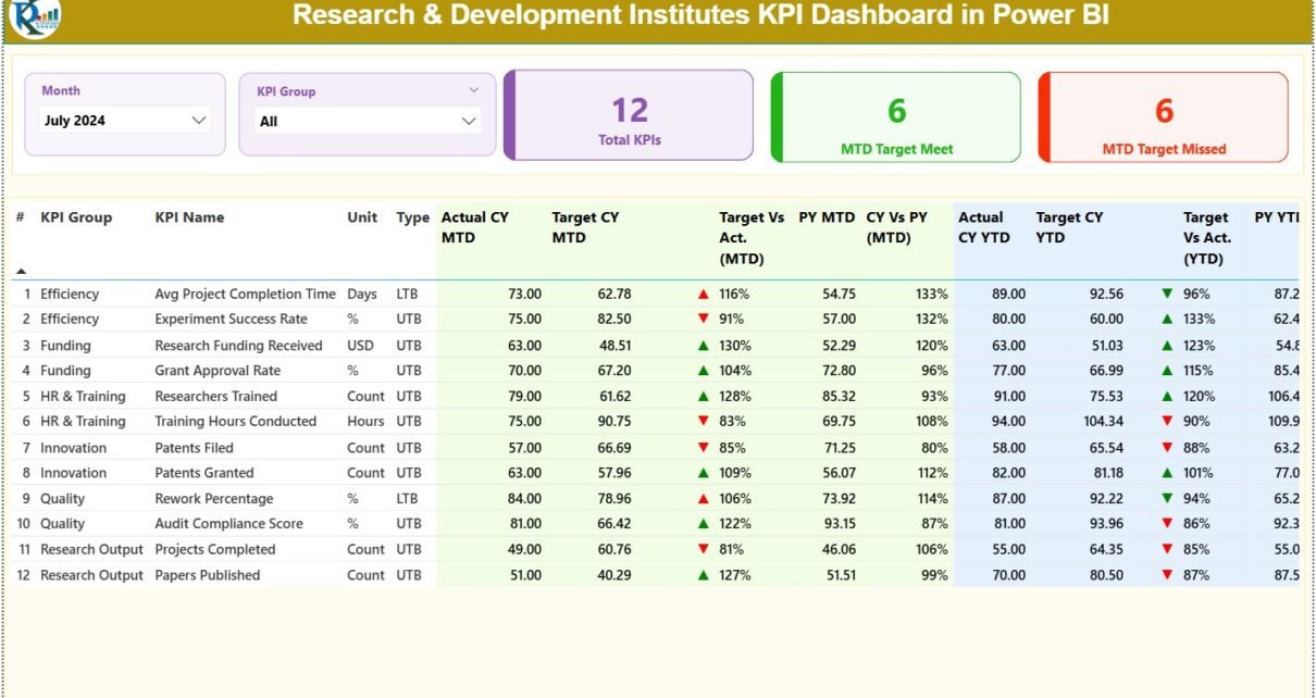
1. Summary Page: What Insights Can You See Here?
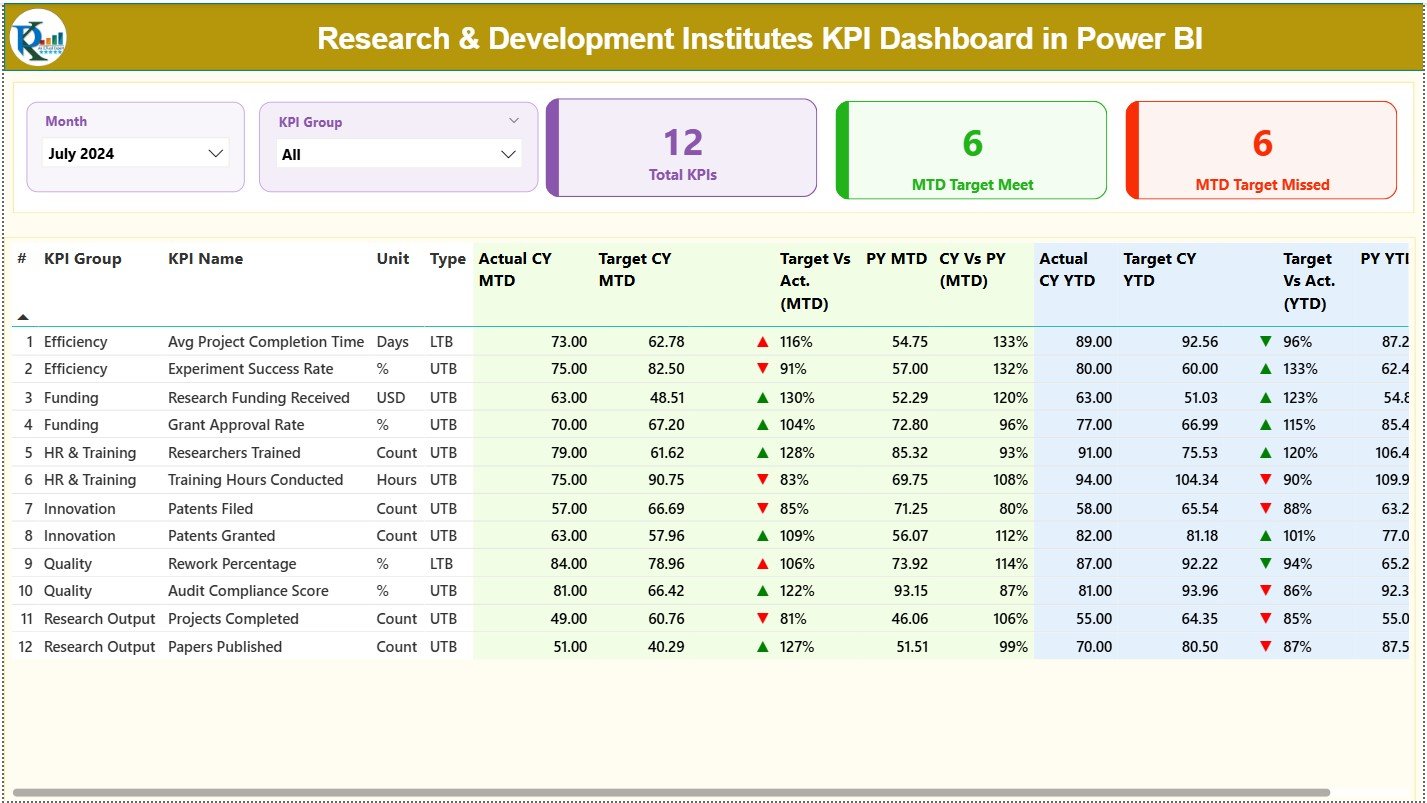
The Summary Page acts as the central control panel. Users explore KPIs with month and KPI group slicers placed at the top. This simple design helps anyone filter data quickly and understand current performance.
✔ Top KPI Cards
The dashboard shows three large KPI cards:
-
Total KPIs Count
-
MTD Target Met Count
-
MTD Target Missed Count
These cards highlight the overall performance pattern for the selected period.
✔ Detailed KPI Table
The table below the cards displays all performance information for each KPI. It includes:
-
KPI Number – A unique sequence number
-
KPI Group – The category of the KPI
-
KPI Name – The performance metric
-
Unit – The measurement unit
-
Type – LTB (Lower the Better) or UTB (Upper the Better)
-
Actual CY MTD – Current month-to-date actual value
-
Target CY MTD – Current month-to-date target value
-
MTD Icon – A green ▲ or red ▼ icon to indicate performance
-
Target vs Actual (MTD) – A percentage comparison using the formula:
Actual MTD / Target MTD -
PY MTD – Previous year MTD number
-
CY vs PY (MTD) – A comparison using the formula:
Current MTD / Previous Year MTD
For YTD, the dashboard displays additional columns:
-
Actual CY YTD
-
Target CY YTD
-
YTD Icon – Green or red depending on performance
-
Target vs Actual (YTD)
-
PY YTD
-
CY vs PY (YTD)
These fields show research performance trends, year-over-year changes, and target achievements.
Click to Purchases Research & Development Institutes KPI Dashboard in Power BI
2. KPI Trend Page: How Does It Track Performance Over Time?
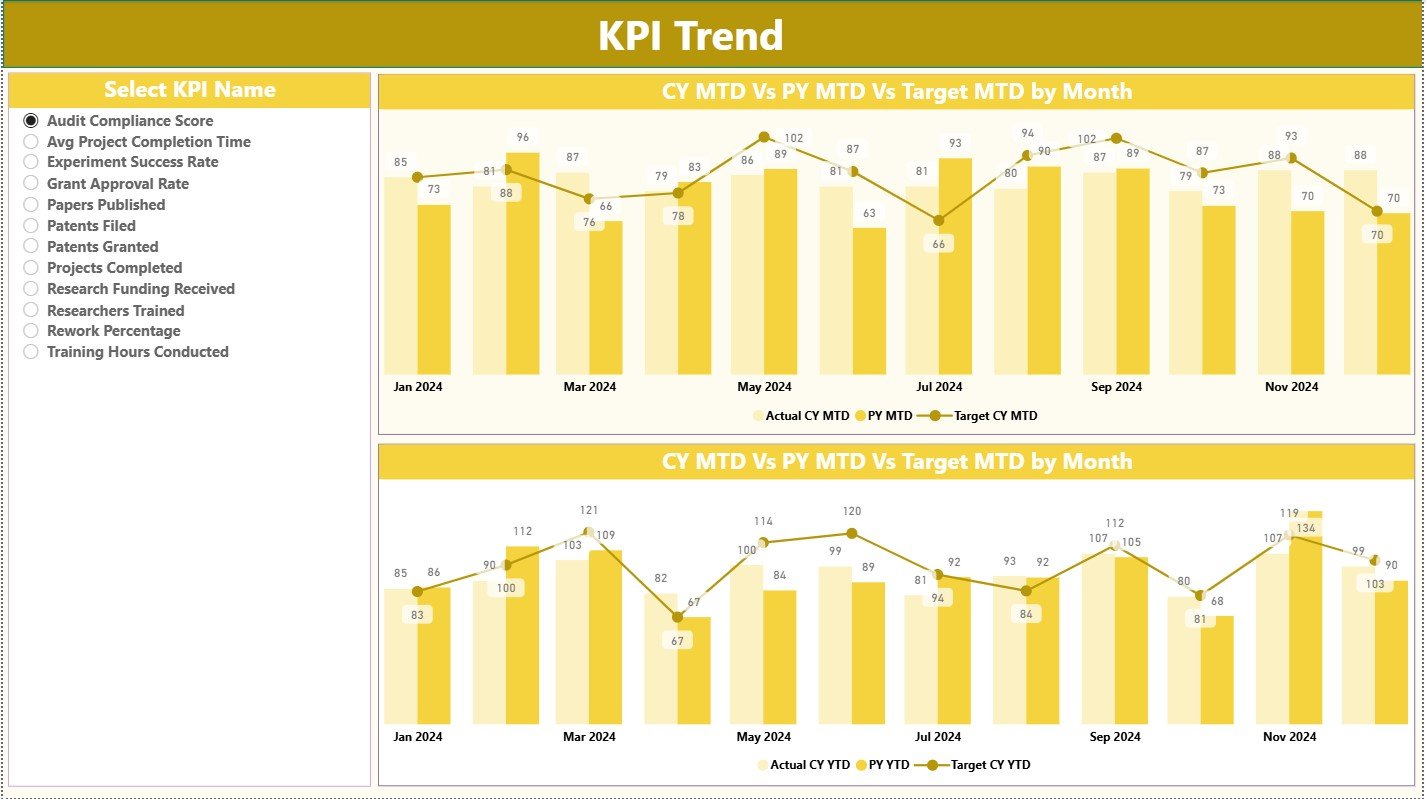
The KPI Trend Page helps users explore patterns. Research leaders often need to see whether performance improves or declines. This page shows:
-
MTD Trend Chart – Comparison of CY Actual, PY Actual, and CY Target
-
YTD Trend Chart – Comparison of CY Actual, PY Actual, and CY Target
-
KPI Slicer on the Left – Users select any KPI and track its trend
Because trends reveal patterns more clearly than tables, this page becomes an essential tool for scientific and management teams.
3. KPI Definition Page: Why Does It Matter?
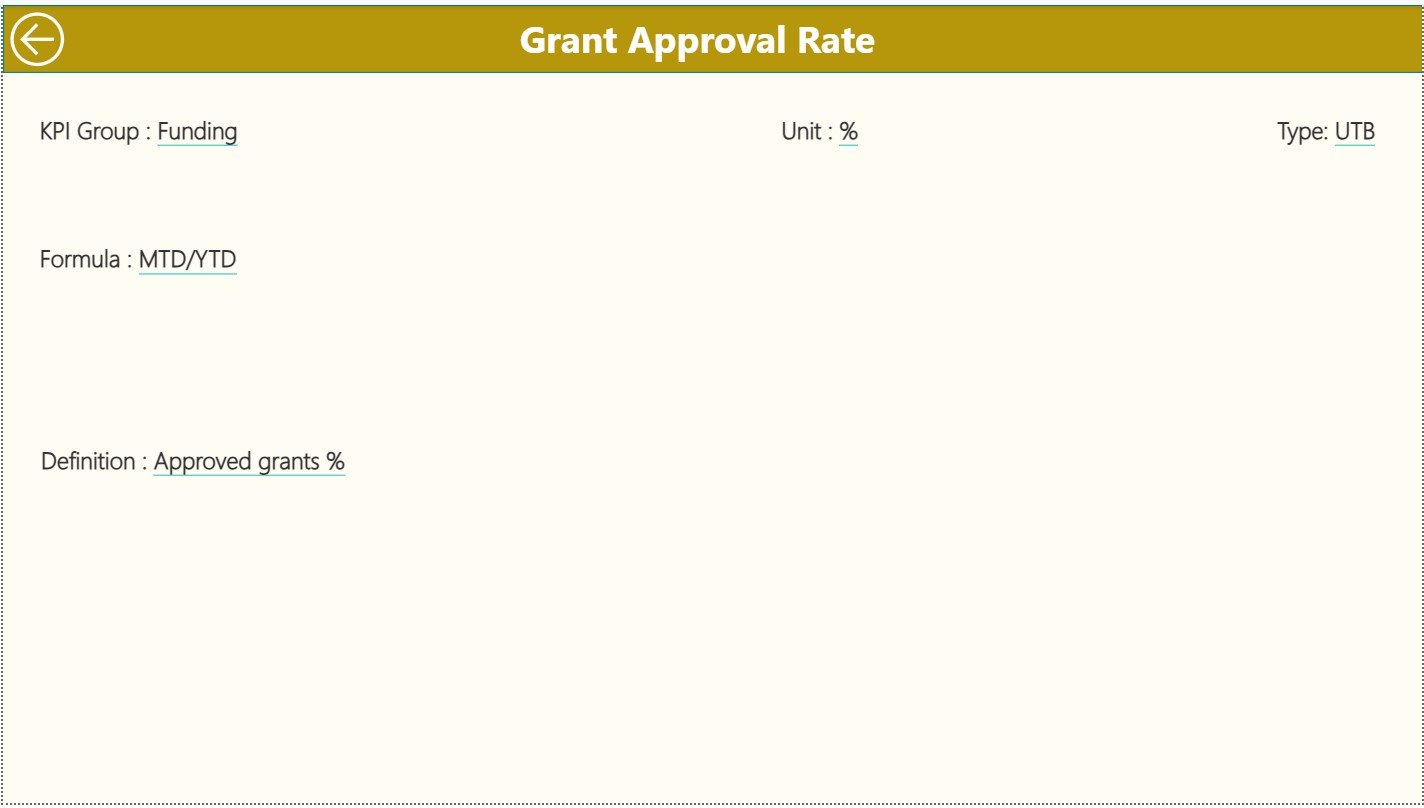
The KPI Definition Page remains hidden and acts as a drill-through page. Users click any KPI from the Summary page and view:
-
KPI Formula
-
KPI Meaning or Definition
-
KPI Group
-
Unit
-
KPI Type (UTB or LTB)
This page ensures clarity. Teams never guess what each KPI means. Instead, they see the exact formula and logic behind every metric. Tracking becomes simple and consistent across departments.
This page includes a Back button so users return to the Summary Page quickly.
What Excel File Powers the Dashboard?
This dashboard uses an Excel file as its data source. That file includes three sheets:
✔ 1. Input_Actual Sheet
You fill:
-
KPI Name
-
Month (first date of the month)
-
MTD Actual
-
YTD Actual
✔ 2. Input_Target Sheet
You fill:
-
KPI Name
-
Month
-
MTD Target
-
YTD Target
✔ 3. KPI Definition Sheet
You fill:
-
KPI Number
-
KPI Group
-
KPI Name
-
Unit
-
Formula
-
Definition
-
KPI Type (UTB or LTB)
Because of this structure, updating the dashboard becomes easy. Teams simply update the Excel file, refresh Power BI, and see fresh insights instantly.
Advantages of a Research & Development Institutes KPI Dashboard in Power BI
A powerful R&D dashboard delivers many benefits. Here are the most important ones:
⭐ 1. Real-Time Performance Visibility
Leaders view updates instantly and make decisions without delay.
⭐ 2. Clear Trend Analysis
Teams track improvement, decline, or stability for each KPI.
⭐ 3. Project and Innovation Control
Managers monitor experiment progress, prototype performance, and research speed.
⭐ 4. Better Resource Allocation
Teams assign budgets, people, and equipment based on data, not guesswork.
⭐ 5. Fast Target Monitoring
Instant indicators (▲▼) show whether KPIs meet or miss targets.
⭐ 6. Higher Research Productivity
Clear insights help teams improve planning and collaboration.
⭐ 7. Zero Manual Reporting
Power BI automates the entire reporting process.
⭐ 8. Transparent Performance for Stakeholders
Directors, scientists, and decision-makers see the same information.
These advantages support better innovation and stronger research outcomes.
How Does This Dashboard Improve R&D Decision-Making?
Because the dashboard shows both MTD and YTD values, leaders notice performance trends early. Teams compare current results with previous year results. They also evaluate how research practices, team skills, or experiments influence performance.
The dashboard also highlights risk areas—missed targets, lower productivity, cost overruns, delays, and quality issues. This makes planning more accurate and efficient.
Click to Purchases Research & Development Institutes KPI Dashboard in Power BI
Best Practices for Using a Research & Development KPI Dashboard
To get maximum value, follow these best practices:
✔ 1. Update the Excel Source File Regularly
Consistent updates ensure accurate reporting.
✔ 2. Choose Meaningful KPI Groups
Group KPIs by research area, department, or objective for easy filtering.
✔ 3. Keep KPI Definitions Clear and Short
Simple definitions help the team understand metrics instantly.
✔ 4. Review MTD and YTD Trends Frequently
Use trend charts to fix problems early.
✔ 5. Compare with Previous Year Data
This improves long-term understanding of research performance.
✔ 6. Use Drill-Through to Understand KPI Logic
Formula transparency builds trust across teams.
✔ 7. Share the Dashboard with Stakeholders
Collaboration increases when everyone works with the same data.
✔ 8. Avoid Overloading the Dashboard
Keep visuals clean for quick understanding.
These practices improve dashboard adoption and ensure clear insights.
How Does the Dashboard Support Research Organizations?
This dashboard supports research teams in many ways:
-
Measures research output quality
-
Tracks progress against funding targets
-
Evaluates innovation efficiency
-
Helps teams analyze experimental success
-
Improves budgeting and planning
-
Shows gaps and bottlenecks early
-
Encourages data-driven improvements
Because research demands precision, the dashboard provides reliable information that helps teams act confidently.
Conclusion
A Research & Development Institutes KPI Dashboard in Power BI creates complete visibility across KPIs, targets, and trends. It helps teams track performance, measure efficiency, and make better decisions. With three well-designed pages—Summary, Trends, and KPI Definitions—this dashboard becomes a powerful tool for research excellence.
Once the data updates in Excel, Power BI transforms it into clear visuals instantly. Because of this automation, teams stop wasting time on manual reporting and focus on innovation, experiments, and discovery.
This dashboard supports R&D success by improving clarity, transparency, and decision-making. Any institute that wants to strengthen research quality should adopt this solution.
Click to Purchases Research & Development Institutes KPI Dashboard in Power BI
Frequently Asked Questions (FAQs)
1. What KPIs can R&D institutes track in Power BI?
Institutes track research output, experiment success rate, prototype quality, cost performance, project timelines, staff productivity, and innovation velocity.
2. Can I update the dashboard without technical knowledge?
Yes. You only update values in the Excel file. Power BI refreshes the dashboard automatically.
3. Can this dashboard support multiple research departments?
Yes. You group KPIs by department, function, or research area and filter them easily.
4. Does the dashboard show year-over-year comparisons?
Yes. The Summary Page shows CY vs PY for both MTD and YTD values.
5. Can I customize KPI definitions?
Yes, the KPI Definition page allows complete customization of KPI formulas and descriptions.
6. Is Power BI better than Excel for R&D dashboards?
Yes. Power BI handles larger data, builds automated visuals, and provides faster insights than Excel.
7. Can we add more pages to the dashboard?
Yes. You can add project pages, cost pages, experiment pages, or research cycle performance pages.
Click to Purchases Research & Development Institutes KPI Dashboard in Power BI
Visit our YouTube channel to learn step-by-step video tutorials