Research institutions play a critical role in driving innovation, solving global challenges, and advancing academic knowledge. However, with multiple projects, departments, and funding sources, managing research data can become overwhelming. Researchers, administrators, and funding managers often struggle to track project progress, funding utilization, and overall performance across institutions.
This is where a Research Institutions Dashboard in Excel comes into play. It serves as a ready-to-use tool that allows research organizations to centralize data, visualize insights, and make informed decisions. Unlike expensive software that requires technical expertise, Excel provides an accessible, flexible, and cost-effective solution for research data management.
In this article, we will explore the structure, features, benefits, and best practices of the Research Institutions Dashboard in Excel. By the end, you’ll know how this dashboard can transform research data into actionable insights.
Click to Purchases Research Institutions Dashboard in Excel
What Is a Research Institutions Dashboard in Excel?
A Research Institutions Dashboard in Excel is a structured analytical tool designed to help institutions monitor research projects, departmental performance, funding sources, and monthly trends in one place. It transforms raw data into charts, KPIs (Key Performance Indicators), and insights that support evidence-based decision-making.
Instead of juggling multiple spreadsheets, administrators can use this dashboard to answer questions like:
-
Which projects are performing well?
-
How efficiently are funds being utilized?
-
Which departments or institutions have the highest research output?
-
What is the monthly trend of research progress?
This tool empowers decision-makers with real-time visibility, ensuring that research activities align with institutional goals.
Key Features of the Research Institutions Dashboard in Excel
The dashboard comes with five main analytical pages and a support sheet. Let’s break them down one by one.
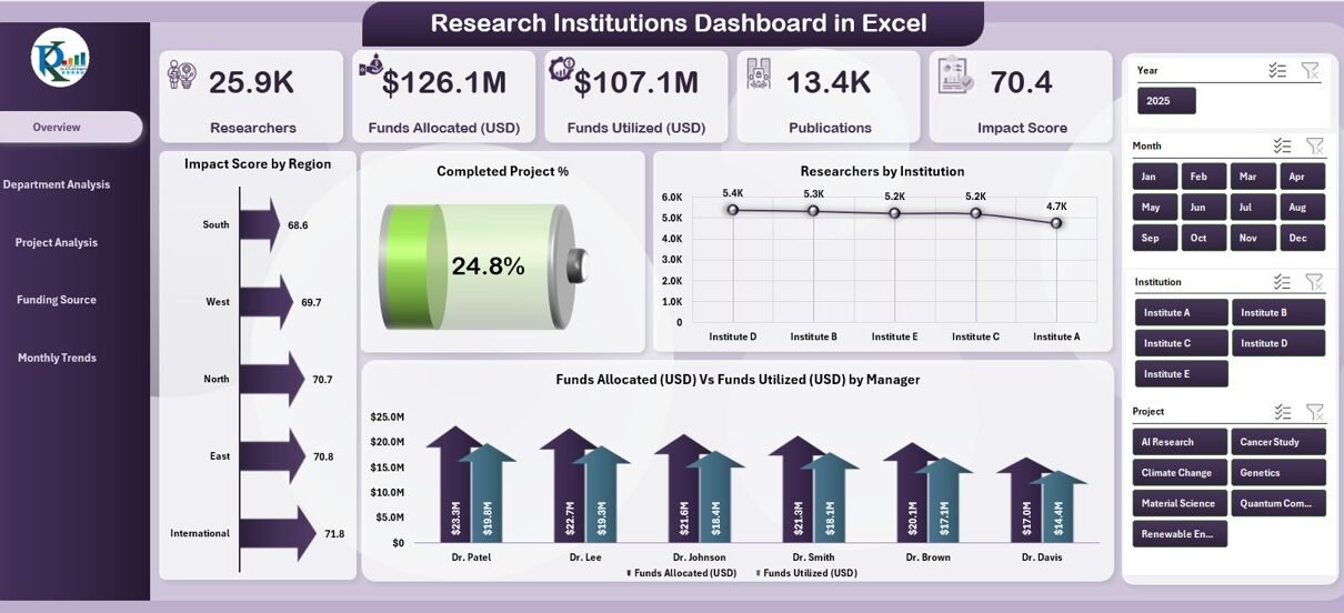
Overview Page
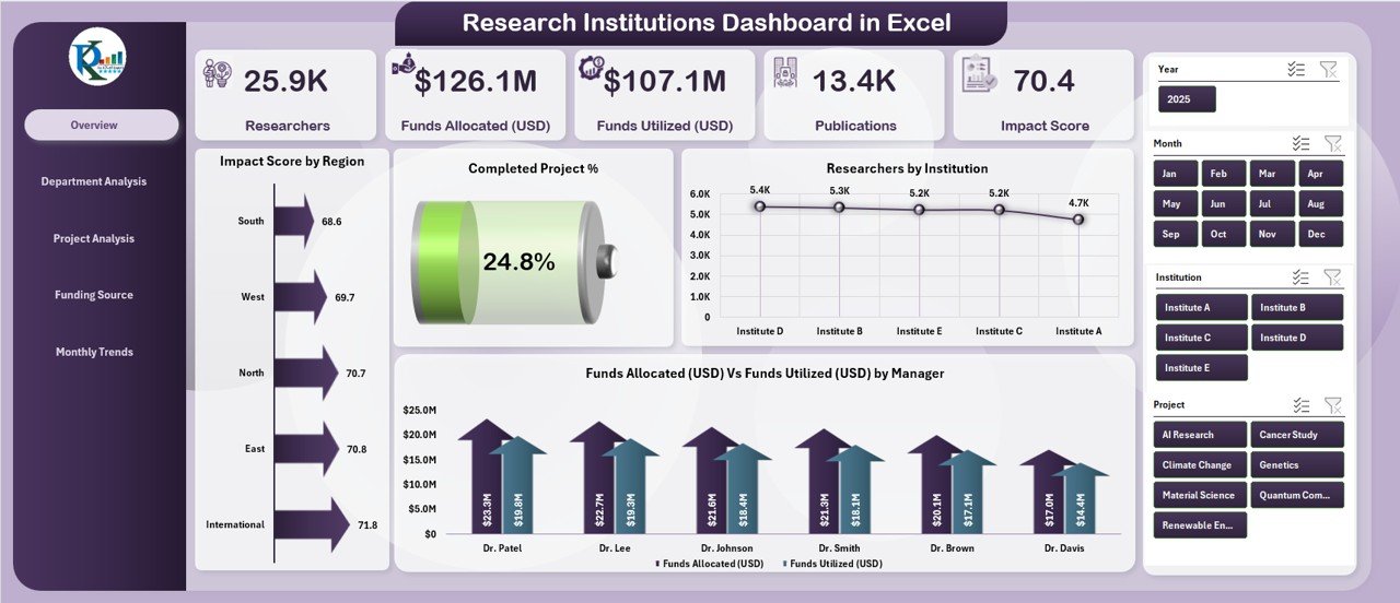
The Overview Page provides a high-level snapshot of research performance. It includes:
-
Impact Score by Region – Highlights which regions deliver the highest research impact.
-
Completed Project % – Tracks overall project completion rates.
-
Researchers by Institution – Shows researcher distribution across institutions.
-
Funds Allocated vs. Funds Utilized by Manager – Compares budget allocation and actual expenditure.
This page works as a quick reference for leadership teams who need an instant view of overall performance.
Department Analysis
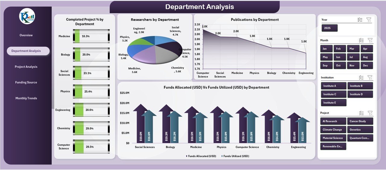
The Department Analysis Page allows administrators to evaluate departmental-level performance. It covers:
-
Completed Project % by Department – Displays efficiency in project completion.
-
Research by Department – Monitors the volume of research output.
-
Publications by Department – Highlights scholarly contributions.
-
Funds Allocated vs. Funds Utilized by Department – Tracks funding efficiency.
This section is essential for identifying top-performing departments and spotting areas needing additional support.
Project Analysis
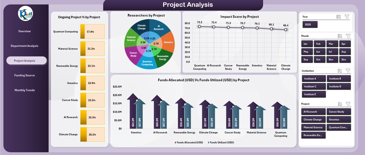
The Project Analysis Page focuses on individual project performance. It includes:
-
Ongoing Project % by Project – Tracks the proportion of active projects.
-
Research by Project – Evaluates research contributions at the project level.
-
Impact Score by Project – Measures the influence of each project.
-
Funds Allocated vs. Funds Utilized by Project – Analyzes financial performance.
This page helps project managers ensure accountability and resource optimization.
Click to Purchases Research Institutions Dashboard in Excel
Funding Source Analysis
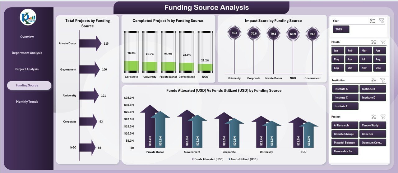
Funding is the lifeline of research. The Funding Source Analysis Page provides insights into:
-
Total Projects by Funding Source – Identifies which funding bodies support the most projects.
-
Completed Project % by Funding Source – Evaluates funder-driven outcomes.
-
Impact Score by Funding Source – Assesses the effectiveness of each source.
-
Funds Allocated vs. Funds Utilized by Source – Monitors financial discipline across funding partners.
This information is especially useful for reporting back to donors and funding agencies.
Monthly Trends
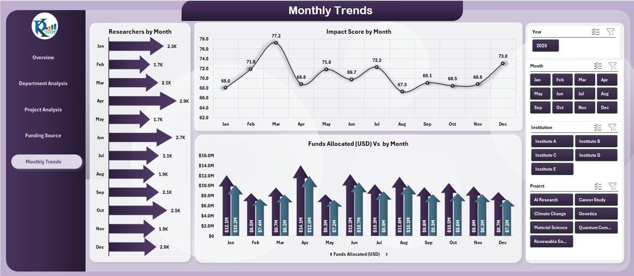
The Monthly Trends Page visualizes how research performance evolves over time. It includes:
-
Research by Month – Tracks the volume of work completed each month.
-
Impact Score by Month – Shows how research impact changes over time.
-
Funds Allocated vs. Funds Utilized by Month – Provides a financial performance trend.
This page ensures that stakeholders can detect seasonal patterns or early warning signs of delays.
Support Sheet
The Support Sheet is where reference data and dropdown lists are stored. It ensures accuracy, consistency, and easy customization of the dashboard.
Why Do Research Institutions Need a Dashboard in Excel?
Managing research data without a dashboard is like sailing without a compass. Institutions deal with multiple moving parts—funding, departments, researchers, and publications. A dashboard provides:
-
Centralized insights for easy monitoring
-
Time-saving automation with charts and KPIs
-
Clear comparisons across projects, departments, and funding sources
-
Improved accountability for researchers and managers
-
Data-driven decision-making for leadership teams
Advantages of the Research Institutions Dashboard in Excel
Here are the major benefits of using this dashboard:
📊 Better Data Visualization – Converts raw numbers into easy-to-understand charts.
⏱️ Saves Time – Reduces manual reporting and tracking.
💰 Cost-Effective – Uses Excel, avoiding costly software.
🎯 Increases Accountability – Tracks project and department performance.
📈 Improves Decision-Making – Provides insights for better planning.
🌍 Global Comparisons – Supports cross-institutional and regional analysis.
Opportunities for Improvement
While the dashboard is powerful, there are areas where improvements can be made:
🔄 Automation with VBA or Power Query – Adding automation would make data refresh easier.
☁️ Integration with Cloud Data Sources – Linking with online research databases could enhance efficiency.
📊 Advanced Visualizations – Power BI or Tableau can provide deeper insights if needed.
🔔 Real-Time Alerts – Conditional formatting can be expanded to highlight risks proactively.
Best Practices for Using the Research Institutions Dashboard in Excel
To get the most value, institutions should follow these best practices:
✅ Keep Data Updated – Regularly refresh the dataset to maintain accuracy.
✅ Use Consistent Naming Conventions – Standardize project and department names.
✅ Define Clear KPIs – Ensure everyone understands how success is measured.
✅ Train Users – Provide basic training for non-technical staff.
✅ Backup Data Regularly – Prevent data loss and ensure continuity.
✅ Leverage Conditional Formatting – Highlight risks, delays, or overspending.
Click to Purchases Research Institutions Dashboard in Excel
How to Build a Research Institutions Dashboard in Excel (Step-by-Step)
-
Collect Data – Gather project, funding, department, and researcher details.
-
Organize Data – Use a structured table format for easy pivot table creation.
-
Create KPIs – Define metrics such as completion %, impact score, and fund utilization.
-
Build Pivot Tables – Summarize data for each KPI.
-
Add Charts – Insert bar charts, line graphs, and pie charts for visualization.
-
Design the Dashboard Layout – Use a clean structure with navigation buttons.
-
Apply Conditional Formatting – Highlight variances and trends.
-
Test and Refine – Validate results before sharing with stakeholders.
Conclusion
The Research Institutions Dashboard in Excel is more than just a reporting tool—it is a strategic asset for research-driven organizations. By combining project performance, departmental analysis, funding efficiency, and monthly trends into one platform, institutions can ensure transparency, accountability, and better decision-making.
Whether you are a research administrator, project manager, or funding partner, this dashboard gives you the clarity you need to maximize impact.
Frequently Asked Questions (FAQs)
1. Who can use the Research Institutions Dashboard in Excel?
This dashboard is useful for research administrators, project managers, funding agencies, and institutional leaders who want to monitor research performance effectively.
2. Do I need advanced Excel skills to use this dashboard?
No. The dashboard is designed to be user-friendly. Basic Excel knowledge is enough to navigate and update it.
3. Can this dashboard handle large datasets?
Yes. With proper structuring and the use of Pivot Tables, Excel can handle thousands of rows of data. For extremely large datasets, integration with Power BI is recommended.
4. How often should the dashboard be updated?
It depends on the institution’s reporting needs. Most research institutions update monthly, but weekly updates are also possible.
5. Can I customize the dashboard for my institution?
Absolutely. Since it is built in Excel, you can easily modify charts, KPIs, and data sources to match your organization’s requirements.
6. What types of charts are best for this dashboard?
Bar charts, pie charts, and line charts are commonly used. They clearly represent comparisons, trends, and distributions.
Visit our YouTube channel to learn step-by-step video tutorials