In today’s fast-paced business landscape, managing resources efficiently can make or break project success. Whether you’re running a small team or managing multiple departments across large enterprises, allocating your resources wisely is essential for boosting productivity, reducing downtime, and achieving operational excellence.
That’s where a Resource Allocation Dashboard in Power BI comes in—a powerful, visual, and interactive tool that helps organizations monitor, plan, and analyze how their resources are being utilized.
In this detailed article, we will explore everything you need to know about the Power BI Resource Allocation Dashboard—its features, benefits, structure, best practices, and frequently asked questions.
Click to Purchases Resource Allocation Dashboard in Power BI
What is a Resource Allocation Dashboard in Power BI?
A Resource Allocation Dashboard is a business intelligence solution built using Power BI that tracks how human resources are assigned to different departments, projects, and roles. This dashboard visualizes allocation trends, efficiency metrics, and utilization percentages through interactive charts, slicers, and cards—offering real-time insights into resource management.
Power BI’s advanced visual capabilities make it the perfect platform for this dashboard. It allows managers to quickly identify underutilized or overworked resources, plan future allocations, and make informed decisions.
Key Features of the Resource Allocation Dashboard in Power BI
The dashboard consists of five detailed pages, each designed to give a comprehensive view of different dimensions of resource management.
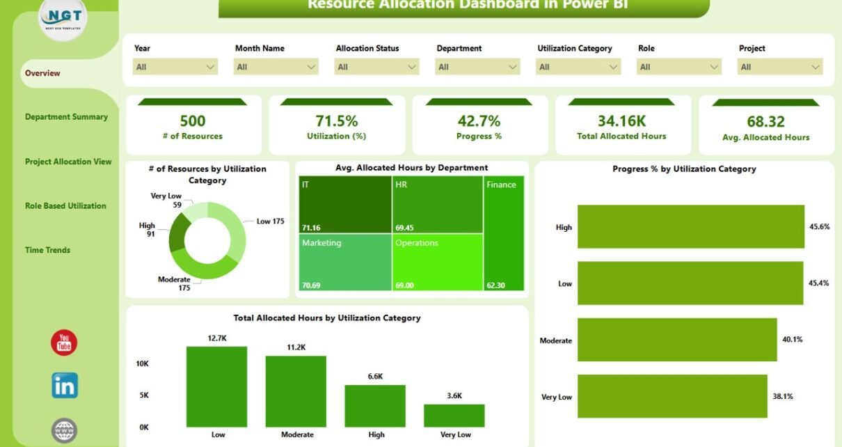
Overview Page
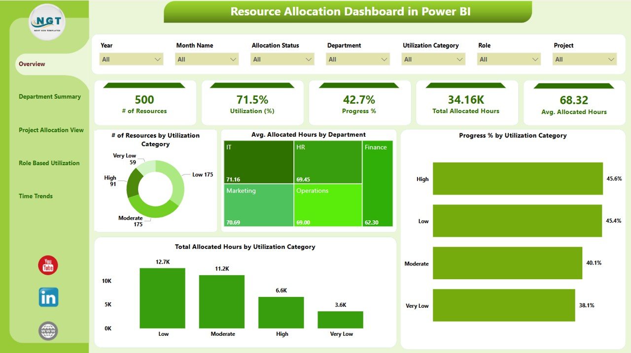
This is the central hub of the dashboard, offering a snapshot of total resources and overall allocation.
-
Slicers: 7 filters to refine the view by project, role, department, or time.
-
Cards: Key metrics like Total Resources, Average Utilization %, Total Allocated Hours, and more.
Charts:
- Number of Resources by Utilization Category
- Average Allocated Hours by Department
- Progress % by Utilization Category
- Total Allocated Hours by Utilization Category
This page is perfect for top-level managers who want an at-a-glance understanding of overall resource efficiency.
Department Summary Page
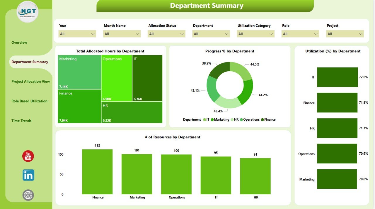
Dive deeper into how departments are performing in terms of resource usage.
-
Slicers: 7, including filters for department, project type, and resource status.
Charts:
- Total Allocated Hours by Department
- Progress % by Department
- Utilization % by Department
- Number of Resources by Department
This page helps identify departments that need more staffing or better allocation planning.
Click to Purchases Resource Allocation Dashboard in Power BI
Project Allocation View
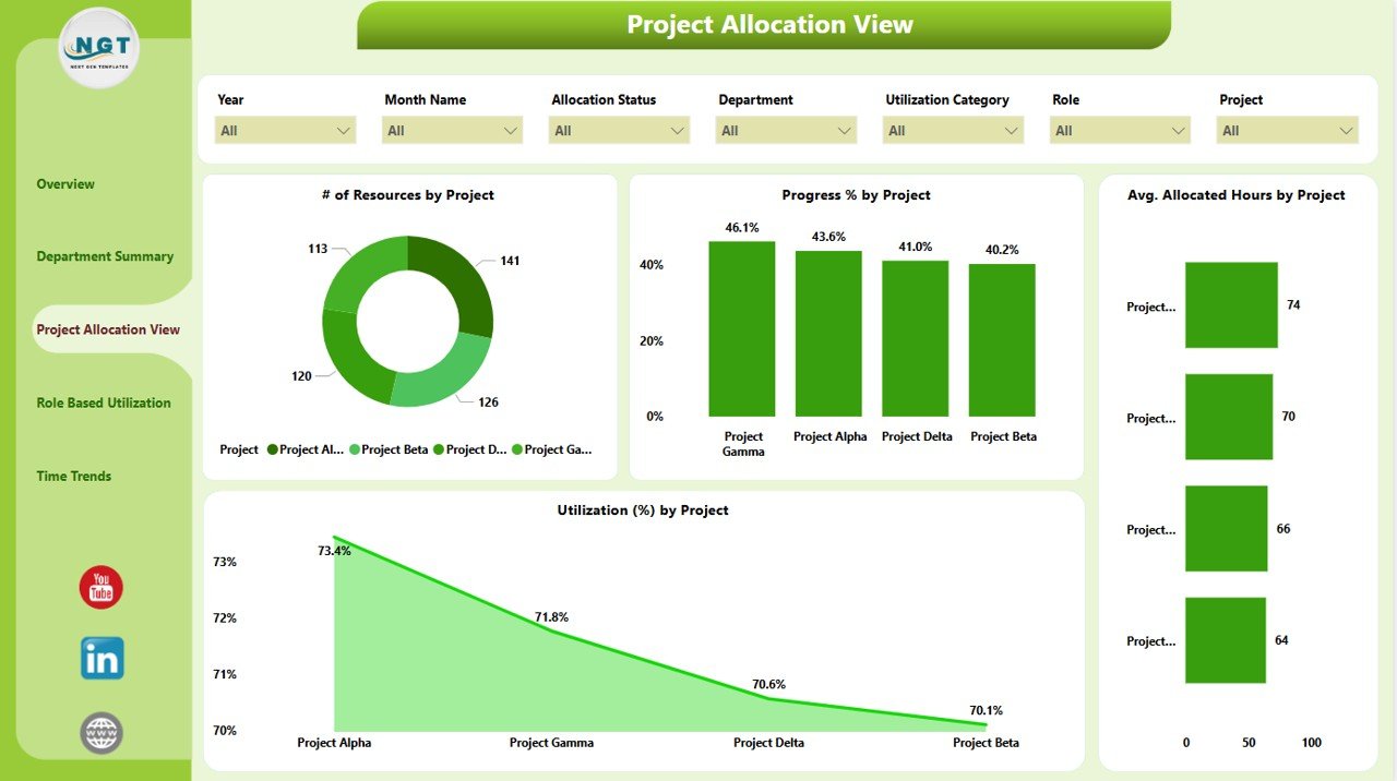
Focuses specifically on project-based allocation and performance.
-
Slicers: 7 to filter data based on project ID, name, status, etc.
Charts:
- Number of Resources by Project
- Progress % by Project
- Average Allocated Hours by Project
- Utilization % by Project
Project managers find this page incredibly helpful to balance workloads and track project health.
Role Based Utilization Page
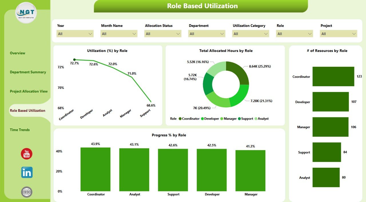
Understand how different roles are utilized across the organization.
-
Slicers: 7, including filters for role type and resource seniority.
Charts:
- Utilization % by Role
- Total Allocated Hours by Role
- Number of Resources by Role
- Progress % by Role
It helps HR and operations teams identify skill shortages or areas where talent is underutilized.
Time Trends Page
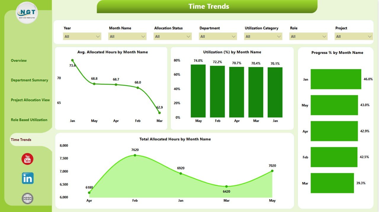
View how resource allocation has changed over time.
-
Slicers: 7, including filters for time periods, project phases, etc.
Charts:
- Average Allocated Hours by Month
- Utilization % by Month
- Progress % by Month
- Total Allocated Hours by Month
Time-based trends are crucial for forecasting and improving long-term planning.
Advantages of Using a Resource Allocation Dashboard in Power BI
Let’s take a closer look at why businesses are adopting Power BI dashboards for resource allocation:
✅ Real-Time Insights
You no longer need to wait for end-of-month reports. Get instant data updates with real-time Excel or database connectivity.
✅ Improved Decision-Making
Interactive charts and slicers help stakeholders make quick, informed decisions without digging into raw data.
✅ Resource Optimization
Easily spot idle or overworked resources, and redistribute workload to improve efficiency.
✅ Better Project Management
Monitor project progress and resource alignment to avoid bottlenecks and missed deadlines.
✅ Enhanced Communication
Power BI dashboards serve as a common source of truth across departments, ensuring everyone is on the same page.
Click to Purchases Resource Allocation Dashboard in Power BI
Best Practices for the Resource Allocation Dashboard in Power BI
To get the most out of your dashboard, consider the following best practices:
1. Keep Your Data Clean and Updated
Make sure the Excel or database sources feeding the dashboard are accurate, up-to-date, and free of errors.
2. Use Standardized Metrics
Define key metrics such as “Utilization %” or “Allocated Hours” clearly so that all stakeholders interpret them consistently.
3. Leverage Slicers for Deep-Dive Analysis
The dashboard comes with 7 slicers per page—use them effectively to drill down by project, role, or department.
4. Set Performance Thresholds
Use conditional formatting to highlight underperforming areas—like utilization below 60% or progress delays.
5. Automate Data Refresh
Use Power BI’s scheduled refresh capabilities to keep your dashboard up to date without manual intervention.
6. Train Your Users
Ensure team members understand how to use the dashboard. A short walkthrough video or help guide can make a huge difference.
How to Build a Resource Allocation Dashboard in Power BI (Basic Steps)
Want to create your own version? Follow these simplified steps:
-
Prepare Your Data: Structure your Excel sheets with key columns like Employee Name, Project, Department, Role, Allocated Hours, Total Hours, Progress %, etc.
-
Load Data into Power BI: Use Power BI Desktop to import the Excel file.
-
Create Relationships: Link tables by common fields like Resource ID, Project ID, and Department Name.
-
Add Visuals: Use Cards for KPIs, Clustered Bar/Column charts for comparisons, and Line charts for trends.
-
Create Slicers: Add filters for date, role, department, project, etc.
-
Design Navigation: Use bookmarks or buttons to jump between dashboard pages.
-
Publish and Share: Upload to Power BI Service and share it with your team securely.
Why Choose Power BI for Resource Management?
You might wonder—why not just use Excel or other project management tools? Here’s why Power BI stands out:
-
Scalability: Handles massive datasets without slowing down.
-
Interactivity: Slicers, drill-throughs, and filters make it extremely user-friendly.
-
Data Connectivity: Pulls data from Excel, SQL, SharePoint, Google Sheets, and more.
-
Custom Visuals: A wide range of chart types and marketplace visuals allow total customization.
-
Security: Role-level security ensures data privacy and control.
Use Cases: Who Can Benefit from this Dashboard?
A Resource Allocation Dashboard in Power BI is useful across many industries and departments:
-
Project Managers – For project planning, staffing, and tracking.
-
HR Teams – For talent management and role alignment.
-
Operations Managers – For workload balancing and strategic planning.
-
IT Departments – For managing technical staff across sprints and development cycles.
-
Consulting Firms – For billing efficiency and client resource tracking.
Conclusion
The Resource Allocation Dashboard in Power BI is a game-changer for organizations aiming to optimize how they use their most valuable asset—people. With its real-time data visualizations, interactive analytics, and flexible filtering, it transforms complex workforce data into actionable insights.
By adopting this dashboard, teams can boost productivity, allocate resources more intelligently, and ultimately drive better project outcomes. Whether you’re an HR professional, project manager, or executive, this dashboard will empower you to make smarter, faster, and data-driven decisions.
Frequently Asked Questions (FAQs)
Q1. What data sources can I connect to the Power BI Resource Allocation Dashboard?
You can connect Excel files, SQL databases, SharePoint lists, Google Sheets, or cloud services like Azure and Dynamics 365.
Q2. How often can I refresh the data in Power BI?
If published to Power BI Service, you can schedule data refreshes up to 8 times per day (or more with Power BI Premium).
Q3. Is technical knowledge required to use the dashboard?
Not at all. Once set up, users only need basic Power BI skills to interact with the visuals and filters.
Q4. Can I customize the dashboard for my organization’s needs?
Yes, the dashboard is fully customizable. You can add/remove visuals, modify filters, change the layout, or apply your brand colors.
Q5. How is resource utilization calculated in the dashboard?
Utilization (%) is typically calculated as:
(Allocated Hours / Total Available Hours) × 100
Q6. Can this dashboard handle multiple locations or teams?
Absolutely. You can filter by region, office location, or team using slicers and design visuals to reflect multi-site data.
Visit our YouTube channel to learn step-by-step video tutorials