In today’s fast-moving business environment, organizations cannot afford to make decisions based on guesswork. Data-driven insights are the foundation of profitable decision-making, and revenue stands as one of the most critical business metrics. A Revenue Analysis Dashboard in Power BI enables companies to track, visualize, and analyze revenue streams in real time, helping leaders make smarter, faster, and more strategic choices.
In this comprehensive guide, we will explore what a Revenue Analysis Dashboard in Power BI is, its key features, benefits, best practices, and real-world applications. We will also provide tips for designing a dashboard that drives results.
Click to Purchases Revenue Analysis Dashboard in Power BI
What is a Revenue Analysis Dashboard in Power BI?
A Revenue Analysis Dashboard in Power BI is an interactive data visualization tool that displays revenue-related information in a structured and visually appealing manner. It connects to your data sources—such as Excel, SQL databases, or cloud applications—and provides up-to-date metrics on revenue performance, profit margins, targets, and more.
Instead of spending hours generating manual reports, decision-makers can use this dashboard to:
-
Track performance against targets
-
Identify revenue trends and patterns
-
Pinpoint underperforming regions, products, or channels
-
Make informed, data-backed decisions
This dashboard becomes the central hub for revenue performance monitoring, ensuring that every stakeholder—from sales managers to executives—has access to actionable insights.
Key Features of the Revenue Analysis Dashboard in Power BI
The Revenue Analysis Dashboard we discuss here is built with five dedicated pages, each offering unique insights into revenue performance. Below is a breakdown of each section.
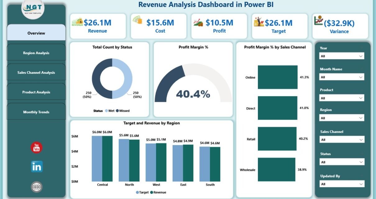
Overview Page
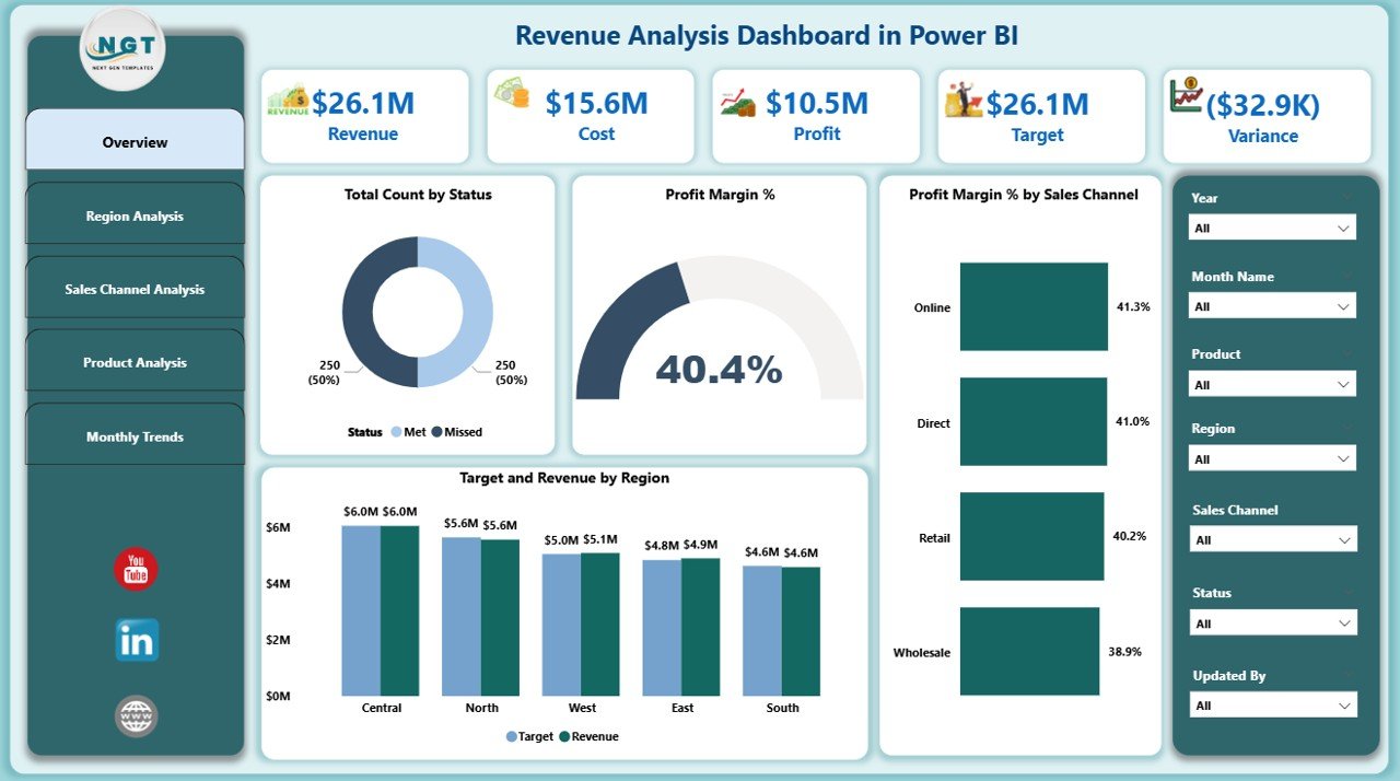
The Overview Page acts as the control center for revenue analysis.
Key elements include:
-
Seven slicers for filtering data by multiple dimensions such as date, region, product, and sales channel.
Click to Purchases Revenue Analysis Dashboard in Power BI
Five KPI cards showing critical metrics like:
- Total Revenue
- Profit Margin %
- Target Achievement %
- Number of Orders
- Average Order Value
Four charts for deeper analysis:
- Total Count by Status – Displays the number of sales transactions in different stages.
- Profit Margin % – Highlights the percentage of profit earned.
- Profit Margin % by Sales Channel – Compares profitability across different sales channels.
- Target vs Revenue by Region – Evaluates target achievements in various regions.
This page offers a bird’s-eye view of overall revenue performance and allows instant drill-downs into specific areas of interest.
Region Analysis Page
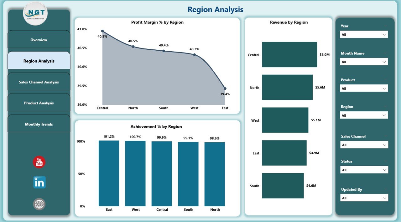
The Region Analysis Page focuses on geographical performance.
Key features include:
-
Seven slicers for region-specific filtering.
Three charts:
- Profit Margin % by Region – Measures profitability by geographic area.
- Revenue by Region – Highlights which regions contribute most to total revenue.
- Achievement % by Region – Displays how each region is performing against set targets.
This section helps identify top-performing areas and regions that need improvement, guiding resource allocation and strategic planning.
Sales Channel Analysis Page
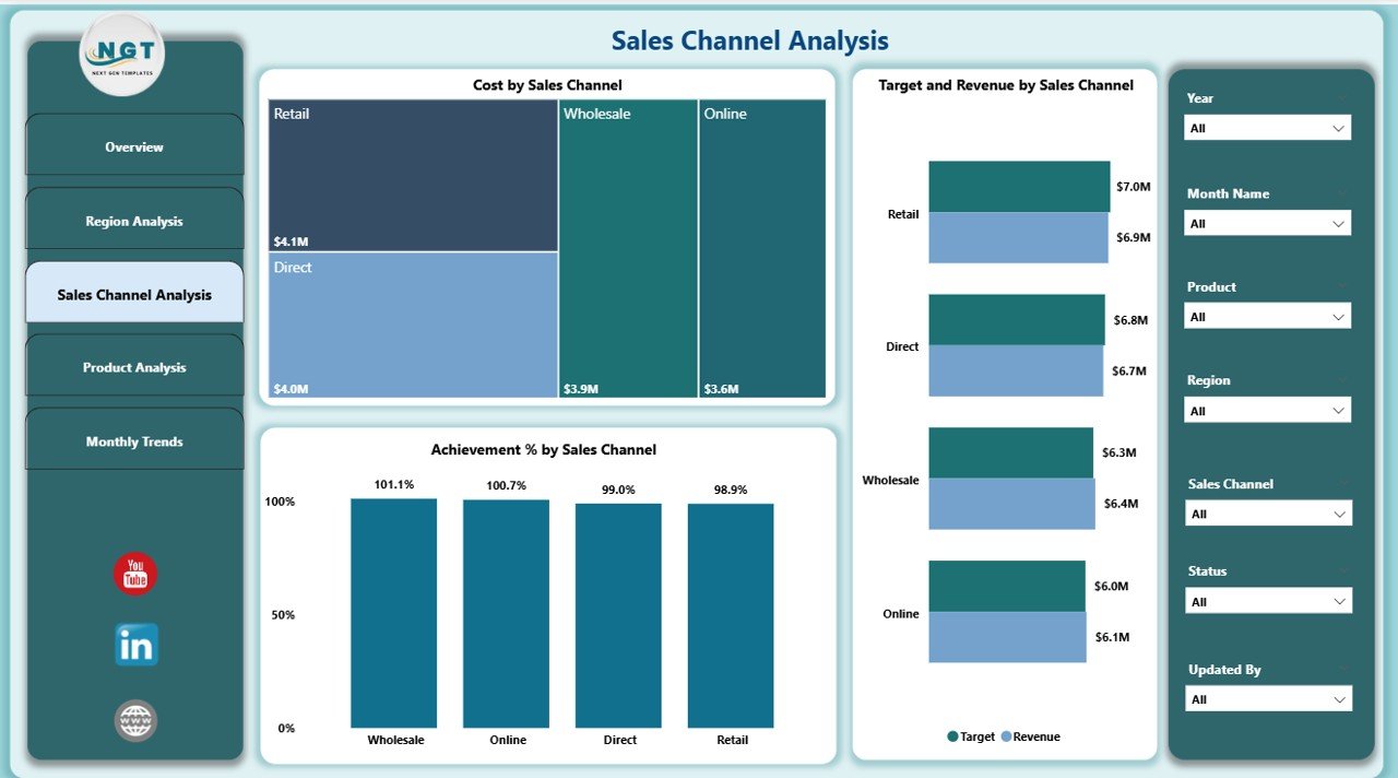
This page analyzes revenue performance based on sales channels such as online, retail, or wholesale.
-
Seven slicers for channel-specific filtering.
Three charts:
- Cost by Sales Channel – Compares costs incurred across different channels.
- Target vs Revenue by Sales Channel – Shows how close each channel is to hitting its targets.
- Achievement % by Sales Channel – Measures performance in percentage terms.
This analysis helps determine which channels bring the highest returns and where to optimize marketing and sales efforts.
Product Analysis Page
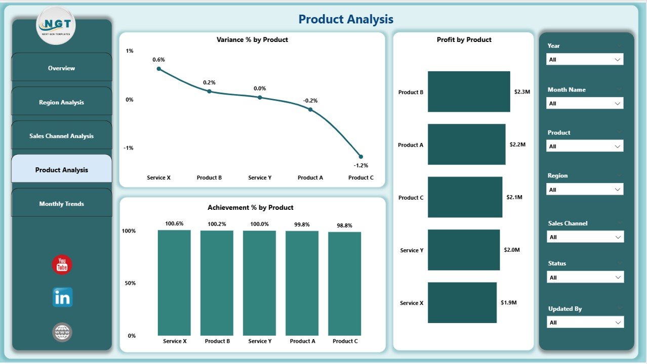
The Product Analysis Page focuses on category-level performance.
-
Seven slicers for product-related filtering.
Three charts:
- Variance % by Product – Shows the difference between actual and expected performance.
- Profit by Product – Displays profitability at a product level.
- Achievement % by Product – Evaluates how products perform against sales goals.
This section is invaluable for product managers and marketing teams who need to understand which products generate the highest returns.
Monthly Trends Page
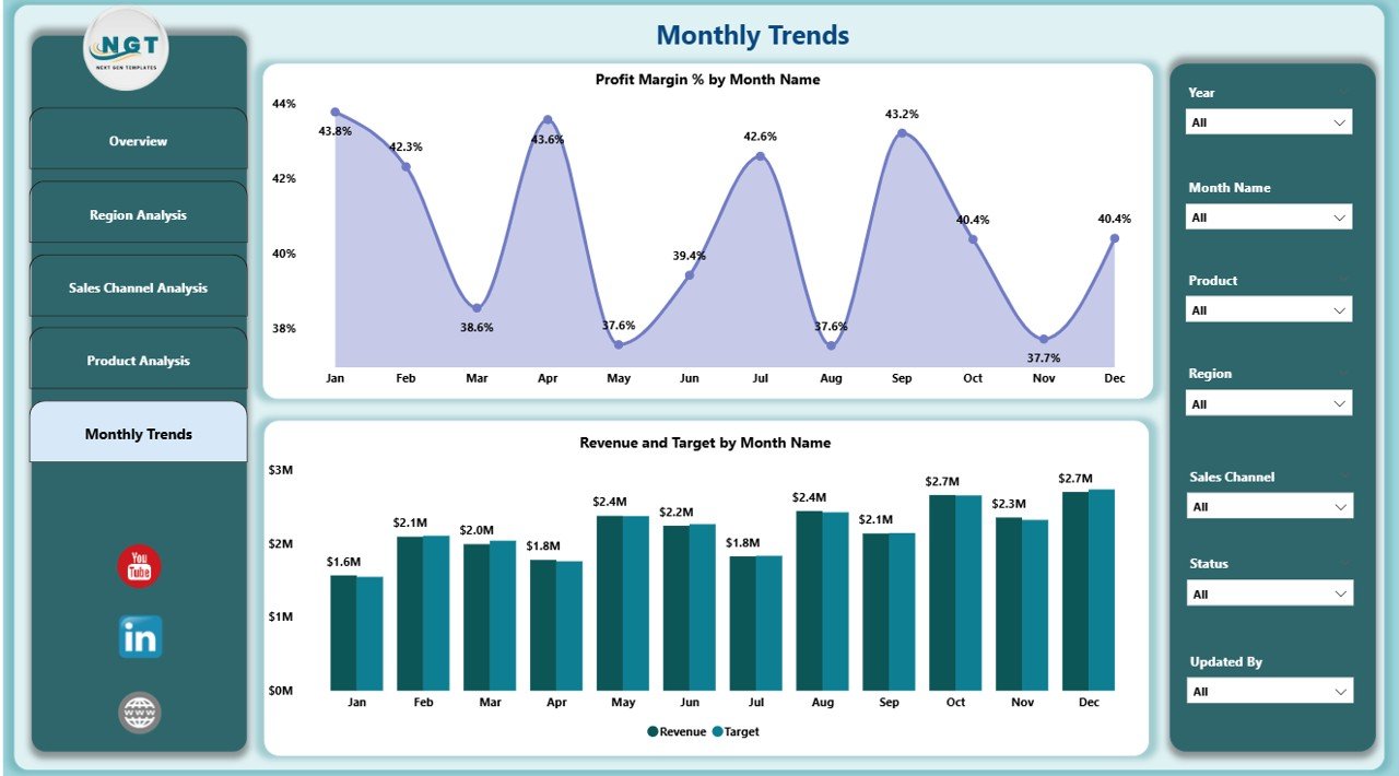
The Monthly Trends Page is designed to reveal performance patterns over time.
-
Seven slicers for month-wise filtering.
Two charts:
- Profit Margin % by Month Name – Tracks monthly profitability trends.
- Revenue and Target by Month Name – Shows how revenue compares to targets each month.
This page helps identify seasonal patterns, peak sales periods, and months that underperform.
Advantages of the Revenue Analysis Dashboard in Power BI
Implementing a Revenue Analysis Dashboard offers multiple business benefits:
-
Real-Time Insights – Access updated metrics without waiting for manual reports.
-
Better Decision-Making – Make data-driven decisions backed by accurate numbers.
-
Improved Target Achievement – Track progress toward sales and revenue goals.
-
Cost Optimization – Identify unprofitable regions, products, or channels and take corrective action.
-
Time Savings – Reduce reporting time significantly with automated data updates.
-
Customizable Filters – Use slicers to focus on the most relevant data for your role.
Opportunities for Improvement in a Revenue Analysis Dashboard
Even the most advanced dashboards can be enhanced. Some areas to improve include:
-
Adding Predictive Analytics – Use AI capabilities in Power BI to forecast future revenue.
-
Integrating More Data Sources – Include CRM, ERP, and marketing platforms for a 360-degree view.
-
Enhancing Mobile Responsiveness – Ensure executives can access insights on the go.
-
Automating Alerts – Get notified when revenue falls below a certain threshold.
-
Including Customer Segmentation – Break down revenue by customer type for targeted strategies.
Best Practices for Using the Revenue Analysis Dashboard in Power BI
To maximize the value of your dashboard, follow these best practices:
-
Keep It Simple – Avoid clutter; show only the most important KPIs on each page.
-
Use Consistent Visuals – Maintain uniform chart styles for easier understanding.
-
Update Data Regularly – Automate refresh schedules to ensure accuracy.
-
Train Users – Provide guidance so everyone can use filters and drill-through features effectively.
-
Leverage Drill-Through Pages – Allow deeper investigation into specific metrics.
-
Apply Conditional Formatting – Highlight underperformance using colors and indicators.
-
Optimize for Performance – Use measures instead of calculated columns to reduce load time.
How to Create a Revenue Analysis Dashboard in Power BI
If you want to build your own dashboard, here’s a simplified process:
-
Connect Data Sources – Link Excel, SQL, or cloud-based data to Power BI.
-
Clean and Transform Data – Use Power Query to remove duplicates, fix formatting, and standardize values.
-
Define KPIs – Decide which metrics are most relevant for your analysis.
-
Create Relationships – Link related tables for cross-analysis.
-
Design Visuals – Use bar charts, line graphs, pie charts, and KPI cards.
-
Add Slicers and Filters – Make the dashboard interactive.
-
Test and Share – Ensure accuracy before publishing to your team.
Real-World Use Cases of a Revenue Analysis Dashboard
This type of dashboard can benefit various industries:
-
Retail – Monitor sales performance across stores and online channels.
-
Manufacturing – Track revenue from different product lines.
-
Hospitality – Compare seasonal revenue trends across locations.
-
IT Services – Measure project-based income and client contributions.
-
E-commerce – Analyze customer segments, conversion rates, and profit margins.
Conclusion
A Revenue Analysis Dashboard in Power BI is a game-changer for businesses that want to track revenue effectively, make informed decisions, and boost profitability. With its interactive visuals, real-time updates, and drill-through capabilities, it offers deep insights into every aspect of your revenue performance. Whether you are analyzing regions, products, sales channels, or monthly trends, this dashboard provides the clarity you need to stay competitive.
By following best practices and continuously improving your dashboard, you can turn revenue data into actionable strategies that drive long-term growth.
Frequently Asked Questions (FAQs)
Q1. What is the main purpose of a Revenue Analysis Dashboard in Power BI?
The main purpose is to track, visualize, and analyze revenue-related metrics in real time for better decision-making.
Q2. Can I connect multiple data sources to the dashboard?
Yes. Power BI allows connections to Excel, databases, cloud services, and APIs for comprehensive analysis.
Q3. How often should the dashboard data be refreshed?
Ideally, set automatic refresh schedules to keep your data up to date daily or even hourly, depending on your needs.
Q4. Can I customize the dashboard for my business needs?
Absolutely. Power BI dashboards are highly customizable, allowing you to adjust visuals, KPIs, and filters.
Q5. Is Power BI suitable for small businesses?
Yes. Power BI is cost-effective and scalable, making it a good choice for businesses of all sizes.
Visit our YouTube channel to learn step-by-step video tutorials