Road safety management plays a critical role in protecting lives, improving traffic control, and reducing accidents on roads. However, many road safety departments still manage performance data using scattered spreadsheets, manual reports, and delayed updates. As a result, decision-makers struggle to monitor safety performance, identify risks quickly, and take corrective actions on time.
That is exactly where the Road Safety Services KPI Dashboard in Excel becomes an extremely valuable tool.
This ready-to-use Excel dashboard helps organizations monitor important road safety metrics in a structured and visual way. Instead of reviewing multiple reports, managers can analyze key performance indicators (KPIs) instantly through interactive charts, KPI cards, and automated comparisons.
Moreover, the dashboard provides Month-to-Date (MTD) and Year-to-Date (YTD) performance tracking along with Target vs Actual comparisons and Previous Year comparisons. Because of this structure, safety teams can clearly understand whether performance improves or declines.
Click to Purchases Road Safety Services KPI Dashboard in Excel
In this detailed guide, you will learn:
-
What a Road Safety Services KPI Dashboard in Excel is
-
Why road safety departments need KPI dashboards
-
Detailed explanation of each worksheet in the dashboard
-
Advantages of using this dashboard
-
Best practices for implementing the dashboard
-
Frequently asked questions related to road safety KPI tracking
Let’s explore everything step by step.
What Is a Road Safety Services KPI Dashboard in Excel?
A Road Safety Services KPI Dashboard in Excel is an interactive performance monitoring tool built inside Microsoft Excel. It helps government agencies, transport departments, and road safety organizations track important safety indicators using visual charts and automated calculations.
Instead of manually calculating performance reports, teams can track key safety metrics through an organized dashboard system.
This dashboard typically tracks KPIs such as:
-
Road accident rates
-
Emergency response times
-
Safety inspection completion rates
-
Traffic violation monitoring
-
Hazard resolution times
-
Public safety awareness metrics
Because the dashboard integrates multiple KPI indicators into one interface, managers gain a clear view of road safety performance.
Furthermore, Excel dashboards allow teams to quickly analyze monthly trends, yearly performance, and target achievement levels.
Why Do Road Safety Departments Need KPI Dashboards?
Road safety operations involve multiple departments including traffic management, emergency services, infrastructure teams, and public awareness programs. Therefore, tracking performance manually becomes extremely difficult.
However, when organizations implement a KPI dashboard, they gain complete visibility into safety performance.
Here are some major reasons why road safety KPI dashboards are essential:
Centralized Safety Monitoring
All key safety metrics appear in one dashboard interface. Therefore, decision-makers do not need to search through multiple reports.
Faster Decision Making
Managers can quickly identify performance gaps and take corrective actions.
Performance Transparency
When teams track KPIs clearly, accountability improves across departments.
Data Driven Road Safety Planning
Historical trends and comparisons help authorities design better safety policies.
Improved Public Safety Outcomes
Better monitoring ultimately leads to safer roads and fewer accidents.
Click to Purchases Road Safety Services KPI Dashboard in Excel
Key Features of Road Safety Services KPI Dashboard in Excel
In this article, we have created a Road Safety Services KPI Dashboard in Excel. This is a ready-to-use Excel template designed to track road safety KPIs in an organized and visual format.
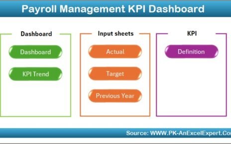
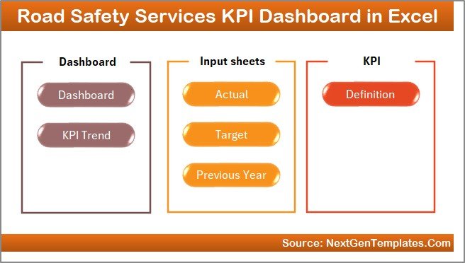
The dashboard contains 7 worksheets, each designed for a specific purpose.
Let’s explore each sheet in detail.
1. Home Sheet – Navigation Center of the Dashboard
The Home Sheet works as the central navigation page of the dashboard.
Instead of scrolling through multiple worksheets manually, users can navigate to any section with a single click.
Key Features of the Home Sheet
-
Acts as an index page for the entire dashboard
-
Includes 6 navigation buttons
-
Each button redirects to a specific worksheet
-
Improves dashboard usability and navigation
-
Makes the dashboard more user friendly
Because of this navigation system, users can easily move between sheets without confusion.
2. Dashboard Sheet – Main KPI Performance Overview
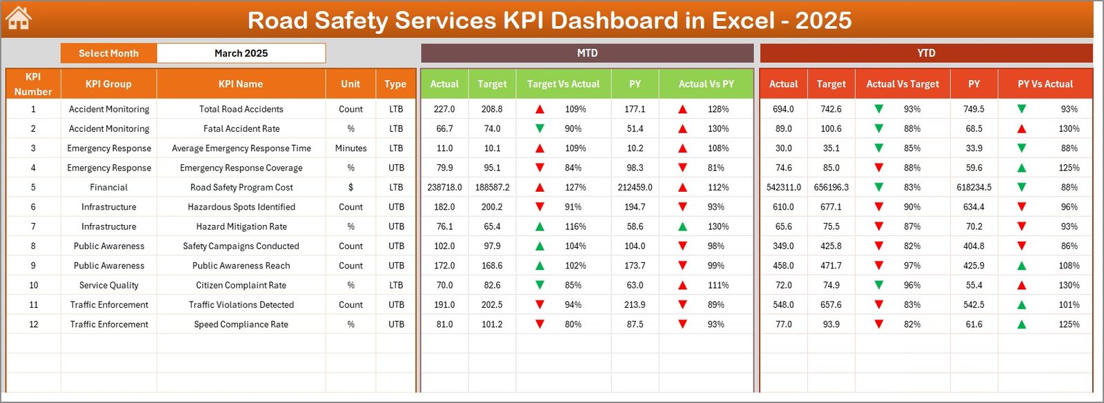
The Dashboard Sheet serves as the main analytics page of the Excel dashboard.
Here, users can view all important KPIs along with performance comparisons.
Dynamic Month Selection
Users can select the reporting month from the drop-down list in cell D3.
Once the month changes, the entire dashboard automatically updates.
KPI Metrics Displayed in the Dashboard
The dashboard shows the following performance indicators:
Month-To-Date (MTD) Metrics
-
MTD Actual
-
MTD Target
-
Previous Year MTD
-
Target vs Actual comparison
-
Previous Year vs Actual comparison
Year-To-Date (YTD) Metrics
-
YTD Actual
-
YTD Target
-
Previous Year YTD
-
Target vs Actual comparison
-
Previous Year vs Actual comparison
Conditional Formatting Indicators
The dashboard also uses visual indicators such as:
-
Up arrows for positive performance
-
Down arrows for declining performance
Because of these visual indicators, users can instantly identify whether performance improves or declines.
Click to Purchases Road Safety Services KPI Dashboard in Excel
3. KPI Trend Sheet – Performance Trend Analysis
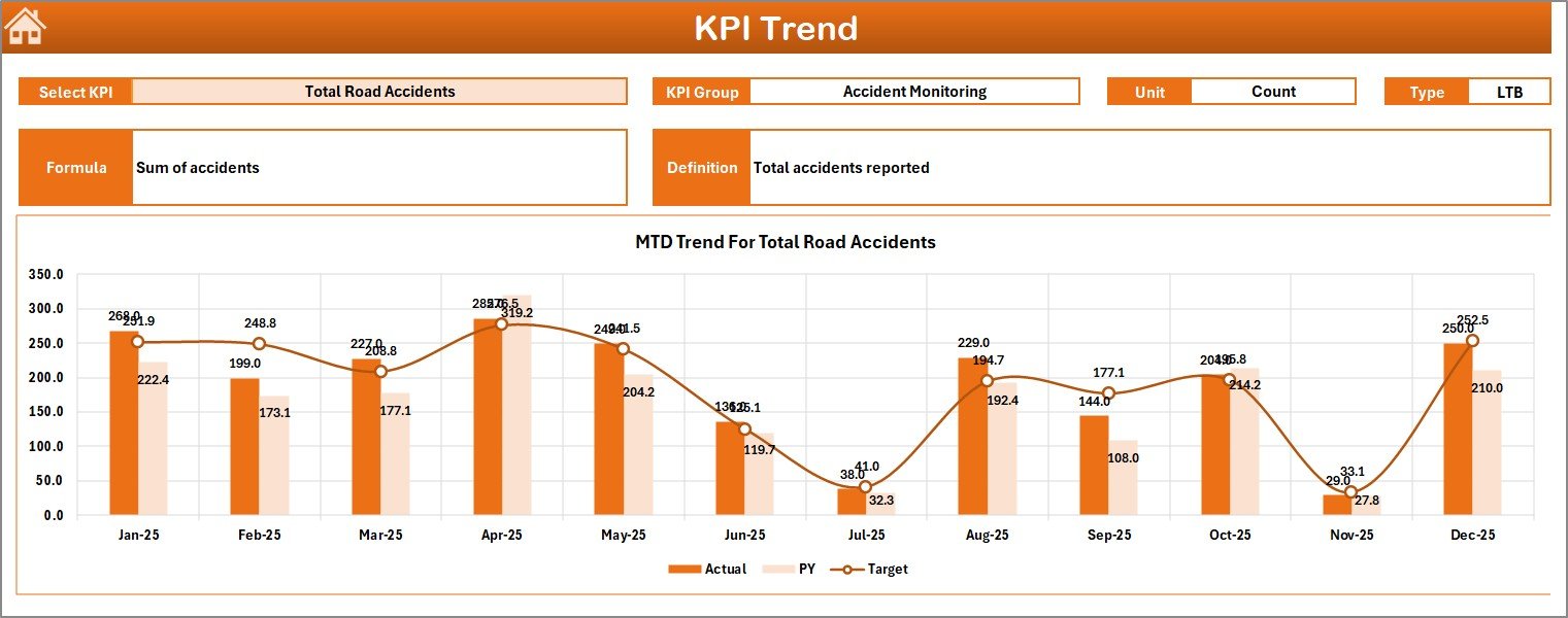
The KPI Trend Sheet helps users analyze performance trends for individual KPIs.
Instead of reviewing aggregated numbers only, this sheet allows deeper analysis of specific indicators.
KPI Selection
Users can select any KPI from the drop-down menu in cell C3.
Once the KPI changes, all related information updates automatically.
KPI Information Displayed
The sheet shows important KPI information such as:
-
KPI Group
-
KPI Unit
-
KPI Type (Lower the Better or Upper the Better)
-
KPI Formula
-
KPI Definition
KPI Trend Charts
The sheet also includes two important charts:
-
MTD Trend Chart
-
YTD Trend Chart
Both charts compare:
-
Actual values
-
Target values
-
Previous year values
Therefore, users can easily identify whether the KPI performance improves or declines over time.
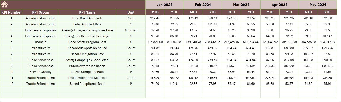
4. Actual Numbers Input Sheet – Data Entry for Current Performance
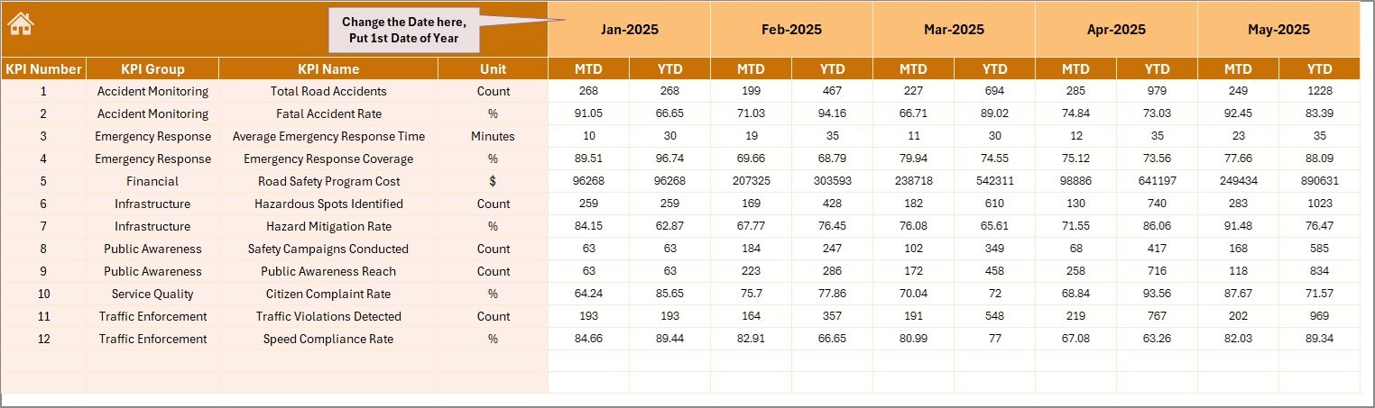
The Actual Numbers Input Sheet stores the current year’s KPI performance data.
Users must enter the actual MTD and YTD numbers in this sheet.
Data Entry Configuration
Users can set the first month of the year in cell E1.
Once the first month is defined, the dashboard automatically adjusts the timeline.
Key Purpose of This Sheet
-
Stores actual KPI values
-
Feeds data to the dashboard
-
Updates charts automatically
-
Enables monthly performance tracking
Because the dashboard relies on this sheet, accurate data entry becomes extremely important.
5. Target Sheet – KPI Target Management
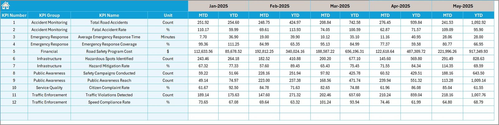
The Target Sheet stores monthly and yearly KPI targets.
Organizations define performance expectations in this sheet.
Target Data Includes
-
Monthly Target (MTD)
-
Year-To-Date Target (YTD)
Once users enter the targets, the dashboard automatically calculates Target vs Actual comparisons.
This comparison helps managers understand whether teams meet their safety goals.
Click to Purchases Road Safety Services KPI Dashboard in Excel
6. Previous Year Numbers Sheet – Historical Benchmarking
Performance benchmarking becomes extremely important when organizations analyze improvements.
Therefore, the Previous Year Numbers Sheet stores historical KPI data.
Users enter previous year values in the same format used for the current year.
Benefits of Previous Year Comparison
-
Helps measure improvement trends
-
Enables year-over-year analysis
-
Identifies long-term safety progress
Because of this comparison, decision-makers can determine whether safety programs produce results.
7. KPI Definition Sheet – KPI Documentation
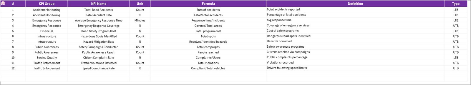
The KPI Definition Sheet acts as a KPI reference library.
Users must define the following information:
-
KPI Name
-
KPI Group
-
KPI Unit
-
KPI Formula
-
KPI Definition
Why This Sheet Is Important
Clear KPI definitions ensure that every team member understands how metrics are calculated.
Moreover, documentation prevents confusion when multiple departments analyze performance.
Advantages of Road Safety Services KPI Dashboard in Excel
Implementing a KPI dashboard provides many operational benefits.
Improved Road Safety Monitoring
Authorities can track safety metrics in real time.
Faster Data Analysis
Instead of manual calculations, Excel automatically updates performance indicators.
Better Decision Making
Managers can identify risk areas quickly.
Historical Performance Comparison
Previous year comparisons help measure improvement.
Enhanced Accountability
Teams clearly understand performance targets.
Reduced Reporting Effort
Automated calculations eliminate repetitive reporting work.
Better Strategic Planning
Trend analysis helps organizations design better safety programs.
Best Practices for Road Safety KPI Dashboard Implementation
Even though dashboards provide powerful insights, organizations must follow best practices to maximize their effectiveness.
Define Clear KPIs
Select KPIs that truly measure safety performance.
Maintain Accurate Data Entry
Ensure that all KPI values are updated regularly.
Review KPIs Monthly
Monthly review helps detect issues early.
Use Consistent KPI Definitions
All departments should follow the same KPI calculation rules.
Train Dashboard Users
Users should understand how to interpret the dashboard metrics.
Monitor KPI Trends
Instead of focusing only on numbers, analyze trends carefully.
Align KPIs with Safety Goals
Every KPI should support overall road safety objectives.
How Does a Road Safety KPI Dashboard Improve Traffic Safety?
A structured KPI dashboard improves road safety in multiple ways.
First, it helps authorities monitor accident patterns and response times.
Next, it allows teams to evaluate safety program effectiveness.
Additionally, the dashboard highlights weak areas that require improvement.
As a result, organizations can implement corrective measures faster.
Ultimately, better monitoring leads to safer roads and fewer accidents.
Conclusion
Road safety management requires constant monitoring, accurate data analysis, and fast decision-making. However, manual reporting systems often slow down this process and create data inconsistencies.
The Road Safety Services KPI Dashboard in Excel solves these challenges by providing a centralized performance monitoring system.
With features like interactive KPI tracking, MTD and YTD analysis, target comparisons, trend charts, and historical benchmarking, the dashboard helps road safety departments manage performance efficiently.
Because the template organizes all KPIs into a single system, managers gain complete visibility into safety operations.
As a result, organizations can identify risks faster, improve safety planning, and ultimately create safer roads for everyone.
Frequently Asked Questions (FAQs)
What is a Road Safety KPI Dashboard?
A Road Safety KPI Dashboard is a performance monitoring tool that tracks key road safety indicators such as accident rates, response times, and inspection performance.
Why should organizations use a Road Safety Dashboard in Excel?
Excel dashboards allow organizations to track safety metrics, analyze trends, and compare targets with actual performance efficiently.
What types of KPIs are included in road safety dashboards?
Common KPIs include accident frequency, response time, hazard resolution time, safety inspections completed, and traffic violation rates.
Can Excel dashboards update automatically?
Yes. Excel dashboards update automatically when users input new data into the source sheets.
Who can use a Road Safety KPI Dashboard?
Government agencies, transportation departments, road safety authorities, and traffic management teams can use this dashboard.
Why is trend analysis important for road safety KPIs?
Trend analysis helps organizations identify patterns in safety performance and evaluate whether safety programs produce improvements.
Visit our YouTube channel to learn step-by-step video tutorials