Road safety plays a crucial role in protecting lives, reducing accidents, and improving transportation systems. Governments, traffic departments, infrastructure agencies, and safety service providers constantly work to reduce road accidents, improve compliance with safety standards, and enhance public awareness. However, managing road safety performance becomes difficult when data remains scattered across multiple reports, spreadsheets, and systems.
Therefore, organizations increasingly use data-driven dashboards to track safety performance and monitor critical metrics. A Road Safety Services KPI Dashboard in Power BI helps decision-makers analyze safety indicators, track progress, and identify areas that require immediate attention.
Click to Purchases Road Safety Services KPI Dashboard in Power BI
Instead of manually reviewing multiple reports, managers can monitor all road safety performance indicators from one centralized visual dashboard. As a result, they can identify trends quickly, evaluate safety programs effectively, and make informed decisions.
In this comprehensive guide, you will learn:
-
What a Road Safety Services KPI Dashboard in Power BI is
-
Why road safety organizations need KPI monitoring
-
Key features of this Power BI dashboard
-
Advantages of using a KPI dashboard for road safety services
-
Best practices for implementation
-
Frequently asked questions about road safety KPI dashboards
Let us explore everything step by step.
What Is a Road Safety Services KPI Dashboard in Power BI?
A Road Safety Services KPI Dashboard in Power BI is a performance monitoring tool that helps organizations track and analyze key road safety indicators through interactive charts, tables, and filters.
This dashboard consolidates data from multiple sources, such as accident reports, safety inspections, compliance audits, and traffic monitoring systems. After consolidating the information, Power BI transforms the raw data into visual insights that help managers evaluate performance.
Instead of analyzing safety performance manually, organizations can use the dashboard to:
-
Monitor safety KPIs in real time
-
Compare current performance with targets
-
Evaluate historical performance trends
-
Identify safety improvement opportunities
Consequently, decision-makers can act faster and implement better safety strategies.
Why Do Road Safety Organizations Need KPI Dashboards?
Road safety management involves multiple activities such as accident monitoring, safety inspections, compliance checks, and awareness programs. However, without proper analytics tools, organizations struggle to measure performance effectively.
A KPI dashboard solves this problem by providing structured insights.
Here are some common challenges faced by road safety organizations:
-
Data scattered across different systems
-
Lack of centralized performance monitoring
-
Delayed reporting and analysis
-
Difficulty tracking safety targets
-
Limited visibility into safety trends
However, when organizations use a Power BI dashboard, they gain complete visibility into safety performance.
As a result, safety managers can quickly identify risks, monitor progress, and improve road safety strategies.
Key Features of the Road Safety Services KPI Dashboard in Power BI
This ready-to-use Power BI dashboard provides a structured framework to monitor road safety KPIs efficiently. The dashboard includes multiple pages that help users analyze data from different perspectives.
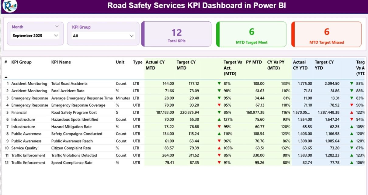
1. Summary Page – The Main Performance Overview
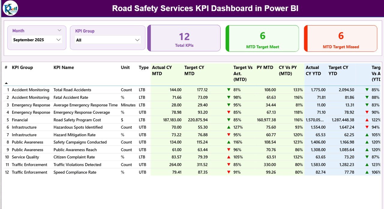
The Summary Page serves as the central control panel of the dashboard. Here, users can instantly review key safety metrics and performance indicators.
At the top of the dashboard, users can apply two slicers:
-
Month Slicer – Allows users to filter data by month
-
KPI Group Slicer – Allows users to analyze KPIs based on their category
These slicers enable dynamic analysis and allow managers to explore performance data interactively.
KPI Performance Cards
The dashboard also includes three important KPI cards:
-
Total KPIs Count – Displays the total number of KPIs monitored in the dashboard
-
MTD Target Meet Count – Shows how many KPIs achieved their targets during the current month
-
MTD Target Missed Count – Displays the number of KPIs that failed to meet targets
These indicators provide a quick overview of safety performance.
Detailed KPI Table
Below the KPI cards, the dashboard presents a detailed KPI table containing several performance indicators.
KPI Number
This column displays the sequence number assigned to each KPI.
KPI Group
This column categorizes KPIs based on their operational group, such as safety inspections, accident monitoring, or compliance management.
KPI Name
This column shows the name of the KPI being monitored.
Unit
This column displays the unit of measurement used for the KPI.
Type
This field indicates the KPI type:
-
LTB (Lower the Better)
-
UTB (Upper the Better)
This classification helps managers evaluate KPI performance correctly.
Click to Purchases Road Safety Services KPI Dashboard in Power BI
Actual CY MTD
This value represents the actual Month-To-Date performance for the current year.
Target CY MTD
This value shows the target performance for the current month.
MTD Icon Indicator
The dashboard displays visual icons to indicate KPI status.
-
▲ Green icon indicates the KPI achieved or exceeded its target
-
▼ Red icon indicates the KPI missed the target
Therefore, users can instantly identify KPI performance.
Target vs Actual (MTD)
This metric calculates the percentage comparison between actual and target values.
Formula used:
Actual MTD / Target MTD
This value helps evaluate KPI performance more accurately.
PY MTD
This column shows the previous year’s Month-To-Date value for the same KPI.
CY vs PY (MTD)
This metric compares current year performance with previous year performance.
Formula used:
Current Year MTD / Previous Year MTD
This comparison helps identify improvements or declines in safety performance.
Actual CY YTD
This column shows the current year cumulative performance (Year-To-Date).
Target CY YTD
This column shows the target value for the entire year.
YTD Icon Indicator
Similar to MTD, this icon indicates YTD performance.
-
Green ▲ indicates target achieved
-
Red ▼ indicates target missed
Target vs Actual (YTD)
This metric compares actual YTD performance with the target.
Formula used:
Actual YTD / Target YTD
PY YTD
This column shows the previous year’s cumulative value.
CY vs PY (YTD)
This metric compares current year YTD performance with the previous year.
Formula used:
Current Year YTD / Previous Year YTD
Thus, managers can evaluate long-term performance trends.
2. KPI Trend Page – Visual Performance Analysis
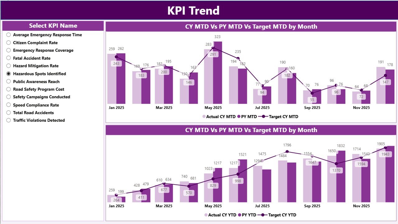
The KPI Trend Page helps users analyze KPI performance trends over time.
This page includes two combo charts.
MTD Trend Chart
This chart compares:
-
Current Year MTD Actual
-
Previous Year MTD Actual
-
Current Year Target
Therefore, users can easily identify monthly performance variations.
YTD Trend Chart
This chart compares:
-
Current Year YTD Actual
-
Previous Year YTD Actual
-
Target YTD
This visual comparison helps managers evaluate long-term performance progress.
KPI Selection Slicer
The left side of the page includes a slicer that allows users to select a specific KPI.
Once selected, the charts update automatically.
Therefore, users can analyze KPI trends in detail.
3. KPI Definition Page – Detailed KPI Explanation
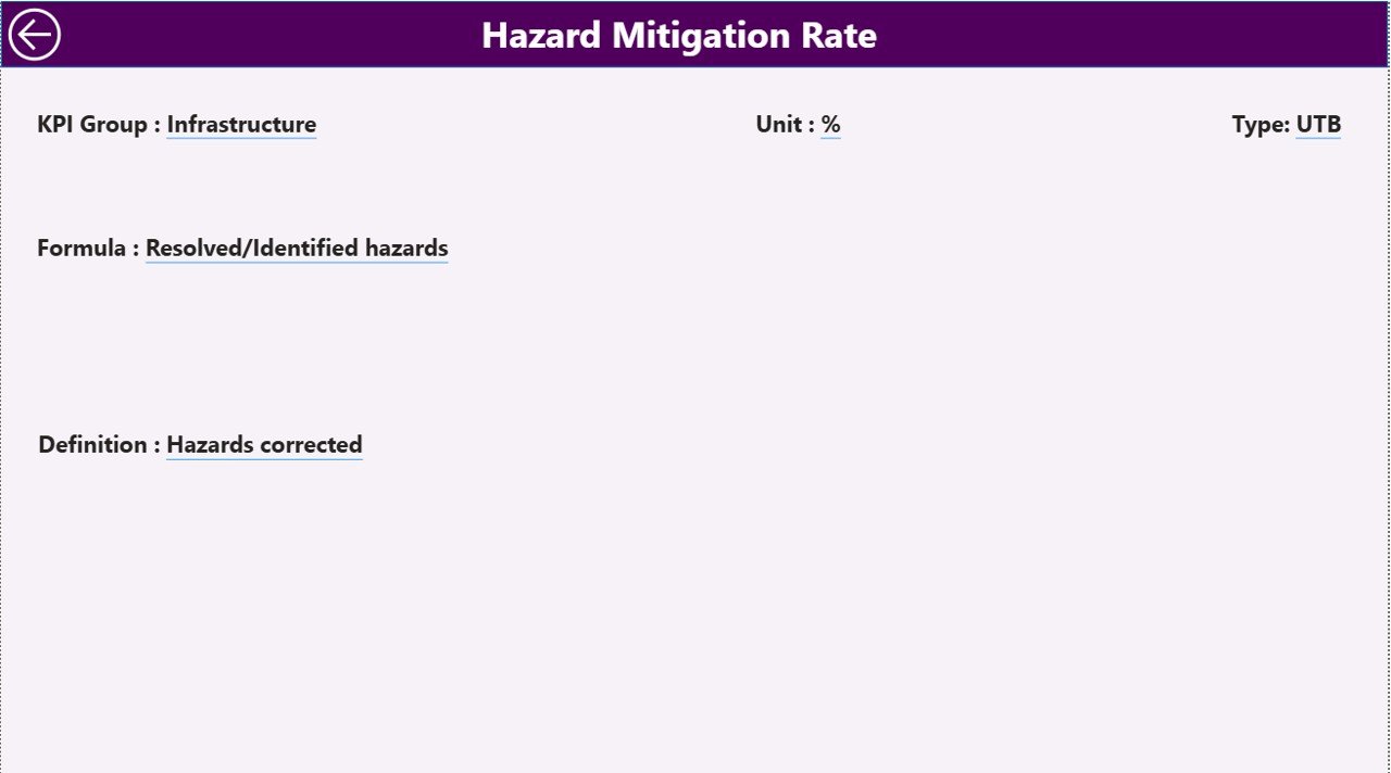
The KPI Definition Page provides additional information about each KPI.
This page includes details such as:
-
KPI Formula
-
KPI Definition
-
KPI Measurement Unit
-
KPI Type
Users can access this page through the drill-through feature.
For example, when a user selects a KPI from the summary page, Power BI navigates to the KPI definition page.
This feature helps users understand KPI calculations clearly.
To return to the main page, users simply click the back button available at the top-left corner.
Excel Data Source Used in the Dashboard
Click to Purchases Road Safety Services KPI Dashboard in Power BI
The Power BI dashboard uses an Excel file as the data source. Users need to maintain three worksheets in the Excel file.
1. Input_Actual Sheet
This sheet stores the actual KPI values.
Users must fill the following fields:
-
KPI Name
-
Month (use the first date of the month)
-
MTD Value
-
YTD Value
This data reflects actual road safety performance.
2. Input_Target Sheet
This sheet stores the target values.
Users must fill:
-
KPI Name
-
Month
-
MTD Target
-
YTD Target
These targets allow the dashboard to evaluate performance.
3. KPI Definition Sheet
This sheet stores KPI details.
Users must fill the following information:
-
KPI Number
-
KPI Group
-
KPI Name
-
Unit
-
Formula
-
Definition
-
KPI Type (LTB or UTB)
This sheet ensures consistency in KPI tracking.
Advantages of the Road Safety Services KPI Dashboard in Power BI
Organizations gain several benefits when they use a KPI dashboard.
1. Centralized Performance Monitoring
The dashboard consolidates all safety metrics into a single interface. Therefore, managers can analyze road safety performance easily.
2. Faster Decision-Making
Visual analytics allow managers to identify issues quickly. Consequently, they can take corrective actions faster.
3. Real-Time Data Insights
Power BI dashboards update automatically when data changes. As a result, organizations can monitor real-time safety performance.
4. Improved Accountability
The dashboard clearly shows whether KPIs meet targets or not. Therefore, teams remain accountable for safety outcomes.
5. Better Performance Analysis
Historical comparisons help managers evaluate trends. Consequently, organizations can measure improvements over time.
6. Data-Driven Safety Strategy
Instead of relying on assumptions, organizations can use data insights to improve road safety initiatives.
Best Practices for Using the Road Safety Services KPI Dashboard in Power BI
Organizations should follow certain best practices to maximize the effectiveness of the dashboard.
1. Define Clear KPIs
Organizations should define measurable and relevant KPIs such as:
-
Accident reduction rate
-
Road inspection compliance
-
Safety awareness program coverage
Clear KPIs improve monitoring.
2. Maintain Accurate Data
Accurate data ensures reliable insights. Therefore, teams must update Excel data regularly.
3. Use Consistent Data Formats
Using standardized formats prevents data errors and improves dashboard performance.
4. Monitor Performance Regularly
Managers should review dashboard insights regularly to identify risks and opportunities.
5. Train Users Properly
Proper training ensures that users understand dashboard features and KPI calculations.
6. Continuously Improve KPIs
Organizations should review KPIs periodically and update them based on changing safety priorities.
Conclusion
Click to Purchases Road Safety Services KPI Dashboard in Power BI
Road safety remains a critical priority for governments, transportation authorities, and safety organizations. However, managing safety performance becomes challenging when data remains scattered and reporting remains manual.
The Road Safety Services KPI Dashboard in Power BI provides a powerful solution to this problem. It transforms raw safety data into clear visual insights, enabling organizations to monitor performance effectively.
Through features such as the summary page, KPI trend analysis, and KPI definition page, users can analyze performance quickly and make informed decisions.
Moreover, the dashboard improves visibility, accountability, and data-driven decision-making.
Therefore, organizations that implement KPI dashboards can significantly enhance road safety monitoring and achieve better outcomes.
Frequently Asked Questions (FAQs)
1. What is a KPI dashboard in Power BI?
A KPI dashboard in Power BI is a visual reporting tool that tracks key performance indicators through interactive charts, tables, and filters.
2. Why is a road safety KPI dashboard important?
A road safety KPI dashboard helps organizations monitor accident trends, safety performance, and compliance metrics to improve road safety outcomes.
3. What data sources can Power BI use for KPI dashboards?
Power BI can connect to multiple data sources including Excel, databases, cloud platforms, and APIs.
4. How often should KPI dashboards be updated?
Organizations should update KPI dashboards regularly, preferably monthly or weekly, depending on reporting requirements.
5. Can Power BI dashboards handle large datasets?
Yes. Power BI can process large datasets and transform them into interactive visual reports.
6. Who can use a Road Safety KPI Dashboard?
Traffic authorities, government agencies, infrastructure companies, and road safety service providers can all benefit from this dashboard.
Visit our YouTube channel to learn step-by-step video tutorials