SaaS Metrics Dashboard in Excel is a professionally designed, pivot-powered analytics template that enables SaaS founders, revenue operations managers, customer success leaders, and finance teams to monitor MRR, ARR, churn rates, expansion revenue, and customer health from a single dynamic interface. In the competitive SaaS landscape, having real-time visibility into your subscription metrics is not a luxury — it is a necessity for survival and growth. This Excel dashboard template transforms raw subscription data into clear, actionable visual insights that empower smarter decision-making across every department.
This template includes 5 interactive dashboard pages covering Overview, Revenue Analysis, Customer Health, Churn Analysis, and Growth Metrics — plus a Data Sheet for raw data input and a Support Sheet with pivot tables that power the entire dashboard dynamically. Whether you are a SaaS startup tracking your first 100 customers or a scaling company managing thousands of subscriptions, this SaaS Metrics Dashboard in Excel gives you complete visibility into your subscription business with dynamic charts, KPI cards, and slicer-based filtering.
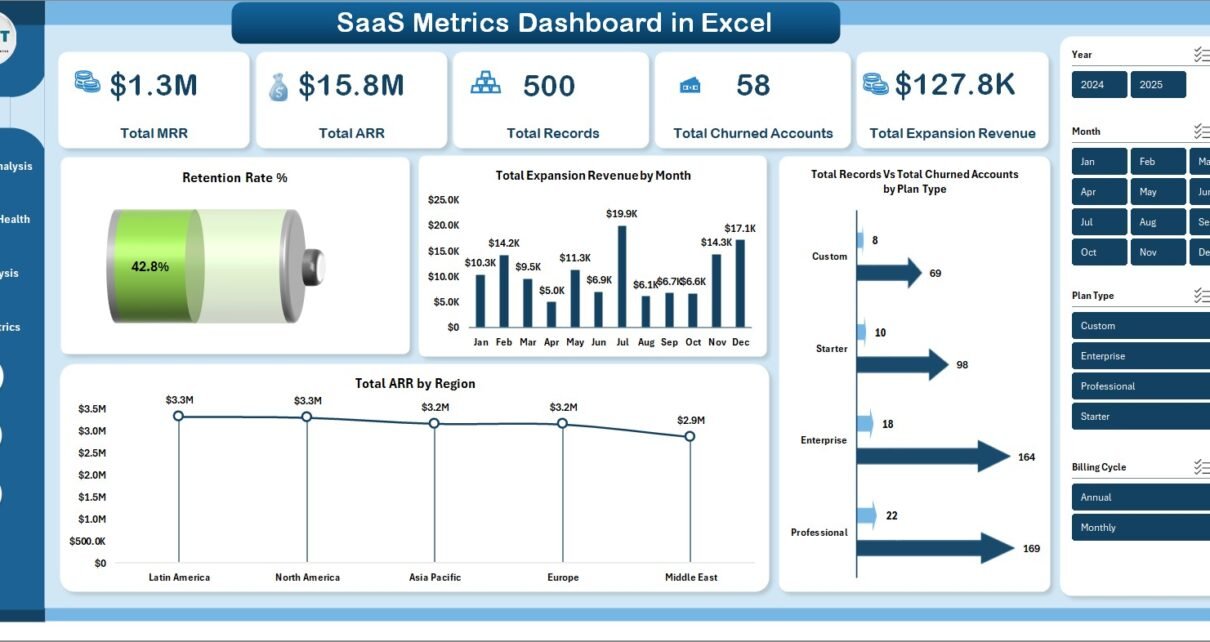
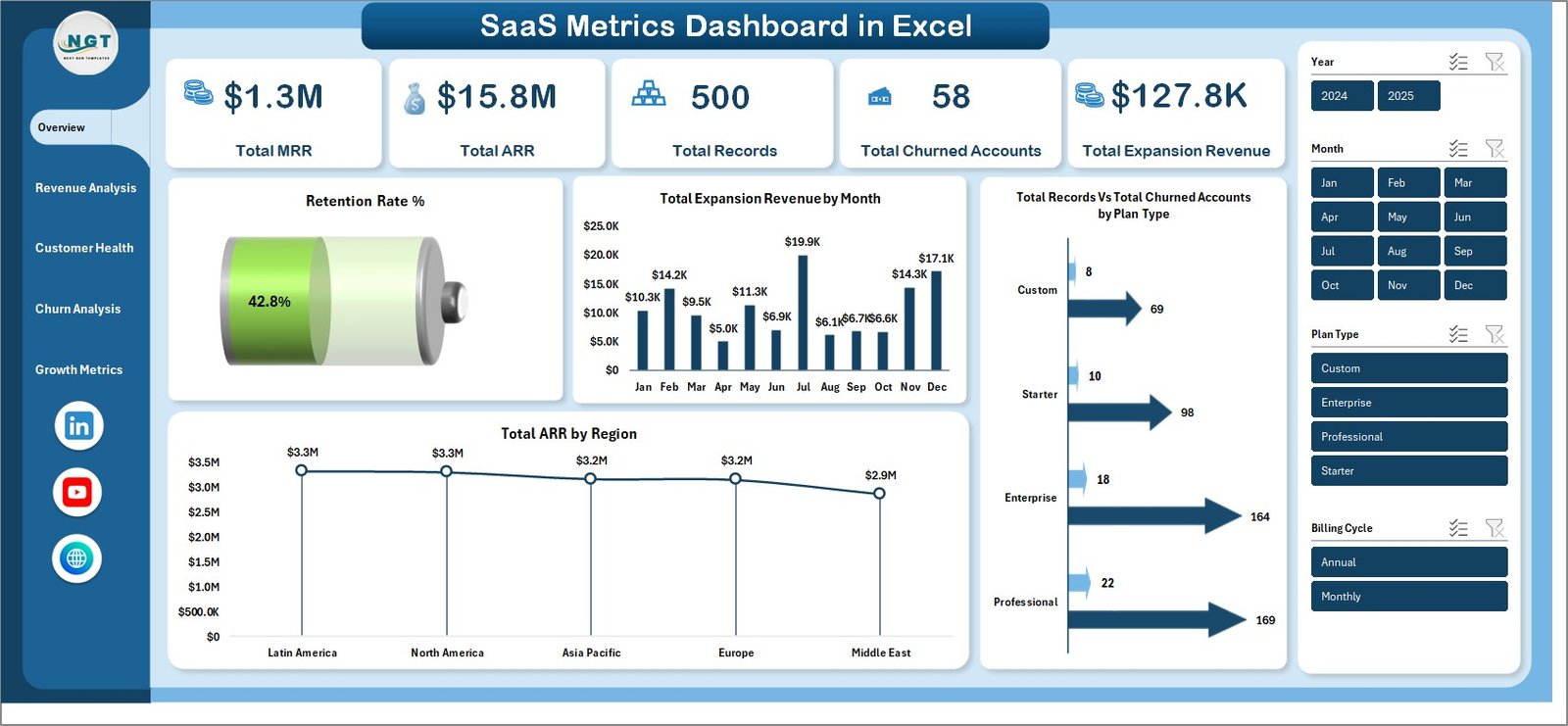
This dashboard is built with SaaS-specific metrics at its core. It tracks 5 key performance indicators on the overview page — Total MRR, Total ARR, Total Records, Total Churned Accounts, and Total Expansion Revenue — giving you an instant snapshot of your subscription business health. The template includes 5 dedicated analysis pages covering every dimension of SaaS performance, from revenue breakdown to churn patterns to growth trajectories. Multiple slicers let you filter across plan type, region, industry, account manager, and billing cycle for targeted analysis.
All charts and KPI cards are powered by pivot tables in the Support Sheet, making the dashboard fully dynamic. Simply update your data in the Data Sheet, click Refresh All in Excel’s Data tab, and every visualization updates automatically — no manual formula editing or VBA knowledge required. The dashboard also includes a structured Data Sheet where you input your SaaS subscription records, and a Support Sheet that serves as the hidden calculation engine behind every chart.
Dashboard Pages Explained
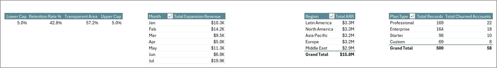
1. Overview Page
The Overview page serves as your command center with KPI cards displaying Total MRR, Total ARR, Total Records, Total Churned Accounts, and Total Expansion Revenue. Interactive charts show Retention Rate % by Overall, Total Expansion Revenue by Month, Total Records by Plan Type, and Total ARR by Region. Multiple slicers allow you to filter and see the filtered dashboard quickly across all these visualizations.
SaaS Metrics Dashboard in Excel
2. Revenue Analysis
The Revenue Analysis page provides a deep dive into your subscription revenue streams. It features Total MRR by Industry to understand which sectors generate the most recurring revenue, Total ARR by Account Manager to evaluate team performance, Total MRR by Customer Name for account-level revenue tracking, Total Expansion Revenue by Company Name to identify upsell champions, and Total MRR by Billing Cycle to analyze payment pattern preferences across your customer base.
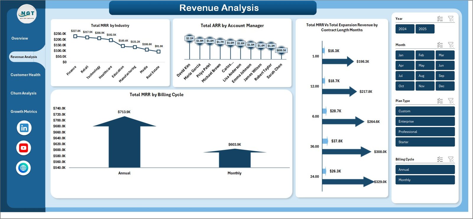
Revenue Analysis
3. Customer Health
The Customer Health page helps you proactively manage customer relationships. It tracks Total Records by Churn Risk to identify accounts needing immediate attention, Avg CSAT Score by Renewal Status to measure satisfaction among renewing versus non-renewing customers, Total Support Tickets by Region to spot geographic areas with high support demand, and Avg NPS Score by Plan Type to compare customer loyalty across different subscription tiers.
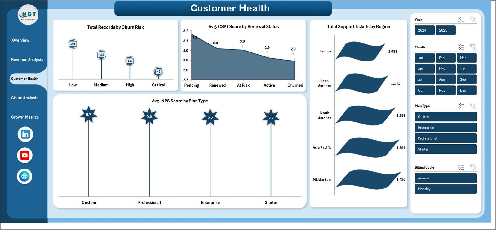
Customer Health
4. Churn Analysis
The Churn Analysis page is dedicated to understanding and combating customer attrition. It displays Churn Rate % by Industry to reveal which business sectors experience the highest attrition, Churn Rate % by Plan Type to compare attrition across subscription tiers, Total Records by Account Manager to measure retention effectiveness per team member, and Total Churned Accounts by Month to identify seasonal churn patterns and trends over time.
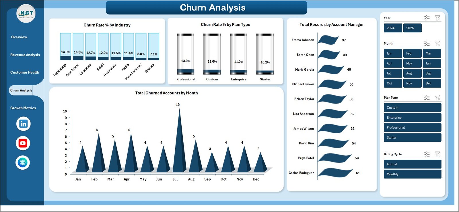
Churn Analysis
5. Growth Metrics
The Growth Metrics page focuses on tracking business expansion and scalability. It features Total Expansion Revenue by Region to identify geographic growth hotspots, Avg MRR Per Account by Industry to measure revenue density per sector, Avg MRR Per Account % by Plan Type to evaluate tier-level profitability, and Total ARR by Year to visualize your annual revenue growth trajectory and ensure your business is scaling on target.
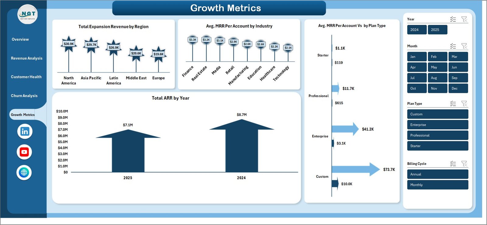
Growth Metrics
6. Data Sheet
The Data Sheet is where you input your raw SaaS subscription data. It comes pre-loaded with sample data in a structured format. Simply replace the sample records with your actual subscription data — maintaining the same column structure — and all dashboard pages will pull from this sheet automatically after refreshing.
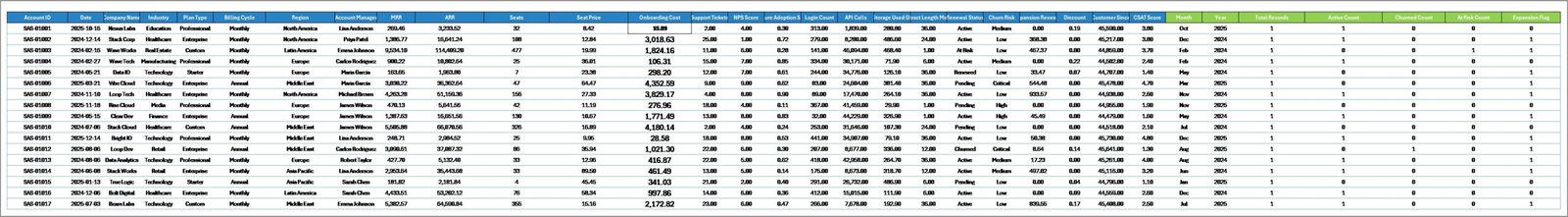
Data Sheet tab
7. Support Sheet
The Support Sheet contains all the pivot tables that power the entire dashboard dynamically. After updating data in the Data Sheet, navigate to the Data tab in Excel’s Ribbon and click Refresh All. Every pivot table recalculates and all charts across all 5 dashboard pages update automatically. You can keep this sheet hidden during presentations to maintain a clean, professional look.
Support sheet tab
Advantages of SaaS Metrics Dashboard in Excel
This dashboard eliminates the need for expensive BI tools by delivering enterprise-grade SaaS analytics right inside Microsoft Excel. It provides a comprehensive view of your subscription business across five critical dimensions — revenue, customer health, churn, retention, and growth — all in one file. The pivot-powered architecture means zero maintenance overhead: update your data, refresh, and you are done. Excel’s universal availability ensures every team member can access and analyze the dashboard without additional software licenses. The slicer-based filtering makes it easy for non-technical users to explore data by region, plan type, industry, or account manager without any training.
Opportunities for Improvement
While the current template covers the most critical SaaS metrics, there are several ways to extend its capabilities. You could integrate cohort analysis to track retention rates by customer signup month, add a VBA-powered automation to auto-refresh data from external sources, or build a financial forecasting module that projects MRR and ARR based on historical trends. Adding a dedicated Account Manager Scorecard page with individual performance rankings could further enhance team management capabilities.
Best Practices
To get the most out of your SaaS Metrics Dashboard in Excel, update your data monthly to ensure real-time visibility into your subscription metrics. Use the slicers strategically to compare performance across different dimensions — for example, filter by a specific industry to understand sector-specific churn patterns. Share the dashboard with your leadership team during board meetings and investor updates for data-driven presentations. Keep the Support Sheet hidden during presentations to maintain a clean, professional appearance. Back up your data regularly and consider creating separate files for different reporting periods to track historical trends over time.
Explore Relevant Templates
If you are interested in more SaaS and business analytics templates, explore these related products from NextGenTemplates:
- SaaS Business KPI Dashboard in Google Sheets — Track MRR, churn rate, CAC, LTV, and more SaaS KPIs with an interactive Google Sheets template.
- Freelancer Business Dashboard in Excel — Monitor freelancer income, client metrics, project tracking, and profitability analysis.
- Digital Marketing Campaign Dashboard in Excel — Track campaign performance, ROI, conversions, and marketing spend across channels.
Frequently Asked Questions
What KPIs does the SaaS Metrics Dashboard in Excel track?
The SaaS Metrics Dashboard in Excel tracks 5 key performance indicators: Total MRR, Total ARR, Total Records, Total Churned Accounts, and Total Expansion Revenue. It also provides detailed analysis of retention rate, churn rate by industry, CSAT scores, NPS scores, and growth metrics across 5 interactive dashboard pages.
Do I need advanced Excel skills to use this SaaS dashboard?
No. Simply replace the sample data in the Data Sheet with your own SaaS subscription data and click Refresh All in the Data tab. All pivot tables, charts, and KPI cards update automatically without any formula editing or VBA knowledge.
What is the best Excel template for tracking SaaS metrics like MRR and ARR?
The SaaS Metrics Dashboard in Excel is one of the best templates for tracking SaaS subscription metrics because it includes MRR and ARR tracking, churn analysis, customer health monitoring with CSAT and NPS scores, expansion revenue tracking, and growth metrics — all powered by dynamic pivot tables across 5 interactive pages.
Can I track customer churn and retention with this dashboard?
Yes. The dedicated Churn Analysis page shows churn rate by industry, churn rate by plan type, churned accounts by month, and records by account manager. The Overview page also displays overall retention rate percentage for quick monitoring.
How do I update the dashboard with my own data?
Go to the Data Sheet tab, replace the sample data with your actual SaaS subscription records in the same column format, then navigate to the Data tab in Excel’s Ribbon and click Refresh All. All pivot tables and charts will update automatically across all 5 dashboard pages.
Conclusion
The SaaS Metrics Dashboard in Excel is a powerful, ready-to-use analytics solution for any subscription-based business looking to gain complete visibility into MRR, ARR, churn, customer health, and growth metrics. With 5 interactive dashboard pages, dynamic pivot tables, smart slicers, and a clean professional design, this template transforms complex SaaS data into actionable insights that drive better decisions. Whether you are presenting to investors, optimizing your retention strategy, or tracking expansion revenue, this dashboard has everything you need.
Click here to Purchase SaaS Metrics Dashboard in Excel
👉 Youtube.com/@PK-AnExcelExpert