In today’s data-driven world, businesses rely heavily on dashboards to visualize and analyze their performance. A Sales Business Intelligence Dashboard in Excel provides a centralized view of key sales metrics, enabling businesses to make informed decisions. This ready-to-use template in Excel simplifies the process of tracking sales performance across various regions, sales representatives, product categories, and time periods. Let’s dive into the features, advantages, best practices, and more.
Click to Purchases Sales Business Intelligence Dashboard in Excel
What is a Sales Business Intelligence Dashboard in Excel?
A Sales Business Intelligence Dashboard in Excel is a powerful tool designed to help sales managers, teams, and executives track and analyze sales performance. It combines multiple data sources, visualizes key metrics, and presents actionable insights to improve sales strategies. The dashboard is fully customizable, allowing users to add or remove charts and data fields as needed.
Excel’s versatility as a data analysis tool, combined with its user-friendly interface, makes it a go-to option for businesses of all sizes. This dashboard template can be used by sales teams, managers, and even top executives to gain a clearer understanding of sales trends, performance, and goals.
Key Features of the Sales Business Intelligence Dashboard
The Sales Business Intelligence Dashboard comes with five essential pages, each focusing on a specific aspect of sales analysis. Below are the key features of this dashboard:
Overview Page
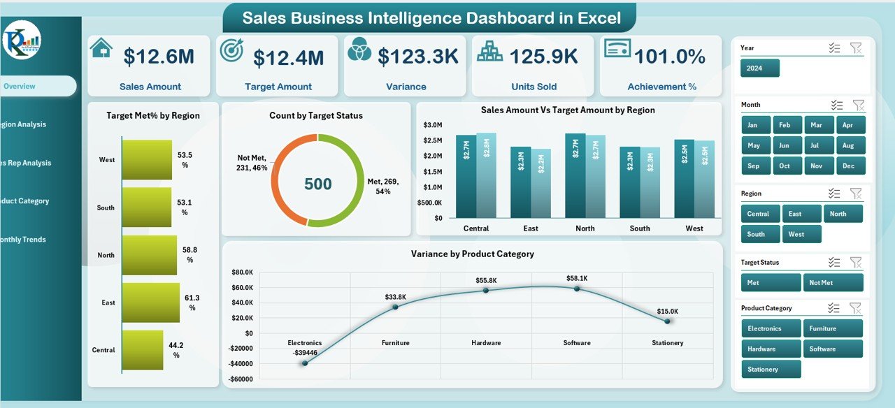
The Overview Page serves as the main entry point of the dashboard. It provides a snapshot of the overall sales performance and key metrics. Here are the main components:
-
Sales Cards: On the right side, you’ll find five interactive sales cards displaying key information such as total sales, sales target, achievement percentage, and more.
Charts: The dashboard includes four critical charts that visualize the sales data:
- Total Met% by Region
- Count by Target Status
- Sales Amount Vs Target Amount by Region
- Variance by Product
These elements offer a clear picture of how sales are performing against the set targets across various dimensions.
Region Analysis
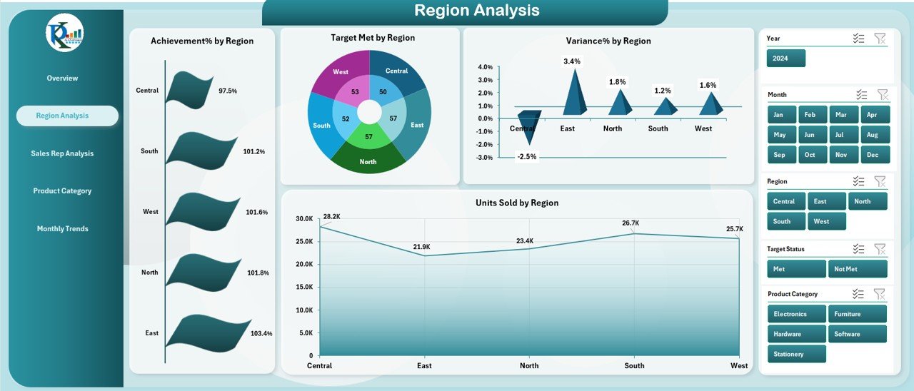
This page focuses on the performance of different regions. The main charts here include:
-
Achievement% by Region: Displays the percentage of sales targets met by each region.
-
Target Met by Region: Shows the total sales achieved versus the target in each region.
-
Variance% by Region: Highlights the variance between actual sales and targets for each region.
-
Units Sold by Region: Represents the total units sold in each region.
These charts allow managers to identify regions performing well and those that may require additional support or focus.
Sales Rep Analysis
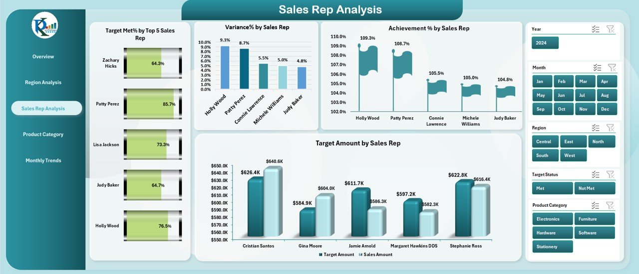
The Sales Rep Analysis page gives insight into individual sales representatives’ performance. It includes:
-
Target Met% by Top 5 Sales Rep: Highlights the top-performing sales representatives based on their ability to meet targets.
-
Variance% by Sales Rep: Measures how far off each representative is from meeting their targets.
-
Achievement % by Sales Rep: Shows the overall achievement percentage of each sales representative.
-
Target Amount by Sales Rep: Displays the target sales amount assigned to each representative.
By analyzing this data, managers can identify top performers, as well as those who need coaching or additional resources.
Product Category Summary
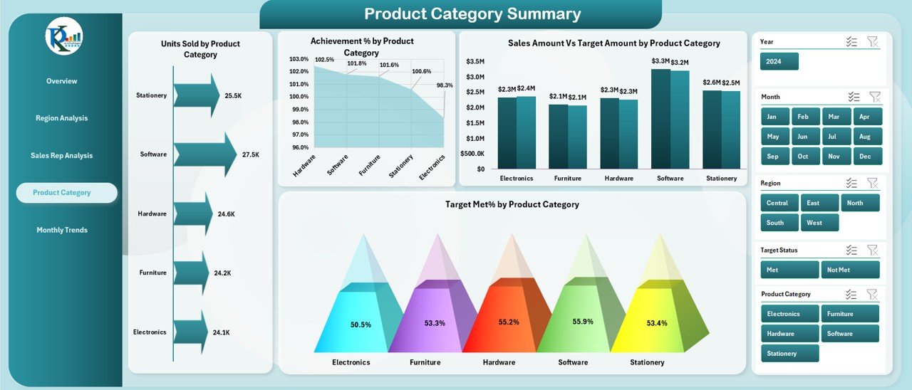
This page focuses on the sales performance by product category, offering the following charts:
-
Units Sold by Product Category: Displays the number of units sold for each product category.
-
Achievement% by Product Category: Shows the percentage of sales targets met by each product category.
-
Sales Amount Vs Target Amount by Product Category: Compares the actual sales to the target sales for each product category.
-
Target Met% by Product Category: Displays the percentage of the target sales met by each product category.
These charts help businesses understand which product categories are performing well and which might require more focus or adjustments.
Click to Purchases Sales Business Intelligence Dashboard in Excel
Monthly Trends
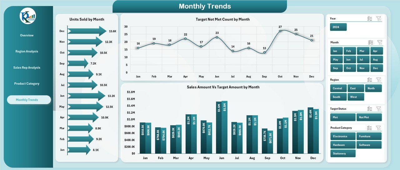
The Monthly Trends page helps track sales performance over time. This page includes:
-
Units Sold by Month: Shows how many units were sold each month.
-
Target Not Met Count by Month: Displays how many times the sales target was not met each month.
-
Sales Amount Vs Target Amount by Month: Compares actual sales amounts to the target sales amounts month by month.
Tracking monthly trends helps businesses spot seasonal variations, monitor progress towards yearly targets, and adjust strategies for future months.
Data Sheet
The Data Sheet serves as the backbone of the dashboard. It stores all the raw data needed to generate the visual reports. Users can easily update this sheet with new data, and the dashboard will automatically reflect the changes.
Support Sheet
The Support Sheet contains reference information like lookup values, dropdown lists, and other reference data used across the dashboard. It ensures that the dashboard remains organized and easy to maintain.
Advantages of Using a Sales Business Intelligence Dashboard in Excel
1. Improved Decision Making
With a dashboard that presents key performance metrics in a visual and easily understandable format, business owners and sales managers can make quicker and more informed decisions. You’ll have access to real-time insights into how your team is performing, which areas need improvement, and which strategies are working.
2. Customization
The Sales Business Intelligence Dashboard in Excel is highly customizable. You can add or remove charts, change the metrics, and adjust the layout according to your business needs. This flexibility ensures that the dashboard meets your specific requirements.
3. Data Accuracy
Excel’s powerful data handling capabilities ensure that the data presented in the dashboard is accurate and up-to-date. Since you’re working with live data, there’s no need for manual recalculation or outdated reports.
4. Time Savings
By consolidating various metrics into one single dashboard, you save time that would otherwise be spent sifting through multiple reports and documents. Everything you need is right in front of you, allowing you to focus on taking action rather than gathering information.
5. Easy to Use
Excel is a widely used tool that most professionals are familiar with. As such, the Sales Business Intelligence Dashboard is easy to use, even for those with limited experience in business intelligence tools. The template comes with clear instructions and is user-friendly.
Best Practices for Using the Sales Business Intelligence Dashboard
To get the most out of your Sales Business Intelligence Dashboard in Excel, here are some best practices:
1. Keep Your Data Updated
For the dashboard to be effective, you must ensure that the data in the Data Sheet is always up to date. Automate data entry whenever possible to reduce human error.
2. Regularly Review and Adjust Targets
Use the dashboard’s monthly trend charts to evaluate how well your sales team is performing against their targets. If certain goals are consistently not being met, consider adjusting your strategies or providing additional support.
3. Leverage Insights for Forecasting
Analyze trends in the dashboard to predict future performance. For example, if a particular region has consistently exceeded its target, you may want to allocate more resources there for the upcoming months.
4. Communicate Results
Share the dashboard with relevant stakeholders, such as senior management or other departments, to keep everyone aligned on sales performance. Regular updates foster transparency and help identify areas for improvement.
5. Train Your Team
Ensure that your sales team understands how to interpret the dashboard and act on the insights provided. Proper training will help them take full advantage of the tool and improve overall performance.
Frequently Asked Questions (FAQ)
What is the Sales Business Intelligence Dashboard in Excel used for?
The Sales Business Intelligence Dashboard in Excel is used to track and analyze sales performance across various regions, sales representatives, product categories, and time periods. It provides actionable insights to improve sales strategies and meet business goals.
How many pages are there in the Sales Business Intelligence Dashboard?
The dashboard contains five main pages: Overview, Region Analysis, Sales Rep Analysis, Product Category Summary, and Monthly Trends. These pages cover different aspects of sales performance and provide comprehensive data insights.
Can I customize the dashboard?
Yes, the Sales Business Intelligence Dashboard in Excel is fully customizable. You can add or remove charts, adjust data fields, and modify the layout to suit your business needs.
How do I update the data in the dashboard?
You can update the data in the Data Sheet, and the dashboard will automatically refresh to reflect the new information. It’s important to keep the data updated for the dashboard to provide accurate insights.
Is Excel the best tool for building a sales dashboard?
Click to Purchases Sales Business Intelligence Dashboard in Excel
Excel is one of the most popular and versatile tools for creating dashboards. It’s user-friendly, widely accessible, and offers powerful data analysis features. However, for larger businesses or more complex data, specialized business intelligence tools may be required.
Conclusion
A Sales Business Intelligence Dashboard in Excel is an invaluable tool for businesses looking to track and improve their sales performance. It offers powerful insights through easy-to-read charts and visualizations, helping teams make data-driven decisions. Whether you’re managing sales by region, sales rep, product category, or month, this dashboard provides all the information you need to stay ahead of the competition.
Visit our YouTube channel to learn step-by-step video tutorials