In today’s innovation-driven economy, Science & Technology Parks play a crucial role in supporting startups, research institutions, and technology-driven enterprises. However, managing data related to funding, revenue, costs, programs, regions, and technology sectors often becomes challenging. As a result, decision-makers struggle to gain clear insights from scattered spreadsheets and raw data.
That is where a Science & Technology Parks Dashboard in Excel becomes extremely valuable. This article explains what this dashboard is, why it matters, how it works, its advantages, best practices, and common questions, using clear language and practical explanations.
This article also expands and improves the already written information while adding creative, useful, and SEO-friendly content. Therefore, by the end, you will clearly understand how this dashboard can simplify analysis and improve decision-making.
Click to Purchases Science & Technology Parks Dashboard in Excel
What Is a Science & Technology Parks Dashboard in Excel?
A Science & Technology Parks Dashboard in Excel is a ready-to-use analytical reporting tool designed to track and visualize key performance indicators of science and technology parks. It transforms raw operational and financial data into interactive charts, KPIs, and insights using Microsoft Excel.
Instead of reviewing multiple sheets and manual reports, users can view all critical information in one structured dashboard. Moreover, since the dashboard runs in Excel, users do not need expensive BI tools or advanced technical skills.
Why Do Science & Technology Parks Need a Dashboard in Excel?
Science and technology parks manage diverse activities such as innovation programs, funding rounds, events, regional operations, and sector-based performance. Without a structured reporting system, teams face several challenges.
Common Challenges Without a Dashboard
-
Data spread across multiple files
-
Manual calculations and errors
-
No clear visibility of performance trends
-
Difficulty comparing regions, programs, and sectors
-
Time-consuming monthly and annual reporting
However, a Science & Technology Parks Dashboard in Excel solves these issues by centralizing data and automating analysis.
How Does a Science & Technology Parks Dashboard in Excel Work?
This dashboard uses a structured Excel workbook with dedicated sheets for data input, calculations, and visualization. Once users update the data sheet, all KPIs and charts update automatically.
Moreover, slicers allow users to filter data by program type, region, technology sector, or month, making analysis faster and more flexible.
Key Features of the Science & Technology Parks Dashboard in Excel
This ready-to-use dashboard includes five interactive analysis pages, a page navigator, and a supporting data sheet. Each page focuses on a specific business question.
What Is the Role of the Page Navigator in This Dashboard?
The Page Navigator, located on the left side, allows users to move between dashboard pages instantly. As a result, navigation becomes smooth and user-friendly.
Benefits of the Page Navigator
-
Quick access to all analysis pages
-
Clean and professional layout
-
Better user experience for presentations
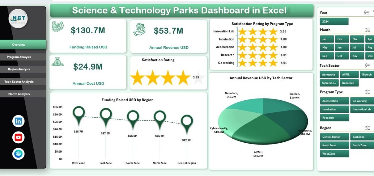
What Insights Does the Overview Page Provide?
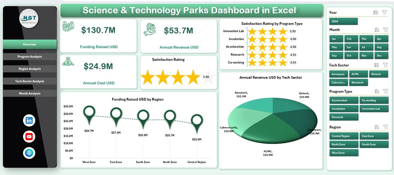
The Overview Page acts as the main summary page of the dashboard. It provides a high-level snapshot of overall performance.
Key Elements of the Overview Page
-
5 KPI Cards for quick metrics
-
4 Interactive Charts, including:
-
Satisfaction Rating by Program Type
-
Funding Raised USD by Region
-
Annual Revenue USD by Tech Sector
-
Why the Overview Page Matters
This page helps decision-makers quickly understand overall performance, funding trends, and revenue distribution without deep analysis. Therefore, executives can make faster decisions.
How Does the Program Analysis Page Help Management?
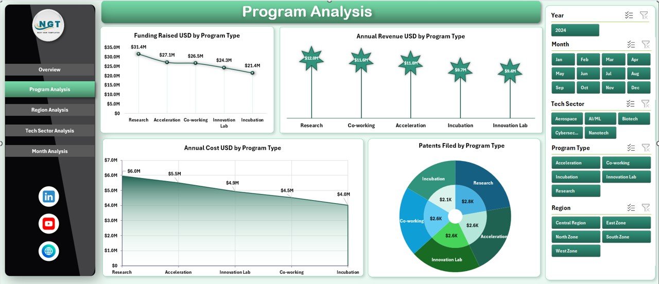
The Program Analysis Page focuses on performance across different program types offered by the science and technology park.
Charts Included in Program Analysis
Click to Purchases Science & Technology Parks Dashboard in Excel
-
Funding Raised USD by Program Type
-
Annual Revenue USD by Program Type
-
Annual Cost USD by Program Type
-
Retentions Failed by Program Type
Why Program Analysis Is Important
By analyzing these charts, management can:
-
Identify high-performing programs
-
Control costs effectively
-
Improve retention strategies
-
Allocate resources wisely
As a result, programs become more efficient and profitable.
What Can You Learn from the Region Analysis Page?
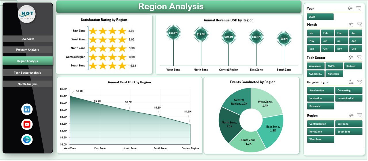
The Region Analysis Page compares performance across different geographical regions.
Charts Available in Region Analysis
-
Satisfaction Rating by Region
-
Annual Revenue USD by Region
-
Annual Cost USD by Region
-
Events Conducted by Region
Value of Region-Based Analysis
This analysis helps organizations understand:
-
Which regions perform best
-
Where costs remain high
-
Which regions conduct more events
-
How satisfaction levels vary geographically
Therefore, leaders can plan regional expansions and improvements more confidently.
Why Is Tech Sector Analysis Critical in Science & Technology Parks?
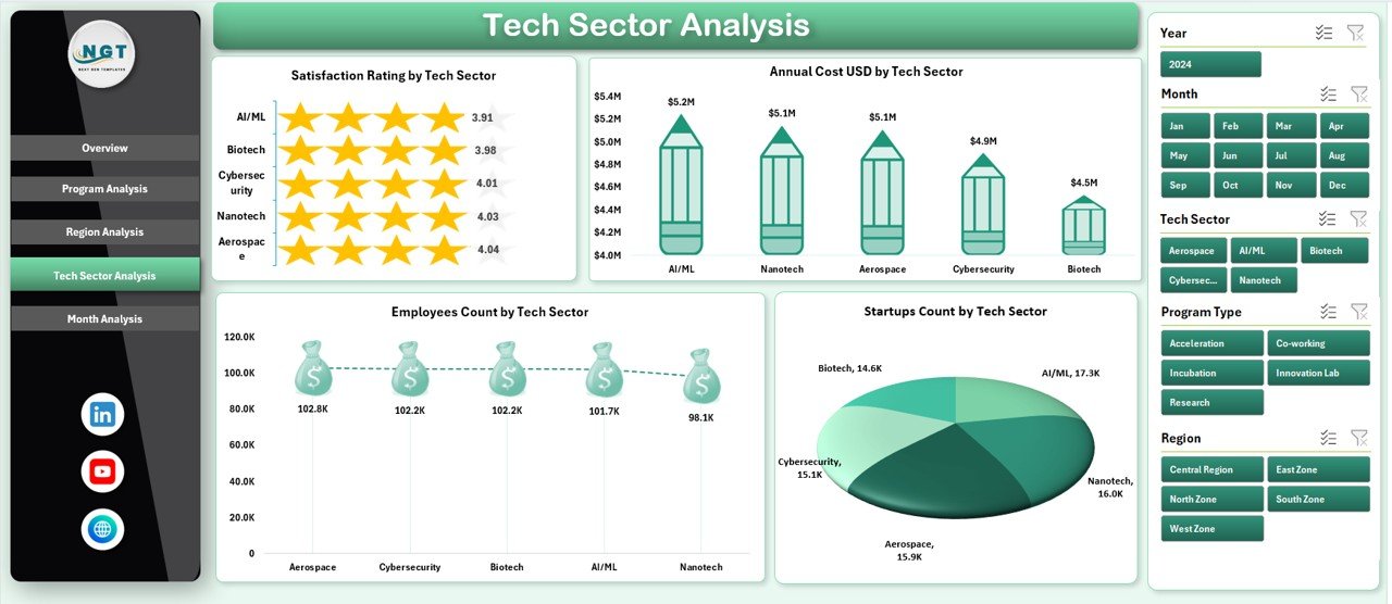
Technology parks support multiple sectors such as AI, biotech, fintech, clean energy, and more. Hence, Tech Sector Analysis becomes essential.
Charts in the Tech Sector Analysis Page
-
Satisfaction Rating by Tech Sector
-
Annual Cost USD by Tech Sector
-
Events Conducted by Tech Sector
-
Employee Count by Tech Sector
Benefits of Tech Sector Analysis
This page helps users:
-
Identify fast-growing sectors
-
Understand sector-wise costs
-
Track employee distribution
-
Improve sector-specific strategies
As a result, park authorities can focus on sectors with the highest growth potential.
What Insights Does the Month Analysis Page Deliver?
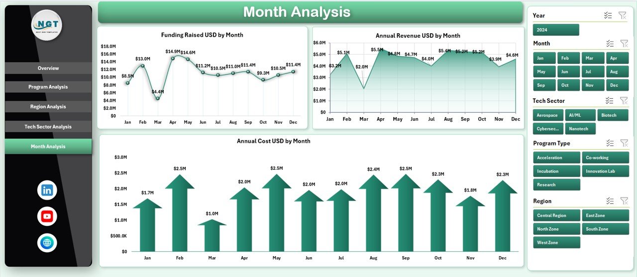
The Month Analysis Page highlights time-based trends.
Charts Included in Month Analysis
-
Funding Raised USD by Month
-
Annual Revenue USD by Month
-
Annual Cost USD by Month
Why Monthly Trends Matter
Monthly analysis allows teams to:
-
Track seasonal funding trends
-
Monitor revenue growth patterns
-
Control monthly expenses
-
Improve forecasting accuracy
Therefore, financial planning becomes more reliable and data-driven.
Click to Purchases Science & Technology Parks Dashboard in Excel
What Is the Role of the Data and Support Sheets?
Behind the dashboard visuals, Data and Support Sheets store structured information.
Purpose of Data Sheet
-
Stores raw input data
-
Acts as the backbone of the dashboard
-
Allows easy updates without breaking formulas
Purpose of Support Sheet
-
Holds helper calculations
-
Manages lookup tables
-
Supports slicers and KPIs
As a result, the dashboard remains stable, flexible, and scalable.
Advantages of Science & Technology Parks Dashboard in Excel
Using this dashboard offers multiple advantages for organizations managing innovation ecosystems.
Key Advantages
-
📊 Centralized Data View – All metrics in one place
-
⏱ Time-Saving Reporting – Automatic updates reduce manual work
-
📈 Better Decision-Making – Visual insights improve clarity
-
💰 Cost Control – Easy comparison of costs and revenues
-
🎯 Performance Tracking – Monitor programs, regions, and sectors
-
🧠 No Technical Barrier – Built entirely in Microsoft Excel
Because of these advantages, this dashboard suits both small parks and large innovation hubs.
Who Can Use a Science & Technology Parks Dashboard in Excel?
This dashboard serves a wide range of professionals.
Ideal Users
-
Science & Technology Park Administrators
-
Innovation Managers
-
Government Agencies
-
Startup Incubators and Accelerators
-
Research Institutions
-
Financial Analysts and Planners
Since Excel remains widely used, adoption becomes easy across teams.
How Does This Dashboard Improve Strategic Planning?
Strategic planning requires accurate, timely, and visual data. This dashboard supports planning by:
-
Highlighting underperforming programs
-
Showing profitable sectors
-
Comparing regional efficiency
-
Identifying cost-heavy areas
As a result, leadership teams can create data-backed strategies instead of assumptions.
Best Practices for the Science & Technology Parks Dashboard in Excel
To get maximum value, users should follow best practices.
Best Practices You Should Follow
-
✅ Keep data clean and consistent
-
✅ Update data regularly
-
✅ Use standardized naming for programs and sectors
-
✅ Review KPIs monthly
-
✅ Avoid manual formula changes
-
✅ Protect key calculation sheets
-
✅ Use slicers for focused analysis
Following these practices ensures accurate insights and long-term usability.
How Can This Dashboard Support Reporting and Presentations?
Since the dashboard includes clear charts and KPIs, it works perfectly for:
-
Board meetings
-
Government reporting
-
Investor presentations
-
Annual performance reviews
Moreover, users can export charts directly into PowerPoint or PDF formats.
Why Choose Excel Over Other BI Tools?
Although many BI tools exist, Excel remains popular.
Reasons to Choose Excel
-
Familiar interface
-
No additional software cost
-
Easy customization
-
Fast implementation
-
Offline access
Therefore, a Science & Technology Parks Dashboard in Excel offers the best balance between power and simplicity.
Conclusion: Is a Science & Technology Parks Dashboard in Excel Worth It?
Yes, without any doubt.
A Science & Technology Parks Dashboard in Excel simplifies complex data, improves visibility, and supports smarter decisions. By organizing performance metrics across programs, regions, tech sectors, and months, this dashboard turns raw data into actionable insights.
Moreover, its ready-to-use structure, interactive pages, and Excel-based design make it a powerful yet accessible solution for innovation-driven organizations.
Frequently Asked Questions (FAQs)
What is a Science & Technology Parks Dashboard in Excel?
It is a ready-to-use Excel-based tool that tracks and visualizes key performance metrics of science and technology parks.
Do I need advanced Excel skills to use this dashboard?
No. Basic Excel knowledge is enough to update data and use slicers.
Can I customize the dashboard?
Yes. You can add new charts, KPIs, or pages based on your needs.
How often should I update the data?
You should update data monthly or quarterly for accurate analysis.
Can this dashboard handle large datasets?
Yes. Excel can handle thousands of records efficiently when structured properly.
Is this dashboard suitable for government reporting?
Yes. It provides clear, professional, and structured insights ideal for official reporting.
Does the dashboard support multiple regions and sectors?
Yes. It supports region-wise and tech-sector-wise analysis through slicers and charts.
Can I share this dashboard with my team?
Yes. You can share it via email, cloud storage, or internal systems.
Visit our YouTube channel to learn step-by-step video tutorials