Managing a secondary school today involves much more than academics alone. Schools must track student performance, attendance, scholarships, participation activities, and monthly trends while also meeting expectations from parents, boards, and regulators. However, when data stays scattered across spreadsheets and manual reports, decision-making becomes slow and unclear.
That is exactly where a Secondary Schools Dashboard in Power BI becomes a powerful solution.
This in-depth article explains what a Secondary Schools Dashboard in Power BI is, why schools need it, how each dashboard page works, and how it supports better academic and administrative decisions. Moreover, you will discover its advantages, best practices, improvement opportunities, and frequently asked questions in a simple and practical way.
Click to Purchases Secondary Schools Dashboard in Power BI
If you manage or analyze data for a secondary school, this guide will help you understand how Power BI dashboards transform raw school data into clear, actionable insights.
What Is a Secondary Schools Dashboard in Power BI?
A Secondary Schools Dashboard in Power BI is an interactive analytics solution that visualizes key school metrics on one centralized platform. It connects student data, academic results, attendance records, scholarships, and participation activities into easy-to-read charts and visuals.
Instead of reviewing multiple Excel sheets or static reports, school leaders can monitor performance instantly. As a result, they gain clarity, accuracy, and confidence in decision-making.
Because Power BI updates visuals dynamically, users can apply slicers to filter data by month, grade, board, city, or activity. Consequently, schools move from reactive reporting to proactive management.
Why Do Secondary Schools Need a Power BI Dashboard?
Secondary schools generate large volumes of data every day. However, data alone does not improve outcomes. Schools need insights, trends, and patterns to act quickly.
A Secondary Schools Dashboard in Power BI helps schools because it:
-
Centralizes academic and administrative data
-
Improves transparency across departments
-
Supports data-driven academic planning
-
Enhances student performance tracking
-
Reduces manual reporting effort
Moreover, when leaders view real-time insights, they respond faster to issues such as low attendance, declining exam scores, or uneven scholarship distribution.
What Data Does a Secondary Schools Dashboard Track?
A well-designed Secondary Schools Dashboard in Power BI typically tracks:
-
Total students by city and subject
-
Exam score percentages
-
Attendance percentages
-
Scholarship percentages by gender and board
-
Student distribution by grade
-
Participation activity performance
-
Monthly trends for attendance, students, and scores
Because all metrics stay connected, schools can drill down from high-level summaries to detailed insights with just a few clicks.
How Is the Secondary Schools Dashboard in Power BI Structured?
This Secondary Schools Dashboard in Power BI includes five well-structured pages, each designed for a specific analytical purpose. Let us explore each page in detail.
What Does the Overview Page Show?
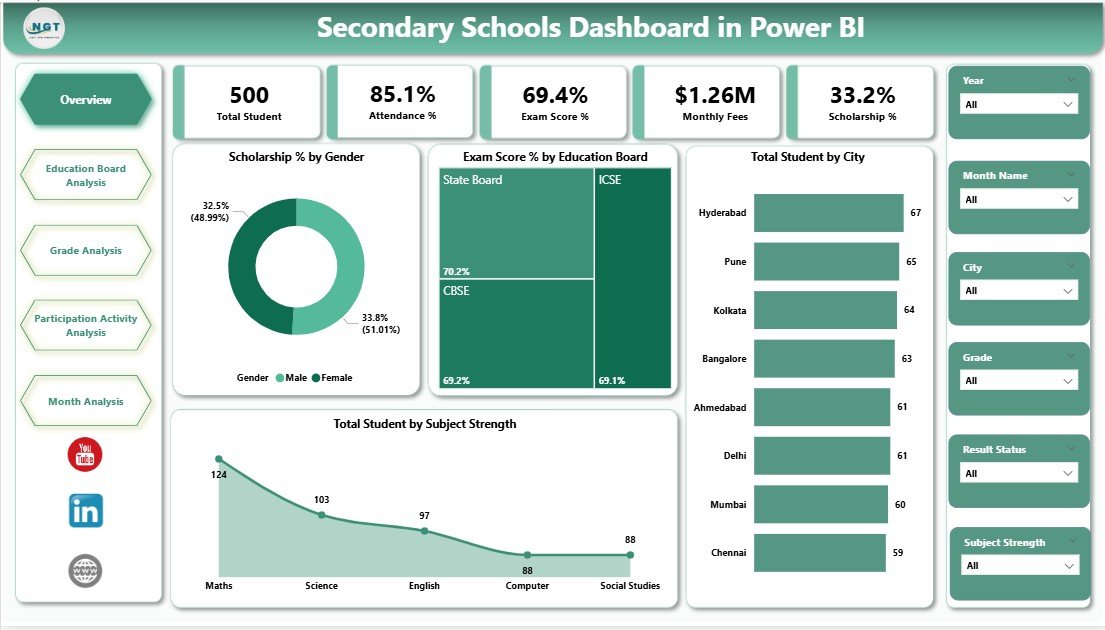
The Overview Page acts as the main entry point of the dashboard. It provides a quick snapshot of overall school performance.
Key Features of the Overview Page
On this page, you will find interactive slicers that allow users to filter data easily. These slicers help leaders focus on specific periods, locations, or categories.
The page includes five key visuals:
-
Scholarship % by Gender
This chart highlights how scholarships distribute between male and female students. As a result, schools ensure fairness and inclusion. -
Exam Score % by Education Board
This visual compares academic performance across different education boards. Therefore, leaders identify which boards perform better. -
Total Students by City
This chart shows student distribution across cities. Consequently, schools plan infrastructure and resources more effectively. -
Total Students by Subject Strength
This visual reveals which subjects attract more students. As a result, schools adjust faculty allocation and curriculum focus.
Because all visuals update instantly with slicers, users gain immediate insights without manual recalculations.
How Does the Education Board Analysis Page Help Schools?
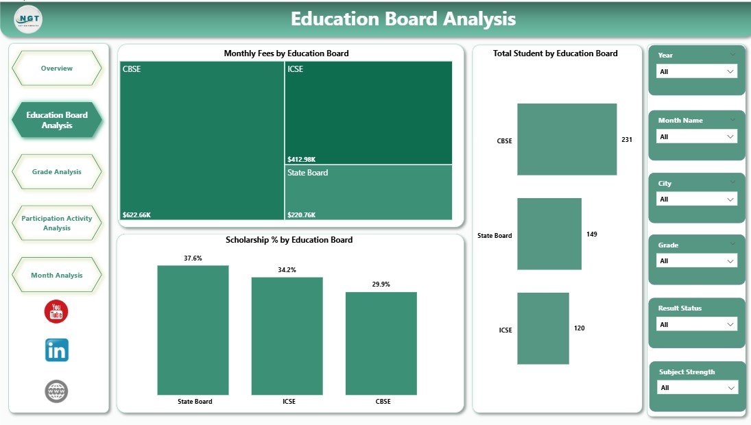
The Education Board Analysis Page focuses specifically on comparing performance across education boards.
Key Visuals on the Education Board Analysis Page
This page also includes slicers for dynamic filtering. It presents three critical charts:
-
Monthly Fees by Education Board
This chart shows cost or fee trends by board. As a result, schools analyze affordability and revenue patterns. -
Total Students by Education Board
This visual highlights enrollment distribution across boards. Therefore, leaders understand student preferences. -
Scholarship % by Education Board
This chart displays how scholarships vary across boards. Consequently, schools ensure balanced financial support. -
Click to Purchases Secondary Schools Dashboard in Power BI
Together, these visuals help schools align academic offerings with financial planning and enrollment strategies.
What Insights Does the Grade Analysis Page Provide?
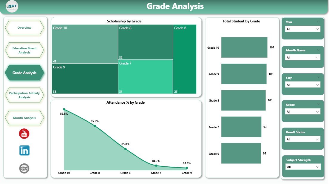
The Grade Analysis Page helps schools understand performance and engagement at the grade level.
Key Visuals on the Grade Analysis Page
With slicers available, users can filter data easily. This page includes:
-
Scholarship % by Grade
This chart shows which grades receive more scholarships. As a result, schools identify support needs early. -
Total Students by Grade
This visual displays student distribution across grades. Therefore, administrators manage class sizes effectively. -
Attendance % by Grade
This chart highlights attendance patterns by grade. Consequently, schools detect absenteeism issues quickly.
Because grade-level insights drive academic planning, this page plays a critical role in student success.
Why Is Participation Activity Analysis Important?
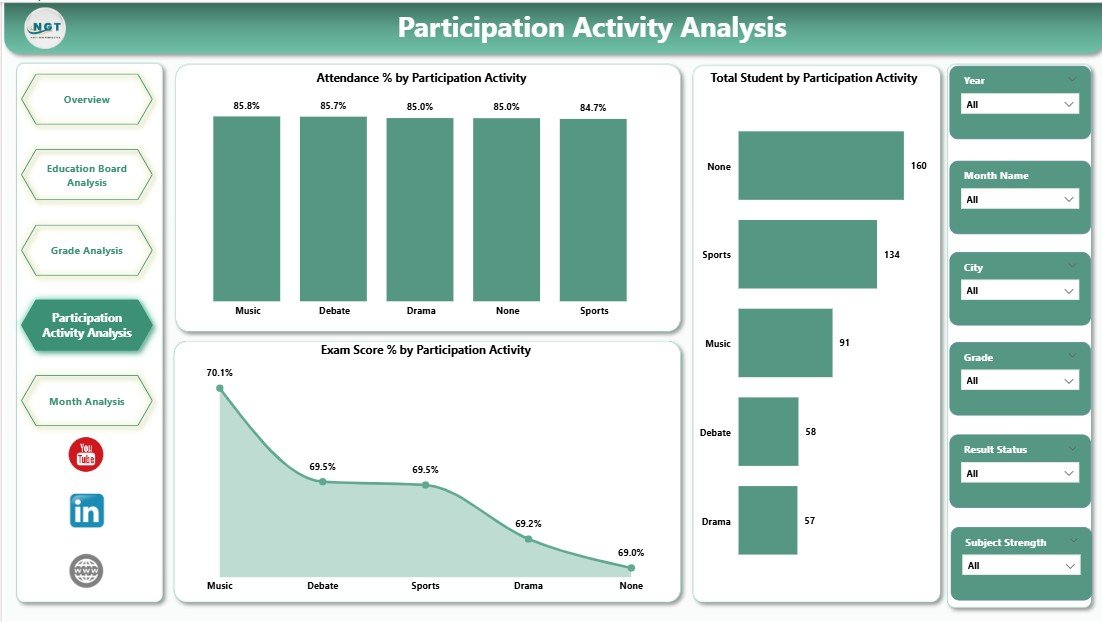
Academic performance alone does not define student development. Therefore, the Participation Activity Analysis Page focuses on extracurricular engagement.
Key Visuals on the Participation Activity Analysis Page
This page includes slicers and three impactful charts:
-
Attendance % by Participation Activity
This visual shows how attendance varies across activities. As a result, schools evaluate engagement levels. -
Total Students by Participation Activity
This chart highlights which activities attract more students. Therefore, schools invest in popular programs. -
Exam Score % by Participation Activity
This visual connects activity participation with academic performance. Consequently, schools promote balanced development.
By combining academic and activity data, schools support holistic education.
Click to Purchases Secondary Schools Dashboard in Power BI
What Does the Month Analysis Page Reveal?
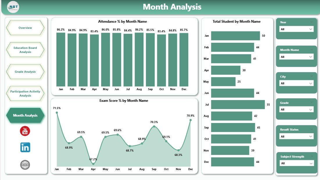
The Month Analysis Page focuses on time-based trends, which play a vital role in planning.
Key Visuals on the Month Analysis Page
This page includes:
-
Attendance % by Month
This chart highlights seasonal attendance trends. As a result, schools plan interventions during low-attendance months. -
Total Students by Month
This visual shows enrollment changes over time. Therefore, leaders monitor admissions and dropouts. -
Exam Score % by Month
This chart tracks academic performance trends across months. Consequently, schools align teaching strategies with results.
Monthly insights help schools move from static reporting to continuous improvement.
Advantages of a Secondary Schools Dashboard in Power BI
A Secondary Schools Dashboard in Power BI delivers multiple advantages for educational institutions.
Key Advantages
-
📊 Centralized Data Visibility
All critical metrics stay in one place, which reduces confusion. -
⏱ Faster Decision-Making
Real-time visuals replace slow manual reports. -
🎯 Improved Academic Performance Tracking
Leaders identify issues early and act quickly. -
💰 Better Scholarship Management
Schools ensure fair and transparent scholarship distribution. -
📈 Trend-Based Planning
Monthly and grade-level trends support proactive planning. -
🔍 Interactive Analysis
Slicers allow users to explore data without technical skills.
Opportunities for Improvement in Secondary Schools Dashboards
Although the dashboard delivers strong value, schools can enhance it further.
Improvement Opportunities
-
Add predictive analytics for dropout risk
-
Include teacher performance metrics
-
Integrate behavioral and discipline data
-
Connect real-time data sources
-
Add comparison with previous academic years
By evolving the dashboard, schools stay future-ready.
Best Practices for the Secondary Schools Dashboard in Power BI
To maximize the value of a Secondary Schools Dashboard in Power BI, schools should follow proven best practices.
Recommended Best Practices
-
✔ Keep visuals simple and focused
-
✔ Use consistent color themes
-
✔ Validate data before loading
-
✔ Design clear slicers for easy filtering
-
✔ Review KPIs regularly with stakeholders
-
✔ Train staff on dashboard usage
-
✔ Update data on a fixed schedule
When schools follow these practices, dashboards remain accurate, reliable, and impactful.
How Does Power BI Improve School Decision-Making?
Power BI improves decision-making by converting complex data into visual stories. Instead of guessing, leaders rely on facts.
For example:
-
Low attendance trends trigger early interventions
-
Scholarship gaps highlight equity issues
-
Activity participation insights improve student engagement
As a result, schools build a culture of data-driven excellence.
Click to Purchases Secondary Schools Dashboard in Power BI
Who Can Benefit from a Secondary Schools Dashboard in Power BI?
Many stakeholders benefit from this dashboard, including:
-
School principals and administrators
-
Academic coordinators
-
Finance and scholarship teams
-
Teachers and counselors
-
Education boards and management committees
Because insights remain accessible, collaboration improves across the institution.
Conclusion: Why Every Secondary School Needs a Power BI Dashboard
A Secondary Schools Dashboard in Power BI transforms how schools manage performance, engagement, and growth. It replaces scattered data with clarity, replaces assumptions with insights, and replaces delays with action.
By using this dashboard, secondary schools gain better visibility, stronger accountability, and improved student outcomes. Moreover, as education becomes more data-driven, such dashboards move from optional tools to essential systems.
If your school wants smarter decisions and measurable improvements, a Secondary Schools Dashboard in Power BI provides the foundation.
Frequently Asked Questions About Secondary Schools Dashboard in Power BI
What is a Secondary Schools Dashboard in Power BI used for?
It helps schools track student performance, attendance, scholarships, participation activities, and monthly trends in one place.
Can non-technical staff use this dashboard?
Yes, Power BI dashboards use simple visuals and slicers, so non-technical users can explore data easily.
Does the dashboard support multiple education boards?
Yes, it includes detailed education board analysis for fees, students, and scholarships.
Can schools customize the dashboard?
Yes, schools can customize visuals, KPIs, and data sources based on their needs.
How often should schools update the data?
Schools should update data monthly or weekly to maintain accuracy and relevance.
Is Power BI suitable for small schools?
Yes, Power BI scales well for both small and large secondary schools.
Visit our YouTube channel to learn step-by-step video tutorials