Managing sewage treatment operations requires accuracy, transparency, and continuous monitoring. However, many organizations still depend on manual reports, scattered Excel sheets, and delayed data updates. As a result, decision-making becomes slow, costly, and reactive. That is exactly why a Sewage Treatment Dashboard in Power BI plays a critical role in modern wastewater management.
This in-depth article explains everything you need to know about a Sewage Treatment Dashboard in Power BI, including its purpose, structure, key features, advantages, best practices, and frequently asked questions. Moreover, the article uses clear language, active voice, and practical examples, which makes it easy to understand for both technical and non-technical users.
Click to Purchases Sewage Treatment Dashboard in Power BI
What Is a Sewage Treatment Dashboard in Power BI?
A Sewage Treatment Dashboard in Power BI is a data-driven visual reporting tool designed to monitor, analyze, and optimize sewage treatment plant operations using key performance indicators (KPIs).
Instead of reviewing raw data tables or static reports, this dashboard converts operational data into interactive charts, KPI cards, and slicers. Therefore, plant managers, engineers, and decision-makers gain instant visibility into energy costs, chemical usage, operating costs, and compliance performance.
Most importantly, Power BI enables users to drill down from a high-level overview to plant-level, region-level, shift-level, and monthly trends analysis—all in one dashboard.
Why Do Sewage Treatment Plants Need a Dashboard in Power BI?
Sewage treatment plants operate continuously and involve high operational costs. Therefore, even small inefficiencies can lead to significant financial and environmental impact. Without a centralized dashboard, teams struggle to identify problem areas on time.
A Sewage Treatment Dashboard in Power BI solves this challenge effectively.
Key Reasons Why This Dashboard Is Essential
-
It provides a single source of truth for operational data
-
It improves cost control and budget planning
-
It highlights energy and chemical consumption patterns
-
It supports regulatory compliance monitoring
-
It enables data-driven decision-making
-
It reduces manual reporting effort and errors
As a result, organizations can operate sewage treatment plants more efficiently and sustainably.
How Does a Sewage Treatment Dashboard in Power BI Work?
The dashboard uses structured data from sewage treatment operations, such as energy usage, chemical costs, operating costs, plant details, region, shift, and time period. Power BI then transforms this data into dynamic visuals.
Users can apply slicers to filter data by plant, region, operator, shift, or month. Consequently, the dashboard updates all charts and KPIs instantly.
Because of Power BI’s interactive nature, users can:
-
Compare costs across plants and regions
-
Identify high-cost operators or shifts
-
Track monthly trends
-
Monitor compliance performance
Page-Wise Structure of the Sewage Treatment Dashboard in Power BI
This Sewage Treatment Dashboard in Power BI consists of five well-structured pages, each designed to answer specific operational questions.
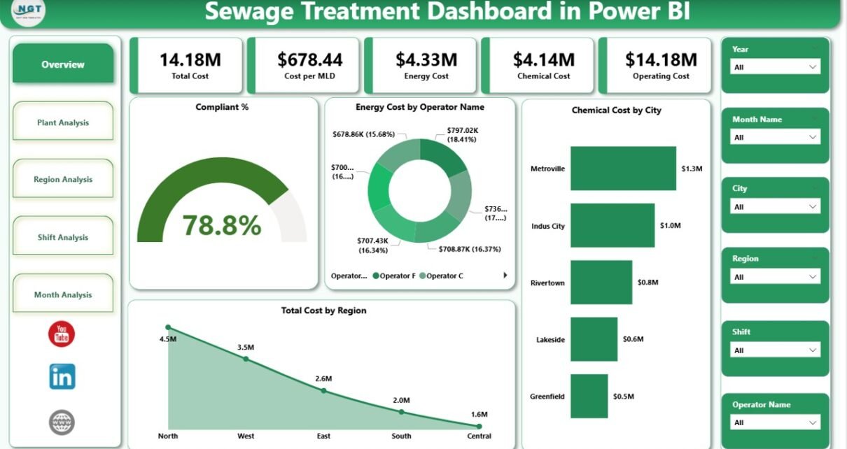
1. Overview Page – How Is the Overall Performance of the Sewage Treatment Operations?
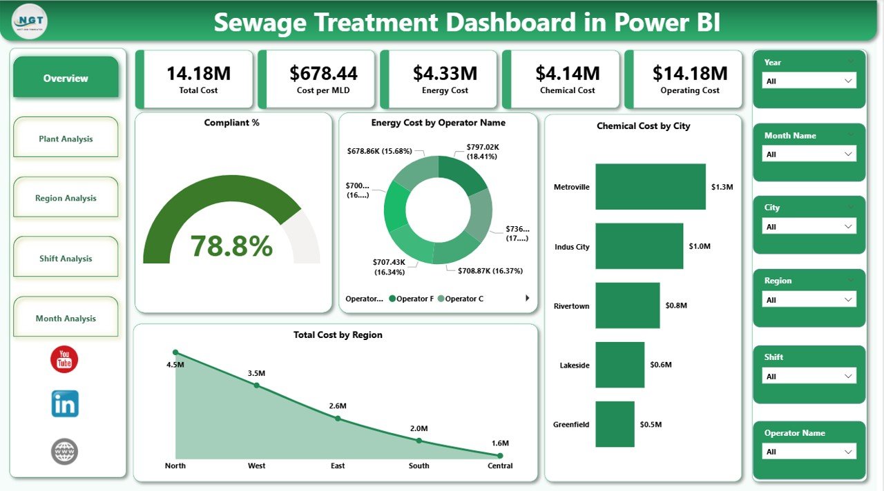
The Overview Page acts as the main landing page of the dashboard. It provides a high-level summary of sewage treatment performance.
Key Elements of the Overview Page
-
Interactive slicers to filter data
-
4 KPI Cards, including:
-
Compliance Percentage
-
Total Energy Cost
-
Total Chemical Cost
-
Total Operating Cost
-
Charts Included on the Overview Page
-
Compliance %
-
Energy Cost by Operator Name
-
Chemical Cost by City
-
Total Cost by Region
Because this page summarizes the entire operation, decision-makers can quickly identify cost drivers and compliance status.
Click to Purchases Sewage Treatment Dashboard in Power BI
2. Plant Analysis Page – Which Sewage Treatment Plants Are Performing Better or Worse?
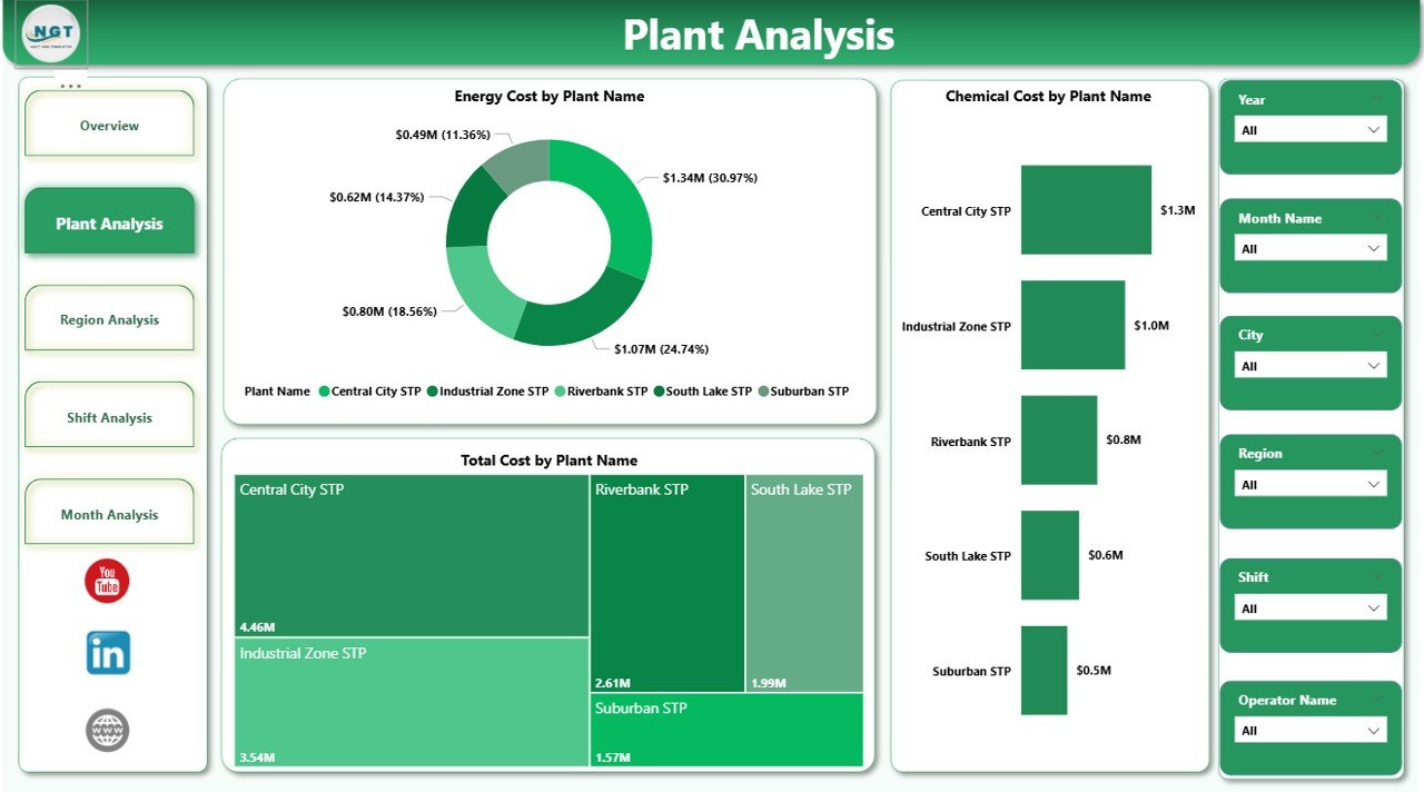
The Plant Analysis Page focuses on individual sewage treatment plants. It allows users to compare costs across different plants.
Charts Included on the Plant Analysis Page
-
Energy Cost by Plant Name
-
Chemical Cost by Plant Name
-
Total Cost by Plant Name
With this analysis, plant managers can:
-
Identify high-cost plants
-
Benchmark plant performance
-
Investigate inefficiencies
-
Prioritize improvement initiatives
3. Region Analysis Page – How Do Costs Vary Across Regions?
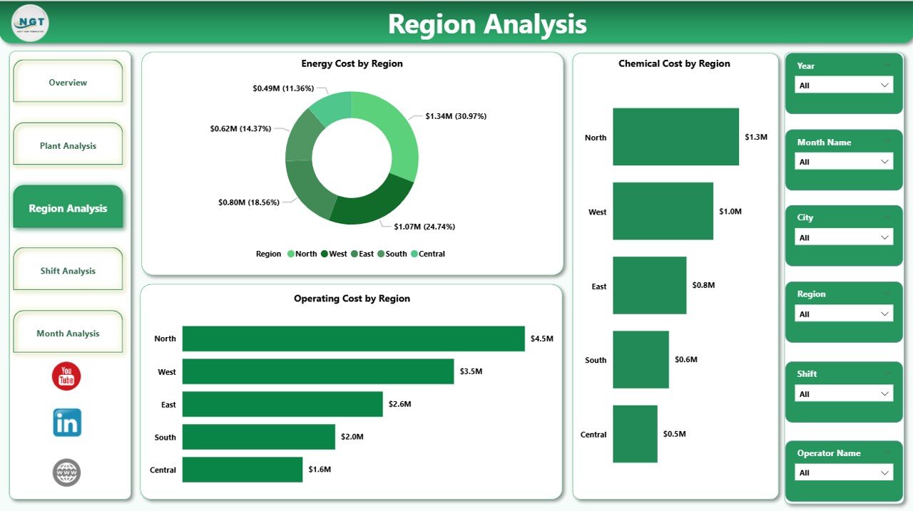
The Region Analysis Page provides insights into regional performance. Since sewage treatment plants often operate across multiple regions, regional analysis becomes essential.
Charts Included on the Region Analysis Page
-
Energy Cost by Region
-
Chemical Cost by Region
-
Operating Cost by Region
As a result, organizations can:
-
Compare regions effectively
-
Allocate budgets more accurately
-
Identify regions with higher operating inefficiencies
4. Shift Analysis Page – Does Shift Timing Impact Operational Costs?
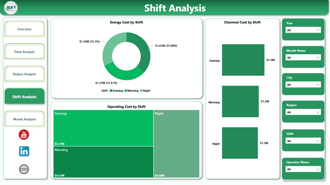
The Shift Analysis Page focuses on performance by operational shifts. Since sewage treatment plants run 24/7, shift-based analysis becomes extremely valuable.
Charts Included on the Shift Analysis Page
-
Energy Cost by Shift
-
Chemical Cost by Shift
-
Operating Cost by Shift
This page helps managers:
-
Identify costly shifts
-
Optimize staffing and operations
-
Improve shift-level accountability
-
Click to Purchases Sewage Treatment Dashboard in Power BI
5. Monthly Trends Page – How Are Costs Changing Over Time?
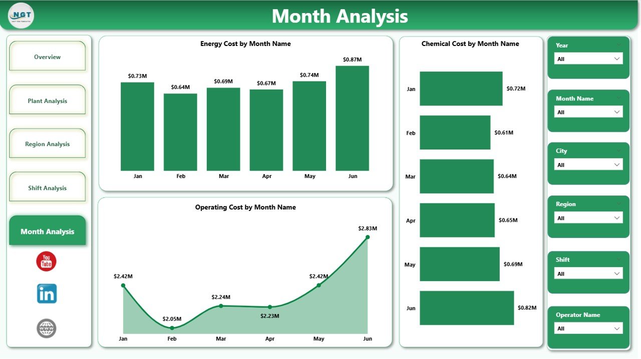
The Monthly Trends Page provides time-based insights. It shows how costs evolve month by month.
Charts Included on the Monthly Trends Page
-
Energy Cost by Month
-
Chemical Cost by Month
-
Operating Cost by Month
Because of this trend analysis, users can:
-
Detect seasonal patterns
-
Track cost escalation
-
Forecast future expenses
-
Support long-term planning
Key Features of the Sewage Treatment Dashboard in Power BI
This dashboard includes several powerful features that enhance usability and insight generation.
Major Features
-
Interactive slicers for dynamic filtering
-
KPI cards for quick performance tracking
-
Drill-down and cross-filtering capabilities
-
Clean and professional visual layout
-
Multi-page analytical structure
-
Automated data refresh capability
Advantages of a Sewage Treatment Dashboard in Power BI
Using a Sewage Treatment Dashboard in Power BI offers multiple advantages for operational and strategic management.
Key Advantages
-
📊 Centralized performance monitoring
-
⚡ Improved energy cost optimization
-
🧪 Better chemical usage control
-
💰 Enhanced cost transparency
-
📈 Faster decision-making
-
🔍 Detailed drill-down analysis
-
♻️ Support for sustainable operations
Because of these benefits, organizations gain both financial and environmental advantages.
Opportunities for Improvement Using the Dashboard
While the dashboard already provides powerful insights, organizations can further improve performance by acting on the data.
Improvement Opportunities
-
Reduce energy consumption during high-cost shifts
-
Optimize chemical dosage by plant and region
-
Improve compliance by identifying non-performing operators
-
Standardize best practices across plants
-
Implement predictive maintenance strategies
Best Practices for the Sewage Treatment Dashboard in Power BI
To maximize the value of the dashboard, organizations should follow proven best practices.
Recommended Best Practices
-
Keep data sources clean and standardized
-
Update data regularly to maintain accuracy
-
Use consistent KPI definitions
-
Limit visuals to meaningful metrics only
-
Apply role-based access control
-
Train users on dashboard interpretation
-
Review dashboard insights during regular meetings
By following these best practices, organizations ensure long-term dashboard success.
Who Can Benefit from a Sewage Treatment Dashboard in Power BI?
Click to Purchases Sewage Treatment Dashboard in Power BI
This dashboard serves multiple stakeholders involved in sewage treatment operations.
Key Beneficiaries
-
Sewage Treatment Plant Managers
-
Operations and Maintenance Teams
-
Environmental Compliance Officers
-
Utility Companies
-
Municipal Authorities
-
Sustainability and Energy Managers
How Does This Dashboard Support Regulatory Compliance?
Compliance plays a critical role in sewage treatment operations. This dashboard helps organizations track compliance percentages and identify non-compliant areas.
Because of real-time visibility, teams can take corrective actions quickly and avoid penalties.
Conclusion
A Sewage Treatment Dashboard in Power BI transforms complex operational data into meaningful insights. It enables sewage treatment organizations to monitor costs, optimize resources, improve compliance, and make smarter decisions.
By using structured pages such as Overview, Plant Analysis, Region Analysis, Shift Analysis, and Monthly Trends, users gain a complete operational picture. Moreover, Power BI’s interactivity ensures faster analysis and better accountability.
In today’s data-driven environment, adopting a Sewage Treatment Dashboard in Power BI is no longer optional—it is essential for efficiency, sustainability, and cost control.
Frequently Asked Questions (FAQs)
1. What data is required for a Sewage Treatment Dashboard in Power BI?
You need data related to energy costs, chemical costs, operating costs, plant name, region, shift, operator, compliance percentage, and date.
2. Can this dashboard handle multiple sewage treatment plants?
Yes, the dashboard supports multiple plants, regions, and shifts with interactive filtering.
3. Is Power BI suitable for sewage treatment operations?
Yes, Power BI provides powerful visualization, scalability, and real-time insights, which makes it ideal for sewage treatment analytics.
4. Can the dashboard be customized?
Absolutely. You can add new KPIs, pages, or filters based on operational requirements.
5. How often should the dashboard data be updated?
You should update the data daily or weekly, depending on operational needs and data availability.
6. Does this dashboard help in cost reduction?
Yes, by identifying high-cost plants, regions, and shifts, the dashboard directly supports cost optimization initiatives.
Visit our YouTube channel to learn step-by-step video tutorials