Modern organizations rely heavily on Shared Services Centers (SSC) to centralize critical business functions such as finance, HR, procurement, IT support, and customer service. Because these centers handle large volumes of operational activities, leaders must monitor their performance carefully. However, many companies still struggle with scattered spreadsheets and manual reporting systems.
As a result, managers often spend hours collecting data instead of analyzing it. Moreover, important performance insights remain hidden inside complex data files.
Therefore, organizations need a visual and automated analytics system that allows them to monitor KPIs quickly and efficiently.
This is exactly where the Shared Services Centers KPI Dashboard in Power BI becomes extremely useful.
The Shared Services Centers KPI Dashboard in Power BI is a ready-to-use analytics solution designed to track KPI performance, compare targets with actual results, monitor trends, and identify operational gaps. Because Power BI provides interactive visualization capabilities, users can easily analyze performance metrics and make faster decisions.
In this comprehensive guide, we will explore everything about the Shared Services Centers KPI Dashboard in Power BI, including its structure, key features, advantages, best practices, and frequently asked questions.
Click to buy Shared Services Centers KPI Dashboard in Power BI
What is a Shared Services Centers KPI Dashboard in Power BI?
A Shared Services Centers KPI Dashboard in Power BI is a performance monitoring tool that helps organizations measure operational efficiency using key performance indicators.
Instead of analyzing raw operational data manually, this dashboard converts complex datasets into clear visual insights.
For example, companies can track:
- Service request resolution time
- HR processing efficiency
- Finance transaction accuracy
- IT support response time
- Procurement cycle time
- Customer service metrics
Because Power BI supports interactive charts, slicers, and drill-through analysis, users can easily filter and analyze KPI performance.
As a result, business leaders can identify performance gaps quickly and take corrective action.
Why Do Shared Services Centers Need KPI Dashboards?
Shared Services Centers support multiple departments across an organization. Therefore, performance tracking becomes critical.
However, without a structured dashboard, companies face several challenges.
For instance:
- Data remains scattered across multiple systems
- Managers struggle to track monthly performance
- Reporting becomes time-consuming
- Decision-making becomes slower
Therefore, organizations implement KPI dashboards to monitor operations more effectively.
Because dashboards display real-time insights, leaders can evaluate performance quickly.
Key Features of the Shared Services Centers KPI Dashboard in Power BI
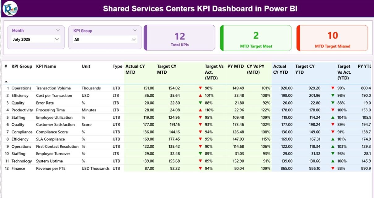
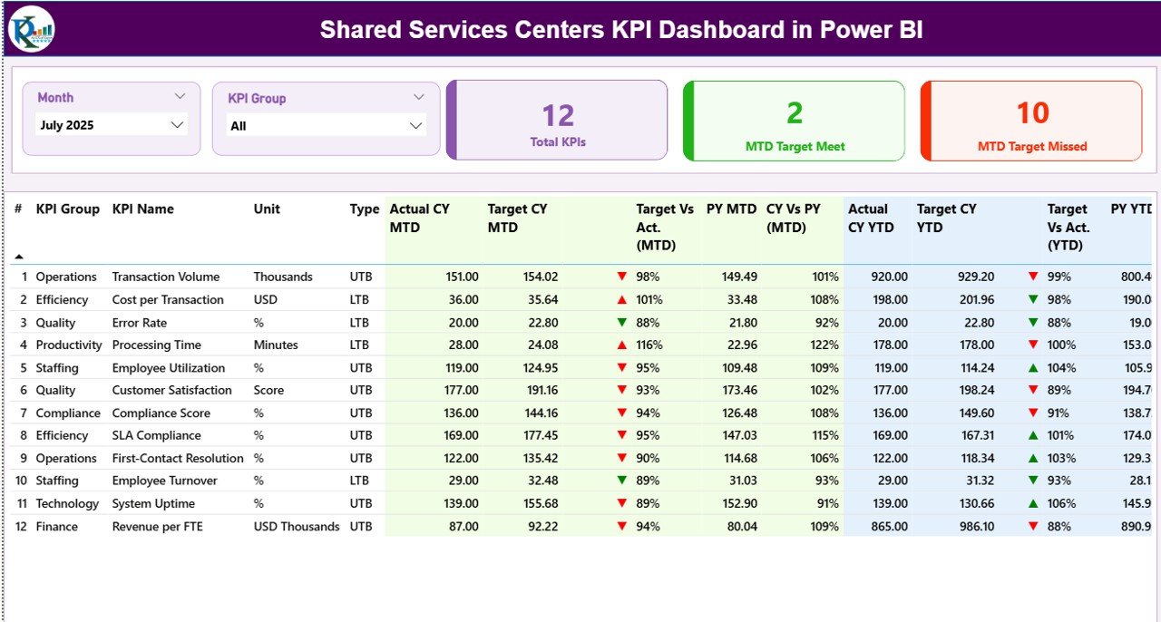
The Shared Services Centers KPI Dashboard in Power BI is designed with a structured architecture. The dashboard contains three interactive pages, each focusing on a different level of analysis.
Let us explore these pages in detail.
Summary Page – Central Performance Monitoring
The Summary Page acts as the main overview of the dashboard.
Here, users can quickly evaluate overall KPI performance.
At the top of the page, the dashboard provides two important filters:
- Month Slicer
- KPI Group Slicer
Because these slicers allow dynamic filtering, users can analyze performance by month or KPI category.
KPI Cards
The summary page also displays three important KPI cards:
- Total KPIs Count
- MTD Target Met Count
- MTD Target Missed Count
These indicators allow managers to immediately understand overall performance.
Detailed KPI Table
Below the KPI cards, the dashboard displays a detailed KPI performance table.
This table contains several performance indicators.
KPI Number
This represents the sequence number of the KPI.
KPI Group
This column shows the category or group of the KPI.
KPI Name
This displays the name of the performance indicator.
Unit
This indicates the measurement unit for the KPI.
Type
This defines whether the KPI is:
- UTB (Upper The Better)
- LTB (Lower The Better)
For example:
- Revenue growth → UTB
- Cost reduction → LTB
KPI Performance Metrics Explained
The dashboard also provides several advanced performance metrics.
Actual CY MTD
This metric represents the actual value for the current year month-to-date performance.
Target CY MTD
This shows the target value for the same KPI during the current month-to-date period.
MTD Status Icon
The dashboard uses visual indicators to show KPI status:
- ▲ Green icon → Target achieved
- ▼ Red icon → Target missed
Because visual signals simplify analysis, users can quickly identify underperforming KPIs.
Target vs Actual (MTD)
This metric shows the percentage comparison between target and actual performance.
Formula used:
Actual MTD / Target MTD
Previous Year MTD (PY MTD)
This metric displays the MTD value for the same period in the previous year.
Current Year vs Previous Year (MTD)
This comparison helps users evaluate performance trends.
Formula used:
Current Year MTD / Previous Year MTD
YTD KPI Metrics
The dashboard also provides Year-to-Date performance metrics.
Actual CY YTD
This metric shows the actual KPI value accumulated throughout the current year.
Target CY YTD
This displays the target KPI value for the current year.
YTD Status Icon
Similar to MTD, the dashboard displays:
- Green ▲ → Target achieved
- Red ▼ → Target missed
Target vs Actual (YTD)
This percentage compares actual YTD performance against the YTD target.
Formula:
Actual YTD / Target YTD
Previous Year YTD (PY YTD)
This shows the YTD value for the same period in the previous year.
Current Year vs Previous Year (YTD)
This metric compares current year performance with previous year performance.
Click to buy Shared Services Centers KPI Dashboard in Power BI
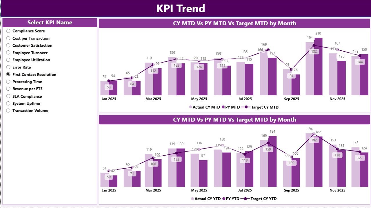
KPI Trend Page – Performance Trend Analysis
The KPI Trend Page provides a deeper analysis of performance trends.
Because operational performance changes over time, trend analysis becomes essential.
This page includes two combo charts:
- MTD Trend Chart
- YTD Trend Chart
These charts display:
- Current Year Actual values
- Previous Year values
- Target values
Users can select a KPI using the KPI Name slicer available on the left side.
As soon as users select a KPI, the charts automatically update.
Therefore, managers can quickly identify trends such as:
- Performance improvements
- Declining metrics
- Seasonal patterns
- Target achievement progress
Click to buy Shared Services Centers KPI Dashboard in Power BI
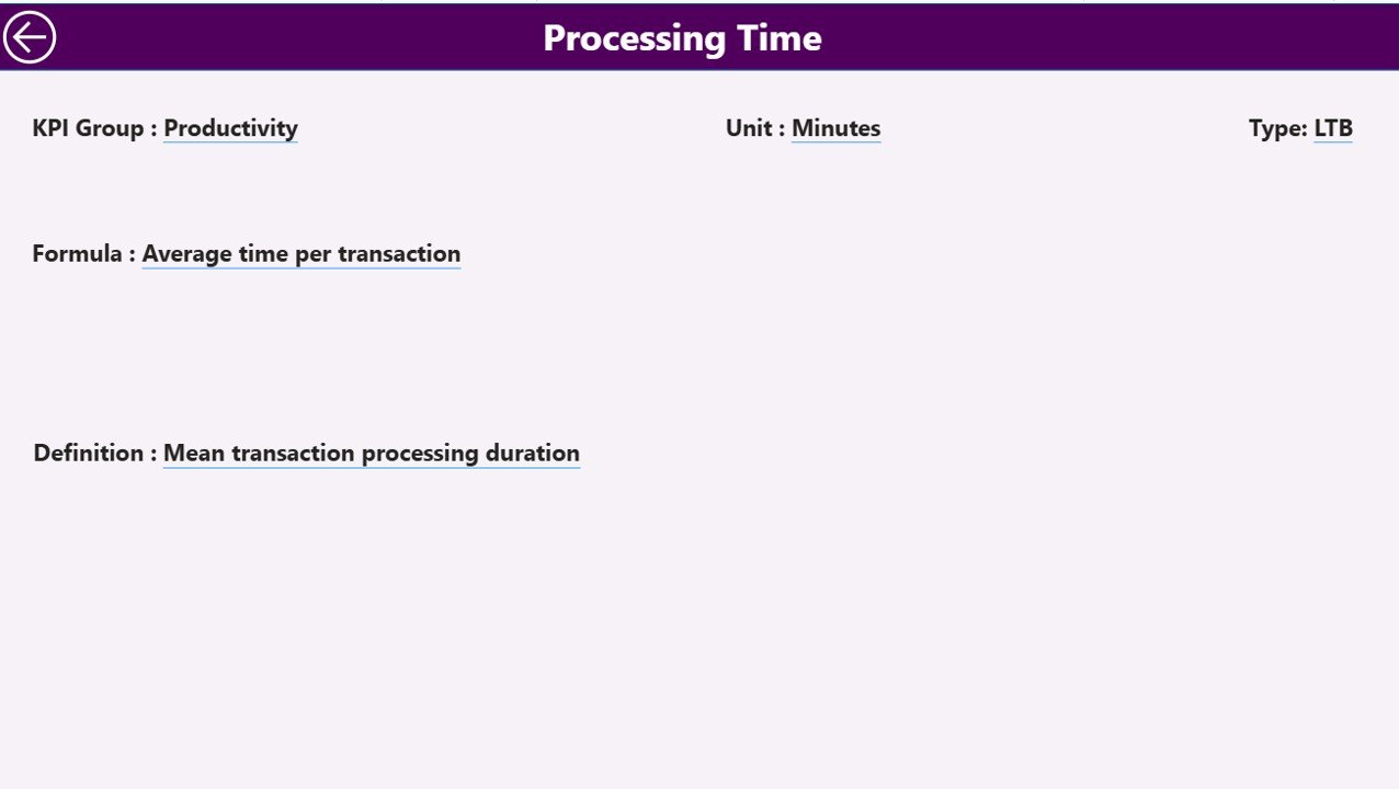
KPI Definition Page – Detailed KPI Information
The KPI Definition Page acts as a drill-through page.
Although this page remains hidden in the dashboard, users can access it through drill-through actions from the summary page.
This page provides detailed KPI information including:
- KPI formula
- KPI definition
- Measurement logic
- KPI group classification
Because this page provides deeper context, users can better understand KPI calculations.
Additionally, the dashboard includes a Back button in the top corner. Therefore, users can easily return to the main dashboard page.
Click to buy Shared Services Centers KPI Dashboard in Power BI
Excel Data Source Structure
The dashboard uses Excel as the primary data source.
Users must fill three worksheets inside the Excel file.
Input_Actual Sheet
This worksheet stores actual KPI performance data.
Users need to fill the following fields:
- KPI Name
- Month (use first day of month)
- MTD value
- YTD value
Because Power BI automatically refreshes the data, the dashboard updates after importing the Excel file.
Click to buy Shared Services Centers KPI Dashboard in Power BI
Input_Target Sheet
This worksheet stores target values for KPIs.
Users must fill:
- KPI Name
- Month
- Target MTD value
- Target YTD value
After updating these values, Power BI compares targets with actual performance.
- KPI Definition Sheet
This sheet stores KPI metadata.
Users must provide:
- KPI Number
- KPI Group
- KPI Name
- Unit of measurement
- KPI Formula
- KPI Definition
- KPI Type (UTB or LTB)
Because this sheet stores KPI definitions, users can maintain consistency across reports.
Advantages of Shared Services Centers KPI Dashboard in Power BI
Organizations gain several benefits by using this dashboard.
- Centralized Performance Monitoring
- The dashboard consolidates multiple KPIs in one place. Therefore, leaders can monitor performance efficiently.
- Real-Time Decision Making
- Because Power BI provides interactive visualizations, managers can quickly identify operational issues.
- Improved Operational Transparency
- Clear visual indicators make KPI performance easy to understand.
- Faster Reporting
- Automated dashboards reduce the time required for manual reporting.
- Better Trend Analysis
- Trend charts allow organizations to analyze performance across months and years.
- Target vs Actual Tracking
Managers can easily track whether teams meet operational targets.
- Data-Driven Strategy
Because the dashboard highlights performance gaps, organizations can improve operational strategy.
Best Practices for the Shared Services Centers KPI Dashboard in Power BI
Organizations should follow several best practices when implementing this dashboard.
Define Clear KPIs
First, organizations must define clear and measurable KPIs.
For example:
- Ticket resolution time
- HR onboarding cycle time
- Payroll accuracy rate
Maintain Data Quality
Organizations should maintain consistent and accurate data inside Excel sheets.
Update Data Regularly
Regular updates ensure that dashboard insights remain accurate.
Use Standard KPI Definitions
Standard definitions prevent confusion across departments.
Train Users
Employees should understand how to interpret dashboard insights.
Monitor Performance Trends
Managers should analyze performance trends regularly.
Who Can Use This Dashboard?
Many professionals can benefit from this dashboard.
For example:
- Shared Services Managers
- HR Operations Teams
- Finance Operations Teams
- IT Service Managers
- Procurement Leaders
- Business Analysts
Because the dashboard provides operational insights, leaders across departments can use it.
Conclusion
Shared Services Centers play a crucial role in modern organizations. However, managing performance across multiple operational processes becomes challenging without proper analytics tools.
Therefore, organizations need a structured system to monitor KPIs and evaluate operational efficiency.
The Shared Services Centers KPI Dashboard in Power BI provides a powerful solution for tracking KPI performance, comparing targets with actual results, analyzing trends, and identifying operational gaps.
Because the dashboard integrates Excel data with Power BI visualization capabilities, organizations can easily transform raw operational data into meaningful insights.
As a result, managers can make faster decisions, improve operational efficiency, and ensure that shared services deliver maximum value to the organization.
Frequently Asked Questions (FAQs)
What is a Shared Services Center KPI Dashboard?
A Shared Services Center KPI Dashboard is a reporting tool that tracks operational performance using key performance indicators.
Why should organizations use Power BI for KPI dashboards?
Power BI offers powerful visualization capabilities, interactive filtering, and automated reporting features.
What type of data does the dashboard require?
The dashboard requires KPI data such as actual performance values, target values, and KPI definitions stored in Excel.
Can organizations customize the dashboard?
Yes, organizations can customize KPIs, visualizations, and data structures according to their operational requirements.
How often should organizations update KPI data?
Organizations should update KPI data monthly or whenever new operational data becomes available.
What industries use Shared Services KPI dashboards?
Many industries use them, including finance, healthcare, IT services, manufacturing, and retail.
Visit our YouTube channel to learn step-by-step video tutorials
Watch the step-by-step video tutorial:
Click to buy Shared Services Centers KPI Dashboard in Power BI