In today’s business landscape, shared services play a vital role in delivering consistent support across finance, HR, IT, procurement, and operations. However, managing performance across multiple service functions can quickly become complex — especially when different teams follow different processes and metrics.
That’s where the Shared Services KPI Scorecard in Excel becomes a game-changer. It provides a centralized, data-driven view of your organization’s key performance indicators (KPIs), helping managers evaluate efficiency, accuracy, and cost effectiveness — all within one structured Excel workbook.
In this article, we’ll explore everything you need to know about this scorecard — its structure, features, benefits, best practices, and FAQs — so you can confidently use it to transform your shared services performance tracking.
Click to Purchases Shared Services KPI Scorecard in Excel
🚀 What Is a Shared Services KPI Scorecard in Excel?
A Shared Services KPI Scorecard is a comprehensive Excel-based management tool designed to monitor, analyze, and improve service performance.
It consolidates critical KPIs from multiple departments — such as HR, Finance, IT, and Procurement — into one place. Using this scorecard, leaders can easily assess whether service delivery aligns with business goals, detect inefficiencies, and identify improvement areas.
Because it’s built in Microsoft Excel, no specialized software is required. The scorecard uses dynamic formulas, dropdowns, and conditional formatting to deliver interactive, real-time insights.
Click to Purchases Shared Services KPI Scorecard in Excel
You can use it for:
-
Monthly and annual performance tracking
-
Target vs. actual analysis
-
Department-wise and KPI-wise trend analysis
-
Strategic decision-making
In short, it transforms raw operational data into clear, actionable insights.
🧩 Structure of the Shared Services KPI Scorecard
The template contains four well-structured worksheets, each performing a specific analytical role. Together, they build a strong framework for data entry, visualization, and performance evaluation.
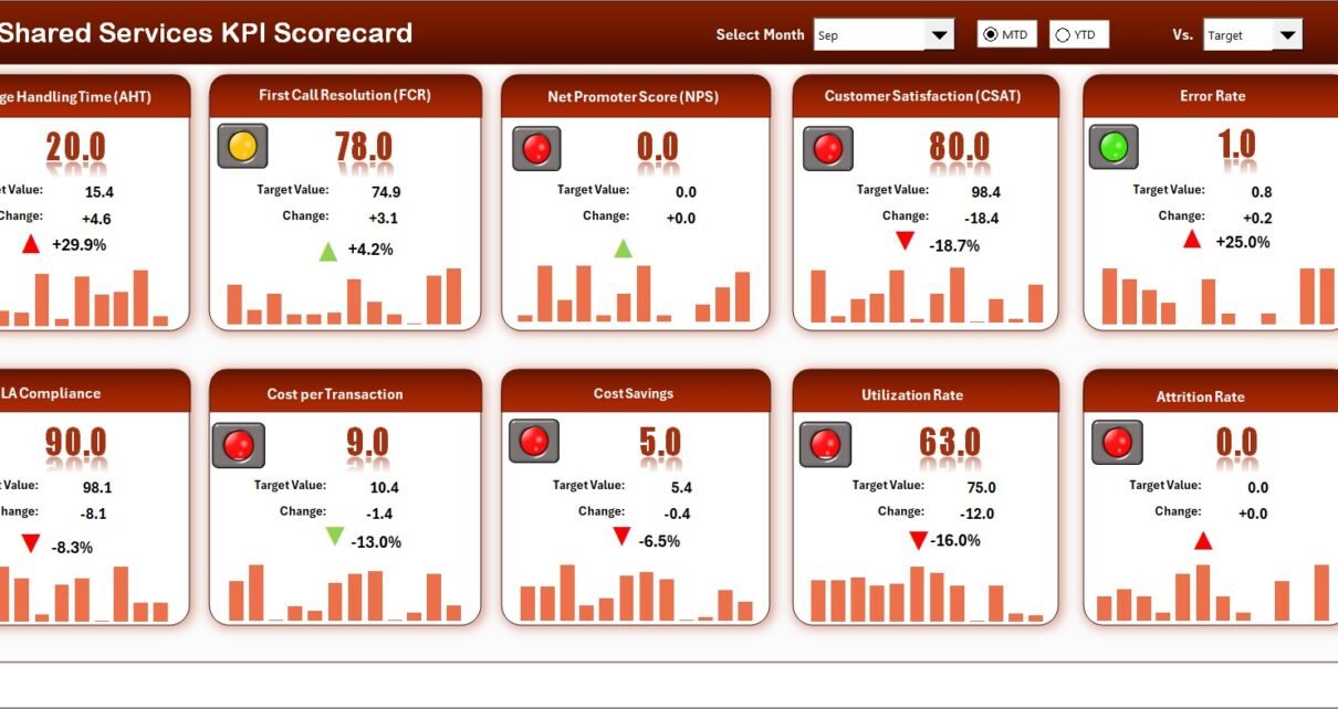
1️⃣ Scorecard Sheet – The Main Performance View
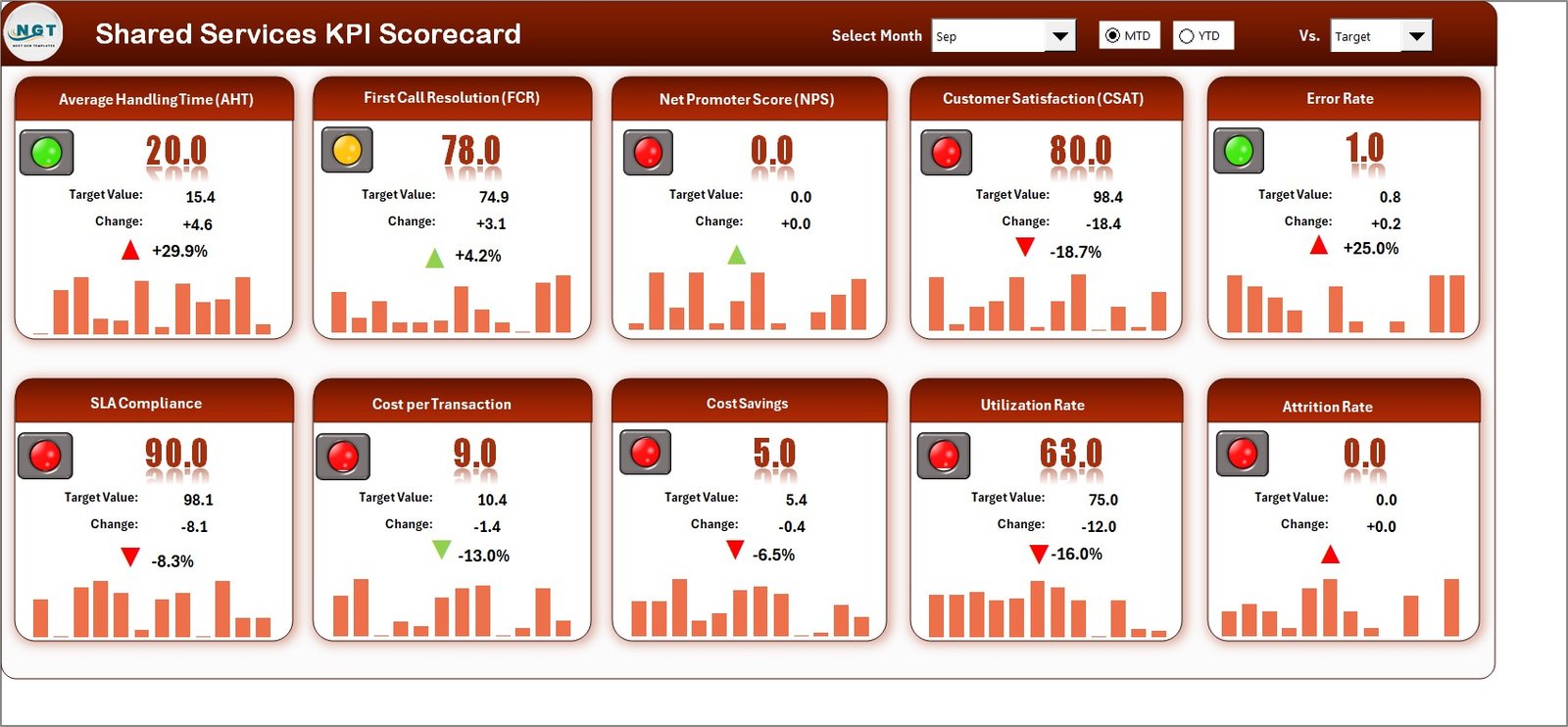
The Scorecard sheet is the central page of the template. It provides a clear and interactive summary of performance across all key metrics.
Key highlights include:
-
Dropdown menus: Easily select the month or time frame (MTD or YTD) you want to analyze.
-
Actual vs Target comparison: Instantly see how each KPI is performing against expectations.
-
Visual indicators: Use color codes and icons to show whether targets are achieved, missed, or on track.
-
Comprehensive overview: Display MTD and YTD data for every KPI, helping you evaluate both short-term and long-term performance.
This sheet acts as the command center for managers who want a quick performance snapshot without navigating multiple reports.
2️⃣ KPI Trend Sheet – Visualizing Performance Over Time
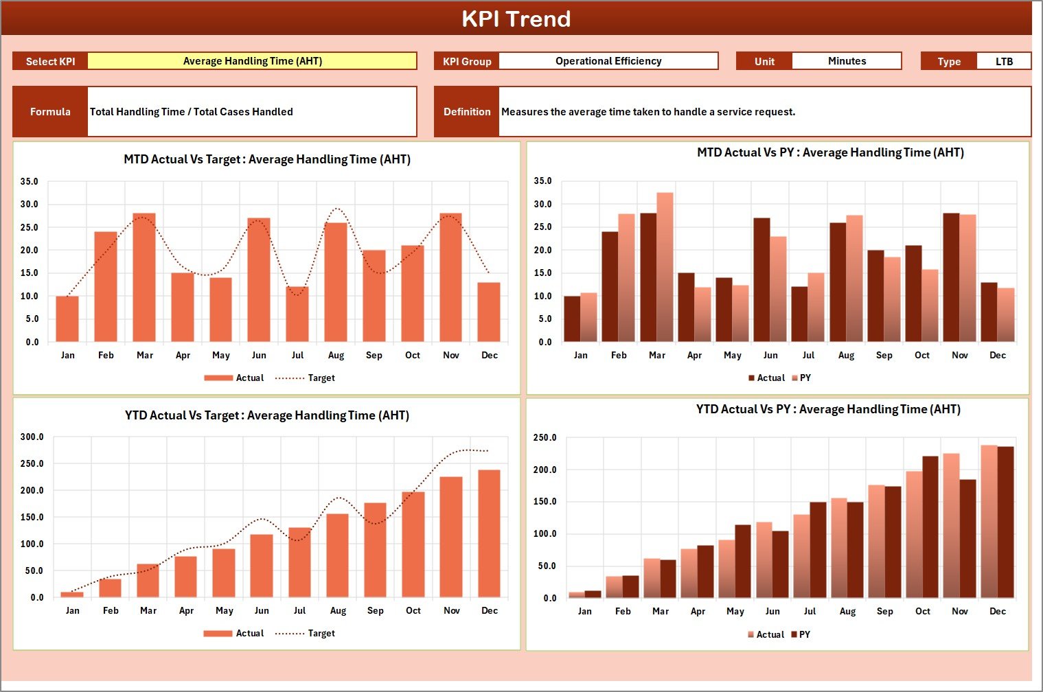
The KPI Trend sheet gives a deep dive into the behavior of individual metrics.
-
Select a specific KPI from a dropdown (cell C3).
-
View detailed information such as the KPI Group, Unit, Formula, and Type — whether Upper-the-Better (UTB) or Lower-the-Better (LTB).
-
Review dynamic trend charts for MTD and YTD data, comparing Actual, Target, and Previous Year (PY) numbers.
This makes it simple to identify trends, detect anomalies, and forecast future performance.
3️⃣ Input Data Sheet – The Data Backbone
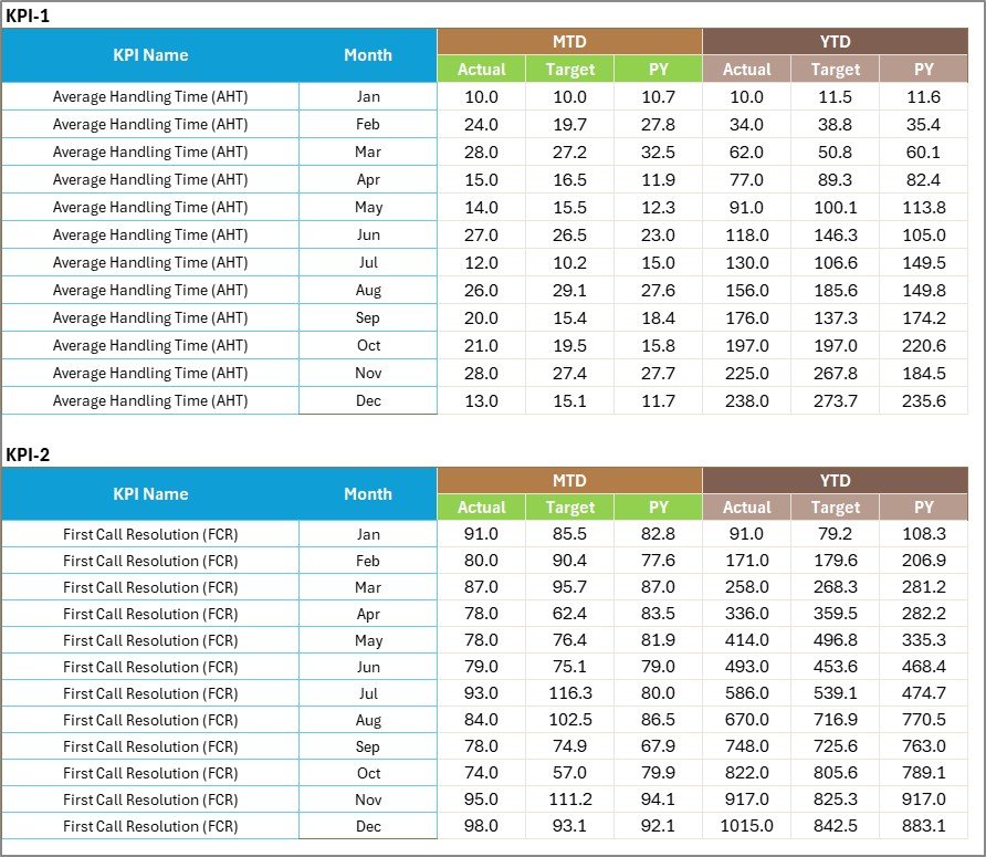
This is where your operational data lives.
-
Record all actual and target values for each KPI monthly.
-
Keep data consistent and up-to-date to ensure reliable analysis.
-
Easily modify or expand as new KPIs or metrics arise.
This sheet feeds the entire dashboard automatically. Once you enter data, the Scorecard and Trend sheets refresh instantly — no extra formulas or manual updates required.
4️⃣ KPI Definition Sheet – Your Data Dictionary
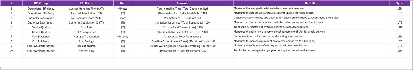
Every strong KPI framework needs a definition repository.
This sheet lists:
-
KPI Name
-
KPI Group
-
Unit of Measure
-
Formula
-
Detailed Definition
It ensures everyone across departments interprets each KPI consistently, preventing confusion and maintaining alignment with organizational goals.
Click to Purchases Shared Services KPI Scorecard in Excel
🔑 Key Features of the Shared Services KPI Scorecard
Here’s what makes this Excel scorecard truly powerful:
-
✅ Ready-to-use template — No coding, no setup. Just plug in your data.
-
📅 Month & Year selectors — Analyze any period dynamically.
-
🎯 Target vs Actual tracking — Highlight gaps immediately.
-
🔁 MTD & YTD analytics — Compare monthly and annual performance side by side.
-
📈 Trend charts — Visualize patterns and changes over time.
-
🟩 Conditional formatting — Red/yellow/green indicators make results intuitive.
-
🧮 Automatic calculations — Formulas handle ratios, percentages, and trends.
-
📋 KPI dictionary — Clear definitions promote data transparency.
-
💻 Excel-based flexibility — Customize layouts, colors, and formulas anytime.
💼 Why Every Organization Needs This Scorecard
Shared service centers often manage multiple departments — HR, Finance, IT, and Admin — all delivering essential back-office functions. Without a centralized scorecard, each team tracks performance differently, making comparison difficult.
This scorecard unifies all metrics into a single, structured view, enabling:
-
Consistent performance measurement
-
Efficient resource allocation
-
Standardized reporting
-
Better governance and accountability
It brings every service area onto the same analytical platform.
🌟 Advantages of Using the Shared Services KPI Scorecard in Excel
Let’s look at the major benefits your organization will gain.
1. Centralized Performance Management
All shared services data — from cost to quality metrics — stays in one Excel file. This eliminates silos and ensures visibility across departments.
2. Improved Decision-Making
The dashboard’s real-time analysis allows leaders to detect inefficiencies early and take corrective actions quickly.
3. Enhanced Transparency
Clear KPI definitions and visual feedback ensure that everyone understands performance outcomes the same way.
4. Scalability
You can easily add more KPIs or expand to additional service lines without rebuilding the dashboard.
5. Easy Adoption
Anyone familiar with Excel can use it. No training or third-party software is needed.
6. Cost-Efficiency
Unlike expensive BI tools, this Excel template provides robust analytics with zero licensing cost.
7. Continuous Improvement
With trend data and variance analysis, managers can identify recurring issues and develop targeted improvement plans.
Click to Purchases Shared Services KPI Scorecard in Excel
🧠 Opportunities for Improvement
Even though the scorecard is comprehensive, it can grow further with these enhancements:
-
Automation: Link data from other systems (ERP, HRMS, CRM) using Power Query or VBA macros.
-
Visualization: Add charts or dashboards using Excel PivotCharts or link to Power BI for interactive visuals.
-
User Access Control: Protect sensitive KPIs using password protection or sheet-level restrictions.
-
Benchmarking: Incorporate industry benchmarks to compare your performance externally.
-
Feedback Integration: Include internal customer ratings for service-quality evaluation.
Implementing these upgrades will make your scorecard more dynamic and valuable.
🧭 Best Practices for Using the Shared Services KPI Scorecard in Excel
Follow these guidelines to get the best results:
1. Keep Data Consistent
Use the same formats for dates, percentages, and currency to ensure accuracy across all sheets.
2. Validate Inputs Regularly
Double-check data before publishing reports to avoid errors that may distort analysis.
3. Align KPIs with Business Goals
Ensure that every KPI directly supports an organizational objective — efficiency, cost reduction, or quality improvement.
4. Use Conditional Formatting Wisely
Highlight critical areas using traffic-light colors, but avoid over-decorating; simplicity aids clarity.
5. Update the Scorecard Monthly
Regular updates ensure timely insights and prevent data backlogs.
6. Communicate Results Clearly
Use charts, summaries, and concise commentary to share results with stakeholders.
7. Promote Collaboration
Encourage departments to use the same definitions and share improvement ideas across teams.
8. Back Up Data
Keep periodic backups of historical data to track long-term trends.
9. Protect Key Formulas
Lock calculated cells so only authorized users can make changes.
By following these practices, you’ll maintain data integrity and create a sustainable performance-tracking process.
Click to Purchases Shared Services KPI Scorecard in Excel
🔧 How to Customize the Scorecard
Because it’s Excel-based, customization is effortless. You can:
-
Add your company branding — logos, color themes, and headers.
-
Introduce department-specific KPIs.
-
Modify target thresholds to reflect new goals.
-
Insert pivot tables for deeper insights.
-
Add slicers to filter by department or region.
-
Create summary dashboards using Power Pivot for cross-functional analysis.
Each tweak helps you tailor the tool to your organization’s exact needs.
📈 How This Scorecard Supports Strategic Goals
The scorecard does more than track numbers — it connects performance to strategy.
Here’s how:
-
It translates objectives like “reduce costs” or “improve efficiency” into measurable KPIs.
-
It aligns department-level targets with corporate goals.
-
It offers a single view for leadership to assess service quality, productivity, and satisfaction.
-
It builds accountability by linking metrics to responsible teams.
With this scorecard, data becomes a catalyst for continuous improvement and informed decision-making.
🏁 Conclusion
The Shared Services KPI Scorecard in Excel is a powerful, easy-to-use, and cost-effective tool for managing business performance.
By consolidating KPIs, simplifying tracking, and visualizing trends, it gives leaders the clarity they need to make confident decisions. Its structure — Scorecard, KPI Trend, Input Data, and Definition sheets — ensures transparency, consistency, and alignment across all service areas.
Whether you manage HR, IT, Finance, or Procurement, this scorecard empowers your teams to deliver better, faster, and more efficient results.
It’s not just a reporting tool — it’s a strategic enabler for growth and operational excellence.
Click to Purchases Shared Services KPI Scorecard in Excel
❓ Frequently Asked Questions (FAQs)
1. What is a Shared Services KPI Scorecard?
It’s an Excel-based tool that tracks performance metrics for shared service functions such as HR, IT, and Finance to measure efficiency and service quality.
2. Do I need Excel expertise to use it?
No. Basic Excel knowledge is enough. The template is plug-and-play with easy dropdowns and visuals.
3. Can I add new KPIs?
Yes. You can expand the Input Data and Definition sheets to include additional KPIs without changing the structure.
4. How do I analyze monthly performance?
Use the dropdowns in the Scorecard sheet to select your desired month or period (MTD/YTD).
5. Does it compare against targets and previous years?
Yes. The scorecard displays Actual, Target, and Previous Year values for quick variance and trend analysis.
6. Can I automate data updates?
Absolutely. You can integrate Power Query or VBA to pull data automatically from external systems.
7. Is it suitable for large organizations?
Yes. The design supports scaling across multiple departments and can be customized for enterprise reporting.
8. How often should I update the scorecard?
Ideally once a month to keep reports accurate and actionable.
Click to Purchases Shared Services KPI Scorecard in Excel
Visit our YouTube channel to learn step-by-step video tutorials