The maritime shipping industry plays a vital role in global trade. Every day, shipping companies transport millions of tons of cargo across oceans. However, managing ship chartering operations can become complex because it involves multiple variables such as charter contracts, fuel costs, cargo types, ports, brokers, and revenue performance.
Many shipping companies still track chartering data using scattered spreadsheets and manual reports. As a result, decision-makers often struggle to analyze operational performance, monitor charter contracts, and identify revenue trends.
Therefore, shipping organizations increasingly rely on interactive dashboards to monitor chartering performance in real time. A well-designed dashboard allows managers to analyze charter operations, evaluate financial performance, and improve decision-making.
That is exactly where the Ship Chartering Dashboard in Excel becomes extremely valuable.
Click to Purchases Ship Chartering Dashboard in Excel
The Ship Chartering Dashboard in Excel is a ready-to-use Excel-based analytics tool that helps shipping companies monitor chartering performance in a structured and visual format. Instead of analyzing multiple reports, users can track operational metrics, fuel costs, charter rates, contract duration, and revenue performance in one centralized dashboard.
In this comprehensive guide, you will learn:
-
What a Ship Chartering Dashboard in Excel is
-
Why shipping companies need chartering dashboards
-
Key features of the dashboard
-
Important chartering metrics
-
Advantages of using the dashboard
-
Best practices for implementing chartering analytics
-
Frequently asked questions about ship chartering dashboards
Let’s explore everything step by step.
What is a Ship Chartering Dashboard in Excel?
A Ship Chartering Dashboard in Excel is an interactive reporting tool that helps maritime companies monitor ship charter operations, contract performance, fuel expenses, and revenue analytics using data visualization.
The dashboard collects operational data from chartering activities and converts it into charts, KPIs, and performance indicators.
Instead of reading long operational reports, managers can instantly understand performance trends through visual analytics.
For example, the dashboard can show:
-
Charter rate performance
-
Fuel costs by region
-
Contract duration by charter type
-
Revenue performance by broker
-
Delay analysis by port
-
Monthly charter performance
Because Excel supports Pivot Tables, Pivot Charts, and slicers, users can interactively filter data and explore insights quickly.
As a result, shipping companies improve operational visibility and financial control.
Why Do Shipping Companies Need a Ship Chartering Dashboard?
Ship chartering involves several operational and financial variables. Therefore, managers must constantly monitor performance metrics.
However, traditional reporting methods create several problems:
-
Data remains scattered across multiple spreadsheets
-
Managers spend hours analyzing reports
-
Operational delays go unnoticed
-
Fuel cost analysis becomes difficult
-
Revenue performance remains unclear
Therefore, shipping companies increasingly implement dashboards.
A Ship Chartering Dashboard solves these problems by providing:
-
Real-time operational visibility
-
Clear performance monitoring
-
Faster decision-making
-
Data-driven chartering strategies
As a result, organizations improve efficiency and profitability.
Click to Purchases Ship Chartering Dashboard in Excel
Key Features of the Ship Chartering Dashboard in Excel
The Ship Chartering Dashboard provides powerful analytical capabilities through multiple pages. Each page focuses on different aspects of chartering operations.
The dashboard includes five analytical pages, allowing users to analyze performance from different perspectives.
Additionally, the dashboard contains a Page Navigator located on the left side, which helps users quickly move between analytical pages.
Let’s explore the pages in detail.
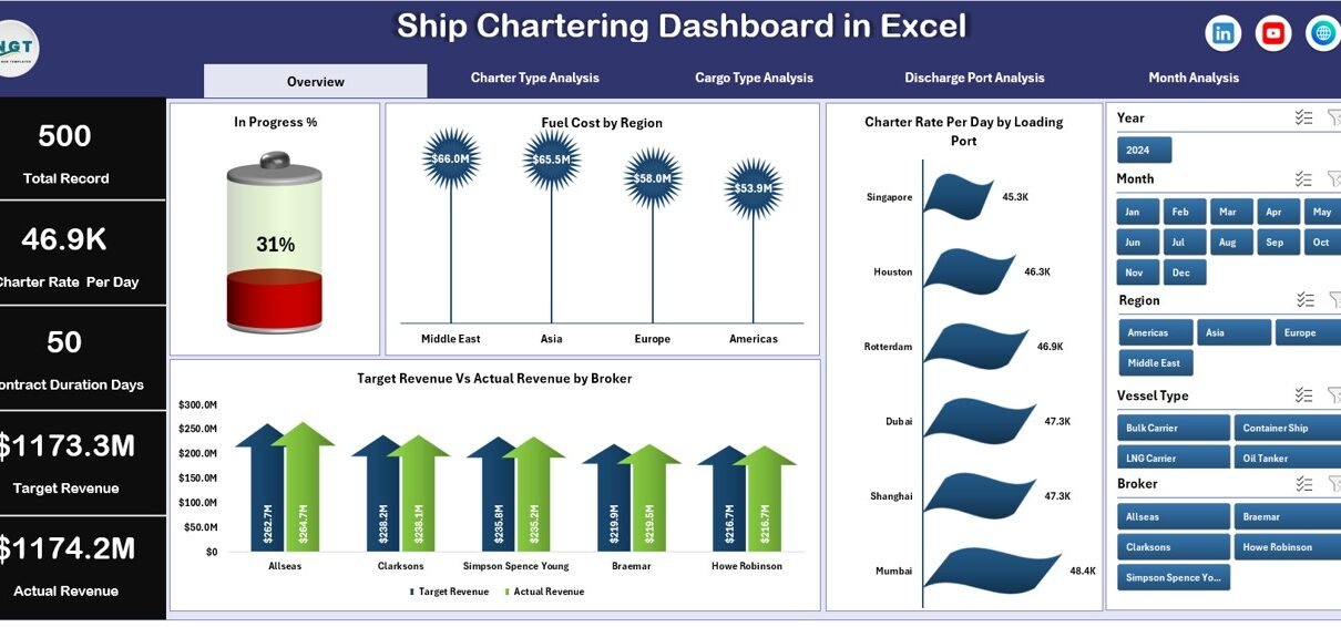
Overview Page – What Insights Can You See Instantly?
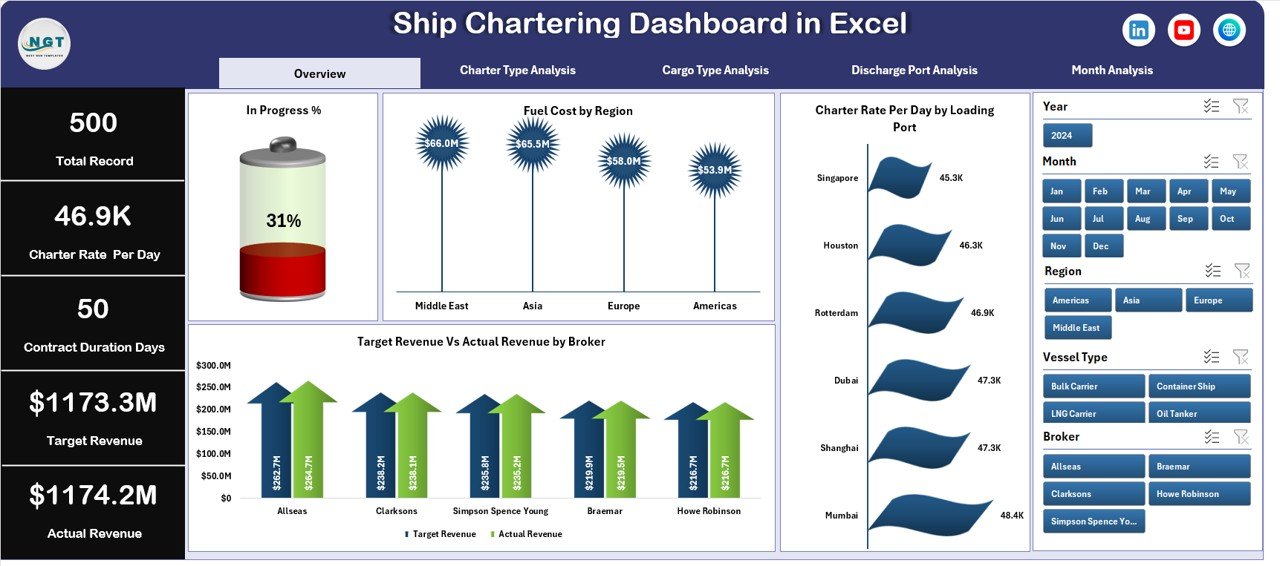
The Overview Page acts as the central summary of chartering operations.
Users can quickly analyze overall performance metrics without exploring detailed reports.
This page includes interactive slicers on the right side, allowing users to filter data based on multiple conditions.
KPI Cards
The dashboard displays four key performance indicators:
-
In Progress %
-
Fuel Cost
-
Charter Rate Per Day
-
Revenue Performance
These KPIs provide a quick snapshot of operational performance.
Charts Available on the Overview Page
The Overview Page includes the following charts:
In Progress %
This chart shows the percentage of charter contracts currently in progress.
Therefore, managers can quickly monitor operational workload.
Fuel Cost by Region
This chart displays fuel expenses across different geographical regions.
As a result, companies can identify regions with higher operational costs.
Charter Rate Per Day by Loading Port
This chart shows charter rate performance by loading port.
Therefore, companies can analyze which ports generate higher charter revenues.
Target Revenue vs Actual Revenue by Broker
This chart compares revenue targets with actual revenue performance for each broker.
Thus, managers can evaluate broker performance and revenue achievement.
Charter Type Analysis – How Do Different Charter Types Perform?
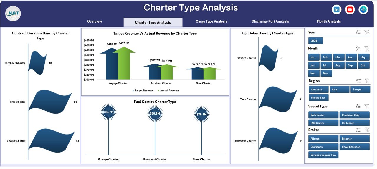
Ship chartering contracts vary depending on business requirements.
Common charter types include:
-
Time Charter
-
Voyage Charter
-
Bareboat Charter
The Charter Type Analysis Page helps managers evaluate operational performance across different charter types.
Charts in Charter Type Analysis
The page includes four important charts.
Contract Duration by Charter Type
This chart shows the total duration of contracts for each charter type.
Therefore, companies can understand long-term charter commitments.
Fuel Cost by Charter Type
This chart analyzes fuel expenses associated with each charter type.
As a result, companies can identify cost-intensive charter operations.
Average Delay Days by Charter Type
This chart displays operational delays based on charter type.
Therefore, managers can detect operational inefficiencies.
Target Revenue vs Actual Revenue by Charter Type
This chart compares expected revenue with actual revenue performance for each charter category.
Thus, companies can evaluate financial performance effectively.
Cargo Type Analysis – Which Cargo Types Generate the Best Performance?
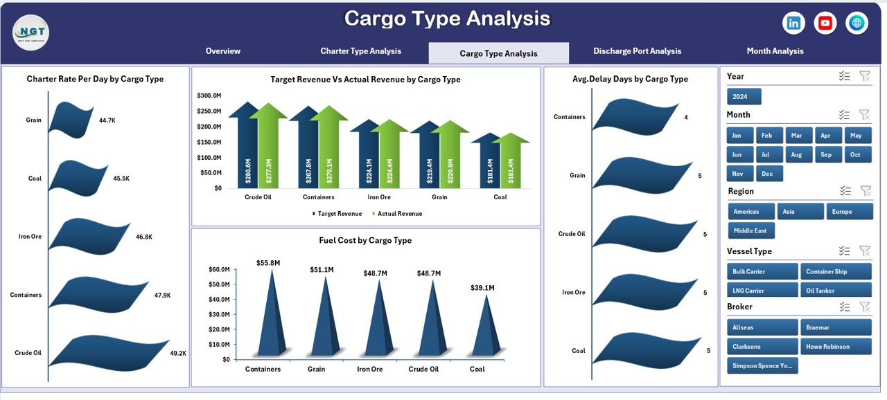
Different cargo types impact charter performance differently.
For example:
-
Bulk cargo
-
Liquid cargo
-
Container cargo
-
Dry cargo
Therefore, analyzing cargo performance becomes essential.
The Cargo Type Analysis Page focuses on operational metrics related to cargo categories.
Charts Available on This Page
Contract Duration by Cargo Type
This chart analyzes the duration of contracts based on cargo categories.
Therefore, companies can identify which cargo types involve longer charter commitments.
Fuel Cost by Cargo Type
Fuel consumption varies depending on cargo weight and distance.
This chart shows fuel costs across cargo categories.
Average Delay Days by Cargo Type
Operational delays often depend on cargo handling complexity.
This chart highlights delay patterns.
Target Revenue vs Actual Revenue by Cargo Type
This chart compares revenue expectations with actual revenue performance.
Thus, companies can identify profitable cargo segments.
Click to Purchases Ship Chartering Dashboard in Excel
Discharge Port Analysis – How Do Ports Impact Chartering Performance?
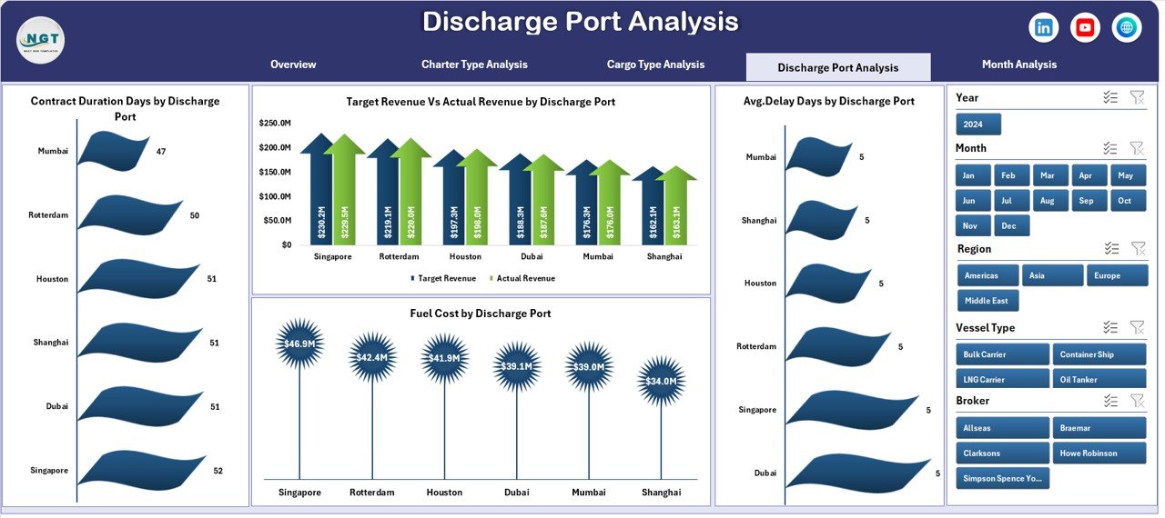
Ports play a critical role in shipping operations.
Port congestion, handling time, and infrastructure directly affect charter performance.
Therefore, analyzing port performance becomes essential.
The Discharge Port Analysis Page provides insights into operational efficiency across ports.
Charts Included
Contract Duration by Discharge Port
This chart shows how long ships remain engaged in contracts associated with specific ports.
Fuel Cost by Discharge Port
Fuel consumption varies depending on route distance and operational delays.
This chart analyzes fuel costs by port.
Average Delay Days by Discharge Port
Port congestion often causes operational delays.
This chart highlights delay patterns across ports.
Target Revenue vs Actual Revenue by Discharge Port
This chart compares expected revenue with actual revenue performance.
Therefore, managers can evaluate the financial impact of each port.
Month Analysis – How Does Performance Change Over Time?
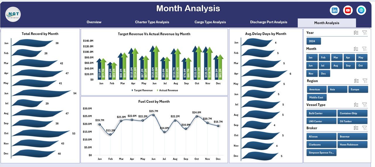
Shipping operations fluctuate throughout the year.
Seasonal demand, weather conditions, and global trade trends influence chartering performance.
Therefore, companies must analyze monthly trends.
The Month Analysis Page focuses on time-based performance monitoring.
Charts Included
Total Records by Month
This chart shows the number of charter transactions each month.
Fuel Cost by Month
Fuel expenses vary due to changing fuel prices and operational activities.
This chart tracks monthly fuel cost trends.
Average Delay Days by Month
This chart helps managers analyze operational delays over time.
Target Revenue vs Actual Revenue by Month
This chart compares revenue targets with actual results each month.
Thus, companies can evaluate financial performance trends.
Data Sheet and Support Sheet
The dashboard also includes backend sheets that support the dashboard.
Data Sheet
The Data Sheet stores all operational records used in the dashboard.
Typical columns include:
-
Charter ID
-
Vessel Name
-
Charter Type
-
Cargo Type
-
Loading Port
-
Discharge Port
-
Broker Name
-
Fuel Cost
-
Charter Rate
-
Contract Duration
-
Delay Days
-
Revenue
-
Month
Pivot tables and charts use this data for analysis.
Support Sheet
The Support Sheet stores reference information used by the dashboard.
Examples include:
-
Port list
-
Charter type categories
-
Cargo categories
-
Broker names
-
Dropdown lists
This sheet helps maintain clean and structured data.
Advantages of Ship Chartering Dashboard in Excel
Click to Purchases Ship Chartering Dashboard in Excel
A well-designed chartering dashboard provides many operational benefits.
Better Operational Visibility
Managers can monitor charter operations instantly.
Improved Decision Making
Visual analytics helps managers identify trends quickly.
Fuel Cost Monitoring
Companies can track fuel expenses across regions and operations.
Revenue Performance Tracking
The dashboard compares revenue targets with actual results.
Delay Identification
Managers can detect operational delays and take corrective actions.
Centralized Data Management
All chartering information appears in one dashboard.
Therefore, organizations save time and improve efficiency.
Best Practices for Using the Ship Chartering Dashboard
Organizations should follow several best practices to maximize the value of the dashboard.
Maintain Accurate Data
Always ensure the data sheet contains accurate information.
Update Data Regularly
Regular updates keep the dashboard insights reliable.
Use Standardized Data Formats
Consistent data structure improves analysis.
Monitor KPIs Frequently
Review operational KPIs regularly to detect issues early.
Train Team Members
Ensure staff understand how to interpret dashboard insights.
Review Performance Trends
Monthly and quarterly reviews help improve operational strategies.
Conclusion
Ship chartering operations involve complex logistics, financial analysis, and operational coordination. Without proper monitoring tools, companies struggle to analyze performance effectively.
However, the Ship Chartering Dashboard in Excel provides a powerful solution.
This dashboard allows shipping companies to monitor operational performance, fuel expenses, charter contracts, cargo performance, port efficiency, and revenue analytics in a single interactive platform.
Moreover, the dashboard provides multiple analytical pages, enabling users to analyze charter operations from different perspectives.
As a result, companies can make faster decisions, improve operational efficiency, and increase profitability.
Therefore, organizations involved in maritime logistics, vessel operations, and shipping management can greatly benefit from implementing this dashboard.
Frequently Asked Questions (FAQs)
What is ship chartering?
Ship chartering refers to the process of renting a vessel for transporting cargo over a specific period or voyage.
Shipping companies use charter agreements to transport goods globally.
Why should companies use a Ship Chartering Dashboard?
Companies use dashboards to monitor operational performance, track fuel costs, analyze charter contracts, and evaluate revenue trends.
Can Excel handle ship chartering analytics?
Yes. Excel supports pivot tables, charts, slicers, and formulas that make it ideal for building analytical dashboards.
Who can use the Ship Chartering Dashboard?
The dashboard can help:
-
Shipping companies
-
Vessel operators
-
Maritime logistics companies
-
Charter brokers
-
Shipping analysts
Can the dashboard be customized?
Yes. Users can customize charts, KPIs, and metrics according to their operational requirements.
Visit our YouTube channel to learn step-by-step video tutorials