Shipping and logistics companies handle a massive amount of data every single day — from delivery schedules to freight costs, and from order tracking to carrier efficiency. Managing all of this information manually can be time-consuming and error-prone. That’s where a Shipping KPI Dashboard in Power BI becomes a game-changer.
This ready-to-use, interactive dashboard helps businesses monitor, analyze, and visualize critical shipping performance metrics in real time. It simplifies complex data into easy-to-understand visuals and enables faster, data-driven decision-making.
In this detailed article, we’ll explore what a Shipping KPI Dashboard in Power BI is, its key features, how it works, and the best ways to use it for improving operational performance.
Click to Purchases Shipping KPI Dashboard in Power BI
⚙️ What Is a Shipping KPI Dashboard in Power BI?
A Shipping KPI Dashboard in Power BI is a dynamic analytics solution that tracks key performance indicators (KPIs) related to shipping and logistics operations. It integrates Excel-based data sources with Power BI’s advanced visualization capabilities, turning raw shipping data into meaningful insights.
This dashboard helps managers and analysts evaluate delivery efficiency, cost control, on-time performance, and customer satisfaction — all from one place.
Power BI acts as a powerful visualization engine that pulls data from Excel sheets, transforms it through Power Query, and displays interactive charts, cards, and tables. As a result, users can explore performance trends, compare actual vs target results, and identify improvement areas instantly.
Click to Purchases Shipping KPI Dashboard in Power BI
📊 Structure of the Shipping KPI Dashboard in Power BI
The Shipping KPI Dashboard is divided into three main pages, each offering a unique perspective on operational performance.
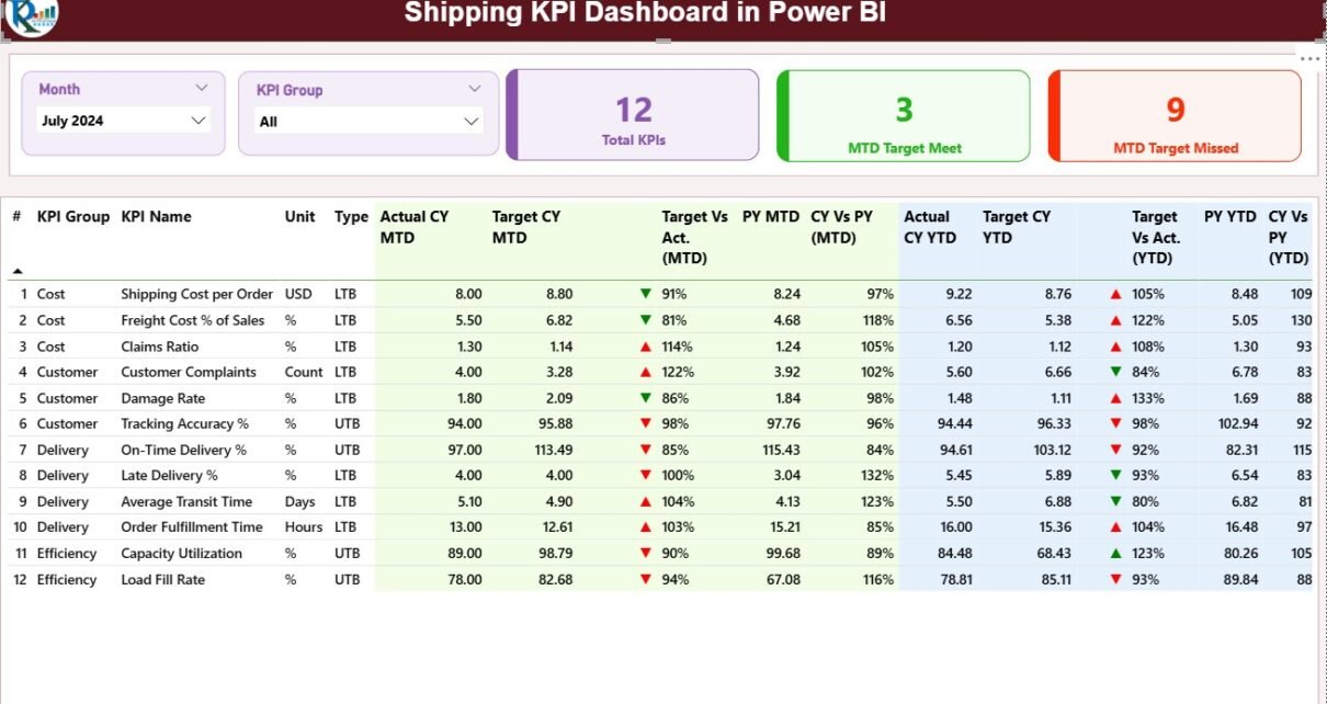
1️⃣ Summary Page — Your Command Center
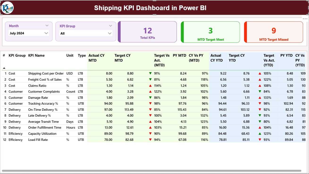
The Summary Page serves as the main page of the dashboard. It provides a complete view of your monthly and year-to-date (YTD) performance.
🔹 Key Components:
-
Month and KPI Group Slicers: Located at the top of the page, these slicers help you filter the data dynamically based on month or KPI category.
-
Performance Cards: Display three critical metrics —
-
Total KPIs Count
-
MTD (Month-to-Date) Target Met Count
-
MTD Target Missed Count
These cards give an instant snapshot of how the shipping operation is performing overall.
-
🔹 Detailed KPI Table:
Below the cards, a detailed table lists all KPIs with both MTD and YTD performance data, including:
-
KPI Number: Sequential number of the KPI.
-
KPI Group: Category or department of the KPI (e.g., Delivery, Cost, Efficiency).
-
KPI Name: Name of the performance metric.
-
Unit: Unit of measurement (e.g., %, Hours, USD).
-
Type: Indicates whether the KPI is LTB (Lower the Better) or UTB (Upper the Better).
-
Actual CY MTD & Target CY MTD: Current year’s month-to-date actual and target values.
-
MTD Icon: Up (▲) or Down (▼) icons in green or red, representing performance status.
-
Target vs Actual (MTD): Calculated as Actual ÷ Target × 100, showing performance achievement in percentage.
-
Previous Year (PY) MTD: MTD figures for the same period last year.
-
CY vs PY (MTD): Comparison between current and previous year MTD data.
-
Actual CY YTD & Target CY YTD: Year-to-date figures for actual and target.
-
YTD Icon & Target vs Actual (YTD): Similar icon-based status and percentage comparisons for YTD values.
-
PY YTD & CY vs PY (YTD): Historical comparison for trend analysis.
This section gives a complete picture of KPI performance, both for the current month and cumulatively for the year.
2️⃣ KPI Trend Page — Understanding Performance Over Time
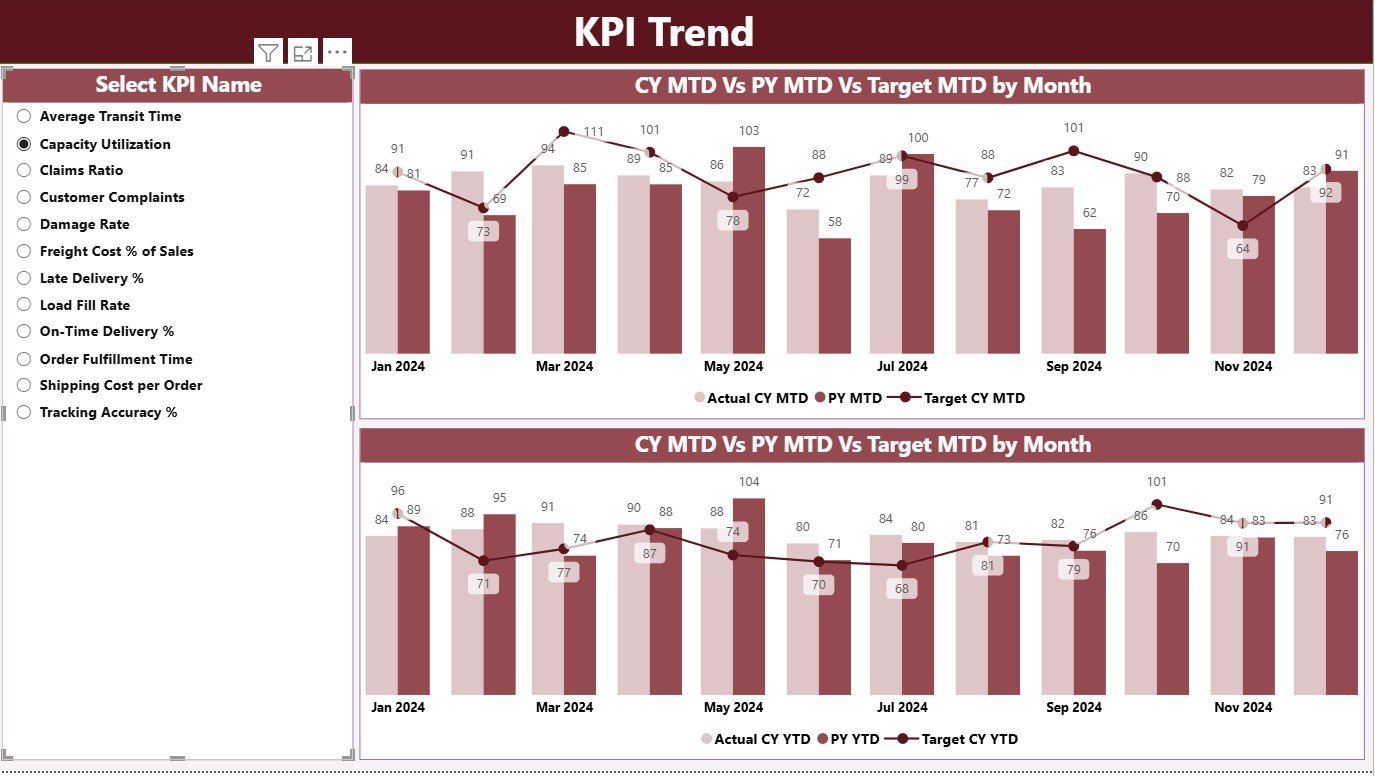
The KPI Trend Page visualizes how shipping KPIs perform over time through combo charts. These charts are incredibly useful for comparing current and previous year’s performance against targets.
🔹 Key Highlights:
-
Two combo charts display MTD and YTD trends.
-
Each chart shows:
-
Current Year Actuals
-
Previous Year Actuals
-
Target Values
-
-
A slicer on the left allows users to select a specific KPI name for focused analysis.
This helps managers quickly identify whether performance is improving, stagnating, or declining, and plan corrective measures.
3️⃣ KPI Definition Page — Deep Dive into KPI Details
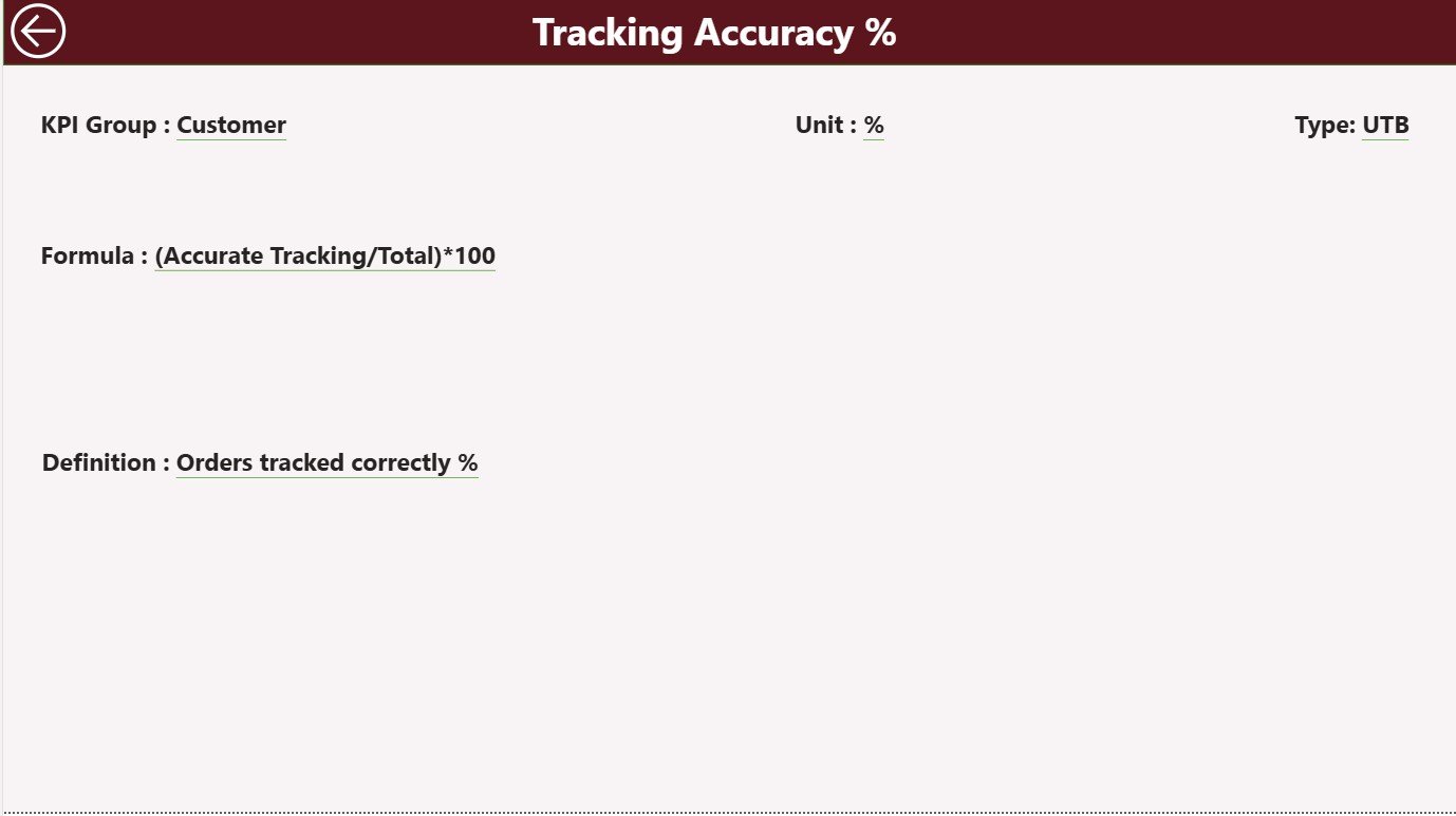
The KPI Definition Page acts as a drill-through page, hidden by default but accessible from the Summary Page.
When users right-click on a KPI in the Summary table and select “Drill Through,” they’re taken to this detailed page showing:
-
KPI Formula
-
Definition
-
Unit
-
Type (LTB or UTB)
This ensures transparency and helps teams understand how each KPI is calculated. A back button in the top left corner takes users back to the main page for seamless navigation.
Click to Purchases Shipping KPI Dashboard in Power BI
📂 Data Source: Excel Integration for Easy Updates
The dashboard connects directly to an Excel workbook, making it simple for anyone to update or maintain the data. The Excel file includes three essential sheets:
1️⃣ Input_Actual Sheet:
This sheet stores actual KPI values for each month.
Columns:
-
KPI Name
-
Month (use the first date of the month)
-
MTD Numbers
-
YTD Numbers
2️⃣ Input_Target Sheet:
This sheet contains the target numbers for each KPI, similarly structured to the Actual sheet.
Columns:
-
KPI Name
-
Month (first date of the month)
-
MTD Targets
-
YTD Targets
3️⃣ KPI Definition Sheet:
This sheet defines each KPI in detail.
Columns:
-
KPI Number
-
KPI Group
-
KPI Name
-
Unit
-
Formula
-
Definition
-
Type (LTB or UTB)
This structure keeps the data organized, consistent, and easy to manage. Users can refresh the Power BI model anytime to load the latest numbers.
🚀 Why Use a Shipping KPI Dashboard in Power BI?
Using Power BI for shipping performance tracking gives organizations a significant advantage. It simplifies reporting, improves visibility, and supports smarter decision-making.
Here are some of the main benefits:
1️⃣ Real-Time Visibility
Power BI allows you to view up-to-date shipping metrics without waiting for manual reports. Every refresh brings in the latest performance data instantly.
2️⃣ Better Decision-Making
With all metrics consolidated in one dashboard, managers can identify issues quickly — whether it’s a cost overrun, delivery delay, or missed target.
3️⃣ Enhanced Accountability
By tracking each KPI with assigned targets, departments become more accountable. Everyone can see performance metrics transparently.
4️⃣ Time Savings
Automated reporting eliminates repetitive data entry and manual charting, saving several hours of work per week.
5️⃣ Customization Flexibility
You can easily add or remove KPIs, modify visuals, or connect other data sources as your business grows.
📈 Common KPIs Tracked in Shipping Dashboards
A Shipping KPI Dashboard typically includes metrics covering cost, delivery, service quality, and operational performance. Some examples include:
-
On-Time Delivery Rate (%)
-
Average Delivery Time (Days)
-
Freight Cost per Shipment (USD)
-
Shipment Accuracy (%)
-
Claims Rate (%)
-
Fuel Efficiency (Miles per Gallon)
-
Number of Shipments
-
Order Fulfillment Rate (%)
-
Carrier Utilization (%)
-
Cost per Ton-Mile (USD)
Each of these KPIs provides valuable insight into how efficiently shipping operations are functioning.
💡 Advantages of Using a Shipping KPI Dashboard in Power BI
The Shipping KPI Dashboard offers multiple advantages for logistics, manufacturing, and e-commerce organizations:
📊 Comprehensive Analysis: See all your KPIs in one place — from financial metrics to operational performance.
🕒 Real-Time Insights: Refresh data anytime to monitor current performance instantly.
🔍 Trend Tracking: Compare current year vs previous year metrics easily.
🧭 Strategic Alignment: Align shipping operations with organizational goals using visual KPIs.
📱 Accessibility: Power BI dashboards can be accessed on desktops, tablets, or mobile devices, ensuring decision-makers always stay informed.
🧩 Integration: Seamlessly integrates with Excel, ERP, and other business data sources.
🎯 Target Tracking: Clearly shows which KPIs are meeting or missing targets through colored icons and charts.
🔄 Opportunities for Improvement
Even though Power BI dashboards are powerful, organizations can still enhance their use of the tool in several ways:
-
Automate Data Refresh: Use scheduled refreshes to eliminate manual updates.
-
Expand Data Sources: Integrate shipping data from ERP or CRM systems.
-
Add Predictive Analytics: Use DAX measures or AI visuals to forecast delivery trends.
-
Incorporate Geo-Maps: Add Power BI Map visuals to track deliveries geographically.
-
User Training: Educate teams on using slicers, filters, and drill-throughs effectively.
These improvements ensure that the Shipping KPI Dashboard becomes an even stronger decision-support system.
Click to Purchases Shipping KPI Dashboard in Power BI
🧠 Best Practices for the Shipping KPI Dashboard in Power BI
To get maximum value from your Shipping KPI Dashboard, follow these best practices:
1️⃣ Define Clear KPIs
Start with KPIs that align directly with your business objectives. Avoid overcrowding your dashboard with unnecessary metrics.
2️⃣ Keep Data Clean and Consistent
Ensure all Excel input sheets use standardized formats and units. Clean data prevents reporting errors.
3️⃣ Use Conditional Formatting Wisely
Visual indicators (like red/green arrows) help users understand performance at a glance — but avoid overusing colors.
4️⃣ Implement Role-Based Access
Restrict data visibility based on roles. Managers may need detailed data, while executives only require summaries.
5️⃣ Refresh Data Regularly
Set up scheduled refreshes to keep the dashboard updated with the latest information.
6️⃣ Focus on Interactivity
Leverage slicers, tooltips, and drill-through options to make the dashboard more dynamic and engaging.
7️⃣ Evaluate Performance Monthly
Regularly review KPI trends to identify what’s working and what needs improvement.
📘 How to Use the Shipping KPI Dashboard Effectively
-
Open the Power BI File: Load the dashboard in Power BI Desktop or Power BI Service.
-
Select Month and KPI Group: Use slicers to filter relevant data.
-
Review Cards: Check total KPIs, target met, and missed counts.
-
Explore the Table: Analyze MTD and YTD performance, along with year-over-year comparisons.
-
Drill Through: Right-click any KPI to see detailed definitions or formulas.
-
View KPI Trends: Analyze MTD and YTD trends visually on the KPI Trend page.
-
Update Data: Modify Excel input sheets and refresh the Power BI model to reflect new data.
This process allows users to interact with the data intuitively, without needing advanced technical skills.
💼 Who Can Benefit from the Shipping KPI Dashboard?
The Shipping KPI Dashboard is ideal for professionals and organizations involved in logistics, warehousing, and supply chain management, including:
-
Logistics Managers
-
Operations Heads
-
Warehouse Supervisors
-
Supply Chain Analysts
-
E-commerce Delivery Teams
-
Fleet Management Units
Any organization that depends on timely, cost-efficient delivery can use this dashboard to gain insights and improve performance.
🔔 Key Takeaways
-
Power BI provides a centralized view of all shipping KPIs.
-
Excel integration ensures easy data management and updates.
-
Visual indicators simplify target achievement analysis.
-
Trend pages and drill-through definitions add depth and context to reporting.
-
With best practices and automation, you can transform this dashboard into a powerful decision-making tool.
🏁 Conclusion
The Shipping KPI Dashboard in Power BI offers a comprehensive, data-driven solution for modern shipping and logistics analysis. By integrating Excel data with Power BI’s visualization power, it turns complex numbers into clear insights that drive performance improvement.
From daily operations to long-term strategy, this dashboard empowers teams to monitor progress, identify bottlenecks, and make smarter business decisions. Whether you’re managing a global supply chain or a regional shipping operation, Power BI’s flexibility and interactivity make it the perfect tool for tracking shipping KPIs efficiently.
Click to Purchases Shipping KPI Dashboard in Power BI
❓ Frequently Asked Questions (FAQs)
1️⃣ What is a Shipping KPI Dashboard in Power BI?
It is an interactive Power BI dashboard that tracks and visualizes shipping performance metrics such as cost, delivery time, accuracy, and efficiency using data from Excel or other sources.
2️⃣ How do I update the data in the dashboard?
You simply update the Excel input sheets (Actual, Target, and KPI Definition) and refresh the Power BI model. The visuals update automatically.
3️⃣ Can I customize the dashboard for my company?
Yes. You can easily add or remove KPIs, modify visuals, and adjust data sources to suit your organization’s needs.
4️⃣ What kind of KPIs can I track?
You can track metrics like On-Time Delivery Rate, Freight Cost per Shipment, Average Delivery Time, Shipment Accuracy, and many more.
5️⃣ Is Power BI suitable for small businesses?
Absolutely. Power BI is scalable, meaning it works perfectly for both small businesses and large enterprises.
6️⃣ Do I need coding knowledge to use this dashboard?
No coding is required. Power BI offers a drag-and-drop interface, making it user-friendly for non-technical users.
7️⃣ Can I share this dashboard with others?
Yes, you can publish the dashboard to the Power BI Service and share it securely with your team or stakeholders.
Click to Purchases Shipping KPI Dashboard in Power BI
Visit our YouTube channel to learn step-by-step video tutorials