Modern cities face serious parking challenges every day. Traffic congestion, limited parking spaces, inefficient monitoring systems, and poor data visibility create major operational issues for city authorities and parking operators. Because urban populations continue to grow, managing parking systems efficiently has become more important than ever.
Smart parking systems help cities monitor parking availability, optimize space usage, and improve traffic flow. However, organizations must continuously track the performance of these systems. Without proper performance monitoring, decision-makers cannot identify operational problems, measure utilization rates, or improve parking efficiency.
Table of Contents
ToggleClick to Purchases Smart Parking Systems KPI Dashboard in Power BI
Therefore, organizations need a centralized performance monitoring solution.
This is where the Smart Parking Systems KPI Dashboard in Power BI becomes extremely valuable.
The Smart Parking Systems KPI Dashboard in Power BI is a ready-to-use analytical dashboard that helps parking operators, city administrators, and transportation planners monitor parking system performance using key performance indicators (KPIs). Because the dashboard combines Excel data with Power BI visualization, users can analyze performance trends, compare targets with actual results, and evaluate operational efficiency easily.
In this detailed guide, you will learn everything about the Smart Parking Systems KPI Dashboard in Power BI, including its features, benefits, implementation process, and best practices.
What Is a Smart Parking Systems KPI Dashboard in Power BI?
A Smart Parking Systems KPI Dashboard in Power BI is an interactive business intelligence solution that monitors and analyzes parking system performance using predefined key performance indicators.
The dashboard collects operational data from Excel input sheets and transforms that data into visual analytics using Power BI. As a result, managers can quickly understand system performance without manually reviewing multiple reports.
For example, parking operators can track:
-
Parking space utilization
-
Parking revenue trends
-
Parking occupancy rates
-
System uptime
-
Traffic congestion indicators
-
Customer usage patterns
Because Power BI provides powerful visualization capabilities, users can quickly identify trends and make informed decisions.
Moreover, the dashboard updates automatically when new data is added to the Excel source file. Therefore, organizations always see the most recent performance insights.
Why Do Cities and Parking Operators Need Smart Parking KPIs?
Click to Purchases Smart Parking Systems KPI Dashboard in Power BI
Cities and transportation agencies manage thousands of parking spaces across multiple locations. Without a structured monitoring system, it becomes difficult to track operational efficiency.
Therefore, organizations rely on Key Performance Indicators (KPIs) to evaluate parking system performance.
Smart parking KPIs help organizations answer important questions such as:
-
How efficiently do parking spaces operate?
-
Are parking targets being achieved?
-
How does current performance compare with last year?
-
Which parking locations perform best?
-
Where should operators improve operations?
Because KPIs provide measurable insights, decision-makers can improve parking strategies and optimize infrastructure investments.
Key Features of the Smart Parking Systems KPI Dashboard in Power BI
The Smart Parking Systems KPI Dashboard in Power BI provides powerful analytics through three interactive pages.
Each page focuses on a specific performance analysis area.
Let’s explore each page in detail.
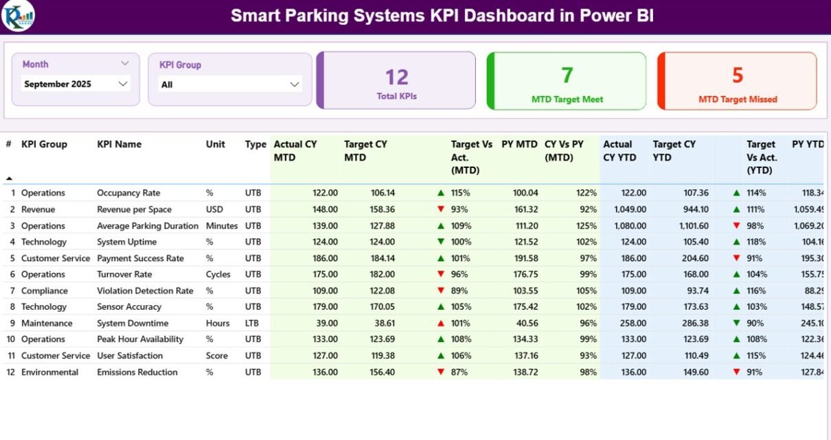
1. Summary Page – Central Performance Monitoring
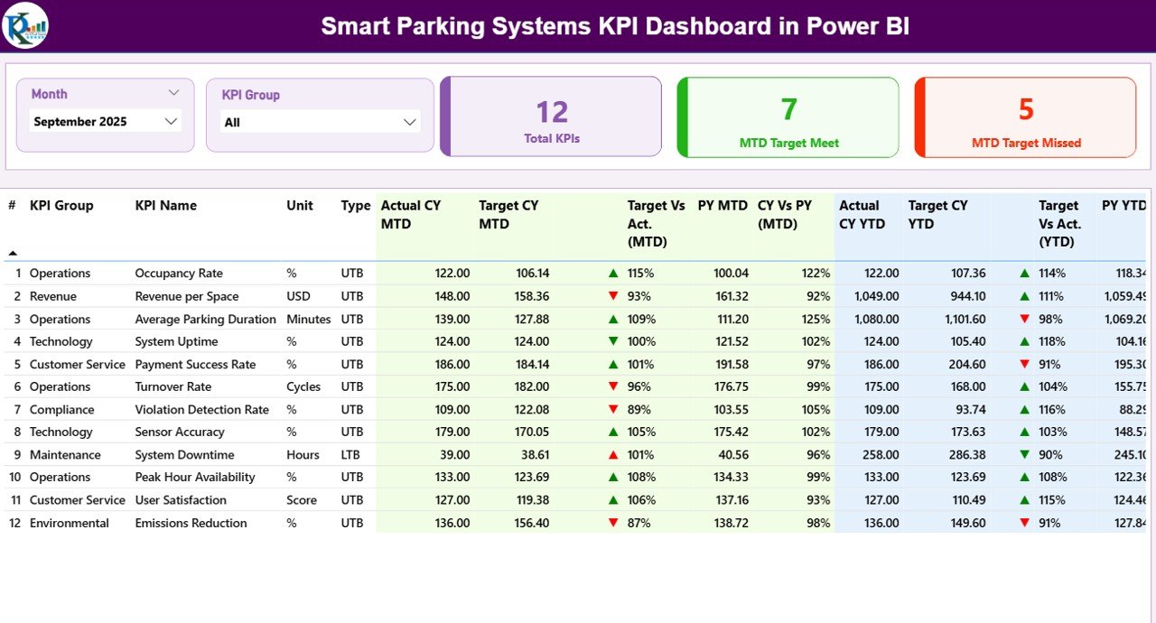
The Summary Page acts as the main dashboard interface where users can view overall KPI performance.
Because this page consolidates multiple performance metrics, managers can quickly evaluate parking system performance.
Interactive Slicers
At the top of the dashboard, users can find two important slicers:
-
Month Slicer – Allows users to filter dashboard results for a specific month.
-
KPI Group Slicer – Helps users filter KPIs based on operational categories.
As a result, users can analyze parking system performance for specific time periods or KPI categories.
KPI Performance Cards
The dashboard also displays three performance cards that provide quick insights.
Total KPIs Count
This card displays the total number of KPIs available in the dashboard.
MTD Target Meet Count
This card shows how many KPIs achieved their monthly targets.
MTD Target Missed Count
This card indicates how many KPIs failed to achieve their monthly targets.
Because these cards highlight performance status immediately, managers can quickly identify operational issues.
Detailed KPI Performance Table
Below the KPI cards, the dashboard displays a detailed performance table.
This table contains multiple KPI performance fields that provide in-depth analysis.
KPI Number
This field shows the unique sequence number of each KPI.
KPI Group
This column categorizes KPIs based on operational areas.
For example:
-
Parking Operations
-
Revenue Management
-
System Performance
-
Customer Usage
KPI Name
This column displays the name of the key performance indicator.
Unit
This field shows the unit of measurement for the KPI.
Examples include:
-
Percentage (%)
-
Number of Vehicles
-
Parking Revenue
-
Parking Duration
-
Click to Purchases Smart Parking Systems KPI Dashboard in Power BI
KPI Type (LTB or UTB)
The dashboard categorizes KPIs into two types:
-
UTB (Upper the Better) – Higher values indicate better performance.
-
LTB (Lower the Better) – Lower values indicate better performance.
For example:
-
Parking occupancy rate → UTB
-
System downtime → LTB
Monthly Performance Metrics
The dashboard provides detailed monthly analysis using multiple fields.
Actual CY MTD
Displays the actual KPI value for the current year month-to-date period.
Target CY MTD
Displays the target KPI value for the current month.
MTD Icon
The dashboard uses visual icons to display performance status.
-
▲ Green Arrow → Target achieved
-
▼ Red Arrow → Target missed
Because visual indicators simplify analysis, managers can quickly identify performance gaps.
Target vs Actual (MTD)
This metric calculates performance percentage using the formula:
Actual MTD / Target MTD
Therefore, users can easily evaluate how closely the KPI achieved its target.
PY MTD
Displays the previous year’s month-to-date performance for comparison.
CY vs PY (MTD)
This metric compares current performance with last year using the formula:
Current Year MTD / Previous Year MTD
As a result, organizations can measure performance improvement year over year.
Year-to-Date KPI Metrics
The dashboard also provides long-term analysis using YTD metrics.
Actual CY YTD
Shows the current year cumulative KPI value.
Target CY YTD
Displays the target cumulative KPI value.
YTD Icon
Visual indicators show whether the KPI meets the yearly target.
Target vs Actual (YTD)
Calculates KPI performance against YTD targets.
PY YTD
Displays the previous year YTD value.
CY vs PY (YTD)
Compares current year performance with last year.
Because these metrics provide long-term insights, organizations can evaluate strategic performance trends.
2. KPI Trend Page – Performance Trend Analysis
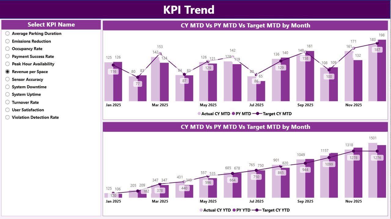
The KPI Trend Page helps users analyze performance trends over time.
Instead of viewing static numbers, managers can observe KPI behavior across multiple months.
The page includes:
-
Two combo charts
-
KPI selection slicer
KPI Selection Slicer
On the left side of the page, users can select any KPI from the dropdown slicer.
Once selected, the dashboard automatically updates the charts.
MTD Trend Combo Chart
This chart compares three important metrics:
-
Current Year Actual
-
Previous Year Actual
-
Target Value
Because the chart combines bars and lines, users can easily compare performance trends.
YTD Trend Combo Chart
The YTD chart provides long-term performance analysis.
It compares:
-
Current year cumulative results
-
Previous year cumulative results
-
Target performance
Therefore, managers can evaluate overall performance growth.
Click to Purchases Smart Parking Systems KPI Dashboard in Power BI
3. KPI Definition Page – Detailed KPI Information
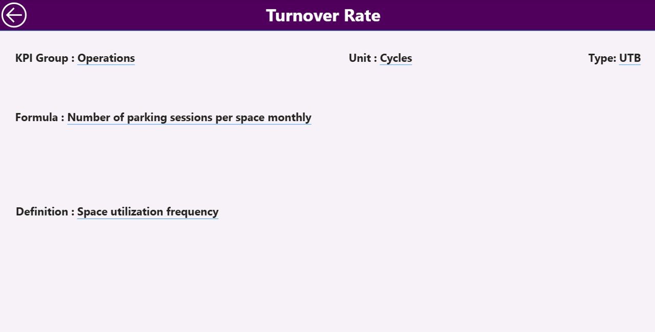
The KPI Definition Page provides detailed explanations of each KPI.
This page remains hidden by default and functions as a drill-through page.
Users can access it directly from the summary page.
Information Available on the KPI Definition Page
When users drill through, they can view:
-
KPI Number
-
KPI Group
-
KPI Name
-
KPI Unit
-
KPI Formula
-
KPI Definition
-
KPI Type (LTB or UTB)
Because this page explains KPI calculations clearly, users can easily understand performance metrics.
Navigation Back to Dashboard
The page also includes a Back Button at the top left corner.
Users can quickly return to the main dashboard page.
Excel Data Structure Used in the Dashboard
The Smart Parking KPI Dashboard uses Excel as the data source.
Users must fill three input worksheets in the Excel file.
1. Input_Actual Worksheet
This sheet contains the actual performance data.
Users must enter:
-
KPI Name
-
Month (first date of month)
-
MTD value
-
YTD value
Because Power BI refreshes automatically, the dashboard updates once the data changes.
2. Input_Target Worksheet
This sheet contains the target KPI values.
Users must enter:
-
KPI Name
-
Month
-
Target MTD
-
Target YTD
Therefore, the dashboard can compare actual performance with targets.
3. KPI Definition Worksheet
This sheet stores KPI metadata.
Users must enter:
-
KPI Number
-
KPI Group
-
KPI Name
-
Unit
-
Formula
-
KPI Definition
-
KPI Type (LTB or UTB)
This sheet enables drill-through KPI explanations.
Advantages of Smart Parking Systems KPI Dashboard in Power BI
Organizations gain multiple benefits when they use this dashboard.
1. Centralized Parking Performance Monitoring
Managers can monitor all parking KPIs in one dashboard.
Therefore, decision-makers do not need multiple reports.
2. Real-Time Performance Insights
Power BI refreshes data automatically.
As a result, managers always see updated insights.
3. Better Operational Decisions
Because the dashboard highlights performance trends, managers can identify problems quickly.
4. Improved Parking Efficiency
Operators can monitor utilization and reduce parking congestion.
5. Data-Driven City Planning
City authorities can analyze parking demand patterns.
Therefore, they can improve urban transportation strategies.
Opportunities for Improvement in Smart Parking KPI Monitoring
Organizations can improve performance monitoring further by implementing additional analytics features.
Integrate IoT Sensor Data
Parking sensors can provide real-time occupancy data.
Add Location-Based Analysis
City managers can analyze performance by parking zones.
Implement Predictive Analytics
AI models can forecast parking demand.
Add Mobile Dashboard Access
Mobile dashboards can help field operators monitor performance.
Best Practices for Using Smart Parking Systems KPI Dashboard in Power BI
Organizations should follow several best practices to maximize dashboard value.
Maintain Accurate Data Inputs
Ensure that Excel input data remains accurate and updated regularly.
Define Clear KPI Metrics
Each KPI must include a clear formula and definition.
Monitor KPIs Regularly
Managers should review KPI performance weekly or monthly.
Train Users on Dashboard Navigation
Teams should understand slicers, drill-through options, and KPI trends.
Standardize KPI Definitions
Organizations should maintain consistent KPI definitions across departments.
Conclusion
Smart parking systems play an important role in modern urban infrastructure. However, managing parking performance requires strong data visibility and operational insights.
The Smart Parking Systems KPI Dashboard in Power BI provides a powerful solution for monitoring parking system performance using structured KPIs. Because the dashboard combines Excel data with interactive Power BI analytics, organizations can analyze trends, compare targets, and evaluate operational efficiency easily.
Moreover, the dashboard simplifies performance monitoring through visual indicators, trend charts, and drill-through KPI explanations. As a result, city administrators, transportation planners, and parking operators can make better data-driven decisions.
Therefore, organizations that implement KPI dashboards can improve parking efficiency, reduce congestion, and enhance urban mobility.
Frequently Asked Questions (FAQs)
Click to Purchases Smart Parking Systems KPI Dashboard in Power BI
What is a Smart Parking Systems KPI Dashboard?
A Smart Parking KPI Dashboard is a business intelligence tool that tracks parking system performance using key performance indicators.
Why should cities monitor parking KPIs?
Cities monitor parking KPIs to improve space utilization, reduce congestion, and optimize parking operations.
What software is used to build this dashboard?
The dashboard uses Power BI for visualization and Excel as the data source.
Can organizations customize the dashboard?
Yes. Organizations can add additional KPIs, modify visuals, and integrate new data sources.
Visit our YouTube channel to learn step-by-step video tutorials