In today’s fast-moving digital world, smart wearables generate massive volumes of performance data every single day. However, without proper tracking and analysis, this data remains underused. That is exactly why a Smart Wearables KPI Dashboard in Excel becomes a powerful and practical solution.
In this detailed guide, you will learn what a Smart Wearables KPI Dashboard in Excel is, why it matters, how it works, its advantages, best practices, and frequently asked questions. Moreover, you will clearly understand how this ready-to-use Excel template helps you monitor KPIs with clarity and confidence.
What Is a Smart Wearables KPI Dashboard in Excel?
Click to Purchases Smart Wearables KPI Dashboard in Excel
A Smart Wearables KPI Dashboard in Excel is a centralized performance monitoring tool designed to track, analyze, and visualize key performance indicators related to smart wearable devices.
Instead of working with scattered spreadsheets or manual reports, this dashboard brings all KPIs into one interactive view using Microsoft Excel. As a result, decision-makers can instantly understand performance trends, compare targets, and identify gaps.
This ready-to-use template works perfectly for:
-
Smart wearable manufacturers
-
Health tech startups
-
Fitness device companies
-
IoT and wearable analytics teams
-
Product managers and data analysts
Why Do Smart Wearables Businesses Need a KPI Dashboard?
Smart wearables operate in a highly competitive and data-intensive environment. Therefore, businesses must track performance metrics accurately and consistently.
Key Reasons to Use a KPI Dashboard
-
First, smart wearables generate continuous data streams
-
Second, manual analysis wastes time and increases errors
-
Third, leadership needs quick insights for faster decisions
-
Finally, KPI dashboards improve transparency and accountability
As a result, a Smart Wearables KPI Dashboard in Excel becomes essential rather than optional.
How Does a Smart Wearables KPI Dashboard in Excel Work?
This dashboard uses structured worksheets, drop-down selections, conditional formatting, and dynamic calculations. Consequently, users can analyze performance without writing complex formulas every time.
Let us now explore each worksheet in detail.
What Are the Key Worksheets in the Smart Wearables KPI Dashboard in Excel?
This dashboard includes 7 well-designed worksheets, each serving a specific purpose.
1. What Is the Home Sheet and Why Is It Important?
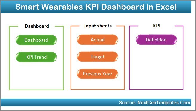
The Home Sheet works as an index or navigation page.
Key Features of the Home Sheet
-
Provides 6 clickable buttons
-
Allows instant navigation to each worksheet
-
Improves user experience and usability
-
Eliminates confusion for first-time users
Therefore, users never waste time searching for the right sheet.
2. What Does the Dashboard Sheet Tab Show?
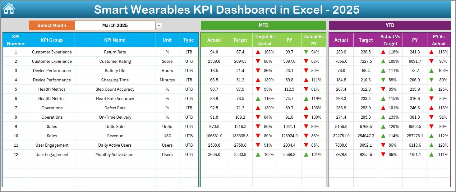
The Dashboard Sheet acts as the heart of the entire template.
Key Highlights of the Dashboard Sheet
-
Month selection drop-down available at cell D3
-
Dynamic KPI values that change based on the selected month
-
Clear comparison between:
-
MTD Actual vs Target
-
MTD Actual vs Previous Year
-
YTD Actual vs Target
-
YTD Actual vs Previous Year
-
Visual Enhancements
-
Conditional formatting with up and down arrows
-
Quick identification of performance gaps
-
Clean and professional layout
As a result, stakeholders can immediately understand where performance stands.
3. How Does the KPI Trend Sheet Help in Analysis?
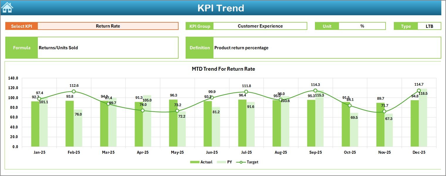
The KPI Trend Sheet focuses on deep KPI-level insights.
Interactive Features
-
KPI selection drop-down at cell C3
-
Automatic display of:
-
KPI Group
-
KPI Unit
-
KPI Type (Upper the Better / Lower the Better)
-
KPI Formula
-
KPI Definition
-
Visual Trends
-
MTD trend charts
-
YTD trend charts
-
Comparison between Actual, Target, and Previous Year
Thus, users can analyze both short-term and long-term trends easily.
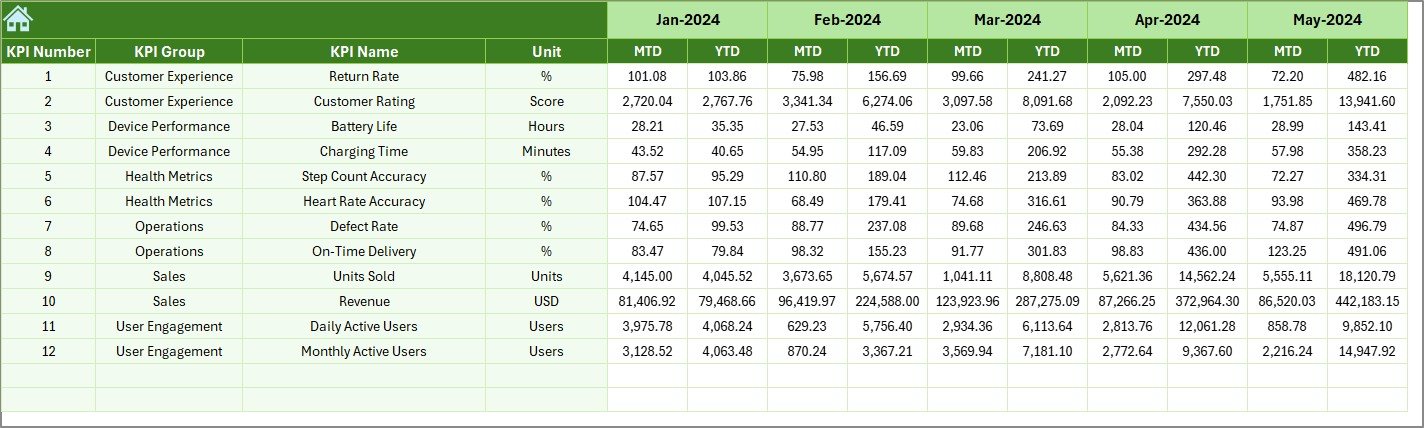
4. What Is the Actual Numbers Input Sheet Used For?
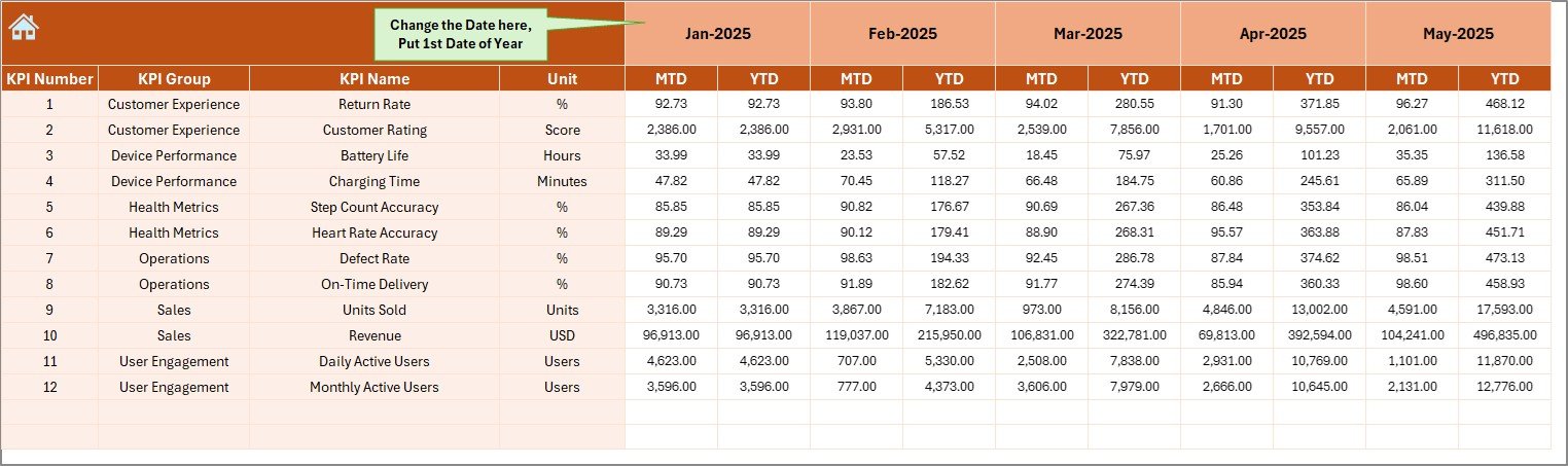
The Actual Numbers Input Sheet stores real performance data.
How This Sheet Works
-
Enter MTD and YTD actual values
-
Change the first month of the year using cell E1
-
Automatically updates all calculations
Because of this structure, data entry remains simple and controlled.
Click to Purchases Smart Wearables KPI Dashboard in Excel
5. Why Is the Target Sheet Tab Important?
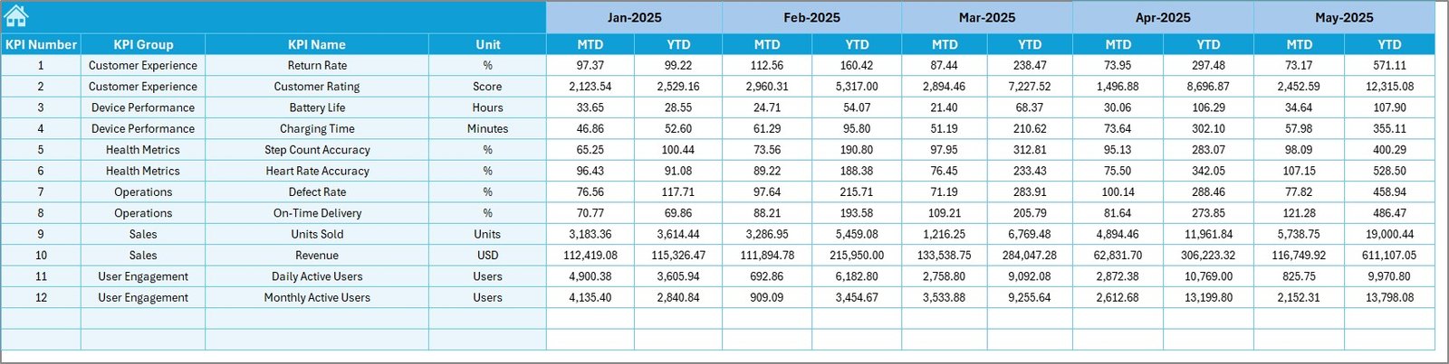
The Target Sheet defines performance expectations.
Key Benefits
-
Enter monthly MTD and YTD targets
-
Enables clear performance benchmarking
-
Supports variance analysis
Therefore, teams always know what success looks like.
6. How Does the Previous Year Number Sheet Improve Insights?
The Previous Year Number Sheet enables year-over-year comparison.
Why This Matters
-
Highlights growth or decline trends
-
Helps identify seasonal patterns
-
Supports long-term strategy planning
As a result, businesses make informed decisions based on historical data.
7. What Is the Role of the KPI Definition Sheet?
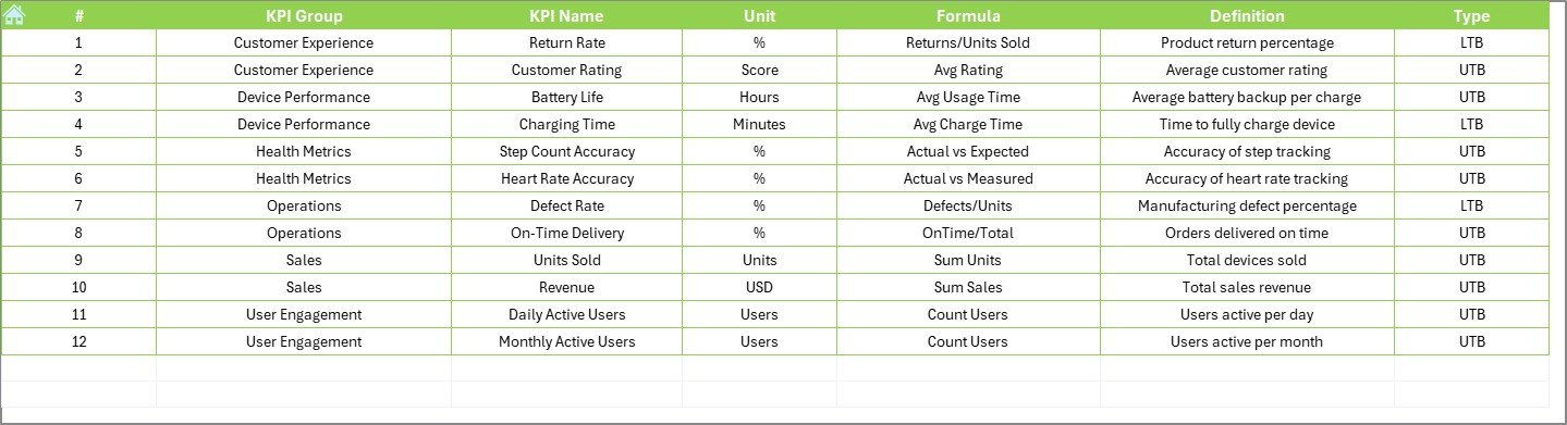
The KPI Definition Sheet acts as a KPI dictionary.
Information Captured
-
KPI Name
-
KPI Group
-
KPI Unit
-
KPI Formula
-
KPI Definition
This sheet ensures consistency and avoids confusion across teams.
What KPIs Can You Track in a Smart Wearables KPI Dashboard?
This dashboard supports multiple KPI categories, such as:
-
Device usage performance
-
Battery efficiency metrics
-
User engagement KPIs
-
Data accuracy indicators
-
Health and fitness tracking metrics
-
Manufacturing and quality KPIs
As a result, the dashboard adapts to different business models.
Advantages of Smart Wearables KPI Dashboard in Excel
Using this dashboard delivers multiple advantages.
Key Advantages
-
✅ Centralized KPI tracking
-
✅ Easy-to-use Excel interface
-
✅ No advanced technical skills required
-
✅ Faster decision-making
-
✅ Real-time MTD and YTD visibility
-
✅ Professional and presentation-ready layout
Therefore, businesses gain clarity without complexity.
How Does This Dashboard Improve Decision-Making?
This dashboard improves decisions in several ways.
-
First, it highlights underperforming KPIs instantly
-
Second, it compares targets with actuals clearly
-
Third, it visualizes trends instead of raw numbers
-
Finally, it supports data-driven planning
As a result, leadership teams act with confidence.
Who Should Use a Smart Wearables KPI Dashboard in Excel?
This dashboard fits a wide range of users.
Ideal Users
-
Smart wearable product managers
-
Operations and performance analysts
-
Health technology startups
-
IoT analytics teams
-
Business owners and consultants
Because of its flexibility, it scales easily with business growth.
Best Practices for the Smart Wearables KPI Dashboard in Excel
Click to Purchases Smart Wearables KPI Dashboard in Excel
Following best practices ensures accurate insights.
Recommended Best Practices
-
📌 Update actual data regularly
-
📌 Maintain consistent KPI definitions
-
📌 Review targets quarterly
-
📌 Use the trend sheet for strategic reviews
-
📌 Avoid manual overwriting of formulas
-
📌 Train users on navigation and inputs
By following these practices, you maximize dashboard value.
How to Maintain Data Accuracy in the Dashboard?
Data accuracy depends on discipline and structure.
-
Always validate input numbers
-
Lock formula cells where needed
-
Use consistent units across KPIs
-
Review previous year data annually
As a result, insights remain reliable and actionable.
Can This Dashboard Support Business Growth?
Yes, absolutely.
As smart wearable businesses scale, KPI complexity increases. Therefore, this dashboard acts as a scalable foundation. Moreover, users can add new KPIs, adjust targets, and extend trend analysis without rebuilding the structure.
Conclusion: Why Choose a Smart Wearables KPI Dashboard in Excel?
A Smart Wearables KPI Dashboard in Excel simplifies performance tracking while maintaining analytical depth. It transforms raw wearable data into meaningful insights using a familiar Excel environment.
Because it combines ease of use, visual clarity, and structured KPI management, this dashboard becomes an essential tool for any smart wearable business aiming for data-driven success.
Frequently Asked Questions (FAQs)
What Is a Smart Wearables KPI Dashboard in Excel?
It is a centralized Excel-based tool that tracks and visualizes smart wearable KPIs using MTD, YTD, target, and previous year data.
Do I Need Advanced Excel Skills to Use This Dashboard?
No. The dashboard uses simple inputs, drop-downs, and automated calculations.
Can I Customize KPIs in This Dashboard?
Yes. You can add, edit, or remove KPIs using the KPI Definition Sheet.
Does the Dashboard Support Monthly Analysis?
Yes. You can select any month from the drop-down and analyze performance instantly.
Can I Compare Performance with the Previous Year?
Yes. The dashboard includes a dedicated Previous Year sheet for year-over-year analysis.
Is This Dashboard Suitable for Presentations?
Yes. The clean layout and visual indicators make it presentation-ready.
Can This Dashboard Grow with My Business?
Yes. You can easily expand KPIs and data as your smart wearables business scales.
Visit our YouTube channel to learn step-by-step video tutorials