In today’s fast-paced digital world, brands must track social media metrics to stay ahead of competitors. A Social Media Performance Dashboard in Power BI delivers deep insights, clear visuals, and real-time updates that empower marketing teams to make data-driven decisions. In this article, you’ll discover everything you need to know about creating, configuring, and optimizing a Social Media Performance Dashboard using Power BI.
Click to Purchases Social Media Performance Dashboard in Power BI
What Is a Social Media Performance Dashboard?
A Social Media Performance Dashboard collects, visualizes, and analyzes social media data from platforms like Facebook, Twitter, Instagram, and LinkedIn. Rather than juggling multiple reports, you view critical metrics in one centralized interface. Consequently, you identify trends, spot underperforming campaigns, and optimize content faster.
Moreover, integrating your Excel dataset with Power BI lets you update visuals with a single click. Therefore, your team always works with the latest numbers.
Why Use Power BI for Social Media Analytics?
Power BI excels at transforming raw data into interactive visuals. Here’s why it stands out:
-
Seamless Data Integration
You pull data from Excel, CSV, APIs, or cloud services. Then, Power BI handles transformations and merges with ease. -
Real-Time Insights
When you refresh your dataset, dashboards update instantly. Thus, you avoid outdated reports. -
Rich Visualization Library
From cards and line charts to heat maps and tree maps, Power BI offers varied visuals to match any analytics need. -
Collaborative Sharing
You publish dashboards to the Power BI Service. Then, team members access them on web or mobile apps. As a result, everyone stays aligned. -
Scalability
Whether you track five or five hundred campaigns, Power BI can handle large datasets without lag.
Furthermore, Power BI’s affordability makes it ideal for small businesses and enterprise teams alike.
Click to Purchases Social Media Performance Dashboard in Power BI
Key Features of the Dashboard
This ready-to-use dashboard uses an Excel file as its data source. You import that file into Power BI Desktop and build five distinct pages. Each page serves a different analytical need. Let’s explore each one.
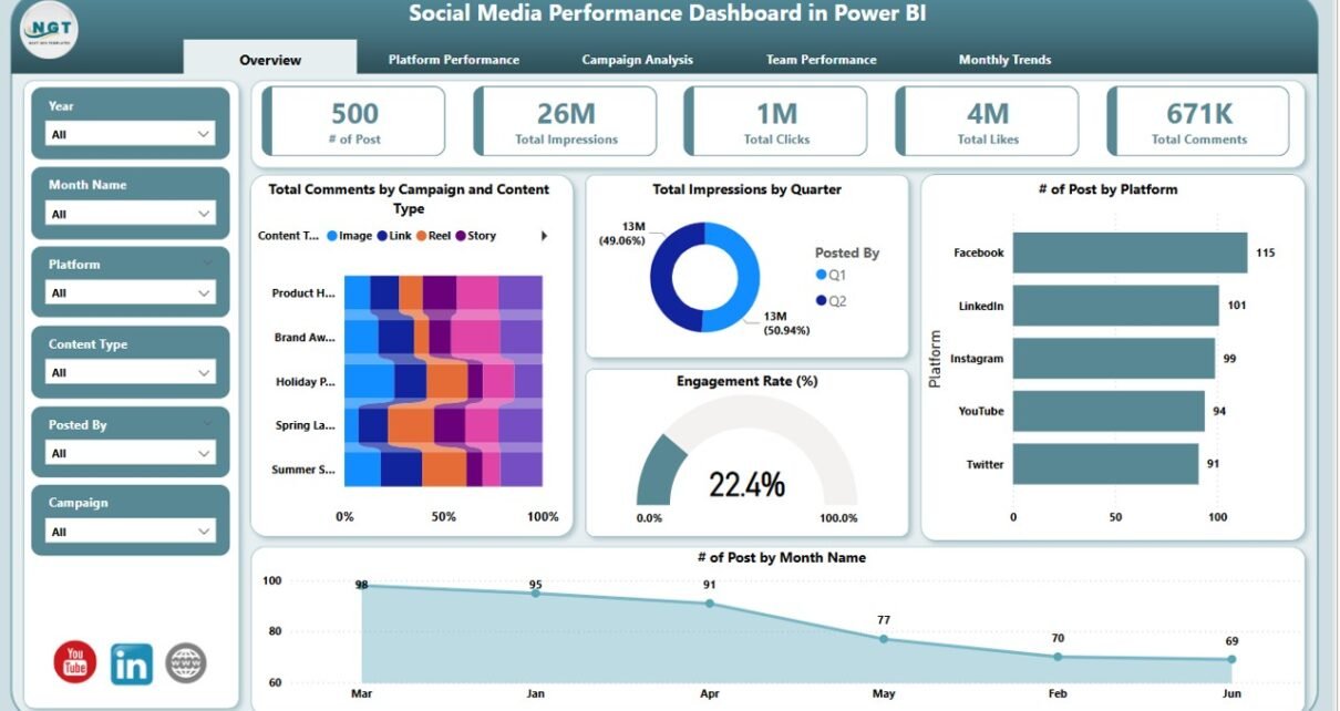
Overview Page

The Overview Page gives you a bird’s-eye view of social media performance.
Six Slicers let you filter by:
- Date range
- Platform
- Campaign
- Content Type
- Posted By
Five Cards display:
- Total Comments (by campaign and content type)
- Total Impressions (by quarter)
- Number of Posts (by platform)
- Engagement Rate (%)
- Number of Posts (by month)
-
Five Charts include:
- Comments by Campaign & Content Type (stacked column)
- Impressions by Quarter (area chart)
- Posts by Platform (bar chart)
- Engagement Rate Over Time (line chart)
- Posts by Month Name (column chart)
As a result, you spot overall trends and major shifts instantly.
Platform Performance Page

On the Platform Performance Page, you drill into each social network’s impact.
-
Six Slicers remain the same for consistent filtering.
Click to Purchases Social Media Performance Dashboard in Power BI
Four Charts highlight:
- Total Likes (by platform)
- Total Impressions (by platform)
- Total Shares (by platform)
- Total Clicks (by platform)
By comparing these metrics side by side, you quickly pinpoint which channels drive the most engagement.
Campaign Analysis Page

The Campaign Analysis Page shifts focus to individual marketing efforts.
-
Six Slicers for flexible slice-and-dice.
Four Charts display:
- Total Likes by Campaign
- Total Impressions by Content Type
- Total Shares by Content Type
- Total Reach by Content Type
Therefore, you learn which campaigns and content types resonate best with your audience.
Team Performance Page

The Team Performance Page evaluates individual or group contributions.
-
Six Slicers ensure consistency.
Four Charts cover:
- Total Likes by Posted By
- Total Impressions by Posted By
- Total Clicks by Posted By
- Engagement Rate (%) by Posted By
Moreover, this page fosters accountability. Marketing managers can reward top performers and coach those who need improvement.
Monthly Trends Page

Finally, the Monthly Trends Page uncovers seasonality and long-term shifts.
-
Six Slicers carry over to maintain context.
Three Charts include:
- Impressions & Engagement Rate (%) by Month Name (combo chart)
- Total Impressions by Month Name (column chart)
- Engagement Rate (%) by Month Name (line chart)
Subsequently, you detect peak months and off-season lulls. Then, you adjust posting schedules or campaign budgets accordingly.
Advantages of Social Media Performance Dashboard
Implementing a Social Media Performance Dashboard yields numerous benefits. Consider these key advantages:
-
Centralized Reporting
You consolidate scattered data sources into one view. Consequently, you save hours previously spent toggling between tools. -
Faster Decision-Making
Real-time visuals highlight issues immediately. Therefore, you can pivot campaigns within minutes, not days. -
Improved Content Strategy
By seeing which posts drive the most clicks or shares, you refine content themes and formats. -
Enhanced ROI Measurement
You link spend to outcomes with precision. Moreover, tracking campaign performance and engagement rates clarifies budget allocation. -
Team Visibility & Accountability
Individual performance metrics motivate team members and encourage healthy competition. -
Trend Identification
Seasonal trends surface fast on the Monthly Trends Page. As a result, you plan peak-period campaigns in advance. -
Scalability
You adapt the dashboard to include new platforms, campaigns, or KPIs as your strategy evolves.
Furthermore, stakeholders appreciate clear visuals over raw tables. Therefore, dashboards boost executive buy-in and support.
Click to Purchases Social Media Performance Dashboard in Power BI
Best Practices for a Social Media Performance Dashboard
To maximize dashboard impact, follow these best practices:
-
Clean and Structure Your Data
-
Ensure consistent date formats.
-
Use clear naming for campaigns and content types.
-
Eliminate duplicate records.
-
-
Use Meaningful Slicers
-
Limit slicers to the most relevant filters.
-
Group related slicers together for intuitive navigation.
-
-
Choose the Right Visuals
-
Use cards for single metrics (e.g., total comments).
-
Use line charts for trends.
-
Use bar or column charts for comparisons.
-
-
Keep It Simple
-
Avoid clutter by limiting each page to 3–5 visuals.
-
Use white space strategically to guide viewers’ eyes.
-
-
Apply Consistent Branding
-
Match colors to your brand palette.
-
Use uniform fonts and styles across pages.
-
-
Add Clear Titles and Labels
-
Title each visual descriptively (e.g., “Likes by Platform”).
-
Label axes and data points for clarity.
-
-
Document Your Calculations
-
Create a separate “Data Model” page if needed.
-
Explain any custom measures or DAX formulas in tooltips.
-
-
Test with End Users
-
Collect feedback from team members.
-
Adjust slicers and visuals based on their workflows.
-
-
Schedule Regular Refreshes
-
Set up daily or hourly data refreshes in Power BI Service.
-
Ensure your Excel file remains accessible or switch to cloud storage.
-
-
Review and Iterate
-
Hold monthly review sessions.
-
Refine visuals and add new KPIs as strategy shifts.
-
By following these practices, you create a dashboard that stays relevant, actionable, and user-friendly.
How to Set Up Your Dashboard in Power BI
Building your dashboard involves a few clear steps. Consequently, you can replicate this process and tailor it to any social media strategy.
Prepare Your Excel Data
- Create one table for raw metrics (date, platform, campaign, content type, likes, comments, shares, clicks, impressions).
- Format it as an Excel Table (Insert → Table).
- Save the file to OneDrive or SharePoint for seamless refresh.
Import Data into Power BI Desktop
- Click Get Data → Excel.
- Select your file and choose the table.
- Click Transform Data to open Power Query.
Transform and Clean Data
- Rename columns for clarity (e.g., “PostDate,” “PlatformName”).
- Convert date columns to Date type.
- Filter out any blank or irrelevant rows.
- Close & apply changes.
Create Relationships (If Needed)
-
If you have lookup tables (e.g., list of platforms), link them via the Model view.
- Ensure a one-to-many relationship from lookup to fact table.
- Use New Measure in the Modeling tab.
Design Each Page
- Overview Page: Add slicers, cards, and combo charts.
- Platform Performance: Insert clustered bar charts.
- Campaign Analysis: Use stacked bar or donut charts.
- Team Performance: Use bar charts and gauge visuals for rates.
- Monthly Trends: Combine line and column visuals in a combo chart.
Format Visuals
- Apply your brand’s color theme via the View pane.
- Set data labels and tooltips on each visual.
- Adjust titles, fonts, and backgrounds for readability.
Add Navigation Buttons
- On the Home Page, insert buttons that link to each report page.
- Use Action settings to enable page navigation.
Publish and Configure Refresh
- Publish your report to Power BI Service.
- Go to Datasets, click Schedule refresh, and enter credentials for your Excel file.
Share with Stakeholders
- Grant workspace access or share individual dashboards.
- Embed in Teams channels or on SharePoint sites for broader visibility.
Once live, your dashboard will auto-refresh and provide up-to-date insights at a glance.
Conclusion
Power BI transforms social media data into actionable insights with intuitive visuals and real-time updates. By implementing a Social Media Performance Dashboard, you centralize reporting, accelerate decision-making, and refine your content strategy based on hard data. Remember to follow best practices—keep visuals clear, data clean, and branding consistent. Then, schedule regular reviews to evolve your dashboard as your marketing goals change.
Frequently Asked Questions
1. What Metrics Should I Track on a Social Media Dashboard?
Track core engagement metrics—likes, comments, shares, clicks, impressions—and derived KPIs like engagement rate. Then, slice by platform, campaign, and content type for deeper insights.
2. How Often Should I Refresh My Dashboard?
Daily refresh works for most teams. However, if you run time-sensitive campaigns, schedule hourly refreshes. Remember that refresh frequency depends on your data source and Power BI Service limits.
3. Can I Use Live APIs Instead of Excel?
Yes. You can connect directly to social media APIs (e.g., Facebook Graph API) using Power BI’s Web connector. Then, schedule more frequent refreshes without relying on manual Excel updates.
-
Cards for single-number KPIs (e.g., total comments)
-
Line charts for trends over time
-
Bar/column charts for platform or campaign comparisons
-
Combo charts for plotting rate and volume on the same axis
7. How Can I Share My Dashboard with Non-Power BI Users?
Export to PDF or PowerPoint for static reports. Alternatively, embed dashboards in SharePoint or Teams, where users can view (but not edit) within their browsers.
8. What Are Common Pitfalls to Avoid?
-
Overloading pages with too many visuals
-
Ignoring data quality issues
-
Failing to document custom measures
-
Using inconsistent date formats
Visit our YouTube channel to learn step-by-step video tutorials
Click to Purchases Social Media Performance Dashboard in Power BI