Soil testing services play a critical role in modern agriculture, agribusiness, and environmental management. Farmers, laboratories, and agri-consultants rely on soil testing results to improve crop yield, manage nutrients, and ensure soil sustainability. However, managing soil test data manually creates confusion, delays reporting, and increases the risk of errors. Therefore, professionals increasingly adopt a Soil Testing Services Dashboard in Excel to gain clarity, speed, and control.
A Soil Testing Services Dashboard in Excel transforms raw soil testing data into meaningful insights through interactive charts, KPIs, and visuals. Instead of checking multiple sheets or static reports, users can analyze performance, turnaround time, revenue, and lab efficiency from one centralized dashboard. As a result, decision-making becomes faster, smarter, and more reliable.
In this detailed article, you will learn everything about the Soil Testing Services Dashboard in Excel. Moreover, this guide explains how the dashboard works, its page-wise structure, key advantages, best practices, and frequently asked questions. Additionally, the language stays simple and practical so that anyone can understand and implement it confidently.
Soil Testing Services Dashboard in Excel
What Is a Soil Testing Services Dashboard in Excel?
A Soil Testing Services Dashboard in Excel is a ready-to-use analytical tool designed to monitor, analyze, and visualize soil testing operations. It consolidates data related to soil samples, test types, crops, laboratories, turnaround time, pending tests, and revenue into one interactive Excel file.
Instead of relying on scattered data or manual summaries, users view all critical information in real time. Consequently, labs improve efficiency, customers receive faster results, and management gains full operational visibility.
Because Excel remains widely available and user-friendly, this dashboard works perfectly for small soil labs, large testing centers, agricultural consultants, and government agencies.
Why Do Soil Testing Services Need a Dashboard in Excel?
Soil testing services handle large volumes of samples, test parameters, crops, and customers every month. Without a structured system, data tracking becomes difficult. Therefore, a dashboard becomes essential.
Key challenges without a dashboard:
-
Delayed test result analysis
-
Poor visibility into pending tests
-
Difficulty tracking turnaround time
-
Limited revenue insights
-
Manual reporting errors
However, a Soil Testing Services Dashboard in Excel solves these issues by centralizing all data and automating analysis.
Key Features of the Soil Testing Services Dashboard in Excel
This dashboard comes as a ready-to-use Excel desktop application. It includes a clean design, interactive slicers, and multiple analytical pages.
Page Navigator
-
Located on the left side
-
Allows quick navigation between dashboard pages
-
Improves user experience and efficiency
-
Soil Testing Services Dashboard in Excel
Right-Side Slicers
-
Filter data by month, lab, crop, test type, or region
-
Instantly update all charts and KPIs
Dashboard Structure – Page-Wise Explanation
The Soil Testing Services Dashboard in Excel contains 5 main analytical pages, along with a support data sheet.
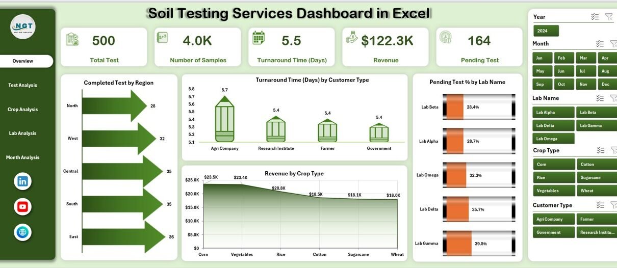
1. Overview Page – How Do You Get a Quick Business Snapshot?
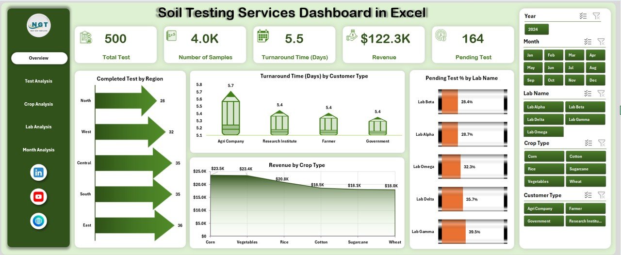
The Overview Page serves as the main landing page of the dashboard. It provides a high-level view of overall performance.
Key Elements
-
Right-side slicers for easy filtering
-
4 KPI cards displaying summarized metrics
Charts on the Overview Page
-
Completed Test by Region
Helps identify high-performing and low-performing regions. -
Turnaround Time by Customer Type
Highlights service efficiency across different customer categories. -
Pending Test % by Lab Name
Shows backlog status and workload distribution. -
Revenue by Crop Type
Reveals which crops generate the highest testing revenue.
This page allows management to quickly understand performance trends before drilling deeper.
2. Test Analysis Page – How Efficient Are Different Test Types?
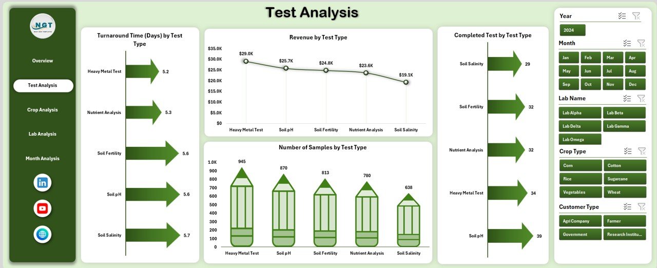
The Test Analysis Page focuses on test-level performance.
Charts on the Test Analysis Page
-
Turnaround Time by Test Type
Identifies tests that take longer to complete. -
Revenue by Test Type
Shows which test services drive profitability. -
Completed Test by Test Type
Highlights testing volume and demand. -
Number of Samples by Test Type
Tracks workload distribution across tests.
This page helps labs optimize testing processes and pricing strategies.
3. Crop Analysis Page – Which Crops Drive Testing Demand?
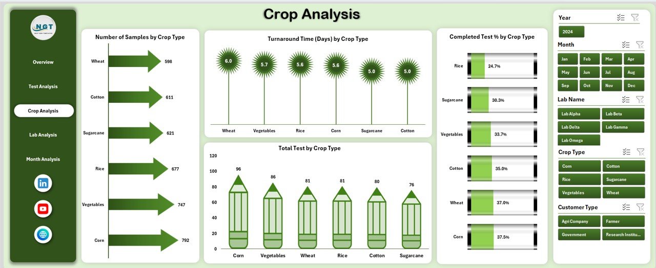
The Crop Analysis Page analyzes soil testing data by crop category.
Charts on the Crop Analysis Page
-
Number of Samples by Crop Type
Shows crop-wise sample volume. -
Turnaround Time by Crop Type
Identifies crops requiring faster processing. -
Completed Test % by Crop Type
Measures completion efficiency. -
Total Test by Crop Type
Tracks overall testing demand by crop.
This analysis supports better resource planning and seasonal forecasting.
4. Lab Analysis Page – How Do Different Labs Perform?
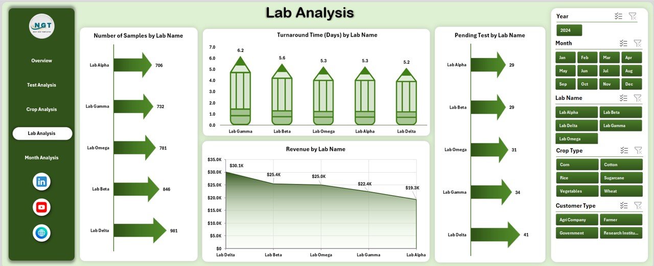
The Lab Analysis Page evaluates performance across multiple laboratories.
Charts on the Lab Analysis Page
-
Number of Samples by Lab Name
Measures workload per lab. -
Turnaround Time by Lab Name
Identifies delays or efficiency gaps. -
Pending Test by Lab Name
Highlights operational bottlenecks. -
Revenue by Lab Name
Compares financial contribution across labs.
This page helps management allocate resources effectively and improve lab productivity.
5. Month Analysis Page – How Does Performance Change Over Time?
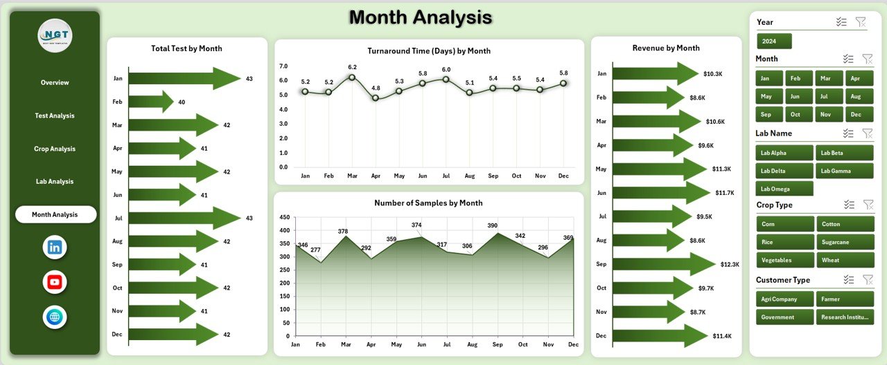
The Month Analysis Page tracks time-based trends.
Charts on the Month Analysis Page
-
Total Test by Month
Shows seasonal demand patterns. -
Turnaround Time by Month
Tracks service efficiency trends. -
Revenue by Month
Analyzes financial growth. -
Number of Samples by Month
Highlights workload fluctuations.
This page supports trend analysis and strategic planning.
Soil Testing Services Dashboard in Excel
Support Sheets – How Does the Dashboard Work in the Background?
Data Sheet
-
Stores raw soil testing data
-
Acts as the backbone of the dashboard
-
Automatically feeds all charts and KPIs
Support sheets ensure data accuracy and smooth dashboard performance.
Advantages of a Soil Testing Services Dashboard in Excel
A Soil Testing Services Dashboard in Excel offers multiple benefits for operational and strategic decision-making.
1. Centralized Data Management
-
Combines all soil testing data in one place
-
Eliminates scattered spreadsheets
2. Faster Decision-Making
-
Real-time insights improve response time
-
Managers act quickly on performance gaps
3. Improved Turnaround Time
-
Identifies delays by test, crop, or lab
-
Supports process optimization
4. Better Revenue Visibility
-
Tracks revenue by crop, test, lab, and month
-
Supports pricing and sales strategies
5. Enhanced Operational Control
-
Monitors pending tests and workload
-
Prevents backlog accumulation
6. User-Friendly and Cost-Effective
-
Requires only basic Excel knowledge
-
Avoids expensive software investments
How Does This Dashboard Support Decision-Making?
This dashboard converts raw numbers into actionable insights.
It helps users:
-
Identify underperforming labs
-
Reduce test turnaround time
-
Improve customer satisfaction
-
Forecast seasonal demand
-
Increase revenue efficiency
As a result, organizations operate with greater confidence and accuracy.
Who Should Use a Soil Testing Services Dashboard in Excel?
This dashboard suits a wide range of users:
-
Soil testing laboratories
-
Agricultural service providers
-
Agri-consultants
-
Research institutions
-
Government agriculture departments
-
Fertilizer and seed companies
Because Excel remains flexible, organizations of any size can adopt it easily.
Best Practices for the Soil Testing Services Dashboard in Excel
Following best practices ensures long-term dashboard success.
1. Maintain Clean and Accurate Data
-
Validate entries regularly
-
Use consistent naming conventions
2. Update Data Frequently
-
Refresh data daily or weekly
-
Avoid outdated insights
3. Use Slicers Wisely
-
Apply filters to focus on key metrics
-
Avoid over-filtering
4. Monitor Turnaround Time Regularly
-
Identify delays early
-
Improve service quality
5. Review Performance Monthly
-
Compare trends over time
-
Adjust operational strategies
6. Train Users Properly
-
Ensure users understand navigation
-
Encourage data-driven culture
How Can You Customize This Dashboard Further?
Soil Testing Services Dashboard in Excel
You can easily enhance this dashboard by:
-
Adding new KPIs
-
Including customer satisfaction metrics
-
Integrating cost analysis
-
Connecting Power BI for advanced analytics
-
Automating data refresh with Power Query
Excel’s flexibility makes customization simple and scalable.
Common Mistakes to Avoid While Using the Dashboard
-
Ignoring data validation
-
Overloading charts with too much data
-
Not reviewing insights regularly
-
Using inconsistent data formats
Avoiding these mistakes improves accuracy and usability.
Conclusion – Why Should You Use a Soil Testing Services Dashboard in Excel?
A Soil Testing Services Dashboard in Excel provides clarity, control, and confidence in managing soil testing operations. It replaces manual reporting with automated insights, improves turnaround time, and enhances revenue tracking.
Moreover, this dashboard supports better planning, operational efficiency, and customer satisfaction. Because it uses Excel, it remains affordable, flexible, and easy to use. Therefore, any soil testing organization aiming for growth and efficiency should adopt this dashboard without hesitation.
Frequently Asked Questions (FAQs)
What is a Soil Testing Services Dashboard in Excel?
A Soil Testing Services Dashboard in Excel is an interactive reporting tool that visualizes soil testing data for analysis and decision-making.
Who can use this dashboard?
Soil labs, agricultural consultants, government agencies, and agribusinesses can use it.
Do I need advanced Excel skills?
No, basic Excel knowledge is sufficient to use the dashboard.
Can I customize the dashboard?
Yes, you can add KPIs, charts, and filters as per your requirements.
Does this dashboard support monthly analysis?
Yes, the Month Analysis page tracks trends over time.
Can this dashboard improve turnaround time?
Yes, it highlights delays and helps optimize processes.
Visit our YouTube channel to learn step-by-step video tutorials


