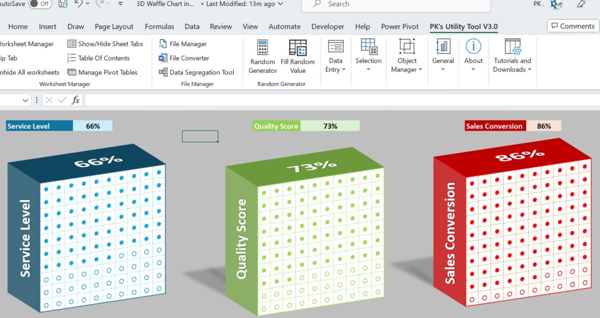
Introduction to 3D Waffle Charts in Excel
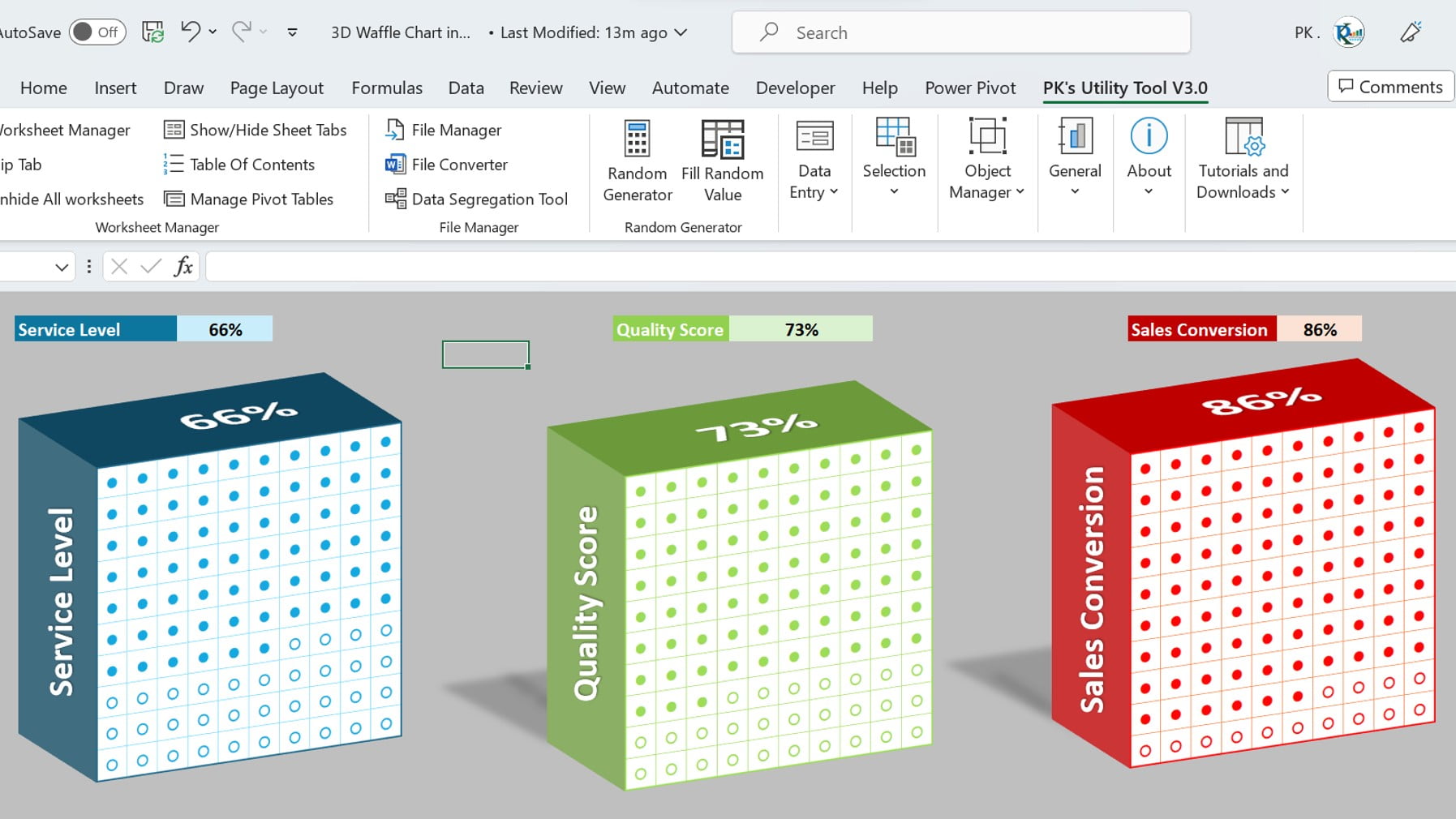
Did you know that you can create stunning 3D waffle charts directly in Excel? This underutilized chart type not only looks great but can enhance the user experience, especially when showcasing KPI metrics like Service Level and Gross Margin.
Click to buy Mind-Blowing Excel Hack: 3D Waffle Charts in Just Steps
Advantages of Using 3D Waffle Charts:
Enhanced Data Representation: Unlike traditional charts, 3D Waffle Charts offer a unique and visually appealing way to display data.
- Versatility: From KPI dashboards to general data representation, these charts are fit for diverse applications.
- Engagement: Their distinct look can engage viewers more than the typical bar or pie chart.
- Easy Comparison: Particularly beneficial when tracking KPI metrics to quickly gauge performance.
Opportunities for Improvement in 3D Waffle Chart Creation:
- Incorporate More Data Types: Currently, it’s best suited for specific KPI metrics. There’s an opportunity to expand its use to other data types.
- Integration with Other Software: The future might see integrations that allow for seamless export/import of these charts across different platforms.
- Automation: With advancements, we might soon be able to auto-generate such charts with just a click, based on the given data.
Best Practices for Crafting Perfect 3D Waffle Charts:
- Always Use Clear Labels: Ensure that your audience understands the data presented.
- Stay Consistent with Colors: If using multiple 3D waffle charts, maintain a consistent color scheme.
- Limit Data Points: To keep the chart clean and readable, avoid overloading it with too many data points.
- Test for Different Devices: Ensure your chart looks good on both desktop and mobile, especially if integrating it into online platforms.
How to Create a 3D Waffle Chart in Excel?
Luckily, the creation process has been simplified for you. We’ve designed a step-by-step tutorial to help you through this process. Watch the below given video to learn how to create a 3D Waffle Chart in Excel-
Watch the step-by-step video tutorial:
Click to buy Mind-Blowing Excel Hack: 3D Waffle Charts in Just Steps
Frequently Asked Questions:
Q: Can I use 3D Waffle Charts for any data type?
Initially, they seem versatile. However, they’re best suited for specific KPI metrics. Nevertheless, with a bit of creativity, you can adapt them for various data representations.
Q: Is there any additional software needed to create these charts?
No, not at all. In fact, you can craft these directly in Excel using the methods we’ve highlighted. Moreover, our tutorial simplifies the entire process for you.
Q: How long does it usually take to master this chart type?
Well, starting off, with the tutorial provided, you can begin designing these charts almost immediately. Yet, as with anything, achieving mastery might take a few practices. On the other hand, the learning curve is relatively short, so you’ll be a pro before you know it!
Q: Are 3D Waffle Charts mobile-friendly?
Typically, they are designed for desktop view. However, given the shift towards mobile usage, it’s essential to test and ensure they are mobile-friendly too. Consequently, always check on multiple devices to ensure compatibility.
Q: How do 3D Waffle Charts compare to traditional charts in Excel?
Well, traditional charts have their place, of course. But, if you’re looking for a fresh and engaging way to display data, 3D Waffle Charts are the way to go. Additionally, they can offer a unique perspective on data visualization that traditional charts might not provide.
Conclusion
Ever looked at Excel and thought it could be jazzier? 3D Waffle Charts are the answer. Seriously, they’re not just cool to look at but make understanding data a breeze. Why stick to the usual when there’s a fun, better way? Try them, and see the difference.
Visit our YouTube channel to learn step-by-step video tutorials
Click to buy Mind-Blowing Excel Hack: 3D Waffle Charts in Just Steps