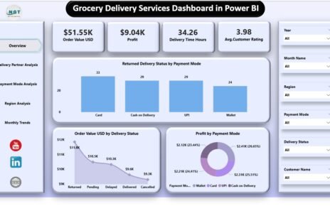
The grocery delivery industry continues to grow every year. Customers now expect fast delivery, fresh products, flexible payment options, and
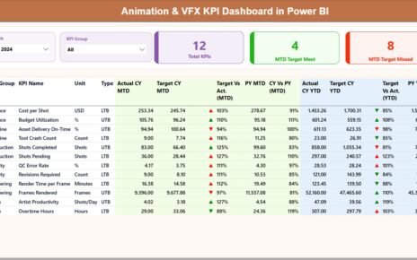
In today’s fast-moving animation and visual effects industry, studios face constant pressure to deliver high-quality output on time and within
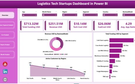
Logistics tech startups operate in a highly competitive and fast-evolving ecosystem. Funding pressure, customer expectations, rising fuel costs, and technology