The steel and metals industry runs on precision. Every small shift in production, energy cost, or customer demand impacts revenue and operational stability. Because companies generate a huge volume of data every day, leaders struggle to monitor KPIs, track costs, and measure performance in real time. As a result, decision-making slows down, operational gaps increase, and growth opportunities slip away.
A Steel & Metals Dashboard in Power BI solves this challenge. It brings all production, financial, quality, and energy KPIs into a single interactive dashboard. You view daily performance, monthly trends, department analysis, plant-wise insights, and product-level performance within seconds. Since Power BI offers strong visuals and automation, you enjoy faster reporting with clear insights.
In this detailed guide, you will explore what this dashboard does, how it works, its important pages, key features, advantages, best practices, and answers to common questions.
Click to Purchases Steel & Metals Dashboard in Power BI
What Is a Steel & Metals Dashboard in Power BI?
A Steel & Metals Dashboard in Power BI is a ready-to-use performance monitoring solution designed for steel mills, metal fabrication units, production plants, rolling mills, manufacturing companies, supply chain teams, and energy management departments. It converts raw data into clean visual insights so you track all important KPIs in one view.
You track:
-
Production output
-
Finished goods percentage
-
Revenue and costs
-
Energy consumption
-
Customer satisfaction
-
Plant performance
-
Monthly and yearly trends
-
Department-wise operations
-
Product-level revenue and cost
This dashboard helps every manager, supervisor, and decision-maker understand daily operations and take faster actions.
Why Do Steel & Metals Companies Need a Power BI Dashboard?
Steel and metals operations involve multiple departments such as production, procurement, quality control, logistics, finance, and maintenance. Each department manages different data sets. Because of this, leaders do not get a connected view of the full business cycle.
A Power BI dashboard solves this by giving:
-
Instant visibility into revenue, cost, and production trends
-
Real-time monitoring of plant and product performance
-
Clear insights into high-cost areas
-
Accurate comparison between departments
-
Fast decision-making using live dashboards
When you use this dashboard, you spend less time collecting data and more time analyzing it.
Key Features of the Steel & Metals Dashboard in Power BI
This dashboard includes 5 detailed pages, each designed to give a clear and simple view of KPIs.
Below is the rewritten and expanded version of your provided information.
1. Overview Page – What Does the Business Look Like Today?

The Overview Page is the main page of the dashboard. It gives a quick summary of the entire steel and metals operation. You understand the overall performance within a few seconds.
What You See on the Overview Page:
✔️ Five Key KPI Cards
These cards highlight important numbers, such as:
-
Completed Product %
-
Total Revenue (USD)
-
Total Cost (USD)
-
Customer Satisfaction
-
Production Efficiency
These numbers show the current business condition and help leaders take quick decisions.
✔️ Four Insightful Charts
The page includes:
-
Completed Product % by Production Unit
-
Revenue (USD) and Total Cost (USD) by Production Unit
-
Customer Satisfaction by Region
-
Production Cost (USD) by Department
These visuals help you identify:
-
High-performing production units
-
Cost-heavy locations
-
Regions with low customer satisfaction
-
Departments that need control
Because all charts update based on filters, you see the exact insights you want.
2. Department Analysis Page – Which Department Performs Better?
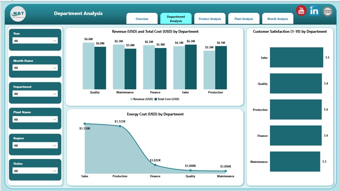
This page helps you compare department-level KPIs. It brings transparency across teams and encourages accountability.
Charts on the Department Analysis Page:
✔️ Revenue (USD) and Total Cost (USD) by Department
You understand:
-
Which department generates the highest revenue
-
Which department consumes the most cost
-
Profit gaps between units
This helps managers reduce cost and improve margins.
✔️ Customer Satisfaction by Department
You track how each department impacts customer experience.
✔️ Energy Cost (USD) by Department
Click to Purchases Steel & Metals Dashboard in Power BI
Energy cost is one of the biggest expenses in steel and metals operations. This chart helps identify:
-
High energy-consuming areas
-
Departments that need efficiency improvements
-
Trends in energy usage
Because the chart updates dynamically, leaders take decisions with confidence.
3. Product Analysis Page – How Do Products Perform?
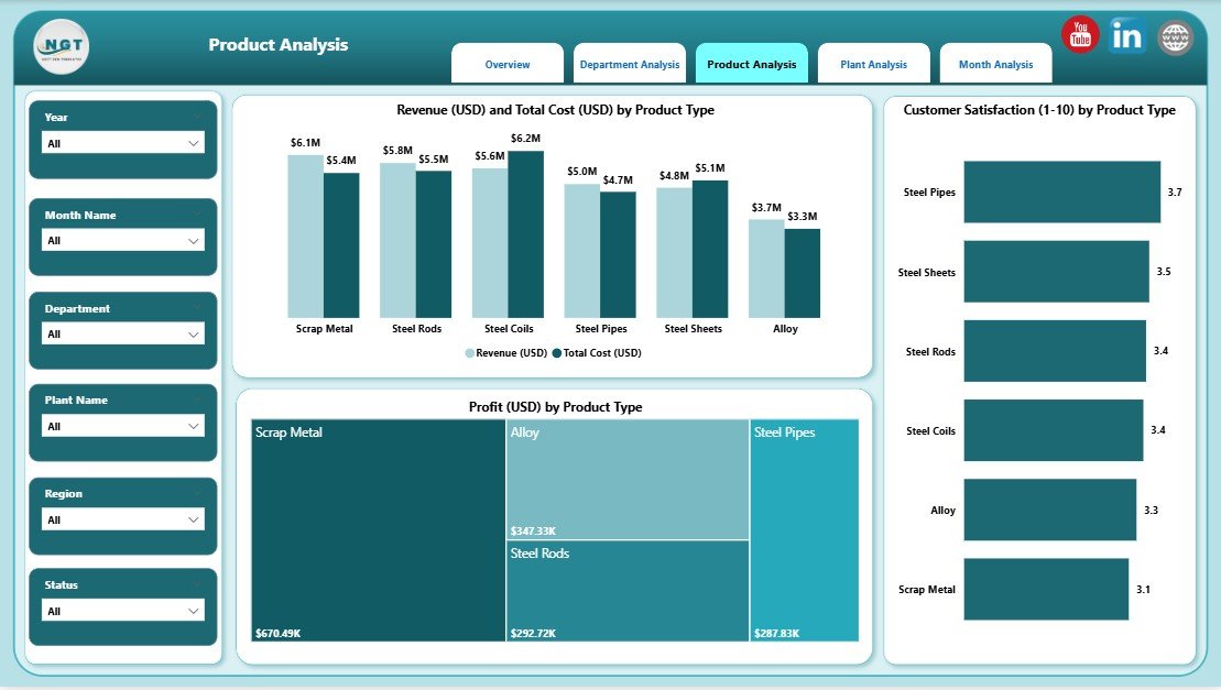
The Product Analysis Page focuses on product-level insights. It shows how each product contributes to revenue, cost, and satisfaction.
Charts on the Product Analysis Page:
✔️ Revenue (USD) and Total Cost (USD) by Product Type
This visual highlights:
-
High-performing products
-
Loss-making products
-
Cost vs revenue comparison
It also helps in pricing, production planning, and sales strategy.
✔️ Customer Satisfaction by Product Type
Customer feedback is important for product improvement. This chart explains which product performs well in quality and which product needs improvement.
✔️ Production Cost (USD) by Product Type
Managers use this chart to control cost and optimize production.
4. Plant Analysis Page – Which Plant Uses Resources Better?
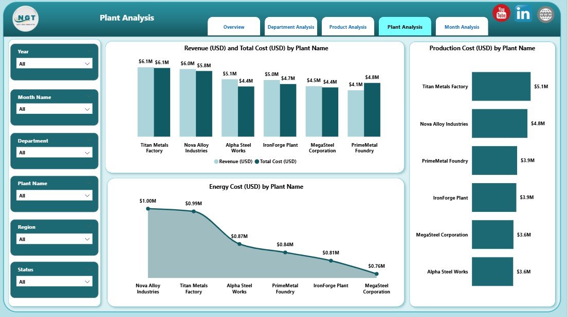
Large steel and metals companies operate multiple plants. This page shows plant-wise performance so leaders understand which plant performs better.
Charts on the Plant Analysis Page:
✔️ Revenue (USD) and Total Cost (USD) by Plant Name
Click to Purchases Steel & Metals Dashboard in Power BI
This helps compare the financial health of each plant.
✔️ Production Cost (USD) by Plant Type
You understand which type of plant (rolling, melting, fabrication, casting, etc.) uses resources efficiently.
✔️ Energy Cost (USD) by Plant Type
This is critical because energy cost directly affects profit.
The page helps companies shift focus toward plants that perform better and guide underperforming plants with the right strategy.
5. Monthly Trends Page – How Does the Business Perform Every Month?
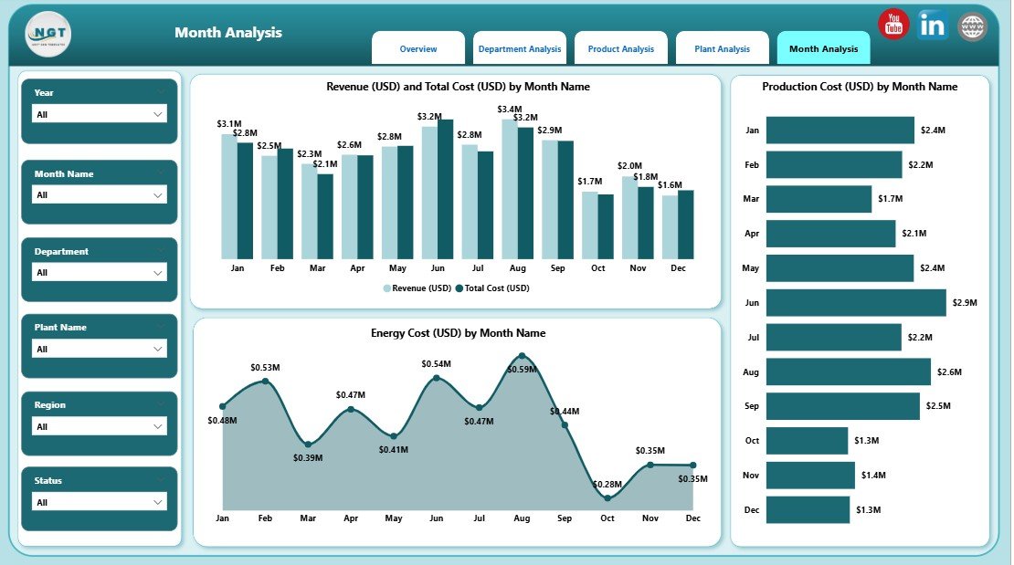
The Monthly Trends Page shows how revenue, cost, and production change over time. This page helps you identify seasonal production patterns, cost increases, and customer trends.
Charts on the Monthly Trends Page:
✔️ Revenue (USD) and Total Cost (USD) by Month
You understand whether revenue grows faster or slower than cost.
✔️ Production Cost (USD) by Month
You track production stability and cost spikes.
✔️ Energy Cost (USD) by Month
This visual helps identify:
-
High energy consumption months
-
Efficiency opportunities
-
Peak production patterns
This page is extremely useful for planning and budgeting.
Advantages of a Steel & Metals Dashboard in Power BI
A well-designed dashboard brings many advantages to the steel and metals industry. Below are the most important benefits.
1. You Make Faster and Better Decisions
You get real-time insights for every department, plant, and product. Because the dashboard updates automatically, you never waste time collecting data.
2. You Reduce Production and Energy Costs
The dashboard highlights:
-
High-cost plants
-
High-energy departments
-
Cost-heavy products
You take immediate steps to reduce waste and improve efficiency.
3. You Improve Production Quality
Customer satisfaction charts help you understand where quality drops. You take action faster and improve customer experience.
4. You Track KPIs from One Place
You no longer manage multiple spreadsheets. The dashboard combines all KPIs into a single view.
5. You Boost Employee Productivity
Teams spend less time preparing reports and more time improving operations.
6. You See Clear Trends Over Time
Monthly trends help you plan budgets, set targets, and monitor performance.
Best Practices for Using the Steel & Metals Dashboard in Power BI
Follow these practices to get the maximum benefit from your dashboard.
1. Keep Data Clean and Updated
Accurate data improves the quality of insights.
2. Use Consistent KPI Definitions
Define KPIs across departments so everyone follows the same rules.
3. Review Monthly Trends Regularly
Use trend reports to make smart decisions in cost planning, manpower, and production.
4. Monitor High Energy Consumption Areas
Energy cost affects profits. Use energy visuals to find optimization opportunities.
5. Use Filters and Slicers for Deep Insights
Always explore data by plant, product, or department to understand the full picture.
6. Compare Revenue vs Cost Frequently
Cost control is critical in steel and metals operations. Track both metrics together.
7. Share the Dashboard Across Teams
Power BI allows easy sharing so everyone stays aligned.
Conclusion
A Steel & Metals Dashboard in Power BI brings complete clarity to production, cost, quality, and revenue performance. Because it provides structured insights across plants, products, departments, and months, leaders take informed decisions with confidence. When you use this dashboard correctly, you improve operational efficiency, increase revenue, reduce costs, and deliver high-quality products to customers.
This dashboard not only simplifies reporting but also supports long-term growth for any steel or metals manufacturing business.
Frequently Asked Questions (FAQs)
1. What is a Steel & Metals Dashboard in Power BI?
It is a visual performance monitoring tool that tracks production, cost, revenue, customer satisfaction, and plant efficiency using interactive dashboards.
2. Who can use this dashboard?
Steel mills, metal fabrication units, rolling mills, production managers, finance teams, quality teams, and plant heads use this dashboard.
3. What data do I need to build this dashboard?
You need production data, cost data, revenue numbers, plant information, customer satisfaction scores, and monthly trends.
4. Does the dashboard update automatically?
Yes, once you connect it with your data source, Power BI updates the dashboard automatically.
5. Can I customize the dashboard?
Yes, you can add new KPIs, change visuals, update slicers, or redesign layouts based on your business needs.
6. How does the dashboard help reduce cost?
It highlights high-cost plants, expensive departments, energy consumption, and low-performing production areas.
7. Is Power BI better than Excel for dashboards?
Yes. Power BI is faster, more visual, easier to refresh, and supports large data sets without performance issues.
Visit our YouTube channel to learn step-by-step video tutorials