Subscription-based businesses grow fast because they create predictable revenue, strong customer relationships, and better product engagement. However, retail teams often struggle to monitor subscription activity properly. They jump between spreadsheets, scattered reports, and unorganized datasets. This slows down decision-making and reduces visibility.
A Subscription-based Retail Dashboard in Excel solves these problems. It helps retail teams view subscription performance, customer segments, revenue trends, costs, and product category insights in one place. Because the dashboard is interactive and easy to use, anyone can analyze business trends in minutes.
In this guide, you will learn how this dashboard works, what each page includes, and why it helps subscription retailers grow faster.
Click to Purchases Subscription-based Retail Dashboard in Excel
What Is a Subscription-based Retail Dashboard in Excel?
A Subscription-based Retail Dashboard in Excel is a ready-to-use analytical template designed for e-commerce companies, digital product sellers, SaaS retailers, and subscription-based brands. It converts structured data into visual insights. You track customer behavior, product category performance, revenue patterns, and satisfaction scores with ease.
This dashboard helps teams:
-
Improve customer retention
-
Identify top-performing products
-
Reduce cancellation rates
-
Understand payment behavior
-
Track monthly revenue changes
-
Compare countries and customer segments
-
Analyze subscription channel performance
Because the dashboard updates automatically when you refresh the data, you don’t waste time creating reports manually.
Click to Purchases Subscription-based Retail Dashboard in Excel
Key Features of the Subscription-based Retail Dashboard in Excel
This dashboard includes five analytical pages and a structured support section.
1. Overview Page
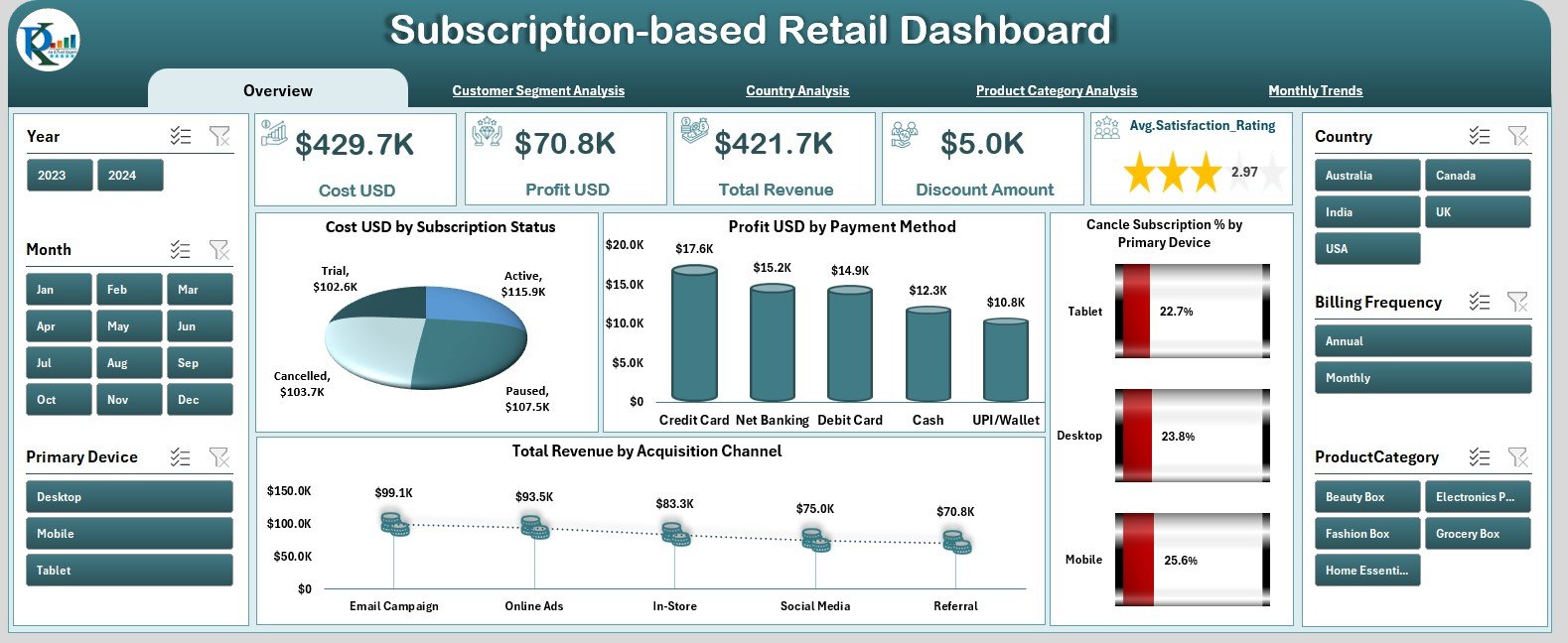
The Overview Page acts as the main control center. It includes slicers on the right-side silencer and five KPI cards that show important business metrics. These cards help decision-makers understand:
-
Total subscriptions
-
Total revenue
-
Total cost
-
Monthly profit
-
Cancellation rate
Below these cards, you will find four analytical charts:
Cost (USD) by Subscription Status
Shows how costs differ between active, canceled, paused, or new subscriptions.
Profit (USD) by Payment Method
Helps you compare profitability across:
-
Credit card
-
Debit card
-
Wallet
-
UPI
-
PayPal
-
Other methods
Cancel Subscription % by Primary Device
Reveals whether cancellations are higher on mobile, web, tablet, or app.
Total Revenue by Acquisition Channel
Helps you identify the most profitable sources such as:
-
Social media
-
Email marketing
-
Affiliate channels
-
Direct website visits
-
Paid ads
This page helps leaders understand the overall business performance in seconds.
2. Customer Segment Analysis
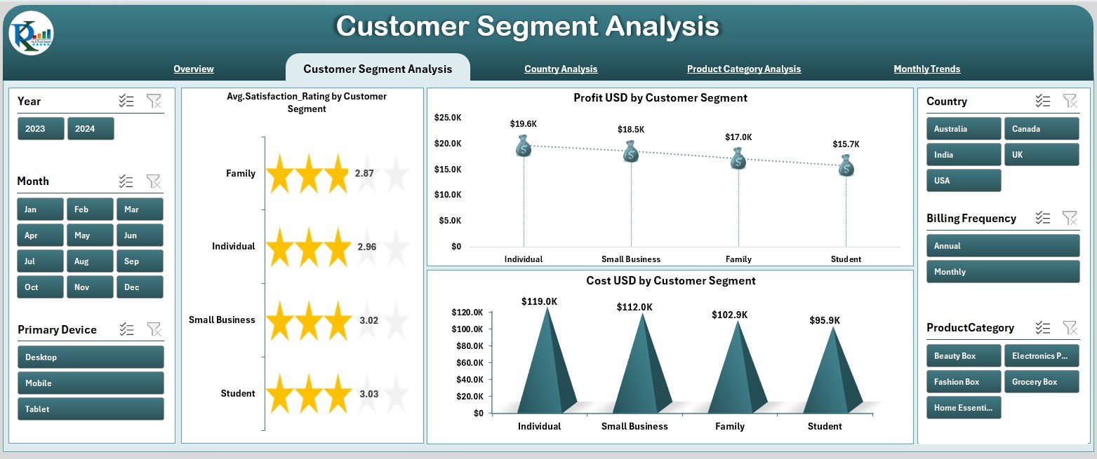
Customer segmentation is critical for subscription-based businesses. The Customer Segment Analysis page helps you understand how different types of customers perform.
This page shows three charts:
Average Satisfaction Rating by Customer Segment
Helps you understand which group of customers remain most satisfied.
Segments include:
-
Students
-
Professionals
-
Enterprise users
-
Families
-
Seniors
-
Free-to-paid converters
Profit (USD) by Customer Segment
Shows which customer groups generate the highest profit.
Cost (USD) by Customer Segment
Helps you identify segments with higher support, service, or platform costs.
This analysis is useful for shaping promotions, pricing strategies, and retention campaigns.
Click to Purchases Subscription-based Retail Dashboard in Excel
3. Country Analysis

The Country Analysis page breaks down performance across the global market.
You see three important charts:
Total Subscriptions by Country
Shows where your customer base grows the fastest.
Cost (USD) by Country
Reveals where operational or service costs stay higher.
Profit (USD) by Country
Displays the profitability of each region, helping leaders plan expansion strategies.
This page is helpful for international brands that want better clarity on market performance.
4. Product Category Analysis
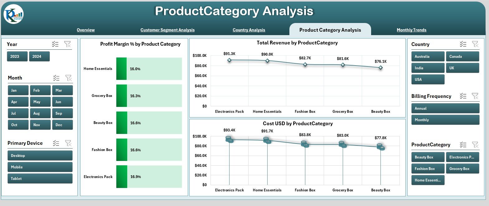
Subscription-based retailers often sell multiple product categories such as:
-
Software tools
-
Courses
-
Streaming content
-
Membership programs
-
Digital files
-
Physical subscription boxes
The Product Category Analysis page helps you identify which categories perform best.
It includes three visual charts:
Profit Margin % by Product Category
Shows profitability for each product type.
Total Revenue by Product Category
Identifies high-revenue product lines.
Cost (USD) by Product Category
Reveals categories with higher production or service delivery costs.
This page helps brands adjust product strategies, add new subscription items, and optimize pricing.
Click to Purchases Subscription-based Retail Dashboard in Excel
5. Monthly Trends
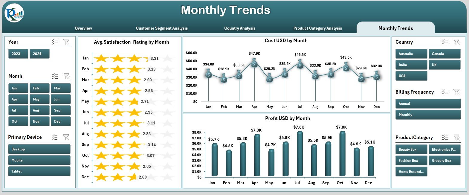
Subscription businesses rely on monthly patterns. The Monthly Trends page shows how customer sentiment, costs, and profits change by month.
You see three charts:
Average Satisfaction Rating by Month
Shows seasonal changes in customer satisfaction.
Cost (USD) by Month
Helps track operational or service delivery expenses month-to-month.
Profit (USD) by Month
Allows clear comparison of profit fluctuations throughout the year.
These charts help teams identify patterns such as months with higher churn, increased demand, or rising marketing expenses.
Support Sheets
The dashboard also includes Support Sheet and Data Sheet sections.
These sheets store raw and processed data for the dashboard.
They include fields such as:
-
Subscription ID
-
Customer segment
-
Payment method
-
Country
-
Product category
-
Acquisition channel
-
Satisfaction rating
-
Cost
-
Revenue
-
Profit
-
Subscription status
-
Month
Users update these sheets to refresh the entire dashboard.
Click to Purchases Subscription-based Retail Dashboard in Excel
Why Do Subscription Retailers Need an Excel Dashboard?
Subscription retailers face challenges like:
-
High churn
-
Customer dissatisfaction
-
Profit fluctuations
-
Marketing overhead
-
Complex customer behavior
-
Seasonal revenue shifts
This dashboard solves these problems by:
-
Giving real-time insights
-
Highlighting the best customer segments
-
Showing product-level profitability
-
Revealing churn patterns
-
Uncovering high-cost areas
-
Tracking global performance
-
Showing monthly changes clearly
Because the dashboard is interactive, teams view insights easily without technical knowledge.
How This Dashboard Helps Improve Business Performance
This dashboard improves performance by:
-
Reducing subscription cancellations
-
Increasing repeat purchases
-
Enhancing customer satisfaction
-
Identifying profitable countries
-
Spotting costly product categories
-
Optimizing marketing investments
-
Improving operational planning
When teams review these insights regularly, they create better strategies and run the business more efficiently.
Click to Purchases Subscription-based Retail Dashboard in Excel
Advantages of Subscription-based Retail Dashboard in Excel
1. Instant Access to Insights
Leaders understand business performance quickly.
2. Clear Segmentation
Charts show customer segments, categories, and countries.
3. Full Subscription Transparency
Trends and KPIs make it easy to track churn, revenue, and profit.
4. No Technical Skills Required
Anyone familiar with Excel can update and use the dashboard.
5. Time Savings
No need to create weekly or monthly reports manually.
6. Better Decision-Making
Data-backed insights support marketing, pricing, and retention planning.
7. Improved Profitability
Profit charts highlight strong and weak areas in the business.
Best Practices for Using This Dashboard
1. Update Data Consistently
Weekly or monthly updates help maintain accuracy.
2. Keep Product Categories Organized
Clear naming reduces reporting errors.
3. Monitor Monthly Trends Regularly
Trends help you predict future patterns.
4. Track Customer Segments Carefully
Targeted marketing improves retention and profit.
5. Use Acquisition Channel Insights
Allocate budgets to the most profitable channels.
6. Review Satisfaction Ratings Frequently
Ratings reveal early warnings of churn.
7. Compare Countries Before Expanding
Country-level insights help guide investment decisions.
Conclusion
A Subscription-based Retail Dashboard in Excel gives subscription businesses a powerful way to understand customer behavior, product category performance, profit trends, and global activity. The dashboard includes five analytical pages and user-friendly navigation, making it ideal for teams that want quick insights.
As you update the data sheets, the dashboard refreshes automatically. This creates a clear, reliable, and time-saving reporting system for any subscription-based retail company.
When used consistently, this dashboard improves decision-making, enhances customer satisfaction, increases retention, and supports long-term growth.
Click to Purchases Subscription-based Retail Dashboard in Excel
Frequently Asked Questions (FAQs)
1. Who can use this dashboard?
Subscription retailers, SaaS platforms, e-commerce stores, digital content sellers, and membership-based businesses.
2. Can I add more product categories?
Yes, you can add new categories in the data sheet and refresh the dashboard.
3. How often should I update the data?
Most companies update the dashboard weekly or monthly.
4. Do I need Excel expertise?
Basic Excel knowledge is enough to operate it.
5. Does the dashboard show churn patterns?
Yes, charts reveal cancellation behavior and customer satisfaction.
6. Can I customize the visuals?
Yes, you can adjust charts, colors, and structures based on preference.
7. Is the dashboard mobile-friendly?
Excel dashboards work best on desktop for full visibility.
Click to Purchases Subscription-based Retail Dashboard in Excel
Visit our YouTube channel to learn step-by-step video tutorials