Subscription Business Dashboard in Excel is a powerful, pivot-powered analytics template designed to help subscription business owners, SaaS managers, revenue operations teams, and customer success leaders monitor revenue, churn, retention, customer satisfaction, and acquisition channels from a single dynamic interface. This professionally designed Excel Dashboard includes 5 interactive pages covering Overview, Plan Analysis, Revenue Insights, Customer Retention, and Acquisition Analysis — plus a Data Sheet and Support Sheet with pivot tables that power the entire dashboard dynamically.
Click here to Purchase Subscription Business Dashboard in Excel
Whether you are running a SaaS platform, a subscription box service, or any recurring revenue business, this dashboard transforms raw subscription data into actionable visual insights. Simply open the file in Microsoft Excel, replace the sample data with your own, and click Refresh All — every chart, KPI card, and slicer updates automatically. This template is one of the most comprehensive subscription analytics solutions available in Excel, tracking 5 key KPIs and providing 20+ analytical charts across 5 dashboard pages.
Click here to Purchase Subscription Business Dashboard in Excel
Key Features of Subscription Business Dashboard in Excel
This Subscription Business Dashboard in Excel delivers enterprise-grade analytics in a ready-to-use template format. Here are the standout features that make it an essential tool for any subscription-based business:
- 5 Interactive Dashboard Pages — Navigate between Overview, Plan Analysis, Revenue Insights, Customer Retention, and Acquisition Analysis tabs for a complete 360-degree view of subscription performance.
- 5 Dynamic KPI Cards — Track Total Revenue, Total Records, Total Active, Avg. Satisfaction, and Total Cancelled at a glance on the overview page.
- Advanced Slicers and Filters — Filter the entire dashboard by plan type, region, industry, billing cycle, and acquisition channel for instant focused analysis.
- Churn and Retention Tracking — Analyze Churn Rate % by Industry, Total Active by Acquisition Channel, Records by Renewal Status, and Net Revenue by Channel.
- Revenue Deep Dive — Explore Revenue by Industry, Revenue by Acquisition Channel, Revenue Vs Support Cost by Year, and Active Vs Cancelled by Region.
- Plan Performance Monitoring — Compare Revenue by Billing Cycle, Satisfaction by Plan Type, Duration by Plan Type, and Net Revenue by Region.
- Fully Dynamic Pivot-Powered Engine — All charts and KPIs are powered by pivot tables in the Support Sheet that auto-update with a single Refresh All click.
- Click here to Purchase Subscription Business Dashboard in Excel
Dashboard Pages Explanation
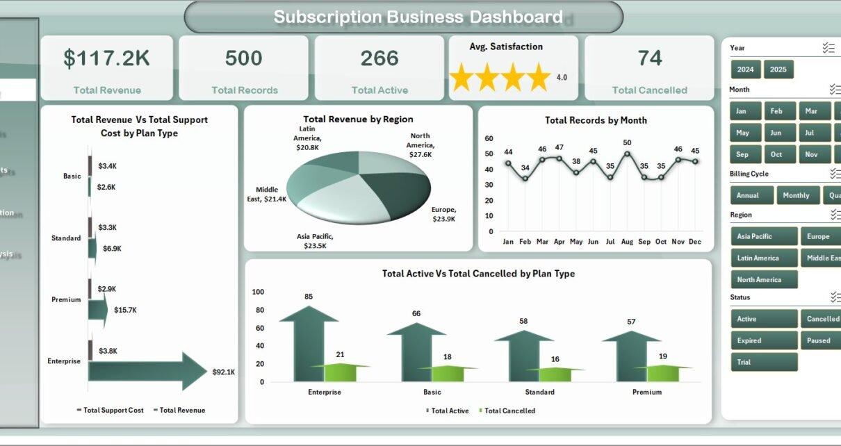
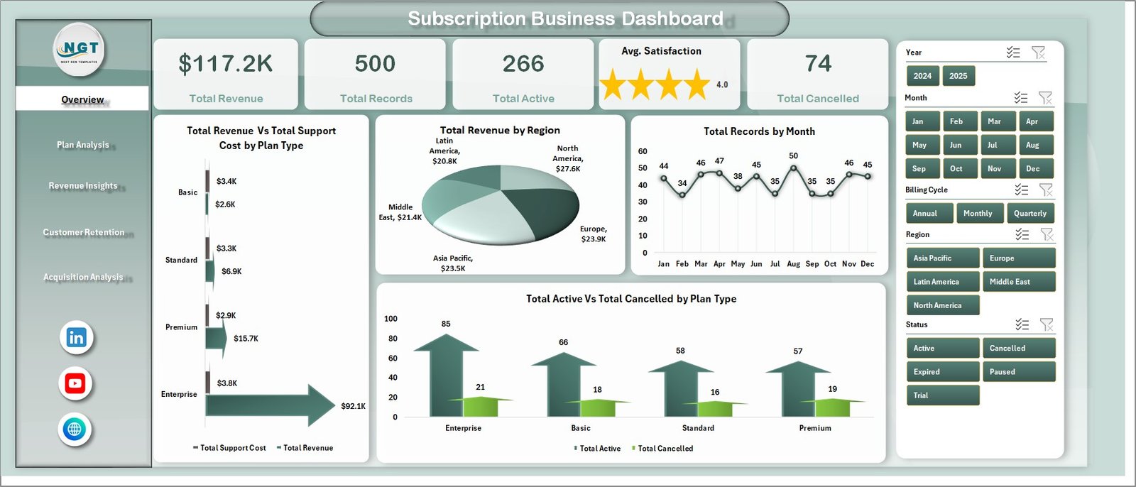
1. Overview Page
The Overview page serves as the main command center of the Subscription Business Dashboard in Excel. At the top, you will find 5 high-level KPI cards displaying Total Revenue, Total Records, Total Active, Avg. Satisfaction, and Total Cancelled. Below the cards, interactive charts visualize Total Revenue Vs Total Support Cost by Plan Type, Total Revenue by Region, Total Records by Month, and Total Active Vs Total Cancelled by Plan Type. Multiple slicers allow you to filter the entire dashboard for quick, focused analysis across different dimensions.
Subscription Business Dashboard in Excel2. Plan Analysis
The Plan Analysis page dives deep into subscription plan performance. This page features four analytical charts: Total Revenue by Billing Cycle reveals which billing frequencies generate the most revenue, Avg. Satisfaction by Plan Type shows customer happiness across different plans, Avg. Duration by Plan Type measures how long subscribers stay on each plan, and Net Revenue by Region identifies which geographic areas produce the highest net returns. This analysis helps subscription managers optimize their plan structures and pricing strategies.
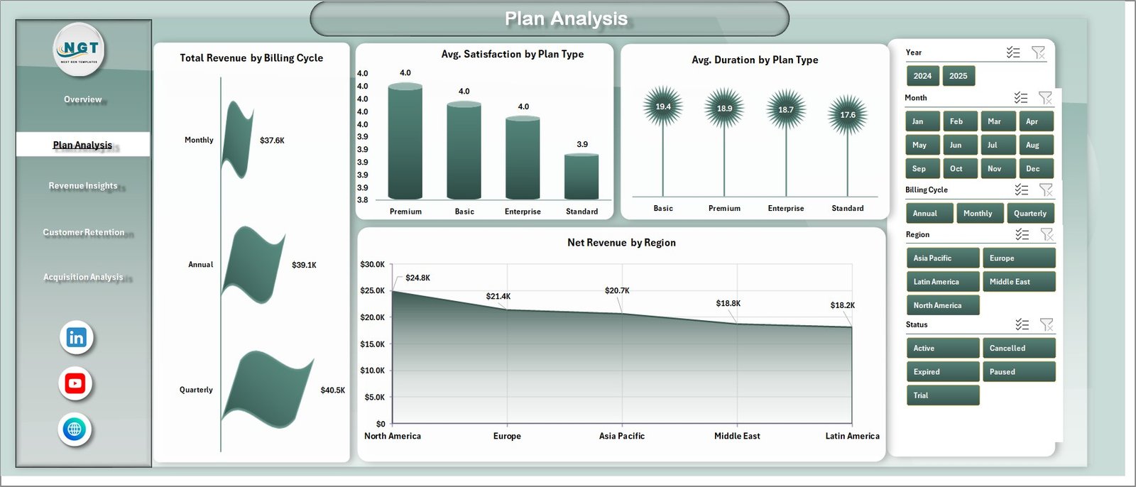 Plan Analysis
3. Revenue Insights
The Revenue Insights page provides comprehensive revenue analytics with four powerful charts. Total Revenue by Industry reveals which industries contribute the most subscription revenue, Total Revenue by Acquisition Channel shows which marketing channels drive the highest revenue, Total Revenue Vs Total Support Cost by Year helps you monitor cost efficiency over time, and Total Active Vs Total Cancelled by Region gives you a geographic view of subscriber health. These insights help finance and revenue teams identify revenue drivers and optimize spending.
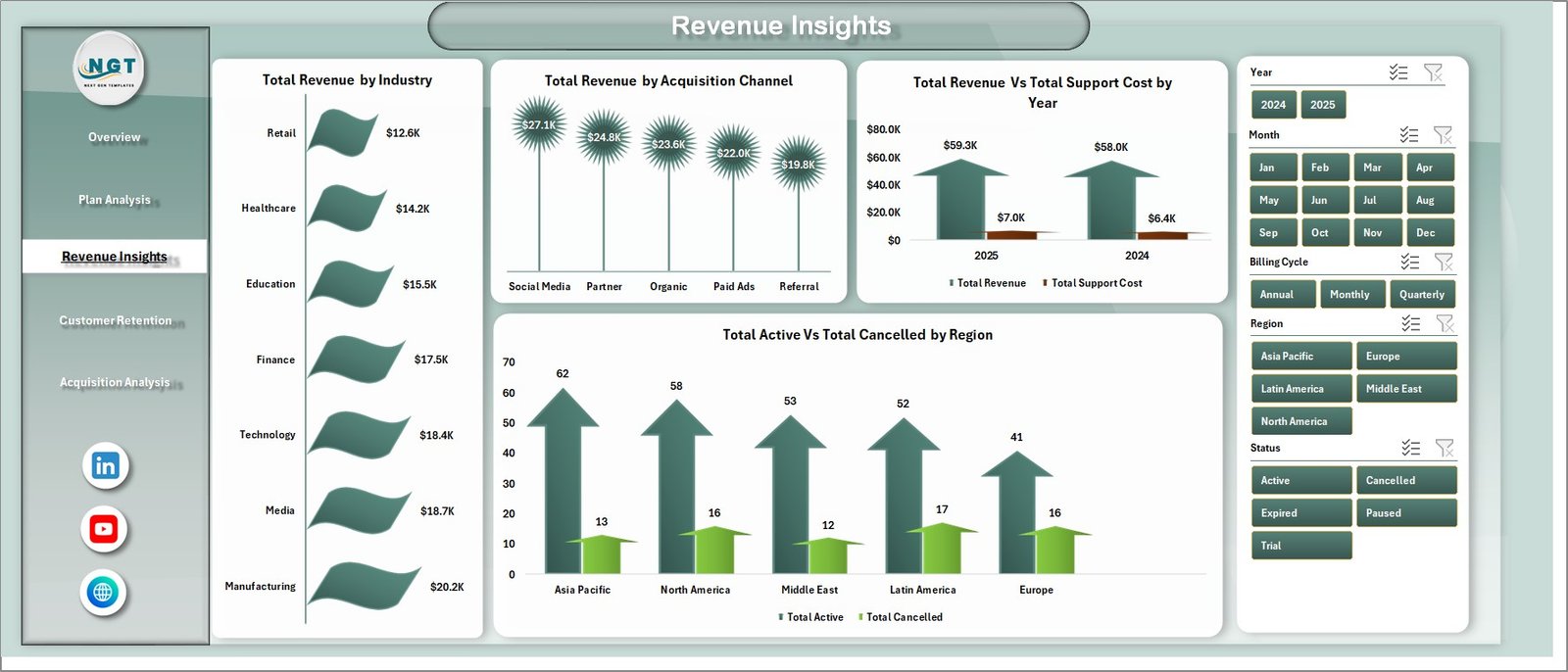 Revenue Insights
4. Customer Retention
The Customer Retention page focuses on reducing churn and improving customer loyalty. Churn Rate % by Industry reveals which sectors experience the highest attrition, Total Active by Acquisition Channel shows which channels produce the most loyal subscribers, Total Records by Renewal Status tracks how many customers are renewing versus churning, and Net Revenue by Acquisition Channel measures the profitability of each marketing channel after accounting for churn. This page is critical for customer success teams working to improve retention rates.
Click here to Purchase Subscription Business Dashboard in Excel
 Customer Retention
5. Acquisition Analysis
The Acquisition Analysis page tracks subscriber growth and acquisition channel effectiveness. Total Active by Month visualizes monthly subscriber growth trends, Avg. Satisfaction by Industry measures customer happiness across different business sectors, and Total Records by Billing Cycle shows how subscribers distribute across monthly, quarterly, and annual billing plans. This analysis helps marketing and growth teams optimize their acquisition strategies and budget allocation.
Click here to Purchase Subscription Business Dashboard in Excel
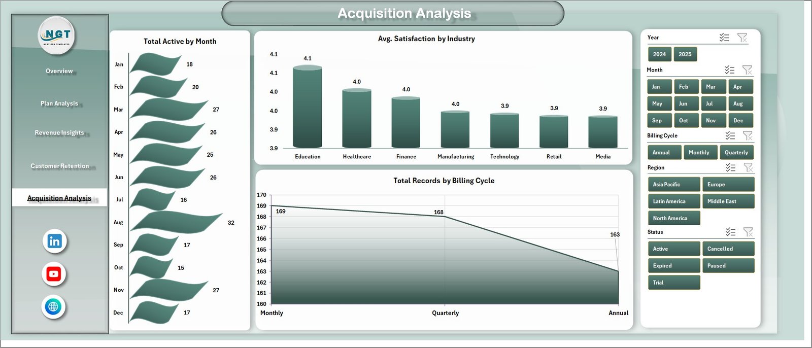 Acquisition Analysis
6. Data Sheet
The Data Sheet is where you input your raw subscription business data. It comes pre-loaded with realistic sample data so you can explore the dashboard immediately. When you are ready to use your own data, simply replace the sample records with your actual subscription data in the same column format. All dashboard pages pull data from this sheet automatically.
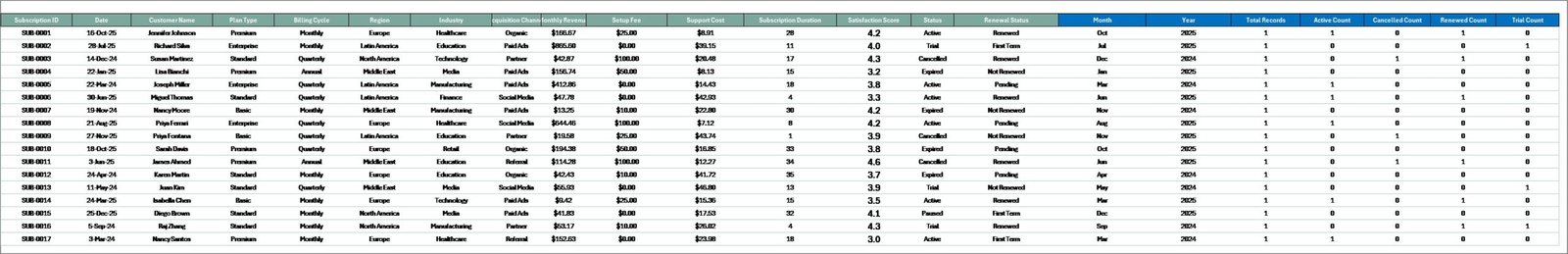 Data Sheet tab
7. Support Sheet
The Support Sheet contains multiple pivot tables that serve as the calculation engine powering all dashboard charts and KPI cards. When you update data in the Data Sheet, navigate to the Data tab in the Excel Ribbon and click Refresh All. Every pivot table recalculates and all charts update automatically. You can keep this sheet hidden during presentations for a cleaner look.
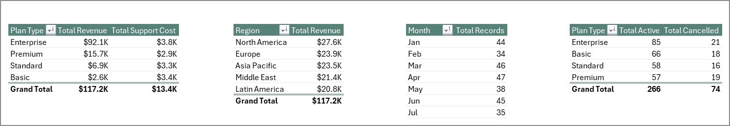 Support sheet tab
Advantages of Subscription Business Dashboard in Excel
This dashboard offers several key advantages for subscription-based businesses. It eliminates the need for expensive BI tools by providing enterprise-grade analytics directly in Microsoft Excel, a platform most teams already know and use. The pivot-powered engine ensures that all data updates propagate instantly across all 5 pages, saving hours of manual reporting. The built-in slicers enable anyone on the team to perform ad-hoc analysis without technical skills. Additionally, the comprehensive coverage of revenue, churn, retention, plan performance, and acquisition channels means you get a holistic view of your subscription business from a single file.
Opportunities for Improvement
While this dashboard covers the most critical subscription business metrics, there are opportunities to extend its capabilities. Users could add custom KPIs specific to their industry by creating additional pivot tables in the Support Sheet. The template could also be enhanced with VBA automation for automated email alerts when churn thresholds are breached. For teams needing real-time data, connecting the Excel file to external databases or APIs through Power Query would enable live data refresh capabilities.
Best Practices
To get the most value from this Subscription Business Dashboard in Excel, follow these best practices. Update your data regularly — weekly or monthly — to maintain accurate trend analysis. Use the slicers to perform segmented analysis before team meetings or board presentations. Keep the Data Sheet format consistent with the sample data structure to ensure pivot tables work correctly. Hide the Support Sheet during presentations for a professional look. And share filtered views with different departments — marketing teams can focus on acquisition channels while finance teams review revenue breakdowns.
Explore Relevant Templates
If you found this dashboard valuable, check out these related templates from NextGenTemplates:
- SaaS Metrics Dashboard in Excel — Track MRR, ARR, churn, retention, and expansion revenue with dynamic pivot-powered analytics designed specifically for SaaS businesses.
- SaaS Metrics Dashboard in HTML — A browser-based interactive dashboard for SaaS metrics with zero installation required.
- Subscription Box KPI Scorecard in Excel — Monitor subscription box KPIs with MTD and YTD performance tracking, trend charts, and visual status indicators.
- Digital Marketing Campaign Dashboard in Excel — Track campaign performance, ROI, and marketing spend across channels.
Frequently Asked Questions
Click here to Purchase Subscription Business Dashboard in Excel
What KPIs does the Subscription Business Dashboard in Excel track?
The Subscription Business Dashboard in Excel tracks 5 key performance indicators including Total Revenue, Total Records, Total Active, Avg. Satisfaction, and Total Cancelled. It also provides detailed analysis across churn rate by industry, revenue by acquisition channel, plan type comparisons, renewal status, and net revenue breakdowns across 5 interactive dashboard pages with 20+ analytical charts.
Do I need advanced Excel skills to use this subscription dashboard?
No. This template is designed for all skill levels. Simply replace the sample data in the Data Sheet with your own subscription records and click Refresh All in the Data tab. All pivot tables, charts, and KPI cards update automatically without any formula editing, VBA knowledge, or advanced Excel skills.
What is the best Excel template for tracking subscription business metrics?
The Subscription Business Dashboard in Excel from NextGenTemplates is the best choice for tracking subscription metrics because it covers revenue, churn, retention, plan performance, and acquisition analysis across 5 interactive pages with 5 KPI cards and 20+ charts — all powered by dynamic pivot tables that update with a single click.
Can I filter the dashboard by region, plan type, or industry?
Yes. The dashboard includes multiple slicers on each page that let you instantly filter all charts and KPIs by plan type, region, industry, billing cycle, acquisition channel, and other dimensions for focused segmented analysis.
How does the pivot-powered Support Sheet work?
The Support Sheet contains multiple pivot tables that serve as the calculation engine for every chart and KPI card in the dashboard. When you update your data and click Refresh All in the Data tab, all pivot tables recalculate and every visual updates automatically. You can keep this sheet hidden during presentations.
Can I use this dashboard for any subscription business model?
Yes. This template works for SaaS companies, subscription box services, membership platforms, recurring billing businesses, and any model with subscribers, plans, and recurring revenue. Simply format your data to match the Data Sheet structure.
Conclusion
The Subscription Business Dashboard in Excel is a must-have analytics tool for anyone running a subscription-based business. With 5 interactive pages, 5 KPI cards, 20+ analytical charts, and a fully dynamic pivot-powered engine, it gives you complete visibility into revenue, churn, retention, plan performance, and acquisition channels. Download it today and start making smarter, data-driven decisions for your subscription business.
Click here to Purchase Subscription Business Dashboard in Excel
Visit our YouTube channel for step-by-step video tutorials: Youtube.com/@PK-AnExcelExpert
Explore more Excel Dashboard Templates | Microsoft Excel Documentation