Supply chain management (SCM) plays a vital role in ensuring that products reach customers on time, with the right quality, and at the lowest possible cost. Companies face daily challenges such as supplier performance, warehouse efficiency, product demand, and transportation delays. Managing all these aspects manually often leads to errors, missed opportunities, and costly inefficiencies.
This is where a Supply Chain Management Dashboard in Excel becomes a powerful tool. Excel remains one of the most flexible and widely used platforms for data analysis, offering built-in formulas, pivot tables, charts, and slicers that can transform raw data into clear, actionable insights. A well-designed Excel dashboard helps supply chain managers visualize performance across suppliers, warehouses, products, and time periods.
Click to Purchases Supply Chain Management Dashboard in Excel
In this article, we will explore the features of a Supply Chain Management Dashboard in Excel, its benefits, best practices, and how it empowers organizations to improve decision-making.
What Is a Supply Chain Management Dashboard in Excel?
A Supply Chain Management Dashboard in Excel is a structured template that provides a single view of all key supply chain metrics. It integrates supplier analysis, warehouse performance, product category trends, and monthly data into one interactive file. Instead of juggling multiple reports, managers can monitor real-time insights, compare performance, and identify risks or opportunities in one place.
This dashboard includes multiple interconnected pages powered by a data sheet and support sheet. By combining slicers, pivot charts, and KPIs, it delivers a complete picture of supply chain efficiency.
Key Features of the Supply Chain Management Dashboard
The Excel-based dashboard template contains five main analytical pages, each with its own unique focus.
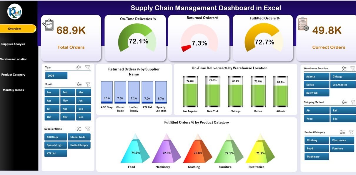
Overview Page
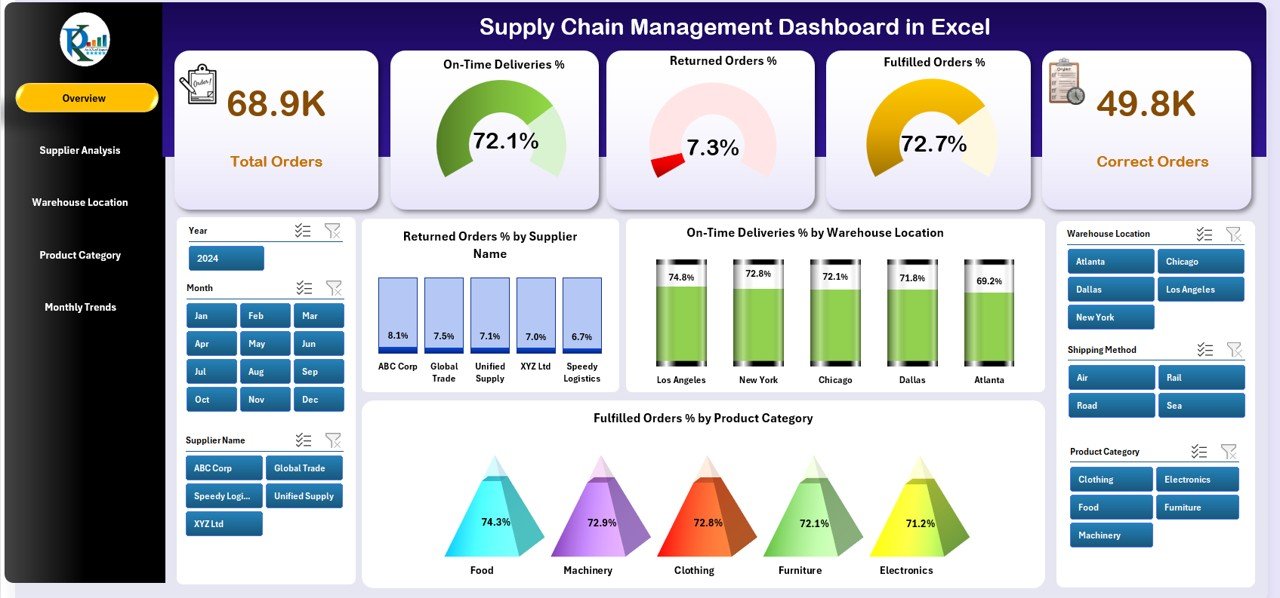
The Overview Page acts as the executive summary of the supply chain.
-
Cards Section: Displays key KPIs such as total orders, fulfilled orders, return percentages, and cost efficiency.
Charts Included:
- Returned Order % by Supplier Name
- On-Time Deliveries % by Warehouse Location
- Fulfilled Order % by Product Category
This high-level view helps decision-makers track the most critical indicators without diving into too much detail.
Supplier Analysis Page
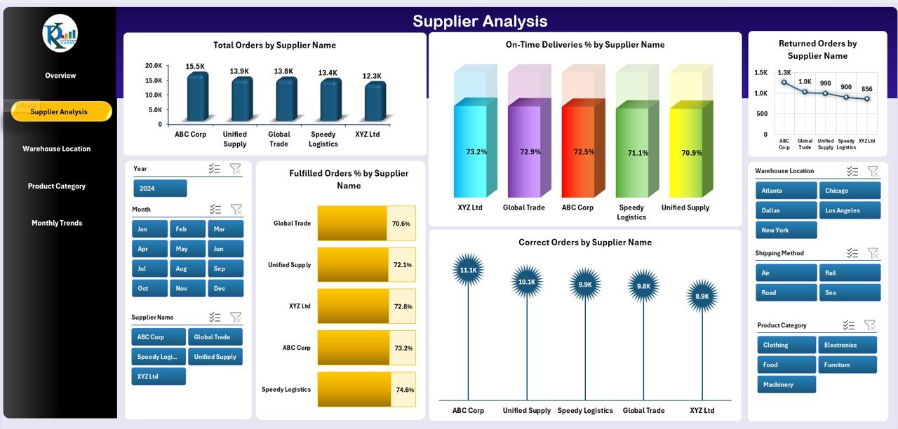
Suppliers are the backbone of any supply chain. The Supplier Analysis Page evaluates their performance.
Charts Included:
- Margin (USD) by Department
- Availability % by Department
- Cost (USD) vs Sales Revenue (USD) by Department
This analysis helps managers identify top-performing suppliers and address issues with underperforming ones.
Warehouse Location Analysis Page
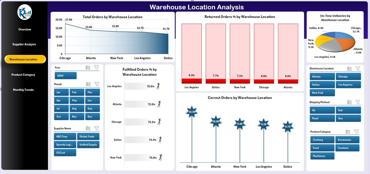
Warehouse efficiency directly impacts delivery speed and customer satisfaction. The Warehouse Location Analysis Page provides insights into how each location performs.
Charts Included:
- Total Orders by Warehouse Location
- Returned Orders % by Warehouse Location
- On-Time Deliveries by Warehouse Location
- Fulfilled Orders % by Warehouse Location
- Correct Orders by Warehouse Location
This helps in optimizing inventory distribution, reducing delays, and improving order accuracy.
Click to Purchases Supply Chain Management Dashboard in Excel
Product Category Analysis Page
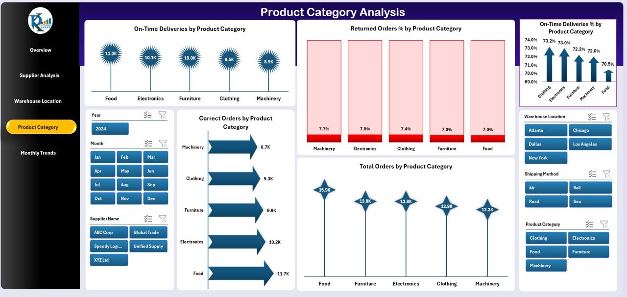
Different product categories often behave differently in terms of demand and fulfillment. The Product Category Analysis Page gives managers a clear view of category-wise performance.
Charts Included:
- On-Time Deliveries by Product Category
- Returned Orders % by Product Category
- Correct Orders by Product Category
- Total Orders by Product Category
This analysis supports demand forecasting and helps businesses adjust their product mix.
Monthly Trends Page
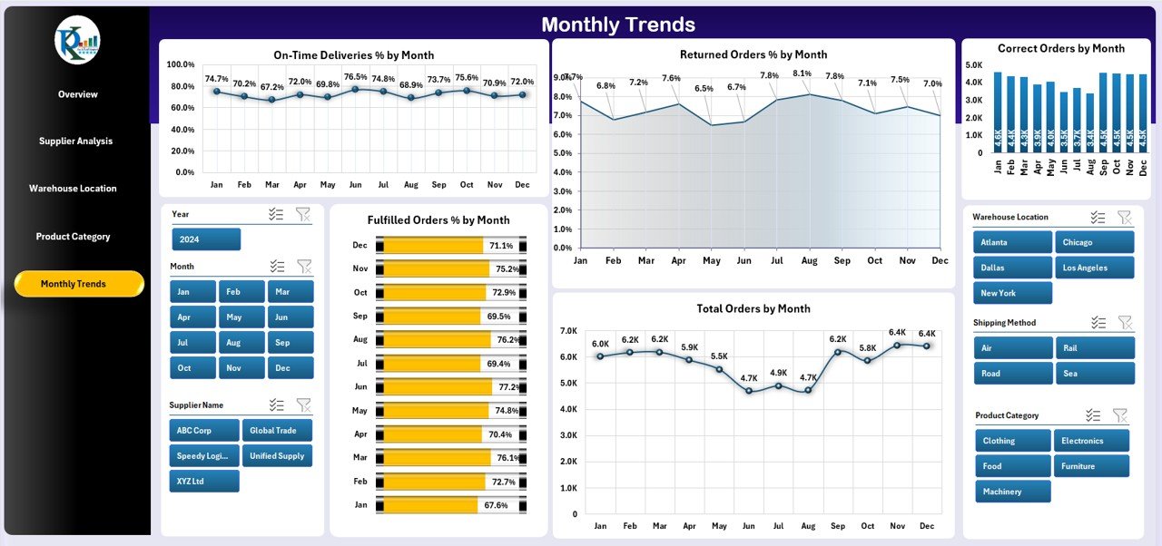
Tracking supply chain trends over time is crucial for planning. The Monthly Trends Page highlights performance shifts and seasonal variations.
Charts Included:
- On-Time Deliveries by Month
- Returned Orders % by Month
- Correct Orders by Month
- Total Orders by Month
Managers can compare month-to-month changes and make data-driven decisions about operations, supplier contracts, and logistics.
Advantages of a Supply Chain Management Dashboard in Excel
✅ Centralized Insights – All supply chain KPIs in one place for faster decisions.
✅ Cost-Effective – No expensive software required; Excel is widely available.
✅ Flexibility – Easy to modify formulas, add charts, or adjust KPIs.
✅ Improved Supplier Relationships – Track supplier performance and negotiate better terms.
✅ Warehouse Optimization – Identify the best and worst-performing locations.
✅ Better Forecasting – Monthly trends and category insights support demand planning.
✅ Error Reduction – Automates calculations, reducing manual mistakes.
✅ Scalability – Can expand as business grows, adding more suppliers, products, or warehouses.
Opportunities for Improvement in Supply Chain Dashboards
Even though Excel dashboards are powerful, there are areas where companies can improve:
🔹 Automation – Linking the dashboard with live ERP or CRM systems for real-time updates.
🔹 Data Quality – Ensuring accurate and clean data entry to avoid misleading visuals.
🔹 Integration – Combining supply chain data with finance and sales dashboards for a holistic view.
🔹 User Training – Equipping staff with Excel skills to update and analyze dashboards independently.
🔹 Customization – Adding more KPIs like transportation cost, supplier lead times, or carbon footprint.
Best Practices for Supply Chain Management Dashboard in Excel
To get the most out of your Excel dashboard, follow these best practices:
-
Define KPIs Clearly – Decide what metrics matter most before designing the dashboard.
-
Use Dynamic Charts – Apply slicers, filters, and pivot charts to make analysis interactive.
-
Keep It Simple – Focus on clarity; avoid cluttered visuals.
-
Ensure Data Accuracy – Validate data sources before creating reports.
-
Update Regularly – Refresh the dashboard weekly or monthly to reflect current performance.
-
Create Drill-Down Options – Allow users to move from overview to detailed supplier or product analysis.
-
Incorporate Conditional Formatting – Use colors or icons to highlight critical issues like late deliveries.
-
Document the Dashboard – Add notes or instructions so users understand each chart and KPI.
Conclusion
A Supply Chain Management Dashboard in Excel is an essential tool for businesses of all sizes. It allows managers to track supplier performance, monitor warehouse efficiency, analyze product categories, and review monthly trends in one centralized platform. With features like interactive slicers and clear charts, this dashboard ensures transparency, accuracy, and efficiency across the supply chain.
By adopting best practices and continuously improving the dashboard, organizations can reduce costs, improve delivery performance, and gain a competitive edge in the market.
Frequently Asked Questions (FAQs)
1. Why should I use Excel for Supply Chain Management Dashboards?
Excel is cost-effective, widely used, and highly customizable. Unlike expensive ERP systems, Excel allows businesses to build dashboards tailored to their unique needs without requiring advanced technical skills.
2. What KPIs should be included in a Supply Chain Management Dashboard?
Key KPIs include on-time deliveries, returned order %, fulfilled order %, supplier margin, cost vs revenue, and warehouse efficiency metrics like correct orders and total orders.
3. Can I link the dashboard to live data sources?
Yes, Excel allows integration with databases, ERP systems, and even APIs. By automating data refresh, managers can track real-time supply chain performance.
4. How often should I update the dashboard?
Most companies update their dashboards weekly or monthly. However, businesses with fast-moving supply chains may prefer daily updates.
5. Is this dashboard suitable for small businesses?
Absolutely. Small businesses can use Excel dashboards to gain visibility into supplier and warehouse operations without investing in costly software.
6. What are the limitations of Excel-based dashboards?
Limitations include handling very large datasets, lack of real-time collaboration compared to cloud platforms, and potential for human errors if data is not validated properly.
7. Can I add more KPIs to this dashboard?
Yes, Excel dashboards are highly customizable. Businesses can add KPIs like transportation costs, supplier lead times, or customer satisfaction metrics.
Visit our YouTube channel to learn step-by-step video tutorials